
Abstract
The SUPR-Qm is a standardized questionnaire for the assessment of the UX of mobile apps. In this paper, we describe our analysis of large-sample datasets to (1) replicate the Rasch model reported in the initial publication of the SUPR-Qm in 2017, (2) identify redundant items from the original 16-item SUPR-Qm that could be removed to create a streamlined 5-item version (SUPR-Qm V2), (3) demonstrate the stability of the SUPR-Qm and SUPR-Qm V2 over two multiyear periods in which data were collected for 155 mobile apps across 23 industries, and (4) develop interpretive norms (including curved grading scales) for the SUPR-Qm and SUPR-Qm V2. This new version enhances the usefulness of the SUPR-Qm for UX practitioners and researchers who need a standardized questionnaire that provides a quick 5-item measure of the UX of mobile apps. The SUPR-Qm V2 is easy to interpret with norms that should remain stable for many years.
Keywords
SUPR-Qm, mobile app, user experience, UX, Rasch scaling
Introduction
The mobile app industry is very lucrative, generating $45 billion in the US and $229 billion worldwide in 2023 (Grand View Research, n.d.; Wylie, 2024). There is widespread belief in the UX community that a good user experience is critical to the success of websites and mobile apps (Geeks of Gurukul, 2023, May 19; Uddin, 2024, February 1). Some published research supports the hypothesized impact of UX constructs such as (1) perceived ease of use and perceived usefulness on higher-level attitudes (such as ratings of overall experience), (2) behavioral intentions (such as recommending or continuing use), and (3) consequent user behaviors (such as actual recommendation, or actual continued usage) (Lah et al., 2020; Lewis & Sauro, 2023).
Despite the importance of UX on the success of mobile apps, the development and publication of efficient, standardized questionnaires focused on the measurement of the UX of mobile apps has been limited. Lusky and Böhm (2017) reviewed the methods used to evaluate mobile UX; they categorized methods as generic (applicable to a wide range of user experiences, not just mobile), mobile adapted (originally generic but adapted to mobile evaluation), and mobile specific (developed for evaluation of mobile UX). Applying this taxonomy to standardized UX questionnaires, there are numerous examples of researchers using generic UX questionnaires in research on the UX of mobile apps. For example:
- van der Heijden and Sørensen (2003) used a standardized consumer acceptance questionnaire, the Hedonic Utilitarian (HED/UT) scale (Voss et al., 2003), to measure attitudes toward mobile information services,
- Dhir and Al-kahtani (2013) used the AttrakDiff™ questionnaire (Hassenzahl, 2018) to evaluate the UX of mobile augmented reality prototypes,
- O’Malley et al. (2014) used the Software Usability Measurement Inventory (SUMI; Kirakowski, 1996) in a study of a mobile app for adolescent obesity management, and
- Kortum and Sorber (2015) used the System Usability Scale (SUS; Brooke, 2013) to assess mobile applications for phones and tablets.
Standardized Questionnaires for Evaluating Mobile App UX
There don’t appear to have been any generic standardized UX questionnaires that have been adapted to mobile app evaluation, but there are two that were developed specifically for that purpose using the methods of classical test theory (CTT; Nunnally, 1978)—the Mobile Phone Usability Questionnaire (MPUQ; Ryu & Smith-Jackson, 2006) and a questionnaire for the assessment of mobile app usability, published by Hoehle and Venkatesh (2015).
The MPUQ is a multidimensional instrument with six subscales that are measured with 72 items. The subscales are ease of learning and use, assistance with operation and problem solving, emotional aspect and multimedia capabilities, commands and minimal memory load, efficiency and control, and typical tasks for mobile phone. These subscales were identified using factor and item analysis (construct validity). The reliabilities of the subscales were acceptable with a coefficient alpha ranging from .82 to .93 (.96 overall).
As part of an information systems investigation in the usability of mobile apps, and the influence of that construct on user attitudes and intention to use, Hoehle and Venkatesh (2015) developed a questionnaire with an initial set of 120 items based on the 2012 version of the Apple® UX guidelines (the AUG scales). The final questionnaire retained 78 of those items, which were hypothesized to measure 19 low-level constructs that in turn measured six high-level constructs, which included application design, application utility, user interface graphics, user interface input, user interface output, and user interface structure. For research purposes, participants also responded to 24 additional items related to the high-level constructs and 11 items related to two outcome constructs (likelihood to use, or loyalty) for a total of 102 items. The reliability of the scales, or coefficient alpha, ranged from .75 to .85. Fit statistics were acceptable for the construct validity (that is, the measurement model) of the questionnaire assessed with confirmatory factor analysis. A structural equation model that included the questionnaire and outcome constructs also had acceptable fit statistics (CFI = .96, RMSEA = .04), which accounted across initial and cross-validation datasets for 41–47% of variance for the intention to keep using and 16–19% of variance for loyalty.
These standardized questionnaires are good from a purely statistical perspective but—with 72 items for the MPUQ and 78 items for the AUG scales—they are not practical for rapid assessment of the UX of mobile apps; plus there are no published norms for interpreting their resulting scores (that is, overall and subscale). This is, in part, due to using the methods of CTT to develop the questionnaires, which is good at identifying multiple factors but requires at least 2 items per subscale (a few more is usually better). And, CTT requires a lot of research to develop and maintain interpretive norms for questionnaire scores.
Another Approach to Building a UX Questionnaire for Mobile Apps: The SUPR-Qm
In 2017, Sauro and Zarolia published the Standardized User Experience Percentile Rank Questionnaire for Mobile Apps (SUPR-Qm). In its original form, the SUPR-Qm is a unidimensional measure with 16 items that differ in how easy or difficult it is for users of mobile apps to agree with them. A key difference between the SUPR-Qm and the other standardized questionnaires for the assessment of the UX of mobile apps is that the SUPR-Qm was developed using Rasch analysis instead of CTT.
Classical Test Theory
CTT refers to a collection of methods for the development and evaluation of standardized tests and questionnaires, with analytical roots in the first decade of the 20th century (the quantitative methods of Karl Pearson and Charles Spearman) and codified in Harold Gulliksen’s book, Theory of Mental Tests (1950). A basic principle of CTT is that every measurement has two components: true score (T: the true value) and error (E: random effects) (Nunnally, 1978). From this basic principle, formulas can be developed or adapted for the assessment of scale reliability, validity, factor analysis (exploratory or confirmatory), and item analysis. For example, this was the method used to develop the Post-Study System Usability Questionnaire (PSSUQ; Lewis, 2019) and the Standardized User Experience Percentile Rank Questionnaire (SUPR-Q; Sauro, 2015).
Item Response Theory (IRT) and Rasch Analysis
IRT is a collection of measurement models of the relationships between item responses on a scale with an underlying construct (such as latent trait). Historically, these methods have two points of origin. In the U.S., Frederick Lord (1953) published “The Relation of Test Score to the Trait Underlying the Test,” the first paper to describe an IRT-like latent trait model. Independently, the Danish statistician Georg Rasch (1960) developed a similar approach to test development. Rasch met Benjamin Wright on a trip to the U.S., and subsequently, Wright and his students spent decades extending the capabilities of Rasch models and developing analytical software for Rasch analysis (WinSteps®).
At a high level, the process for standardized test development using Rasch analysis is like the CTT process. Start by hypothesizing the construct of interest, develop the initial set of items, collect data to analyze the initial item set, and adjust based on the results (discard poor items and add new ones, if necessary). Test the revised item set and iterate as needed until you have an acceptable set of items. Finally, collect enough additional data to establish norms for the interpretation of scale scores.
At a low level, the analytical tools for Rasch analysis are very different from those used in CTT, reflecting fundamental differences in their theoretical bases. Rather than using factor analysis to guide item retention decisions, a critical visualization in Rasch analysis is the Wright Map, which puts item difficulty and person scores computed from a set of data on a common logit, or log odds, scale. Item retention or exclusion decisions are made based on the extent to which items cover a good range of difficulty without overlap or large gaps, as represented on the Wright Map. Poor items can also be identified by examination of their infit and outfit statistics. Given a large enough sample size to achieve stable estimates for the locations of items on the logit scale, the probabilities for scale scores can be directly computed from the logit scale to develop interpretive norms that tend to be stable over time (Babcock & Albano, 2012).
The first applications of Rasch analysis were to develop tests of abilities based on responses to questions that have right and wrong answers. The basic idea is to include items that vary sufficiently in difficulty so that the test score (the number of correct items) will be a sensitive measure of a wide range of individual abilities. One of the advantages of Rasch and similar IRT scales is the ability to deliver items programmatically using an adaptive questionnaire that selects the best next question to ask based on the answers to previous questions, reducing the number of questions needed to determine an individual’s test score. For example, the application of adaptive testing has reduced the duration of the SAT® from 3 to 2 hours (College Board, 2023, August 14).
Since the introduction of Rasch analysis, researchers have extended the modeling of right-wrong dichotomous items to other dichotomous metrics, such as yes-no answers to a series of items that vary in how likely people are to agree with them (Lewis & Sauro, 2023, June 6). Rasch analysis has also been extended to the modeling of items with multiple response options that have ordinal relationships (such as 1: Strongly Disagree, 2: Disagree, 3: Neither Agree nor Disagree, 4: Agree, and 5: Strongly Agree), where the scale score is the sum of the ratings after reversing any negative-tone items (negative-tone items are rare in Rasch scales).
Sauro and Zarolia (2017) used this extension of Rasch scaling to develop the SUPR-Qm.
A Review of the Development of the 2017 Version of the SUPR-Qm
The steps in the development of the SUPR-Qm were initial item creation, item refinement, and identification of the final item set. For more details, see Sauro and Zarolia (2017).
Initial Item Creation
There were 23 positive-tone items in the initial set covering the utility, usability, intended usage, and reasons for deleting apps, plus four free-response questions. The ratings of those items from a sample of 104 Amazon™ Mechanical Turk participants indicated that 2 items were not sufficiently applicable. Analysis of responses to the free-form questions informed the generation of additional items, bringing the number of items up to 34.
Item Refinement
The second study evaluated the properties of 34 items using data from 341 Mechanical Turk respondents. Respondents were assigned to one of three groups: the first group was presented with a list of 15 popular apps and selected the one they used the most; the second group selected an app from the list that they didn’t use much but was still on their phone, and the third group rated the app they had used most recently.
Principal component analysis of the items indicated multidimensionality rather than the unidimensionality required for a Rasch scale. Seven items were removed for having excessively high infit or outfit values using the criterion of MNSQ values greater than 3 (Bond & Fox, 2007). A similar analysis was used to remove 10 respondents from the sample.
Final Item Set
Additional studies identified items that would be harder for respondents to agree with (which are important to retain to measure higher levels of UX) and removed excessively redundant items (which are important to exclude to improve measurement efficiency). Evaluation of the remaining 16 items (from 284 Mechanical Turk respondents, divided into the same groups as in the second study) produced the Wright Map in Figure 1. Table 1 shows the wording for each item referenced in Figure 1.
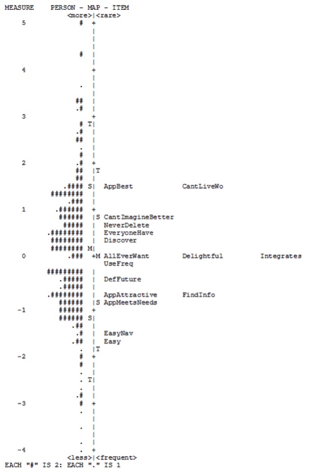
Figure 1. Wright Map of the final item set of the original SUPR-Qm from Sauro and Zarillo (2017).
Interpreting a Wright Map
A Wright Map (also called an item-person map) places the difficulty of the items (how hard it was for respondents to agree with them) on the same measurement scale as the participants’ ratings. Each # represents a number of participants on the left side (two participants per # in Figure 1), and the label shows the item on the right side of the map.
A Wright Map is organized as two vertical histograms with the items and respondents (persons) arranged from easiest on the bottom to most difficult on the top. For example, most participants agreed or strongly agreed (4s and 5s) to the items “Easy” and “EasyNav.” In contrast, fewer participants rated apps as “AppBest.”
On the left side, the Wright Map shows the mean (M) and two standard deviation points (S = one SD and T = two SD) for the measurement of participants’ tendency to agree. On the right side of the map, the mean difficulty of the items (M) and two standard deviation points (S = one SD and T = two SD) for the items are shown.
Table 1. Labels and Text for the 16 Items in the SUPR-Qm (the top row shows the most difficult for respondents to agree with, the bottom the easiest)
| Label | Item Wording |
| CantLiveWithout | I can’t live without this app on my phone. |
| BestApp | The app is the best app I’ve ever used. |
| CantImagine | I can’t imagine a better app than this one. |
| NeverDelete | I would never delete the app. |
| EveryoneHave | Everyone should have the app. |
| Discover | I like discovering new features on the app. |
| AllEverWant | The app has all the features and functions you could ever want. |
| Delightful | The app is delightful. |
| Integrates | The app integrates well with the other features of my mobile phone. |
| UseFreq | I like to use the app frequently. |
| DefUse | I will definitely use this app many times in the future. |
| Attractive | I find the app to be attractive. |
| FindInfo | The design of this app makes it easy for me to find the information I’m looking for. |
| MeetsNeeds | The app’s features meet my needs. |
| EasyNav | It is easy to navigate within the app. |
| Easy | The app is easy to use. |
Note: In practice these items are usually arranged in two grids of 8 items each, with items randomly assigned to grids, then within grids randomly presented as standard five-point agreement items (1: Strongly Disagree to 5: Strongly Agree). Some labels in this table differ slightly from the alternate labels shown in Figure 1, but the item wording was consistent across all studies.
Research Goals for the Present Study
The research goals for the new SUPR-Qm analyses that we conducted for the present study were to use new data collected over 4 years (2019–2023) in the following ways.
- Replicate original findings. Investigate the extent to which the alignment of the 16 items on the underlying logit scale computed with the new data corresponding to the original item alignment shown in Figure 1.
- Streamline the SUPR-Qm. Develop a streamlined version of the SUPR-Qm by identifying a subset of items that produces scores comparable to the 16-item version.
- Verify stability of SUPR-Qm scales. Determine if the updated logit scale is stable over the time of collection and the set of industries in the normative database for full and streamlined versions of the SUPR-Qm.
- Develop SUPR-Qm norms. Use the updated logit scale to provide percentile-like probabilities and a grading scale for SUPR-Qm scores at the product level (that is, develop SUPR-Qm norms).
Method
In this section we describe the participants, materials, and procedures used to collect the new SUPR-Qm data.
Participants
The participants were members of a professional online consumer panel, all from the United States. Respondents volunteered to participate in this research and were paid for participation by the online consumer panel. Participants could not be identified from their survey responses, and as is typical in consumer surveys, there was no risk associated with participation. We complied with the ethical standards of the Human Factors and Ergonomics Society (HFES, July 15, 2020) and the User Experience Professionals Association (UXPA, n.d.). The analyses in support of the research goals were conducted on two datasets. Suspicious cases were removed before analysis using standard methods (such as inspection of completion times and responses in free text fields).
Dataset 1
The first was a compilation of data collected in retrospective UX surveys from February 2019 through May 2023 for 23 industries (like dating, pets, and office supplies) using a total of 155 websites. For these surveys’ industries, sample sizes, and demographics data, see the Appendix. This was the dataset used for all Rasch analyses. Overall, after removing 77 respondents for excessive infit or outfit using the “mean square greater than three” criterion of Bond and Fox (2007), the total sample size was 4,149 (48% male, 50% female, 42% less than 30 years old, and 58% 30 years or older).
Dataset 2
The second dataset was collected to investigate two proposed subsets of SUPR-Qm items. The total sample size of this group was 454 (41% male, 57% female, 34% less than 30 years old, and 66% 30 years or older). The sample was divided between investigations of a 3-item version of the SUPR-Qm (SUPR-Qm03, n = 200) and a 5-item version (SUPR-Qm05, n = 254).
Materials
Survey data was collected with the MUiQ platform (MUiQ, n.d.). Rasch analyses were conducted with WinSteps Version 5.5.1.0 (n.d.) and IBM® SPSS® Statistics Version 23 (Kirkpatrick & Feeney, 2016) was used for all other analyses. Graphs were created with Excel™ 365.
Procedure
The procedures for the collection of data for Dataset 1 and Dataset 2 were similar, but not identical.
Dataset 1
This data was collected in retrospective UX surveys from February 2019 through May 2023 (see the Appendix for details). The primary purpose of these surveys was to refresh a normative database for the interpretation of SUPR-Q scores (Sauro, 2015), but over this time we also collected SUPR-Qm data from respondents who indicated that they also used the mobile app for the company or service they were rating. In these surveys, all SUPR-Qm items had been randomly assigned to one of two 8-item grids and then randomized within those grids for each participant.
Dataset 2
The participants in the second dataset were users of at least one mobile music service app (Amazon paid, Apple paid, Pandora™ free, Spotify™ free, Spotify paid, and YouTube™ free). These apps were selected based on their frequency of occurrence and ratings in Dataset 1 to increase the likelihood that members of the online panel would be users of at least one service and because the services covered a range of SUPR-Qm ratings (poorest for YouTube free to best for Spotify paid).
We conducted these additional surveys to investigate two proposed subsets of SUPR-Qm items in support of Research Goal 2: SUPR-Qm03 and SUPR-Qm05 (with 3 and 5 of the 16 SUPR-Qm items selected to provide full coverage of the underlying logit scale). As detailed in the Results section, we found that these subsets produced scores that closely corresponded to scores obtained from all 16 items. We were concerned, however, that the manner of collecting the items in two 8-item grids might have influenced the scores we were getting from the subsets due to the influence of the other items in the grids.
For Dataset 2, we varied the assignment of items to grids to get SUPR-Qm03 and SUPR-Qm05 scores that were not influenced by the other items. For SUPR-Qm03, the first grid showed only the 3 items selected for that version, followed by two more grids, one with 6 randomly assigned items and one with the remaining 7 items. For SUPR-Qm05, the first grid showed only the 5 items selected for that version, followed by a grid with the remaining 11 items. The order of presentation of items within grids was randomized for all participants.
Results
The Results section is organized by our four research goals.
Research Goal 1: Replicate Original Findings
As shown in Figure 1, the alignment of the original 16 items on the logit scale, shown in the Wright Map, ranged between -2 and +2 with Easy and EasyNav on the very easy end of the scale and BestApp and CantLiveWithout on the very difficult end. There were three clusters of items in between including the following:
- Above 0 (hard): CantImagine, NeverDelete, EveryoneHave, Discover
- Around 0 (moderate): AllEverWant, Delightful, Integrates, UseFreq
- Below 0 (easy): DefUse, Attractive, FindInfo, MeetsNeeds
Figure 2 shows the Wright Map built with Dataset 1. As in Figure 1, all items were located between -2 and +2 on the logit scale, with items tending to be more separated than in Figure 1. Consistent with Figure 1, Easy was the easiest item to agree with and CantLiveWithout was the most difficult. The other items were as follows:
- Above 0 (hard): BestApp, CantImagine, NeverDelete, EveryoneHave, UseFreq
- Around 0 (moderate): AllEverWant, Delightful, Discover
- Below 0 (easy): DefUse, Integrates, Attractive, FindInfo, MeetsNeeds, EasyNav
Despite a few differences in the Wright Maps shown in Figures 1 and 2, the Spearman correlation of the rank order of items on the logit scale was statistically significant and nearly perfect (r(14) = .95, p < .0001), providing evidence of a reasonably successful replication of the original findings.
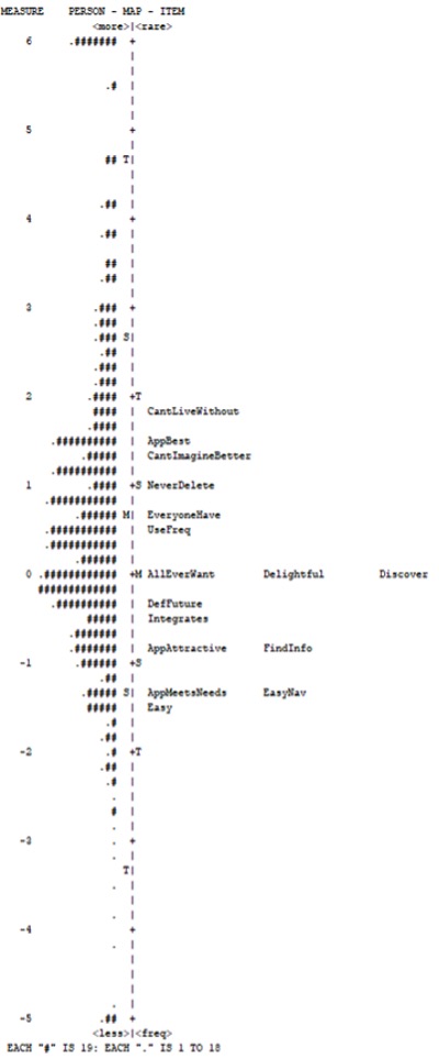
Figure 2. Wright Map of the original SUPR-Qm based on 4,149 ratings, collected between February 2019 and May 2023.
Research Goal 2: Streamline the SUPR-Qm
Our examination of the Wright Map in Figure 2 showed opportunities to streamline the SUPR-Qm by removing redundant items. Redundant items are those that are located around the same place on the y-axis of Figure 2 (having similar logit positions). Note that there are no statistical methods for deciding which of a set of redundant items should be excluded or retained. Therefore, these decisions become part of the craft of standardized questionnaire development. For example, the 3 items at the exact center of the scale (AllEverWant, Delightful, and Discover) have exactly the same measurement properties, so it doesn’t matter which one is selected for inclusion during the streamlining process; the choice is simply up to the questionnaire developer.
The most extreme reduction was the retention of just 3 items, 1 item in the middle of the scale (AllEverWant) and the 2 most extreme items (Easy and CantLiveWithout), which we refer to as the SUPR-Qm03. We were concerned that 3 items might not provide sufficient coverage of the scale, so we also defined a 5-item version (SUPR-Qm05) by adding 2 items between the middle of the scale and each extreme (Easy, FindInfo, AllEverWant, NeverDelete, and CantLiveWithout).
As described in the Methods section, we collected Dataset 2 to enable the comparison of data collected with the designated 3 and 5 items in isolation or, as in our large Dataset 1, mixed with the other SUPR-Qm items. Figures 3 and 4 show the results of those comparisons (for clarity, the full SUPR-Qm is labeled SUPR-Qm16).
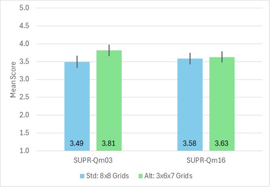
Figure 3. Comparison of SUPR-Qm03 and SUPR-Qm16 collected in standard (8×8) and alternate (3x6x7) grids (n = 200, error bars are 95% confidence intervals; the difference is significant for SUPR-Qm03 but not for SUPR-Qm16).
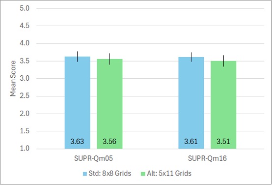
Figure 4. Comparison of SUPR-Qm05 and SUPR-Qm16 collected in standard (8×8) and alternate (5×11) grids (n = 254, error bars are 95% confidence intervals; the difference is not significant for SUPR-Qm05 or SUPR-Qm16).
In Figures 3 and 4, the means for the full SUPR-Qm were not significantly different (Figure 3: t(198) = .44, p = .66, d = .05 ± 23; Figure 4: t(252) = 1.04, p = .30, d = .10 ± .20). In Figure 3, the means for the streamlined SUPR-Qm03 were significantly different as a function of allocation to grids (t(198) = 2.7, p = .009, d = .32 ± .24), but in Figure 4 the means for the SUPR-Qm05 were not significantly different (t(252) = .60, p = .55, d = .07 ± .21). Based on these findings, the SUPR-Qm05 (but not the SUPR-Qm03) appeared to be a suitable short version of the SUPR-Qm.
Research Goal 3: Verify Stability of SUPR-Qm Scales
Another advantage of Rasch scaling is the theoretical stability of scales across changes in time, with some empirical estimates of Rasch scales being stable for as long as 15 years (Babcock & Albano, 2012). To verify the stability of the SUPR-Qm and SUPR-Qm05 scales, we divided Dataset 1 into two parts, Group A and Group B.
As shown in Table 1 in the Appendix, the data in Group A were collected from February 2019 through August 2021, covering 11 industries and 58 websites with n = 2143. Group B included data collected from February 2022 through May 2023, covering 12 industries and 97 websites with n = 2006. The only industry included in both groups was Airlines. As shown in Figures 5 and 6, the locations of scores on the logit scales were nearly identical for both the full SUPR-Qm and the SUPR-Qm05, demonstrating their scale stability over variation in time and industries.
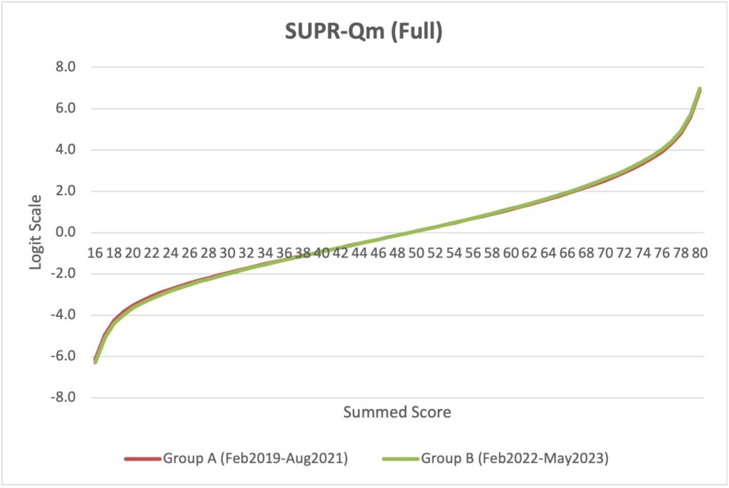
Figure 5. Stability of Rasch scale for full SUPR-Qm, indicated by an overlap of lines for Groups A and B.
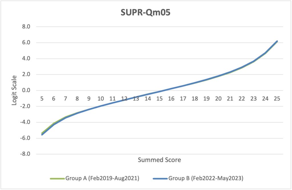
Figure 6. Stability of Rasch scale for SUPR-Qm05, indicated by an overlap of lines for Groups A and B.
Research Goal 4: Develop SUPR-Qm Norms
One of the advantages of Rasch scaling is the alignment of all possible scale scores on a logit scale, which enables conversion of scores to percentile-like probabilities with the formula p = exp(logit)/(1 – exp(logit)). Tables 2 and 3 show, for all possible SUPR-Qm and SUPR-Qm05 summed scores, the conversion of the summed score to a five-point mean score, the associated logit, that logit converted to a probability, and assignment of letter grades and standard grade points to those probabilities. Mean scores are summed scores divided by the number of items in the scale. Grades were assigned to probabilities using the same pattern as the curved grading scale for the System Usability Scale (Sauro & Lewis, 2016):
- A+: 96-100%
- A : 90-95%
- A- : 85-89%
- B+: 80-84%
- B : 70-79%
- B- : 65-69%
- C+: 60-64%
- C : 41-59%
- C- : 35-40%
- D : 15-34%
- F : 0-14%
Table 2 is useful for assessing full SUPR-Qm16 results. For example, the first row of the table shows the case in which all 16 items were rated a 5 (Strongly Agree).
Table 2. Logits, Probabilities, and Associated Grading Scales for Full SUPR-Qm Scores
| Summed Score | Mean Score | Logit | Probability | Curved Grade | Grade Point |
| 80 | 5.00 | 6.88 | 99.9% | A+ | 4.0 |
| 79 | 4.94 | 5.61 | 99.6% | A+ | 4.0 |
| 78 | 4.88 | 4.83 | 99.2% | A+ | 4.0 |
| 77 | 4.81 | 4.33 | 98.7% | A+ | 4.0 |
| 76 | 4.75 | 3.95 | 98.1% | A+ | 4.0 |
| 75 | 4.69 | 3.64 | 97.4% | A+ | 4.0 |
| 74 | 4.63 | 3.38 | 96.7% | A+ | 4.0 |
| 73 | 4.56 | 3.14 | 95.9% | A | 4.0 |
| 72 | 4.50 | 2.93 | 94.9% | A | 4.0 |
| 71 | 4.44 | 2.73 | 93.9% | A | 4.0 |
| 70 | 4.38 | 2.55 | 92.8% | A | 4.0 |
| 69 | 4.31 | 2.37 | 91.5% | A | 4.0 |
| 68 | 4.25 | 2.21 | 90.1% | A | 4.0 |
| 67 | 4.19 | 2.06 | 88.7% | A- | 3.7 |
| 66 | 4.13 | 1.91 | 87.1% | A- | 3.7 |
| 65 | 4.06 | 1.77 | 85.4% | A- | 3.7 |
| 64 | 4.00 | 1.63 | 83.6% | B+ | 3.3 |
| 63 | 3.94 | 1.50 | 81.8% | B+ | 3.3 |
| 62 | 3.88 | 1.38 | 79.9% | B | 3.0 |
| 61 | 3.81 | 1.25 | 77.7% | B | 3.0 |
| 60 | 3.75 | 1.13 | 75.6% | B | 3.0 |
| 59 | 3.69 | 1.02 | 73.5% | B | 3.0 |
| 58 | 3.63 | 0.90 | 71.1% | B | 3.0 |
| 57 | 3.56 | 0.79 | 68.8% | B- | 2.7 |
| 56 | 3.50 | 0.69 | 66.6% | B- | 2.7 |
| 55 | 3.44 | 0.58 | 64.1% | C+ | 2.3 |
| 54 | 3.38 | 0.47 | 61.5% | C+ | 2.3 |
| 53 | 3.31 | 0.37 | 59.1% | C | 2.0 |
| 52 | 3.25 | 0.27 | 56.7% | C | 2.0 |
| 51 | 3.19 | 0.17 | 54.2% | C | 2.0 |
| 50 | 3.13 | 0.07 | 51.7% | C | 2.0 |
| 49 | 3.06 | -0.03 | 49.3% | C | 2.0 |
| 48 | 3.00 | -0.13 | 46.8% | C | 2.0 |
| 47 | 2.94 | -0.23 | 44.3% | C | 2.0 |
| 46 | 2.88 | -0.33 | 41.8% | C | 2.0 |
| 45 | 2.81 | -0.42 | 39.7% | C- | 1.7 |
| 44 | 2.75 | -0.52 | 37.3% | C- | 1.7 |
| 43 | 2.69 | -0.62 | 35.0% | C- | 1.7 |
| 42 | 2.63 | -0.72 | 32.7% | D | 1.0 |
| 41 | 2.56 | -0.81 | 30.8% | D | 1.0 |
| 40 | 2.50 | -0.91 | 28.7% | D | 1.0 |
| 39 | 2.44 | -1.01 | 26.7% | D | 1.0 |
| 38 | 2.38 | -1.11 | 24.8% | D | 1.0 |
| 37 | 2.31 | -1.21 | 23.0% | D | 1.0 |
| 36 | 2.25 | -1.31 | 21.2% | D | 1.0 |
| 35 | 2.19 | -1.42 | 19.5% | D | 1.0 |
| 34 | 2.13 | -1.52 | 17.9% | D | 1.0 |
| 33 | 2.06 | -1.63 | 16.4% | D | 1.0 |
| 32 | 2.00 | -1.74 | 14.9% | D | 1.0 |
| 31 | 1.94 | -1.85 | 13.6% | F | 0.0 |
| 30 | 1.88 | -1.96 | 12.3% | F | 0.0 |
| 29 | 1.81 | -2.08 | 11.1% | F | 0.0 |
| 28 | 1.75 | -2.20 | 10.0% | F | 0.0 |
| 27 | 1.69 | -2.33 | 8.9% | F | 0.0 |
| 26 | 1.63 | -2.46 | 7.9% | F | 0.0 |
| 25 | 1.56 | -2.61 | 6.8% | F | 0.0 |
| 24 | 1.50 | -2.76 | 6.0% | F | 0.0 |
| 23 | 1.44 | -2.92 | 5.1% | F | 0.0 |
| 22 | 1.38 | -3.11 | 4.3% | F | 0.0 |
| 21 | 1.31 | -3.32 | 3.5% | F | 0.0 |
| 20 | 1.25 | -3.56 | 2.8% | F | 0.0 |
| 19 | 1.19 | -3.87 | 2.0% | F | 0.0 |
| 18 | 1.13 | -4.29 | 1.4% | F | 0.0 |
| 17 | 1.06 | -4.99 | 0.7% | F | 0.0 |
| 16 | 1.00 | -6.19 | 0.2% | F | 0.0 |
Table 3 is useful for assessing SUPR-Qm05 results. For example, the first row of the table shows the case in which all five statements were rated a 5 (Strongly Agree).
Table 3. Logits, Probabilities, and Associated Grading Scales for SUPR-Qm05 Scores
| Summed Score | Mean Score | Logit | Probability | Curved Grade | Grade Point |
| 25 | 5.00 | 6.14 | 99.8% | A+ | 4.0 |
| 24 | 4.80 | 4.68 | 99.1% | A+ | 4.0 |
| 23 | 4.60 | 3.62 | 97.4% | A+ | 4.0 |
| 22 | 4.40 | 2.88 | 94.7% | A | 4.0 |
| 21 | 4.20 | 2.29 | 90.8% | A | 4.0 |
| 20 | 4.00 | 1.79 | 85.7% | A- | 3.7 |
| 19 | 3.80 | 1.35 | 79.4% | B+ | 3.3 |
| 18 | 3.60 | 0.95 | 72.1% | B | 3.0 |
| 17 | 3.40 | 0.58 | 64.1% | C+ | 2.3 |
| 16 | 3.20 | 0.23 | 55.7% | C | 2.0 |
| 15 | 3.00 | -0.12 | 47.0% | C | 2.0 |
| 14 | 2.80 | -0.46 | 38.7% | C- | 1.7 |
| 13 | 2.60 | -0.81 | 30.8% | D | 1.0 |
| 12 | 2.40 | -1.17 | 23.7% | D | 1.0 |
| 11 | 2.20 | -1.54 | 17.7% | D | 1.0 |
| 10 | 2.00 | -1.93 | 12.7% | F | 0.0 |
| 9 | 1.80 | -2.35 | 8.7% | F | 0.0 |
| 8 | 1.60 | -2.81 | 5.7% | F | 0.0 |
| 7 | 1.40 | -3.37 | 3.3% | F | 0.0 |
| 6 | 1.20 | -4.18 | 1.5% | F | 0.0 |
| 5 | 1.00 | -5.43 | 0.4% | F | 0.0 |
Discussion and Recommendations
The mobile app industry is large and there is significant competition for users. Despite their limitations in diagnosing usability problems, standardized questionnaires are important tools in the assessment of the UX of mobile apps. There are only a few standardized UX questionnaires developed specifically for mobile apps: the MPUQ, AUG scales, and SUPR-Qm.
CTT and IRT in UX Research
These questionnaires differ in their methods of construction; CTT was used in the MPUQ and AUG scales, IRT (Rasch analysis) was used in the SUPR-Qm. Whether CTT or IRT is the better approach for the development of a standardized UX questionnaire depends on the measurement goals.
CTT tends to generate sets of items that are optimized around the average level of multiple constructs. IRT, by contrast, optimizes a questionnaire that reliably measures a fuller range of a single construct from low to high, not just around the average.
IRT methods produce scales that have an interval level of measurement. CTT scales are theoretically ordinal, but in practice, they can be treated as interval data for the purpose of statistical analysis, as long as researchers avoid making interval claims about the results (Harris, 1985; Nunnally, 1978; Sauro & Lewis, 2016).
In most cases, CTT is appropriate for developing standardized UX questionnaires, especially when the goal is to measure multiple constructs with an efficient number of items. But when the measurement goal is a unidimensional measure that is sensitive to a broad range of knowledge or experiences, the more appropriate method is IRT (including Rasch analysis).
Accomplishing the Four Research Goals
The results for all four research goals were encouraging.
Goal 1: Replicate Original Findings
The Wright Map for Dataset 1 was very similar to the final Wright Map published in Sauro and Zarolia (2017). In both maps, the logit scores for items fell between -2 to +2. The rank correlation of items on the two maps was almost perfect (.95). Taken together, these findings suggest a successful replication.
Goal 2: Streamline the SUPR-Qm
The original SUPR-Qm has 16 items. Examination of the Wright Map in Figure 2 revealed opportunities to streamline the questionnaire by removing redundant items. We tested two short versions of the SUPR-Qm, one with just 3 items (SUPR-Qm03) and one with 5 items (SUPR-Qm05).
The key variable in those tests was the extent to which the retained variables were shown to respondents before the other items or were embedded in two 8-item grids (which is how the data were collected for Dataset 1). To justify using the large amount of data in Dataset 1 to establish norms for the short forms, we had to estimate the extent to which respondent behavior was different when retained items were rated in an initial grid versus rated in the context of the other items.
As shown in Figures 3 and 4, SUPR-Qm03 ratings were significantly affected by the presentation variable, but SUPR-Qm05 ratings were not. Consequently, we do not recommend use of the SUPR-Qm03. Practitioners can confidently use the full SUPR-Qm or, when a short form would be advantageous, the SUPR-Qm05.
Note that, although we have developed an adaptive program for the SUPR-Qm, we now do not recommend that approach for attitudinal questionnaires like the SUPR-Qm. While working on the program we found that measurement converged (the program stopped) after the presentation of 4 or 5 items, so it is more efficient to simultaneously present a good set of 5 items in a grid. Furthermore, the primary advantage of adaptive testing for a high-stakes test like the SAT is the dramatic reduction in the amount of time required to complete the test (from 3 to 2 hours) because each SAT item takes a fair amount of time to complete. That is not the case with the type of agreement items used in the SUPR-Qm, which respondents typically complete in a few seconds per item.
Goal 3: Verify Stability of SUPR-Qm Scales
To investigate the stability of the SUPR-Qm and SUPR-Qm05, we divided the large sample in Dataset A into two groups that had a common method (retrospective UX surveys) but differed in their time periods (Group A: February 2019 through August 2021 and Group B: February 2022 through May 2023) and industries (for details, see Table 1 in the Appendix). As shown in Figures 5 (SUPR-Qm) and 6 (SUPR-Qm05), the locations of the groups’ scale scores on the underlying logit scales were almost indistinguishable. We don’t necessarily expect these scales to be stable for 15 years as reported by Babcock and Albano (2012), but these results suggest that the scales have been stable for over 4 years (February 2019 through May 2023) and should remain stable for years to come.
Goal 4: Develop SUPR-Qm Norms
We used the properties of the logit scale to build tables showing percentile-like probabilities for all possible SUPR-Qm and SUPR-Qm05 scores (respectively, Tables 2 and 3). As an additional aid for interpreting these scores, the tables include assignment of letter grades on a standard curve plus a standard assignment of points for each grade. Thus, a summed SUPR-Qm score of 49 (3.06 if averaged across the 16 items) has a probability of occurrence of 49.3%, a letter grade of C, and a grade point of 2.0. For the SUPR-Qm05, a summed score of 15 (3.00 if averaged across the 5 items) has a probability of occurrence of 47.0%, a letter grade of C, and a grade point of 2.0.
In UX research, the focus is usually on the assessment of products and services rather than assessment of individuals. Table 4 shows a summary of the curved grading scales in Tables 2 and 3 for the assessment of scores averaged across multiple respondents. The SUPR-Qm and SUPR-Qm05 score ranges show summed scores and, in parentheses, the item means computed by dividing the summed scores by the number of items in the scale. For easiest use by practitioners, we also provide (in square brackets) the score ranges interpolated to a 0–100-point scale which we have found to be the easiest for non-UX stakeholders to understand (computed by subtracting 1 from the associated 5-point mean, multiplied by 25).
Table 4. Curved Grading Scale for Interpreting SUPR-Qm and SUPR-Qm05 Scores
| SUPR-Qm Score Range | SUPR-Qm05 Score Range | Grade | Grade Point | Probability Range |
| 73.21-80.00 (4.58-5.00) [89.4-100] | 22.42-25.00 (4.48-5.00) [87.1-100] | A+ | 4.0 | 96-100% |
| 67.94-73.20 (4.25-4.57) [81.2-89.3] | 20.82-22.41 (4.16-4.47) [79.1-87.0] | A | 4.0 | 90-95% |
| 64.75-67.93 (4.05-4.24) [76.2-81.1] | 19.88-20.81 (3.98-4.15) [74.4-79.0] | A- | 3.7 | 85-89% |
| 62.04-64.74 (3.88-4.04) [71.9-76.1] | 19.08-19.87 (3.82-3.97) [70.4-74.3] | B+ | 3.3 | 80-84% |
| 57.50-62.03 (3.59-3.87) [64.8-71.8] | 17.72-19.07 (3.54-3.81) [63.6-70.3] | B | 3.0 | 70-79% |
| 55.36-57.49 (3.46-3.58) [61.5-64.7] | 17.11-17.71 (3.42-3.53) [60.6-63.5] | B- | 2.7 | 65-69% |
| 53.35-55.35 (3.33-3.45) [58.4-61.4] | 16.50-17.10 (3.30-3.41) [57.5-60.5] | C+ | 2.3 | 60-64% |
| 45.61-53.34 (2.85-3.32) [46.3-58.3] | 14.28-16.49 (2.86-3.29) [46.4-57.4] | C | 2.0 | 41-59% |
| 43.00-45.60 (2.69-2.84) [42.2-46.2] | 13.54-14.27 (2.71-2.85) [42.7-46.3] | C- | 1.7 | 35-40% |
| 32.00-42.99 (2.00-2.68) [25.0-42.1] | 10.50-13.53 (2.10-2.70) [27.5-42.6] | D | 1.0 | 15-34% |
| 16.00-31.99 (1.00-1.99) [0-24.9] | 5.00-10.49 (1.00-2.09) [0-27.4] | F | 0.0 | 0-14% |
Note: Score ranges show summed scores, and, in parentheses, the item means computed by dividing the summed scores by the number of items in the scale, and, in square brackets, interpolation to a 0–100-point scale.
As an example, for Dataset 2 we collected ratings of the Spotify free (n = 46) and paid (n = 60) services with the SUPR-Qm05, with the results shown in Figure 7. After interpolating raw scores to a 0–100-point scale, the mean rating for the free service was 62.4 (a grade of B-) and for the paid service was 71.3 (a grade of B+). This difference was statistically significant (t(104) = 2.28, p = .025). For the free service, the 95% confidence interval ranged from 56.3 (C) to 68.5 (B); for the paid service the interval ranged from 66.3 (B) to 76.2 (A-). So, it is implausible that the population mean for the free service has a grade lower than C or higher than B, whereas for the paid service the population mean is unlikely to have a grade lower than B or higher than A-.
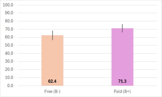
Figure 7. SUPR-Qm05 comparison of Spotify free and paid services (error bars are 95% confidence intervals with the paid version significantly higher than the free version).
Limitations and Future Directions
As is the case for this type of questionnaire development, there is a possibility that there might be other items that could extend the effective range of measurement of the scale. The range of the developed scale, however, seems to be sufficient for UX research purposes.
For the future, we plan to use the 5-item version of the SUPR-Qm to continue to build our data so we can check periodically over the next decade for any changes in its measurement properties.
Conclusion
We conducted this research to build upon the original SUPR-Qm developed by Sauro and Zarola (2017). There are only a few standardized UX questionnaires designed specifically for the UX of mobile apps, and the SUPR-Qm is the only one of those developed using Rasch analysis. Using two large sets of data (Dataset 1, n = 4149; Dataset 2, n = 454) we conducted analyses that:
- Replicated the original findings (similar locations of the 16 items on the logit scale indicating consistent item difficulties),
- Streamlined the original 16-item SUPR-Qm to a version with 5 key items (the SUPR-Qm05),
- Demonstrated the stability of the SUPR-Qm and SUPR-Qm05 over 2 multiyear periods in which data were collected on 155 mobile apps across 23 industries, and
- Developed norms for the interpretation of the SUPR-Qm and SUPR-Qm05, including a curved grading scale.
This new 5-item version enhances the usefulness of the SUPR-Qm for UX practitioners and researchers who need a standardized questionnaire that provides a quick measure of the UX of mobile apps that is easy to interpret with norms that should remain stable for many years. For these reasons, we plan in our practice to replace the first version of the SUPR-Qm with this second version, SUPR-Qm V2 (Figure 8).
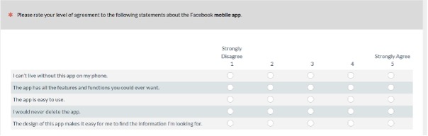
Figure 8. The SUPR-Qm V2 (we recommend randomizing the order of presentation of items).
Tips for Usability Practitioners
Our tips for usability practitioners are following:
- When you need a quick but reliable measure of the UX of mobile apps, use the streamlined version with 5 items (SUPR-Qm V2). It provides scores comparable to the original 16 items (SUPR-Qm V1) with minimal loss in information.
- When reporting SUPR-Qm findings, be sure to document which version you used (SUPR-Qm V1 with 16 items or SUPR-Qm V2 with 5 items).
- The SUPR-Qm V1 and V2 provide valid and reliable measures of user attitudes toward mobile apps. Although low scores do not provide specific guidance on what to change, low scores can be valuable during development by providing evidence that there are likely serious UX issues to discover and address with additional usability studies or other user research methods.
- If there is a need for more diagnostic information or additional content measures, and the time it will take for participants to complete an additional questionnaire is not a problem, consider using one of the longer multifactor questionnaires like the MPUQ.
- Of the various ways we’ve demonstrated for reporting SUPR-Qm scores, we recommend interpolating raw item means to 0–100-point scales for interpretation with Table 4.
- Use the curved grading scale to interpret SUPR-Qm scores, not only to interpret mean scores but also to interpret the endpoints of confidence intervals around the means.
Acknowledgement
Thanks to our fantastic team of researchers who conducted the surveys and the participants who provided the data. Also, we greatly appreciate the feedback and encouragement we received from the anonymous reviewers.
References
Babcock, B., & Albano, A. (2012). Rasch scale stability in the presence of item parameter and trait drift. Applied Psychological Measurement, 36(7), 549–564. https://www.researchgate.net/publication/258125508_Rasch_Scale_Stability_in_the_Presence_of_Item_Parameter_and_Trait_Drift
Bond, T. G., & Fox, C. M. (2007). Applying the Rasch model: Fundamental measurement in the human sciences (2nd ed). Lawrence Erlbaum. https://www.amazon.com/Applying-Rasch-Model-Fundamental-Measurement/dp/0805854622/
Brooke, J. (2013). SUS: A retrospective. Journal of Usability Studies, 8(2), 29–40. https://uxpajournal.org/wp-content/uploads/sites/7/pdf/JUS_Brooke_February_2013.pdf
College Board. (2023, August 14). What is digital SAT adaptive testing? College Board. https://blog.collegeboard.org/what-digital-sat-adaptive-testing
Dhir, A., & Al-kahtani, M. (2013). A case study on user experience (UX) evaluation of mobile augmented reality prototypes. Journal of Universal Computer Science, 19(8), 1175–1196. https://www.academia.edu/76646831/A_Case_Study_on_User_Experience_UX_Evaluation_of_Mobile_Augmented_Reality_Prototypes
Geeks of Gurukul. (2023, May 19). The importance of user experience (UX) design in mobile apps. LinkedIn. https://www.linkedin.com/pulse/importance-user-experienceux-design-mobile-apps-geeks-of-gurukul
Grand View Research. (n.d.). Mobile application market. https://www.grandviewresearch.com/industry-analysis/mobile-application-market
Gulliksen, H. (1950). Theory of mental tests. John Wiley. https://psycnet.apa.org/record/2009-12806-000
Harris, R. J. (1985). A primer of multivariate statistics (2nd ed.) Academic Press. https://www.abebooks.com/9780123272522/Primer-Multivariate-Statistics-Richard-Harris-0123272521/plp
Hassenzahl, M. (2018). A personal journey through user experience. Journal of Usability Studies, 13(4), 168–176. https://uxpajournal.org/wp-content/uploads/sites/7/pdf/JUS_Hassenzahl_August2018.pdf
HFES. (2020, July 15). Code of ethics. Human Factors and Ergonomics Society. https://www.hfes.org/Membership/Code-of-Ethics
Hoehle, H., & Venkatesh, V. (2015). Mobile application usability: Conceptualization and instrument development. MIS Quarterly, 39(2), 435–472. https://www.researchgate.net/publication/283521711_Mobile_Application_Usability_Conceptualization_and_Instrument_Development
Kirakowski, J. (1996). The Software Usability Measurement Inventory: Background and usage. In P. Jordan, B. Thomas, & B. Weerdmeester (Eds.), Usability Evaluation in Industry (pp. 169–178). Taylor & Francis. https://www.taylorfrancis.com/chapters/edit/10.1201/9781498710411-33/software-usability-measurement-inventory-background-usage-kirakowski
Kirkpatrick L. A., & Feeney, B. C. (2016). A simple guide to IBM SPSS for version 23. Cenage Learning. https://www.cengage.com/c/a-simple-guide-to-ibm-spss-statistics-version-23-0-14e-kirpatrick-feeney/9781305877719/
Kortum, P., & Sorber, M. (2015). Measuring the usability of mobile applications for phones and tablets. International Journal of Human-Computer Interaction, 31(8), 518–529. https://www.researchgate.net/publication/281717032_Measuring_the_Usability_of_Mobile_Applications_for_Phones_and_Tablets
Lah, U., Lewis, J. R., & Šumak, B. (2020). Perceived usability and the modified Technology Acceptance Model. Journal of Human-Computer Interaction, 36(13), 1216–1230. https://measuringu.com/article/perceived-usability-and-modified-tam/
Lewis, J. R. (2019c). Using the PSSUQ and CSUQ in user experience research and practice. MeasuringU Press. https://www.amazon.com/USING-PSSUQ-CSUQ-Experience-Research/dp/1733339205/
Lewis, J. R., & Sauro, J. (2023). Effect of perceived ease of use and usefulness on UX and behavioral outcomes. International Journal of Human-Computer Interaction. https://measuringu.com/article/effect-of-perceived-ease-of-use-and-usefulness-on-ux-and-behavioral-outcomes/ (DOI: 10.1080/10447318.2023.2260164)
Lewis, J. R., & Sauro, J. (2023, January 10). Applying Rasch analysis to UX research. MeasuringU. https://measuringu.com/applying-rasch-analysis-to-ux-research/
Lewis, J. R., & Sauro, J. (2023, June 6). Measuring tech savviness with technical activity checklists. MeasuringU. https://measuringu.com/rasch-analysis-of-three-technical-activity-checklists/
Lord, F. M. (1953). The relation of test score to the trait underlying the test. Educational and Psychological Measurement, 13(4), 517–549. https://onlinelibrary.wiley.com/doi/pdf/10.1002/j.2333-8504.1952.tb00926.x
MUiQ. (n.d.). MUiQ platform. MeasuringU. https://measuringu.com/muiq/
Lusky, M., & Böhm, S. (2017). Quantifying mobile user experience: Status quo, implementation challenges, and research agenda. In Proceedings of CENTRIC 2017 (pp. 53–58). IARIA Press. http://www.thinkmind.org/index.php?view=instance&instance=CENTRIC+2017
Nunnally, J. C. (1978). Psychometric theory. McGraw-Hill. https://www.amazon.com/Psychometric-Theory-McGraw-Hill-psychology-Nunnally/dp/0070474656
O’Malley, G., Dowdall, G., Burls, A., Perry, I. J., & Curran, N. (2014). Exploring the usability of a mobile app for adolescent obesity management. JMIR Mhealth and Uhealth, 2(2), e29. https://www.researchgate.net/publication/264640436_Exploring_the_Usability_of_a_Mobile_App_for_Adolescent_Obesity_Management
Rasch, G. (1960). Studies in mathematical psychology: I. Probabilistic models for some intelligence and attainment tests. Nielsen & Lydiche. https://eric.ed.gov/?id=ED419814
Ryu, Y. S., & Smith-Jackson, T. L. (2006). Reliability and validity of the mobile phone usability questionnaire (MPUQ). Journal of Usability Studies, 2(1), 39–53. https://uxpajournal.org/reliability-and-validity-of-the-mobile-phone-usability-questionnaire-mpuq/
Sauro, J. (2015). SUPR-Q: A comprehensive measure of the quality of the website user experience. Journal of Usability Studies, 10(2), 68–86. https://measuringu.com/article/a-comprehensive-measure-of-the-quality-of-the-website-user-experience/
Sauro, J., & Lewis, J. R. (2016). Quantifying the user experience (2nd ed.). Morgan Kaufmann. https://www.amazon.com/Quantifying-User-Experience-Practical-Statistics/dp/0128023082/
Sauro, J., & Zarolia, P. (2017). SUPR-Qm: A questionnaire to measure the mobile app user experience. Journal of Usability Studies, 13(1), 17–37. https://uxpajournal.org/supr-qm-measure-mobile-ux/
Uddin, N. (2024, February 1). How UI design increases the success rate of your mobile application. Musemind. https://musemind.agency/blog/ui-design-increases-success-rate-mobile-application
UXPA. (n.d.). UXPA code of professional conduct. User Experience Professionals Association. https://uxpa.org/uxpa-code-of-professional- conduct/
van der Heijden, H., & Sørensen, L. S. (2003). Measuring attitudes towards mobile information services: An empirical validation of the HED/UT scale. In Proceedings of the 11th European Conference on Information Systems (pp. 765–777). DBLP. https://research.cbs.dk/files/59126120/2002_24.pdf
Voss, K. E., Spangenberg, E. R., & Grohmann, B. (2003). Measuring the hedonic and utilitarian dimensions of consumer attitude. Journal of Marketing Research, 49(3), 310–320. https://www.researchgate.net/publication/247837325_Measuring_the_Hedonic_and_Utilitarian_Dimensions_of_Consumer_Attitude
WinSteps (n.d.). WinSteps Rasch Analysis and Rasch measurement software. WinSteps. https://www.winsteps.com/winsteps.htm
Wylie, L. (2024, February 1). US app market statistics (2024). Business of Apps. https://www.businessofapps.com/data/us-app-market/
Appendix
Appendix Table 1 provides details about the industries included in Dataset 1. It also shows the division of Dataset 1 into the two groups (A and B), which we used to analyze the stability of the SUPR-Qm and SUPR-Qm05 scales over differences in time and industries.
Appendix Table 1. Industries, Sample Sizes, and Gender/Age Demographics for Retrospective UX Data (collected from February 2019 through May 2023)
| Group A (2/19–8/21) | Apps | n | Male | Female | < 30 years | ≥ 30 years |
| Airlines | 5 | 105 | 54% | 44% | 52% | 48% |
| Auto | 4 | 49 | 59% | 39% | 51% | 49% |
| Dating | 7 | 277 | 46% | 52% | 43% | 57% |
| Dieting | 5 | 135 | 41% | 58% | 53% | 47% |
| Food Delivery | 4 | 159 | 47% | 53% | 49% | 51% |
| Job Search | 4 | 38 | 48% | 50% | 57% | 43% |
| Mass Merchants | 9 | 182 | 33% | 66% | 31% | 69% |
| Meeting Software | 4 | 73 | 58% | 41% | 73% | 27% |
| Music | 7 | 1058 | 49% | 50% | 50% | 50% |
| Pets | 4 | 33 | 43% | 56% | 47% | 53% |
| Outdoors Stores | 5 | 34 | 57% | 41% | 48% | 52% |
| Group B (2/22–5/23) | Apps | n | Male | Female | < 30 years | ≥ 30 years |
| Airlines | 12 | 242 | 47% | 51% | 61% | 39% |
| Business Information | 3 | 92 | 53% | 46% | 26% | 74% |
| Clothing | 13 | 144 | 45% | 52% | 28% | 72% |
| Electronics | 9 | 131 | 62% | 37% | 18% | 82% |
| Grocery | 8 | 251 | 40% | 59% | 31% | 69% |
| News | 14 | 133 | 41% | 57% | 30% | 70% |
| Office Supplies | 4 | 62 | 58% | 38% | 19% | 81% |
| Real Estate | 5 | 93 | 51% | 48% | 49% | 51% |
| Seller Marketplaces | 6 | 238 | 44% | 54% | 60% | 40% |
| Ticketing | 5 | 203 | 52% | 45% | 40% | 60% |
| Travel Aggregators | 8 | 133 | 51% | 48% | 48% | 52% |
| Wireless | 10 | 284 | 50% | 47% | 25% | 75% |
| Total (23 industries) | 155 | 4149 | 48% | 50% | 42% | 58% |
Note: The table shows the data collected over two time periods: February 2019 to August 2021 (n = 2143) and February 2022 through May 2023 (n = 2006). This grouping divides the large dataset roughly in half to allow investigation of the stability of Rasch measurement over differences in time and industry for Research Goal 3 (the only industry in common across the time periods was Airlines). The total demographics are the averages over industries weighted by the sample sizes.