
[:en]
Abstract
As more people use smartphones to complete web surveys, survey designers are beginning to optimize online questionnaires for limited screen displays, determining which design practices and features can carry over to mobile devices. One such feature is a logout button—an action button that allows users to leave the survey, usually saving their information by default. However, little is known about how the labeling and placement of such buttons affects survey data quality and respondent satisfaction for mobile device users.
We developed the first experiment of a two-experiment laboratory study to explore whether action buttons labeled with text specifying the button’s functionality are more easily interpreted and preferred by the user. Experiment 1 compared two logout button label designs: Save and Logout and Logout (both saved the user’s data). Results showed that all participants correctly reported that the Save and Logout button would save their information, whereas very few participants reported that the button labeled only as Logout would also save. Participants unanimously preferred the Save and Logout button over Logout. Similarly, if these action buttons are not easily located, users may miss the button entirely. In Experiment 2, we explored the effects of a Save and Logout button location (on the main screen, within the main menu, or within a submenu) on effectiveness, efficiency, and the satisfaction with which participants completed a survey. Results showed that main screen placement resulted in greater accuracy, faster completion time, and less self-reported difficulty. Further, participants overwhelming preferred that the logout button be placed on the main screen compared to anywhere inside a menu.
Keywords
Mobile devices, Action buttons, Usability evaluation, Web survey
Introduction
With the increasing prevalence of smartphones, the smartphone as a mode for survey data collection has become a reality (e.g., Tourangeau et al., 2017). Online surveys on smartphones (aka, mobile surveys) have indisputable advantages, that is, convenience to respond, greater coverage, and lower cost. However, there are unique challenges to designing the user interface (UI) of a mobile survey. An optimally designed mobile survey UI facilitates accurate responses and provides a satisfying user experience. Accurate responses reduce measurement errors while a satisfying user experience may keep respondents from dropping off. With the limited screen display on a smartphone, it is crucial to carefully design every component on the screen to enable respondents to complete surveys on a smartphone effectively, efficiently, and with satisfaction.
Action buttons are an essential component in a mobile survey UI. Actions like data entry and navigation through questions are accomplished by tapping these buttons. A logout button in mobile surveys usually carries out two functions: saving the data that have been entered and closing the survey to prevent unauthorized entry; it is, therefore, an integral part of any online survey instrument. Labeling and placement of a logout button are two design features that can have significant implications for respondents’ logout behavior.
Research on button labeling, though limited, has shown that unlabeled action buttons have a lower likelihood for their actions to be correctly interpreted by users (Leung et al., 2011) and text-labeled buttons have been shown to increase task accuracy and efficiency compared to unlabeled icon-only buttons (Wiedenbeck, 1999). Further, users with different cultural backgrounds may interpret icon-only action buttons differently (Kim & Lee, 2005). Properly labeled navigation buttons have also been shown to enhance usability (Ahmad et al., 2018). With regard to logout buttons specifically, in a usability study of an online survey, several participants spontaneously reported preference of “Save and Logout” to “Logout” for label wording of a logout button (Nichols et al., 2016). These findings suggest that action buttons clearly labeled with text specifying the button’s functionality are more likely to be correctly understood and preferred by the user. However, whether the label Save and Logout is empirically superior to the label Logout in a logout button has yet to be investigated.
Empirical investigation on logout button placement in an online survey is also scant. Johnston and Pickrell (2016) conducted contextual inquiries with technicians and logistics personnel who use mobile applications for their day-to-day work. They identified specific usability issues affecting the use of the applications and proposed a set of heuristics for use by designers and developers. One such heuristic is to avoid unintuitive button placement. Other studies have also shown that visibility of navigation buttons improves usability (e.g., Pernice & Budiu, 2016). When designing surveys or apps for smartphones, it is important to make the user feel in control. One way to accomplish this is by allowing the user to close and re-enter a mobile app easily through the availability of a well-defined, intuitively located button (Ahmad et al., 2018; Johnston & Pickrell, 2016). In a usability study on mobile devices, some participants failed to locate the logout button when it was buried three layers down from the main screen (Nichols et al., 2016). However, given the limited space on smartphone screens, placing an action button in a sublayer beneath the screen display is a common practice (Burigat et al., 2008). How to best negotiate efficient screen use and ease of button-locating is yet to be addressed.
In the present study, we investigated the optimal wording for the logout button label and optimal placement of the logout button. The study consisted of two experiments. Experiment 1 examined the label for logout buttons to determine whether save and logout functionality should be explicitly labeled on the button. Experiment 2 investigated the effects of three different logout button placements (on the main screen/visible, level-1 menu, level-2 menu) on participants’ logout performance.
In this study, older adults were chosen as participants because poor mobile survey design would likely have a bigger impact on this population. Compared to a younger population, older adults generally have less experience with new technologies and have poorer vision and finger mobility (e.g., Owsley, 2011; Seidler et al., 2010). According to the guidance by the International Organization for Standardization, standards development should be based on human characteristics and abilities, that is, general effects of aging and impairments (e.g., Kurakata, 2019). A design that is suitable for older adults would be at least usable with the younger population, who generally have better perceptual and motor capabilities than their older counterparts (Basak et al., 2008; Kurakata, 2019; Nichols et al., 2020).
Experiment 1
The purpose of this experiment was to address the following three questions:
- If participants needed to leave in the middle of a survey, what is the likelihood they would choose to tap a button labeled Save and Logout compared to a button only labeled Logout?
- Do participants think their information will be saved if they choose Save and Logout compared to Logout?
- Do participants prefer the Save and Logout button design to the Logout only design?
Methods
The following sections provide more information about the Experiment 1 participants, the design and procedure, and how the data were analyzed.
Participants
Thirty adults (19 females and 11 males, mean age = 68.24 years, SD = 5.14), recruited from senior centers in the metropolitan area of Washington DC, participated in the study. Twenty-three percent of the participants had post-graduate degrees, 30% bachelor’s degrees, 20% some college education, and 27% high school diploma. They all spoke fluent English and could read writing in English. On-site vision screening showed that all participants had normal habitual vision (the vision with which the participant presented at the experimental session, e.g., with eyeglasses) for reading newspapers (Colenbrander Reading Test) and had normal color vision (Ishihara Plate Color Test). All participants operated a smartphone with their index finger. The mean width of the index fingertip was 11.5 mm (SD = 1.8). Fifty-three percent of the participants reported at least 24 months of experience using a smartphone, 13% between 12 and 24 months, 13% between 6 and 12 months, and 17% had less than 6 months experience. In addition, 73% of participants reported using their smartphone every day, 7% most days, 7% some days, and 10% rarely. All participants provided written informed consent and were given a small honorarium for participating in this study.
Experimental Design
This was a within-subjects design with a single two-level factor—Label (Save and Logout, Logout). Figure 1 depicts the two label designs on a mobile survey UI screen. The two designs were shown to the participant in sequence. The order of presenting the two designs was counterbalanced across participants, that is, half of the participants were shown the Save and Logout design first, while the other half Logout first.
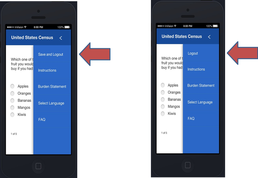
Figure 1. Save and Logout (left) and Logout only (right).
Experimental Procedure
Mock-ups for each design (Logout and Save and Logout) were presented on a computer screen one at a time, and the participant was asked two probing questions for each design. The first question was on the likelihood of logout button use (If you had to go somewhere before finishing the entire survey, what would you do?); the response coding scheme was dichotomous: 1 if the participant said they would click the Save and Logout button (respective to the condition they were given) and 0 for any other response. The second question was on interpretation of button functionality (Do you think any information you have already entered will still be there when you return and log back into the survey later?); the response coding scheme was also dichotomous: 1 if the participant said yes and 0 if the participant said no or that they were unsure. See Table 1 for details. Following the questions, both designs were presented side-by-side, and the participant was asked to choose the one they preferred.
Data Analysis
Descriptive and inferential statistical analyses were performed on the performance measures according to the nature of the data. Detailed analysis is described in the Results section.
Table 1. Coding Scheme for Response to the Probing Questions
|
Question |
Response coding |
|
If you had to go somewhere before finishing the entire survey, what would you do? |
1 – The participant responded with Save and Logout button when the Save and Logout design was shown or Logout button when the Logout design was shown. 0 – Otherwise. |
|
Do you think any information you have already entered will still be there when you return and log back into the survey later? |
1 – The participant responded that information would be saved. 0 – The participant responded that information would not be saved or that they were uncertain. |
Results
The likelihood of logout button use was investigated with the following question: If you had to go somewhere before finishing the entire survey, what would you do? For the Save and Logout design, 96.7% of participants reported that they would choose the Save and Logout button if they had to go somewhere before finishing a survey. For the Logout only design, 53.3% would choose Logout. See Table 2 for the tabulation. We used generalized estimating equations to fit a repeated measures logistic regression, predicting response (i.e., tapping the button or not) from label type (Save and Logout, Logout). Compared to Save and Logout, the probability of tapping the button was significantly lower when the label was Logout only, b = -3.23 (1.01), 95% CI [-5.21, -1.25], p = .0014.
Table 2. Distribution of Action Choices by Design
|
Action choice |
Save and Logout button displayed |
Logout button displayed |
|
Tap the button |
29 (96.7%) |
16 (53.3%) |
|
Not tap the button |
1 (3.3%) |
14 (46.7%) |
Note: Number and percent of participants, N = 30.
The interpretation of button functionality was investigated with the following question: Do you think any information you have already entered will still be there when you return and log back into the survey later? For the Save and Logout design, 96.7% of participants reported that if they had been working on a survey, the information they had entered would still be there when they returned and logged back into the survey. For the Logout design, only 33% said that the data would be saved. See Table 3 for tabulation. We used generalized estimating equations to fit a repeated measures logistic regression, predicting response (Saved, Not saved, or uncertain) from the label type (Save and Logout or Logout). The results showed that when compared to Save and Logout, the probability of choosing Information Saved was significantly lower when the label was Logout only, b = -.63 (.10), 95% CI [-.83, -.44], p < .001.
Table 3. Distribution of Label Interpretation by Design
|
Interpretation |
Save and Logout button displayed |
Logout button displayed |
|
Information Saved |
29 (96.7%) |
10 (33.3%) |
|
Information Not Saved or Uncertain |
1 (3.3%) |
20 (66.3%) |
Note: Number and percent of participants, N = 30.
All the participants preferred the Save and Logout button.
Discussion
The results from this experiment show that the label of Save and Logout conveys a clearer meaning of the button’s functionality, that is, that the survey responses will be saved after logging out of the survey instrument. The findings are further supported by participants’ comments during debriefing, as several explained that “save” provides reassurance that their information will not be lost. This type of label, therefore, may encourage the participant to select the logout action before leaving in the middle of a survey.
Experiment 2
In the previous experiment, we concluded that a logout button should be labeled with Save and Logout to prevent data loss. A question naturally follows: Where is the optimal location to place the Save and Logout button? This experiment investigated the effect of three different logout button placements on participant performance: on the screen (visible), within the main menu (one level deep), or within a submenu (two levels deep). Specifically, which button placement enables the participant to complete a survey more accurately, more efficiently, and with less difficulty?
Methods
The following sections provide more information about the Experiment 2 participants, the design and procedure, the performance measures used, and how the data were analyzed.
Participants
The participants were the same as Experiment 1.
Experimental Design
This was a within-subjects design with one factor—Placement. Placement had three levels defined as follows and as shown in Figure 2: (A) on-screen (on survey question screen), (B) main menu (inside a main menu, e.g., Menu > Save & Logout), and (C) submenu (inside a submenu menu, e.g., Menu > Account > Save & Logout). The order of presentation of the three designs was counterbalanced across participants. There was a total of six order groups (each letter represents the placement level as defined and shown in Figure 2): ABC, ACB, BAC, BCA, CAB, and CBA.
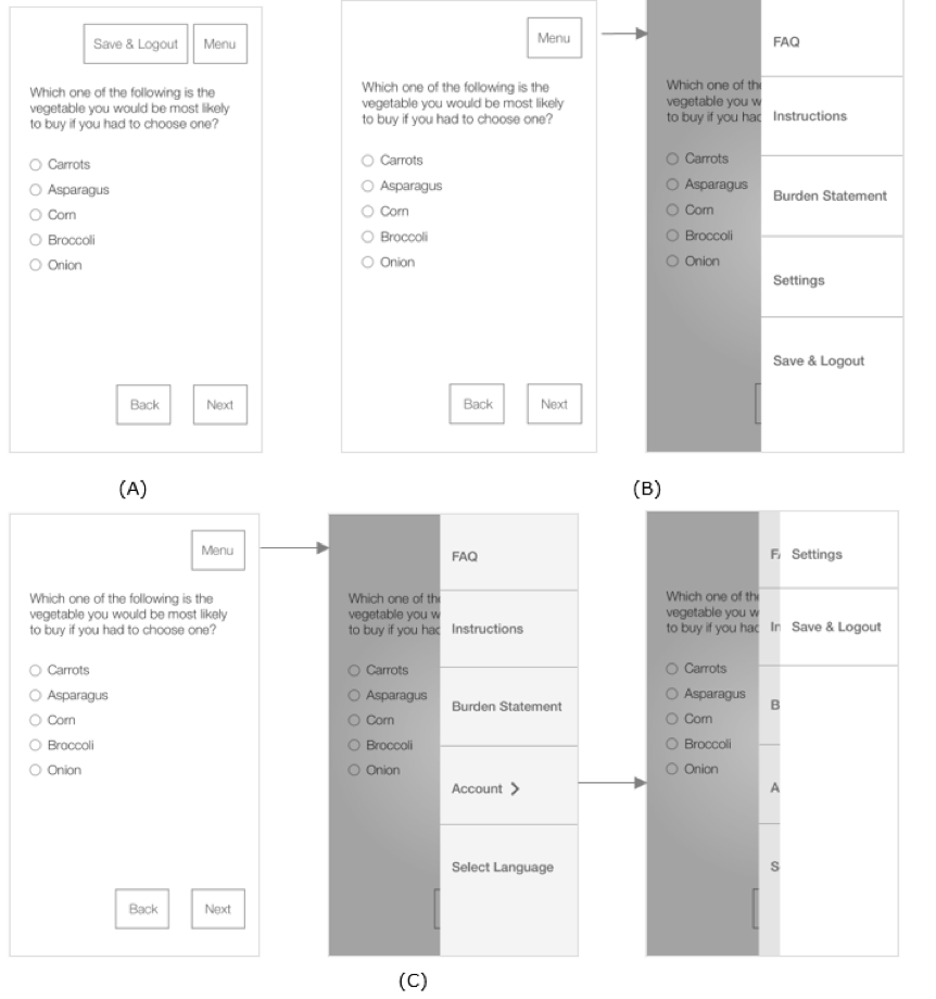
Figure 2. Placement of logout button: (A) on-screen placement, (B) main menu placement, and (C) submenu placement.
Performance Measures
The following are the five person-level measures:
- Success: This was a binary variable with 1 denoting that the participant found and tapped Save & Logout and 0 otherwise.
- Completion Time: This was the period between the onset of the second survey question screen (after the instruction screen) and the time when the Save & Logout button was tapped.
- Deviations (from an optimal path): This was the number of taps that were not necessary to access the Save & Logout button (consecutive taps on the same object were counted as one tap).
- Difficulty: This was the self-reported of task difficulty on a 5-point rating scale with 1 being very easy and 5 being very difficult.
- Preference: This was the preferred Save & Logout button placement among the three designs.
Experimental Procedure
The participant was given a smartphone and instructed to answer a survey question on the first screen and move to the second screen. On the second screen, a paragraph was displayed. The paragraph instructed the participant to move to the next screen and find and tap the Save and Logout button as soon as possible to log out of the survey, before answering the survey question on that screen. Figure 3 depicts this workflow.
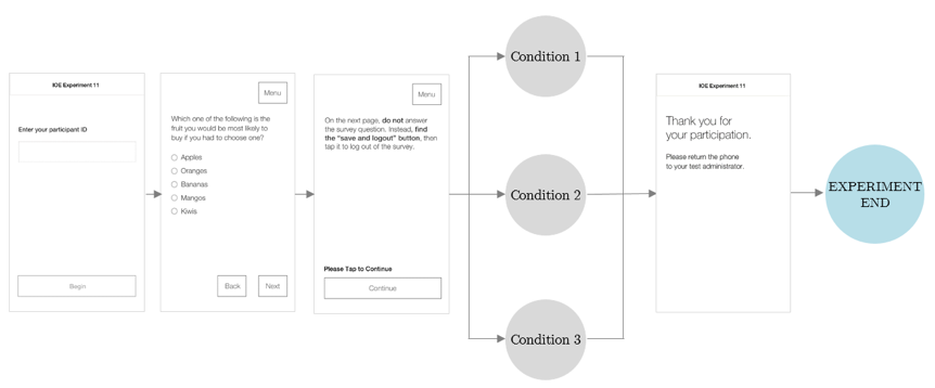
Figure 3. Graphical illustration of experimental procedure.
Data Analysis
Descriptive and inferential statistical analyses were performed on the performance measures according to the nature of the data. Detailed analyses are described in the Results section. Two participants were excluded from analysis because technical difficulties compromised their data.
Results
Success Rate (accuracy): All participants in both on-screen and main menu conditions (A and B in Figure 2) successfully completed the task to log out of the survey (i.e., 100% success rate), whereas there was only a 54% success rate in the submenu condition (C in Figure 2). We used generalized estimating equations to fit a repeated measures logistic regression, predicting accuracy from placement (on-screen, main menu, submenu). Compared to the submenu, the probability of an accurate response was significantly higher when the placement was onscreen (b = .46 (.09), 95% CI [.35, .72], p < .0001) or in the main menu (b = .46 (.09), 95% CI [.35, .72], p < .0001).
Completion Time: We conducted a 6 x 3 (placement order by placement) mixed ANOVA on completion time to assess the placement effect as well as a possible order effect, excluding participants who did not successfully complete the task. There was no statistically significant effect of order on completion time and no interaction (p > .05), indicating that there was no learning effect attributed to the order of experimental conditions and that the counterbalance of experimental condition order cancelled out possible order effects. However, there was an effect of placement on completion time. Because there was no effect of order, we ran a repeated measures ANOVA on completion time with placement as the only factor, which was significant, F(2, 28) = 23.47, p <.001, ηp2 = .63. Pairwise comparisons show that completion time differed between all placement conditions, with participants performing faster in the on-screen condition (M = 5.08, SE = 1.47 sec) than in the main menu condition (M = 18.67, SE = 4.86 sec; mdiff = 13.39, SE = 3.5, p = .005) or in the submenu condition (M = 64.10, SE = 10.16 sec; mdiff = 59.03, SE = 10.29, p < .001), respectively (adjusted for multiple comparisons, using Bonferroni). Completion time was also statistically significantly shorter in the main menu condition compared to submenu (mdiff = 45.43, SE = 11.23, p = .004). The completion time differences are shown in Figure 4.
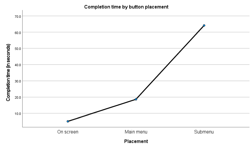
Figure 4. Completion time by button placement.
Because the task failures only occurred in the submenu condition, we then conducted a 6 x 2 mixed ANOVA excluding that condition (and thereby increasing n). Again, there was no statistically significant effect of order and no interaction (p > .05). Because there was an effect of placement on completion, we ran the model once more without order, revealing a statistically significant effect of placement (F (1, 27) = 30.85, p < .001, ηp2 = .58), with participants performing faster in the on-screen condition (M = 4.96, SE = .87 sec) than main menu (M = 22.29, SE = 3.85 sec; mdiff = 17.92, SE = 3.23, p < .001).
Deviations (from an optimal path): We conducted a 6 x 3 (placement order by placement) mixed ANOVA on number of deviations to assess the placement effect as well as a possible order effect, excluding participants who did not successfully complete the task. There was no statistically significant effect of order on deviations and no interaction (p > .05), indicating that there was no learning effect attributed to placement order and that the counterbalance of experimental condition order cancelled out possible order effects. However, there was an effect of placement on deviations. Because there was no effect of order, we ran a repeated measures ANOVA on deviations with placement as the only factor. A statistically significant placement effect was found, F (2, 26) = 13.69, p <.001, ηp2 = .51. Pairwise comparisons with Bonferroni correction show that there were significantly more deviations in the submenu condition (M = 6.36, SE = 1.48) compared to either on-screen (M = .21, SE = .16; mdiff = 6.14, SE = 1.55, p = .005) or main menu placement (M = .71, SE = .32; mdiff = 5.64, SE = 1.61, p = .012), respectively. Deviations did not differ between on-screen and main menu placement. These deviations are show in Figure 5.
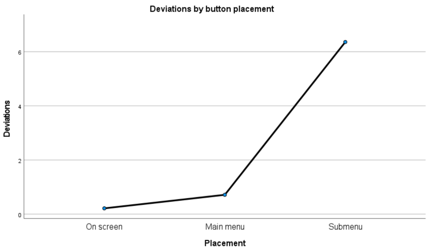
Figure 5. Deviations by button placement.
Because the task failures only occurred in the submenu condition, we then conducted a 6 x 2 mixed ANOVA excluding that condition (and thereby increasing n). Again, there was no effect of order and no interaction (p > .05). Because there was an effect of placement, we re-ran the model without order, revealing a statistically significant effect of placement (F (1, 26) = 10.68, p < .001, ηp2 = .29), with significantly more deviations in the main menu condition compared to on-screen (mdiff = .96, SE = .29, p = .003). However, it is important to note that the average deviations in both conditions was quite small, close to 0 for on-screen (M = .15, SD = .46) and 1 for main menu (M = 1.11, SD = 1.55).
Difficulty Rating: We used generalized estimating equations to fit a repeated measures logistic regression, predicting self-reported difficulty from design. There was an effect of design on completion difficulty. Compared to the submenu placement design, both on-screen and main menu participants were less likely to report difficulty, b = -2.29 (.21), 95% CI [-2.69, 11.88], p < .0001 and b = -1.18 (.20), 95% CI [-1.58, -.78], p < .0001, respectively. That is, the probability of a greater difficulty rating was higher in the submenu condition compared to both on-screen and main menu. Distributions of difficulty rating by condition are shown in Table 4 (difficulty rating on a 5-point rating scale with 1 being very easy and 5 being very difficult).
Table 4. Distribution of Difficulty Ratings by Condition (count, percentage)
|
Design |
Difficulty scale |
||||
|
1 |
2 |
3 |
4 |
5 |
|
|
On-screen |
19, 67.9% |
6, 21.4% |
2, 7.1% |
1, 3.6% |
0, 0% |
|
Main menu |
6, 21.4% |
7, 25.0% |
9, 32.1% |
5, 17.9% |
1, 3.6% |
|
Submenu |
1, 3.6% |
4, 14.3% |
5, 17.9% |
9, 32.1% |
9, 32.1% |
Preference: No participants preferred submenu placement, 85.7% preferred on-screen placement, and 14.3% preferred main menu.
Discussion
The results from this experiment show that placing the Save & Logout button on the screen helps the participant to locate the button with ease and log out from the survey efficiently. In addition, the on-screen placement is preferred by most participants. On the other hand, the submenu placement has a poor success rate and is not preferred by anyone. Placing the logout button within the main menu does not result in failure to logout. Given the limited screen space in mobile user interface design, placing the logout button within the main menu can also be a viable option.
General Discussion
This two-experiment study investigated whether save and logout functionality should be explicitly labeled on a button and whether button placement (on the screen, within the main menu, or within the submenu) affects effectiveness, efficiency, and satisfaction.
In Experiment 1, more participants correctly interpreted the Save and Logout button’s functionality, compared to the Logout only button. Similarly, all but one of the Save and Logout participants reported that they would choose the Save and Logout button if they had to go somewhere before finishing the entire survey, compared to only half of the Logout participants who said they would choose Logout. Perhaps unsurprisingly, all participants preferred the Save and Logout button to the Logout only button. When save and logout functionalities are combined in a single button labeled Save and Logout, there is no need for two separate buttons in an already limited mobile display. Further, this label gives participants confidence that their information will be saved which simply does not seem to exist for a logout only design even if information is actually being saved. This is one simple way to reduce drop offs and cognitive burden (worry about whether information will be saved). All action buttons should be labeled so that respondents know the button’s action upon seeing the text.
One limitation with the first experiment, however, is that it was low fidelity. That is, participants were providing an oral response about what they would do if they were completing a survey, as opposed to actually completing one. Participants’ and users’ projections and preferences do not always map directly to actual behavior. As such, we recommend field-testing to further examine the effects of logout button labeling on logout behavior and task completion.
Action buttons, and even navigation options, that are hidden behind other menus too often go unnoticed, or at least are used less frequently. While participants in Experiment 2 were able to complete the task successfully under either condition of the logout button being placed on the screen or one level deep, the on-screen condition enabled participants to complete the task faster with less deviations from the optimal path and with less difficulty. Further, participants overwhelmingly preferred that the logout button be placed outside the menu compared to inside. The adage “what’s out of sight is out of mind” applies to mobile survey UI design. When the logout button is placed two levels deep in a menu, there is low discoverability.
Label and placement of logout buttons can be likened to the hamburger menu—a button represented by an icon of three horizontal lines. In other words, the hamburger menu is essentially an unlabeled button that people need to identify as actionable. The icon is tempting to use because of the limited mobile space and the amount of functionality that can be hidden within it, but the issue is also just that—the contents remain hidden. Further, the button is less efficient because it forces people to first open it in order to see the options and locate their action of interest. Consequently, the hamburger menu has been largely criticized for its negative user experience implications (Tsiodoulos, 2016). In Experiment 2, while Save and Logout is located in a button labeled Menu, this first requires users to click another (and then perhaps another) button to review the options. Saving screen display space can be achieved in ways that do not violate basic human-computer interaction principles, such as visibility and mapping (relationship between controls and their effects in the world).
Of note, during Experiment 2, participants answered one survey question and were then instructed to find the “save and logout” button. However, when answering survey questions, the task is not to logout but, rather, to complete the survey. To avoid encouraging people to logout (and potentially not return), placing the logout button within a clearly labeled menu, instead of on the main screen, is an acceptable option.
The findings provide empirical evidence supporting Nielsen’s (1994) usability guidelines, with button labels being an indication of system status and the logout button being an aspect of effective user control. Further, the findings also address design challenges specific to a mobile UI. For instance, without taking mobile constraints into consideration, one could argue that the logout only label with main or submenu placement would be optimal for a minimalist and aesthetic design (Nielsen, 1994). From experience with other applications, users may have come to understand that the logout button will automatically save their data, rendering the additional words “save and” unnecessary. They may also assume that the logout button will not be visible (on screen) but be located within a menu and therefore have no issues locating it during a survey. However, in making such a call, one needs to consider the audience of the tool. Is the more minimalist “logout” label meaning “save your work and leave” ubiquitous? Is a main or submenu placement of the logout button ubiquitous? Perhaps not yet for the user that is only starting to do surveys or other interactions on smaller screens. Designing for the novice (in this case adding the words “save and” to the logout button and placing it on the screen) would aid the novice user and not harm the more advanced user (Kolle, 2018). Until tested, though, we could not know that going against a minimalist design with such a crucial button was warranted. These are the first studies to experimentally evaluate the difference between two logout button designs and three logout button locations. Taken together, the findings provide evidence-based design guidance for unambiguous, functionality-specific labels and visible, easily accessible action buttons. If adopted, these designs have the potential to reduce survey drop-offs and respondents’ burden as well as to improve user experiences with other mobile apps.
Tips for Usability Practitioners
When conducting a study similar to ours, the following tips may be useful:
- When evaluating the efficacy of different designs, include behavioral measures in addition to what is self-reported.
- When designing action buttons, use text labels that specify their functions.
- Do not bury critical buttons within submenus even when working with a limited screen display (e.g., on a smartphone).
- When using a measure of difficulty on a Likert scale, consider treating the variable as ordinal for a more nuanced understanding of how response patterns vary across groups.
Acknowledgments
We thank MetroStar Systems for developing the experimental software used in this experiment, Mr. Russel Sanders for managing the project under which this research was carried out, Mr. Sabin Lakhe and Mr. Lawrence Malakhoff for technical support, and Mr. Kevin Younes for recruitment assistance.
Disclaimer
The views expressed are those of the authors and not necessarily those of the U.S. Census Bureau or Northrop Grumman.
References
Ahmad, N., Rextin, A., & Kulsoom, U. E. (2018). Perspectives on usability guidelines for smartphone applications: An empirical investigation and systematic literature review. Information and Software Technology, 94, 130–149.
Basak, C., Boot W., Voss M., & Kraemer, A. (2008). Can training in a real-time strategy video game attenuate cognitive decline in older adults? Psychology and Aging, 23(4), 765–77. https://doi.org/10.1037/a0013494.
Burigat, S., Chittaro, L., & Gabrielli, S. (2008). Navigation techniques for small-screen devices: An evaluation on maps and web pages. International Journal of Human-Computer Studies, 66(2), 78–97.
Jarrett, C., & Gaffney, G. (2009). Forms that work: Designing Web forms for usability. Morgan Kaufmann.
Johnston, A., & Pickrell, M. (2016). Designing for technicians working in the field: 8 usability heuristics for mobile application design. In Proceedings of the 28th Australian Conference on Computer-Human Interaction (pp. 494–498). https://doi.org/10.1145/3010915.3011003
Kim, J. H., & Lee, K. P. (2005). Cultural difference and mobile phone interface design: Icon recognition according to level of abstraction. In Proceedings of the 7th international conference on Human computer interaction with mobile devices & services (pp. 307–310). https://doi.org/10.1145/1085777.1085841
Kolle, L. (2018, December 6). Designing a new product? Get to know the ‘nerd’ and the ‘newb’. Medium. https://medium.com/ideal-design/designing-for-extremes-the-nerd-and-the-newb-d6c74d5a1e73
Kurakata, K. (2019) Accessible-design standards for consumer products developed in ISO/TC 159/SC 4/WG 10. In S. Bagnara, R. Tartaglia, S. Albolino, T. Alexander, & Y. Fujita (Eds.). In Proceedings of the 20th Congress of the International Ergonomics Association (IEA 2018). Advances in Intelligent Systems and Computing, Vol 824. Springer. https://doi.org/10.1007/978-3-319-96071-5_159 .
Leung, R., McGrenere, J., & Graf, P. (2011). Age-related differences in the initial usability of mobile device icons. Behaviour & Information Technology, 30(5), 629–642.
Nichols, E., Olmsted-Hawala, E., Meyers, M., & Wang, L. (2016). Internal briefing on 2016 Primus usability testing. U.S. Census Bureau.
Nichols, E., Olmsted-Halawa, E., Raim, A., & Wang, L. (2020). Attitudinal and behavioral differences between older and younger adults using mobile devices. In Q. Gao & J. Zhou (Eds.). Human Aspects of IT for the Aged Population. Technologies, Design and User Experience. HCII 2020. Lecture Notes in Computer Science, Vol 12207. Springer.
Nielsen, J. (1994). Usability engineering. Morgan Kaufmann.
Owsley, C. (2011). Aging and vision. Vision Research, 51(13), 1610–1622. ISSN 0042-6989, https://doi.org/10.1016/j.visres.2010.10.020.
Pernice, K & Budiu, R. (2016, June 26). Hamburger menus and hidden navigation hurt UX metrics. Nielsen Norman Group. https://www.nngroup.com/articles/hamburger-menus/
Seidler, R., Bernard, J., Burutolu, T., Fling, B., Gordon, M., Gwin, J., Kwak, Y., & Lipps, D. (2010). Motor control and aging: Links to age-related brain structural, functional, and biochemical effects. Neurosci Biobehav Rev., 34(5), 721–733. ISSN 0149-7634, https://doi.org/10.1016/j.neubiorev.2009.10.005
Tourangeau, R., Maitland A., Rivero G., Sun H, Williams D., & Yan T. (2017). Web surveys by smartphone and tablets: Effects on survey responses. Public Opinion Qu
[:]