
[:en]
Abstract
Prior research has suggested that people tend to select more items when presented with a forced choice (yes/no) format than with a select-all-that-apply (SATA) format, and some have argued against ever using SATA in research. We review findings from previous research and report the results of new studies comparing a standard SATA grid format with two forced choice formats: a yes/no grid and a series of individual yes/no questions.
We found no difference in selection rates when both formats appeared in grids. The observed percentage of selection was larger with sets of individual yes/no questions than for SATA grids, but the difference was not statistically significant. We found that participants significantly preferred SATA to forced choice formats. We compare our findings with previous research and discuss the implications for UX researchers and practitioners.
Keywords
Survey item format, select all, choose all, forced choice, grid, series
Introduction
Core aspects of conducting UX research include finding the right participants (screening) and understanding characteristics about the participants’ attitudes and prior behavior. These characteristics may be about prior experiences (e.g., products purchased, stores visited) or important product features (e.g., top tasks).
It is common in surveys to present grids of options in which respondents use checkboxes to indicate which options are applicable to the question being asked (Figure 1). A common term for this format is “Check all that apply” (CATA) or “Select all that apply” (SATA).
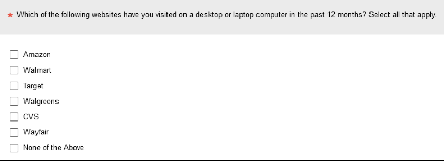
Figure 1. Example of a select-all-that-apply item grid.
In 1982, Sudman and Bradburn hypothesized that requiring respondents to take an action for each option should result in a higher selection rate than the SATA format. They reasoned that failure to check an option could be due to causes other than the option not being applicable. For example, respondents might unintentionally skip over the item or intentionally stop reviewing items before reaching the end of the list to get through the survey faster. Based on this rational analysis, they advised against using the SATA format and recommended using a forced choice grid (similar to Figure 2).

Figure 2. Example of a forced choice yes/no item grid.
In addition to a forced choice grid, it is also possible to present forced choice items as a series of yes/no items (Figure 3).
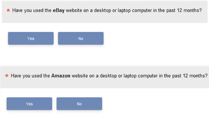
Figure 3. Example of a forced choice yes/no item series.
It seems plausible that the forced choice formats should produce higher rates of selection, but such reasoning doesn’t provide insight regarding the magnitude of the difference or whether the forced choice format matters (grid vs. series).
Estimating these effects requires empirical investigation. Although there are many papers that report the use of SATA (e.g., Ares et al., 2010; Parente et al., 2011), our focus is on the few published studies that have compared SATA versus forced choice, as reviewed in the following sections.
National Education Longitudinal Study of 1988
In 1994 Rasinski and colleagues published the first experiment that compared SATA and forced choice (Rasinski et al., 1994), using data collected in the National Education Longitudinal Study of 1988 (National Center for Education Statistics, 1988). They had 2,210 high school students complete different versions of a paper-and-pencil survey about their experiences during high school. The primary independent variable of interest was the format (SATA vs. forced choice).
The experimental manipulation was applied to three items with 4, 12, and 20 response options (total of 36). Across the three items, the mean number of selections with the SATA format was 4.04; with the forced choice format the mean was 4.6. One way to standardize these findings is to convert the mean number of selections to percentages by dividing them by the total number of 36 possible selections. With this manipulation, the mean of 4.04 becomes 11.2% and 4.6 becomes 12.8%, a difference of 1.6%.
Unsurprisingly, with a sample size over 2,000 this difference was statistically significant (due to the power of the study), but whether it is large enough to be of practical significance is another question.
Undergraduate Experience at Washington State University
Smyth et al. (2006) manipulated SATA and forced choice in three surveys of the undergraduate experience at Washington State University. In the first survey 1,800 respondents answered three items with a total of 36 response options; in the second survey 3,004 respondents answered six items with a total of 77 response options; and in the third survey 3,045 respondents answered one item with 15 response options.
Across this series of surveys, there were 128 choices, with a mean selection rate of 3.6 for the SATA format and 4.5 for the forced choice format, with statistically significant differences for all three surveys. Dividing these means by 128, the percentage SATA selection was 2.8% and the percentage forced choice selection was 3.5%, a difference of 0.7%.
In 2008, Smyth et al. conducted a similar online survey comparing SATA and a forced choice grid with a total of 64 choices across six items, also collecting similar forced choice data using telephone surveys. Because it isn’t possible to collect SATA over the phone, we focus on the online results. The total number of choices across the items was 64. For the online survey (n = 1082), the average number of options selected from the forced choice grid was 4.72 and from SATA was 4.17 (a significant difference in means)—respectively, percentage selections of 7.4% and 6.5%, a difference of 0.9%.
The online survey content and target population of Smyth et al. (2006) and Smyth et al. (2008) were similar to Rasinsky et al. (1994), as was the magnitude of the overall difference, suggesting statistically but not practically significant differences.
NatCen Social Research Omnibus Survey
As part of a survey conducted in 2014 by NatCen Social Research, Nicolaas et al. (2015) replicated and extended the Smyth et al. (2008) research to include computer-assisted face-to-face data collection in addition to online and telephone. Because face-to-face data collection can mimic SATA using showcards, Nicolaas et al. combined their comparison of SATA with forced choice over online and face-to-face sessions. A key difference in the Nicolaas et al. online study was the use of a series of yes/no questions rather than the yes/no grid used by Smyth et al. (2008).
Across 16 choices (with n varying from 452 to 474 due to some item nonresponse), the average difference in percentages between forced choice and SATA selections was 24%, markedly different from the percentages reported in the Rasinsky et al. (1994) or the Smyth et al. (2006, 2008) studies. Given the methodological differences, this could be due to the combination of online with face-to-face data or the use of a series of yes/no questions rather than a yes/no grid.
Pew Research American Trends Panel
In 2018, Pew Research used its American Trends Panel to investigate selection rates for SATA and forced choice versions of 12 items (Lau & Kennedy, 2019). Respondents were U.S. adults (n = 4,581) and were asked whether they or someone in their family had experienced different undesirable events (e.g., home break-in or denied health insurance). Their method clearly specified that the forced choice format was a series of yes/no questions (not a grid).
They reported the selection rates for each item and format, shown in Table 1. The overall mean difference between the percentage of affirmative responses in the yes/no series condition minus the percentage of selections in the SATA condition was 7.3% (95% confidence interval at the item level from 4.6% to 10.0%).
An alternative to comparing percentage selection is to assess differences in the rank order of items (Callegaro et al., 2014). The rank order was similar for the two formats, with a mean absolute rank difference of 0.6 (for percentage data at the item level the Pearson and Spearman correlations were .98 for the two formats).
Table 1. Results for Lau and Kennedy (2019)
|
Item |
SATA % |
Yes/No % |
Difference |
SATA Rank |
Yes/No Rank |
|Rank Diff| |
|
1 |
36% |
52% |
16% |
2.5 |
2 |
0.5 |
|
2 |
22% |
27% |
5% |
6 |
7 |
1 |
|
3 |
18% |
22% |
4% |
7.5 |
8 |
0.5 |
|
4 |
16% |
21% |
5% |
9.5 |
9 |
0.5 |
|
5 |
13% |
19% |
6% |
11 |
11 |
0 |
|
6 |
4% |
6% |
2% |
12 |
12 |
0 |
|
7 |
51% |
63% |
12% |
1 |
1 |
0 |
|
8 |
36% |
45% |
9% |
2.5 |
3 |
0.5 |
|
9 |
27% |
37% |
10% |
5 |
4 |
1 |
|
10 |
28% |
32% |
4% |
4 |
5 |
1 |
|
11 |
18% |
29% |
11% |
7.5 |
6 |
1.5 |
|
12 |
16% |
20% |
4% |
9.5 |
10 |
0.5 |
|
Mean |
24% |
31% |
7.3% |
6.5 |
6.5 |
0.6 |
Notes: Item is the item number from Lau and Kennedy (2019); SATA % is the overall percentage of selection from the SATA grid; Yes/No % is the overall percentage of affirmative selection from the yes/no series; Difference is Yes/No % minus SATA %; SATA Rank is the rank assigned to the tabled SATA %; Yes/No Rank is the rank assigned to the tabled Yes/No %; |Rank Diff| is the absolute value of the difference in the ranks.
Insights from Previous Research
Consistent with the hypothesis of Sudman and Bradburn (1982), these four lines of empirical research found statistically significant differences in selection rates from SATA and forced choice formats. In all four cases, the percentage of forced choice selection was greater than the percentage of SATA selection.
The research, however, differs in the estimated magnitudes of the difference (1.6% for Rasinsky et al., 1994; 0.8% for Smyth et al., 2006; 0.9% for Smyth et al., 2008; 24% for Nicolaas et al., 2015; 7.3% for Lau & Kennedy, 2019). One could argue that differences of 1–2% would rarely be practically significant, but that’s a more difficult argument to make for a difference of 24% or 7.3%. So, why might the results of Nicolaas et al. and Lau and Kennedy be so different from Rasinsky et al. and Smyth et al.?
One possibility is the difference in the forced choice format. The literature we reviewed has been inconsistent in two ways. First, some researchers have not specified whether they used a forced choice grid as originally recommended by Sudman and Bradburn (1982) or a series of yes/no questions. Second, some have documented the use of forced choice grids while others have documented the use of forced choice series. We did not turn up any previous research that directly compared selection rates for forced choice grids versus a forced choice series.
Objective of the Current Research
The primary objective of the current research was to add to the SATA vs. forced choice literature with comparison of (a) SATA vs. forced choice in a grid and (b) SATA vs. forced choice in a series using data collected in a user experience (UX) research context.
Method
Participants
The research participants were members of a research panel, all U.S. adults who participated for a nominal cash incentive. We conducted two surveys with n = 201 for Survey 1 and n = 260 for Survey 2.
Surveys
The surveys were programmed using the MUIQ® UX testing platform. The images in Figures 1, 2, and 3 are screenshots of the survey pages. We used a Greco-Latin experimental design (Lewis & Sauro, 2020) in both surveys to have respondents make selections from a SATA grid (Figure 1) and one of the two forced choice formats (grid in Survey 1 as shown in Figure 2; series in Survey 2 as shown in Figure 3). Greco-Latin experimental designs have the enhanced discriminative power of within-subjects designs plus appropriate counterbalancing of the order of presentation of substantive and nuisance independent variables.
There were two groups of selection items. The first had a list of six well-known mass market websites (those shown in Figure 1), and the second had a list of four well-known seller marketplaces (those shown in Figure 2). With two formats and two website groups, the experimental design had four orders of presentation:
- Mass merchants in SATA format followed by seller marketplaces in forced choice format
- Mass merchants in forced choice format followed by seller marketplaces in SATA format
- Seller marketplaces in SATA format followed by mass merchants in forced choice format
- Seller marketplaces in forced choice format followed by mass merchants in SATA format
Each respondent was randomly assigned to one of these orders, so each respondent experienced both formats with different website groups in a fully counterbalanced experimental design. After completing the two sets of selections, respondents indicated which of the formats they preferred.
The independent variable of interest was the within-subjects comparison of SATA and forced choice formats. The other independent variables were the type of website (mass merchant vs. seller marketplace, within-subjects) and the order of presentation (between-subjects).
To focus on the primary effect of interest—the difference in selection percentages for SATA and forced choice formats—data were collapsed over the nuisance variables of website type and presentation order. In each survey, we analyzed mean selection percentages and respondent preferences.
Results
Survey 1: Forced Choice Grid
Selection rates. In Survey 1, the mean selection percentage for SATA was 54.06% and for the forced choice grid was 54.11%, an observed difference of .05% that was not statistically significant (t(200) = .024, p = .98). The 95% confidence interval around the difference ranged from -4.5% to 4.4%.
Respondent preferences. Figure 4 shows percentages and 95% adjusted-Wald binomial confidence intervals (Sauro & Lewis, 2016) for the format preferences in Survey 1. Respondents overwhelmingly preferred the SATA format (72.1%) to the forced choice grid (13.4%).
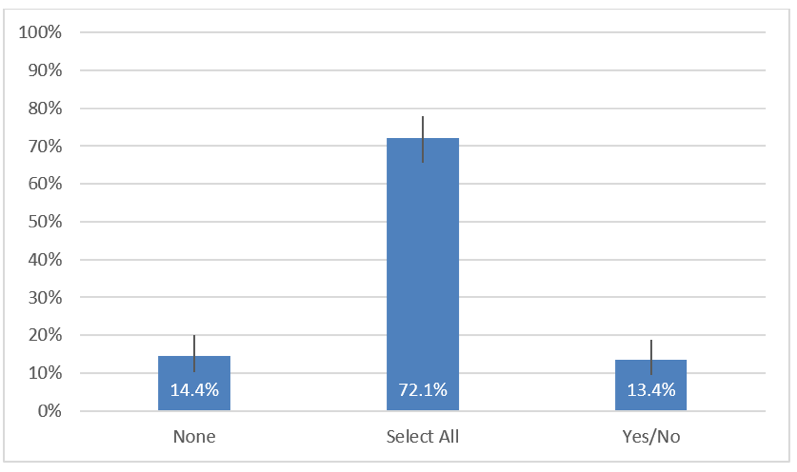
Figure 4. Preferences for SATA and the forced choice grid in Survey 1.
Survey 2: Forced Choice Series
Selection rates. The selection percentages in Survey 2 were 55.4% for SATA and 58.5% for the forced choice series of yes/no questions (illustrated in Figure 3), a nonsignificant difference of ‑3.1% (t(259) = 1.6, p = .11). The 95% confidence interval around the difference ranged from ‑6.9% to 0.7%.
Respondent preferences. Figure 5 shows percentages and 95% adjusted-Wald binomial confidence intervals for the format preferences in Survey 2. As in Survey 1, respondents significantly preferred the SATA format (61.9%) to the forced choice series (16.5%).
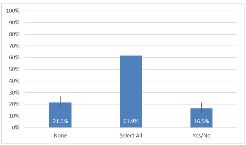
Figure 5. Preferences for SATA and the forced choice series in Survey 2.
Discussion
There isn’t much empirical research in differences in selection rates for response options presented in SATA and forced choice question formats. The data that exist generally support the hypothesis of Sudman and Bradburn (1982) that selection rates would be greater with forced choice formats. In some published research, the magnitudes of the reported differences were small (1.6% in Rasinski et al., 1994; 0.8% in Smyth et al., 2006; 0.05% in our Survey 1). Lau and Kennedy (2019) and Nicolaas et al. (2015) reported larger differences (respectively, 7.3% and 24%), and we found a difference of 3.1% in our Survey 2.
Based on their findings, Lau and Kennedy wrote, “Pew Research Center has adopted a policy of using a forced choice format instead of a select-all-that-apply list in its online surveys whenever possible” (2019, p. 4). Should UX researchers adopt a similar policy?
We argue that for several reasons such a decision would be premature.
First, the context of much UX research is qualitatively different from the social and political research conducted by the Pew Research Center. People may be much more emotionally invested in the content of social and political research (e.g., victimization, attitude toward political parties) than in most UX research (e.g., product usage).
Second, Lau and Kennedy (2019) compared SATA with a series of forced choice questions rather than presenting them in grids structured like the commonly used SATA grids (see Figures 1 and 2). When we used a forced choice grid in Survey 1, we found a near-zero difference between selection rates for SATA and forced choice. When we ran the same experiment in Survey 2 using a forced choice series instead of a grid, our estimated difference in the selection rates was 3.1%. This was not significantly different from 0 (p = .11), so we shouldn’t make too much of it, but it is interesting that the only two studies that had observed differences greater than 2% are known to have compared SATA with forced choice series.
Third, although Lau and Kennedy (2019) present a rational argument that their forced choice selection rates should be closer to reality than SATA selection rates, there are counterarguments that reduce our confidence in that assertion. For example, Callegaro et al. (2014) suggested that requiring a yes or no response could, through an acquiescence bias, inflate selection rates. Without conclusive validation studies, which would be very difficult to conduct, it isn’t possible to determine which selection rate is closer to reality.
Fourth, the rank order of selection rates collected with SATA track very closely with those collected using forced choice formats (e.g., Table 1).
Fifth, respondents in both of our surveys indicated overwhelming preference for SATA over forced choice, likely due to the relative ease of scanning a list and clicking as needed in a single vertical column versus forcing a selection for each item, whether or not it applies. Given the goal of keeping drop-out rates as low as possible when collecting survey data, this is not a trivial concern.
For these reasons we recommend that UX researchers and practitioners use SATA rather than forced choice unless there is a compelling reason to do otherwise (e.g., a need to compare new results with previous research that used forced choice).
Conclusion
Researchers have reasoned that if there is any difference in selection rates as a function of question format, you would expect higher rates with forced choice than with SATA. Empirical analysis of previous research generally supports this hypothesis, with four sources reporting differences favoring forced choice of 0.8%, 1.6%, 7.3%, and 24%.
In our current UX research, we found no difference in selection rates when both formats appeared in grids. When comparing a SATA grid with a forced choice series, the observed difference was 3.1%. Examination of 95% confidence intervals around the estimated differences indicated that differences greater than 4.5% were unlikely when both SATA and forced choice items appear in grids, and differences greater than 7% were unlikely when forced choice items appear in a series of yes/no questions—results that are consistent with most previous research.
When deciding which format to use, researchers should not assume that SATA and forced choice formats will produce identical selection rates. On the other hand, they very likely will produce similar rank order patterns. Respondents greatly prefer SATA over both forced choice formats.
Future research on this topic should focus on investigating the relative influence of different variables on the difference in selection rates for SATA and forced choice questions, including forced choice format (e.g., grid vs. series) and research context (e.g., UX vs. education vs. social policy/politics).
Tips for Usability Practitioners
Practitioners who need to collect selection data may find these tips helpful:
- Because we found only small differences in selection rates as a function of question format in a UX research context but found respondents significantly preferred SATA over forced choice, we recommend using SATA in UX research unless there is a compelling reason not to do so.
- If there is a need to collect these types of data with a forced choice format, we recommend using a forced choice grid rather than a series of yes/no questions.
- Because the data reported to date generally indicate greater selection rates for the forced choice series format, researchers should assume that format matters and avoid putting themselves in the position of having to compare data collected with different formats.
- When collecting this type of data, report the format used (SATA, forced choice grid, or forced choice series).
References
Ares, G., Barreiro, C., Deliza, R., Giménez, A., & Gámbaro, A. (2010). Application of a check-all-that-apply question to the development of chocolate milk desserts. Journal of Sensory Studies, 25(1), 67–86.
Callegaro, M., Murakami, M. H., Tepman, Z., & Henderson, V. (2014). Yes-no answers versus check-all in self-administered modes: A systematic review and analyses. International Journal of Market Research, 57(2), 203–223.
Lau, A., & Kennedy, C. (2019). When online survey respondents only ‘select some that apply.’ Pew Research Report available at https://www.pewresearch.org/methods/2019/05/09/when-online-survey-respondents-only-select-some-that-apply/.
Lewis, J. R., & Sauro, J. (2020). Latin and Greco-Latin experimental designs for UX research. MeasuringU article available at https://measuringu.com/latin-and-greco-latin-experimental-designs/.
NatCen Social Research. (2014, June). Mixed modes and measurement error, 2009 (computer file). UK Data Archive (distributor).
National Center for Education Statistics. (1988). National Education Longitudinal Study of 1988. https://nces.ed.gov/surveys/nels88/.
Nicolaas, G., Campanelli, P., Hope, S., Jäckle, A., & Lynn, P. (2015). Revisiting “yes/no” versus “check all that apply”: Results from a mixed modes experiment. Survey Research Methods, 9(3), 189–204.
Parente, M. E., Manzoni, A. V., & Ares, G. (2011). External preference mapping of commercial antiaging creams based on consumers’ response to a check-all-that-apply question. Journal of Sensory Studies, 26(2), 158–166.
Rasinski, K. A., Mingay, D., & Bradburn, N. M. (1994). Do respondents really “mark all that apply” on self-administered questions? Public Opinion Quarterly, 58(3), 400–408.
Sauro, J., & Lewis, J. R. (2016). Quantifying the user experience: Practical statistics for user research (2nd Ed). Morgan-Kaufmann.
Smyth, J. D., Christian, L. M., & Dillman, D. A. (2008). Does “Yes or No” on the telephone mean the same as “Check-All-That-Apply” on the Web? Public Opinion Quarterly, 72(1), 103–113.
Smyth, J. D., Dillman, D. A., Christian, L. H., & Stern, M. J. (2006). Comparing check-all and forced-choice question formats in web surveys. Public Opinion Quarterly, 70(1), 66–77.
Sudman, S., & Bradburn, N. M. (1982). Asking questions: A practical guide to questionnaire design. Jossey-Bass.
[:]