
Abstract
Information architecture is the practice of effectively organizing, structuring, and labeling the content of a website or application into a structure that enables efficient navigation. Card sorting is a research method that employs users’ input to help derive an effective navigation structure. Whether a card sorting study is conducted using manual methods and tools, or online automated tools, those tools only assist the User Experience (UX) professional in creating usable, intuitive information architecture. As with most user research, the UX professional still has to make sense of the collected data and take the data one (or several) steps further. How do you interpret user input to determine what categories to create? What should those categories be named? Which content should they contain? Should the categories contain subcategories, and which content should they contain? Should you duplicate links across categories, and where should these duplicate links reside?
Although a wealth of articles, books, and blogs by experts in the information architecture field discuss the card sorting technique, most do not answer these questions, nor do they address the step-by-step details of how to analyze the data to create a navigation structure. Attendees at card sorting workshops taught by the two primary authors (Righi and James) of this article invariably report that of all the elements of card sorting, they have the most difficulty taking the leap from the data they’ve gathered to constructing that final navigation structure.
This article presents a set of best practices for analyzing card sorting data to derive an effective information architecture and navigation structure. It addresses methods of interpreting cluster analysis data matrixes and dendrograms generated by automated card sorting tools. And, it focuses on the details of making a decision about final categories and category labels. In short, it helps the UX professional make informed judgments when multiple interpretations of the data are possible.
Tips for UX Practitioners
The following are suggestions that UX practitioners can use in their own card sorting analysis:
- Use online card sorting tools to more easily collect data from a larger sampling of participants. Although we in this profession often rely on small “n” qualitative data, card sorting is one activity that can greatly benefit from the input of large “n” samples. Larger “n” samples afford us the ability to see whether all of the audience segments for a website or application organize content in the same way or if they conceptualize the structure differently from one another.
- Before beginning the analysis process, be sure to examine and “clean” the data participant by participant to remove any suspicious data. We have found that one of the downsides of automated tools and large “n” data sometimes renders that data impersonal; practitioners simply accept it all and move right to analysis.
- Although most online tools do not provide the capability for users to group items into subcategories, this does not imply that this decision is any less important or should be glossed over quickly. The dendrogram and “slider” provided in online tools can help you more easily make decisions about where large categories naturally break into subcategories.
- If you’re having trouble settling on a final label name for any of your categories, you may consider conducting a synonym analysis or review search engine and site search data.
- Do not let the length or complexity of this process discourage you from performing it. Creating an IA is a critically important step in the design of a website or application. It forms the foundation of the user’s navigation experience. Time spent on ensuring the structure is as good as you can make it, based on user input, is time well spent.
Introduction
Information architecture (IA) is the practice of effectively organizing, structuring, and labeling the content of a website or application. IA is used to create the navigation structure of a website, including the categories of content and what they are named. Card sorting is a popular user-centered design method that helps us derive an effective IA. At first glance, card sorting seems to be a deceptively easy task: Present representative users with content or functionality slated to be included in a website or application, and ask them to sort it into logical groupings. What better way to create an IA than to get the users themselves to create it? There is little to be argued with when looking at card sorting this way.
In recent years, the process of conducting card sorts has gone from handing a stack of 3 x 5 index cards to users to creating an online study, emailing a link to users, and sitting back and collecting the data. Again: Deceptively easy.
However, with card sorting, as the saying goes, the devil is in the details. Once you’ve collected the data, how do you make sense of it? How do you discern and assess the groupings the users created? How do you compile results from many users? How do you reconcile disparate groupings? How do you determine the best labels for the groupings? And, how do you do all of this in a way that, as much as possible, is backed by solid, objective criteria?
Fortunately, the tools available today to collect the data include electronic data visualization and analysis routines to help analyze the data. Online dendrograms and various item/category matrixes quickly and easily provide the practitioner with a variety of views of the data. The use of these tools and the interpretation of the resulting data, though, are far less straightforward.
To address the vexing problem of card sort data analysis, a group of User Experience (UX) practitioners convened at the 2011 Usability Professionals’ Association conference in Atlanta to address and formulate a set of best practices for analyzing card sort data. This paper details those practices.
This paper does not address the question of which tools to use or the relative merits of variations of card sorting. And, because the focus of this paper is on the analysis of the collected data, we also do not discuss the planning and creation of a card sorting study. Most of what is addressed will refer to various automated card sorting tools, but this paper will largely be tool-agnostic. For the purposes of illustrating the various tools and methods, this paper will, however, reference a sample card sort study for a coffee house’s website that we performed using the WebSort tool (http://uxpunk.com/websort/; URL as of 10-21-12).
This paper presents the approach in a more-or-less sequential order of when we recommend each step be implemented. However, depending on the situation, you may change the order or eliminate some steps entirely. Although there are many informal methods for analyzing card sort data, the approach described here is more objective and data-based compared to a simple “eye balling” of the sort results.
Even though these guidelines are presented as a sequence, card sort data analysis, like many research practices, is typically a highly iterative process. You will likely wish to revisit earlier steps in the sequence to get different views of the data or to test alternate hypotheses regarding the IA.
Finally, this set of guidelines is just that: a guide for approaching a sometimes complex but much-needed technique in the arsenal of the UX professional.
Collect the Data
Although collecting the data is not the focus of this article, the manner in which the data is collected can have an impact on how it is analyzed. Therefore, we will briefly cover the two most common methods for gathering data and discuss the analysis implications of each.
The first consideration is whether you conducted a closed card sort or an open card sort. A closed card sort asks participants to sort content into predetermined categories whereas an open card sort allows participants to sort and categorize content into their own categories and label those categories. This article is based on an open card sort having been conducted.
Second, you may have gathered the data in an unmoderated or moderated fashion. And, third you could have conducted either an online/remote or in-person study to gather your data.
Although there are several variations and combinations of these approaches, the most common (in our experience) are open, moderated/in-person, using physical cards, and unmoderated/remote, using an online tool. The example we focus on in this article is based on the latter. However, we will also briefly describe the former approach.
Moderated/In-Person Card Sorting Using Physical Cards
Moderated/in-person card sorting allows you to watch a participant while they are actively performing the card sort. You can observe the extent of the participant’s ease and confidence as they sort the cards in real time. A participant may move cards they are unsure about to the back of the stack, while placing easy-to-sort terms (cards) into their respective buckets. Each of these data points is a clue to the strength of the categories participants create.
Moderated/in-person card sorting also allows you to ask participants to think aloud as they are sorting. A think-aloud protocol provides qualitative insight into a participant’s thought processes as they rationalize the more complex categories or category labels. It also gives you insights into the words they use to describe the categories.
At the end of the moderated session, you can hold a debriefing, where you can gather any additional feedback the participant might have and gain further insight into why an item was sorted into a particular category. All of this information tells you which categories and labels immediately make sense and which ones are potentially more confusing, providing important inputs to the design of the IA.
You could also videotape a moderated/in-person card sort if you think additional team members would benefit from watching the session at a later time. After conducting a moderated/in-person card sort, you would then typically create a data matrix for each participant in spreadsheet software like Excel. The matrix is used to show the categories and the cards placed under them. This spreadsheet will become the format within which you will analyze the data.
Unmoderated/Remote Card Sorting Using an Online Tool
Unmoderated/remote card sorts use online card sorting tools that provide an electronic data set of categories and the cards placed under them. Most automated tools currently allow participants to create only one level of grouping. However, later in the paper we discuss how you can make sub-grouping decisions that are driven by the strength of the association of the cards within their categories.
Unmoderated/remote card sorting also allows you to gather data from a much larger number of participants for the same effort as moderated/in-person sorting (unless of course you’re compensating each participant). Having a large “n” provides a measure of statistical validity not provided by small “n” research. Unmoderated/remote card sorting also makes it easier and less costly to reach a broader, more geographical diverse base of users. It is generally easier to analyze data that have been collected by an online tool. Online tools create the data tables and diagrams you will need for your analysis. If you use physical cards, you will have to create these tables and diagrams yourself1.
1Tools such as SynCaps (http://www.syntagm.co.uk/design/syncapsv2.shtml) can be used to create index cards with bar codes, making it easy to later scan in your results, thus enabling an online tool to create the necessary analysis files.
“Clean” the Data
Regardless of the method you use to collect your data, you should begin your data analysis by first removing any data that seem suspect—that is, data from participants who did not make a serious attempt to complete the sorting exercise. The inclusion of dubious data can negatively affect your results. This type of data are near impossible to spot when looking at combined data, so it’s essential to remove them participant by participant before you aggregate your data.
There are no hard and fast rules about whether to include or exclude data, but as a general guide, there are three key areas to consider when determining whether a participant’s data should be included for analysis:
- Number of categories the participant created
- Quality of labels participant associated with the categories
- Amount of time participant took to complete the exercise
Number of categories created
Consider removing a participant’s data that contain too few or too many categories to be meaningful. To make this determination, look at the average number of categories created across all participants. Then, investigate participant results that strongly deviate from the average.
However, be careful when you do so. Often, participants with expert domain knowledge will create a larger number of categories based on more specific categories. These are worthy of inclusion. On the other hand, when a participant creates only a few categories with a large number of items in a single category, it may indicate that the participant got tired or didn’t want to spend further time and simply placed all the remaining cards together for expedience.
In short, before throwing out data, first try to determine the “why” of the number of categories created. If there seem to be a large or small number, tread carefully and use your best judgment about removing a participant’s data.
Quality of labels associated with categories
You should also pay attention to the labels participants give to categories when deciding whether to discard their data. When examining category labels, look to see whether the labels make sense and have meaning within the domain you are researching. Odd or surprising category labels tend to indicate that a participant hasn’t carefully considered or understood the meaning of the cards they have put together. Participants also tend to create meaningless labels when they’ve become disengaged with the exercise and are looking to complete it as quickly as possible. In these cases, a participant may have used many vague category labels, such as “stuff,” “other,” or “miscellaneous.” In other cases, a participant may have created duplicate categories or synonyms of an existing label. These data will not be of much use in helping you to derive an IA. If you suspect these behaviors, check the time it took the participant to complete the sort. This will help you make a decision about whether to eliminate or keep the data. (See the following section.)
Finally, participants may divide the cards into broad categories that are only relevant to them, such as “Things I am interested in” and “Information I don’t care about.” Although not helpful in creating an IA, these labels may provide valuable information on participants’ key information needs and other requirements.
In the case of a website redesign, participants may label categories similarly to those of the IA of the current website. This may either prove that the existing IA has validity, or that the participant is not giving ample thought to the exercise and is merely following a learned—and possibly flawed—convention. You will ultimately need to make a judgment call whether to include these data. (You can attempt to reduce the chance of this outcome by instructing participants to, as far as possible, disregard the current IA, and definitely not to look at it while completing the card sort study.)
Amount of time participant took to complete the exercise
Finally, consider the time the participant took to complete the card sort. The time required to carry out the exercise will vary depending on the number of cards, the complexity of the content, and the tool being used. Performing a dry run/pilot of the exercise will provide you a useful benchmark for how long the card sort should take participants to complete. Some tools also provide general guidelines based on the number of cards included in the study.
You should further investigate any results that deviate widely from these estimates to determine whether they are valid. An unusually short time may indicate that the participant was more interested in receiving the incentive being offered than providing thoughtful insight. Alternatively, a short completion time may be due to a participant’s facility with the content. An unusually long time may indicate confusion or uncertainty, possibly due to lack of domain knowledge or confusion using the tool itself. On the other hand, participants may have just taken an extremely in-depth approach to the exercise. With unmoderated/remote card sorts, participants may have taken a break in the middle of the task, as well. Therefore, while it is important to look at the time a participant took to complete the task sort, be careful about eliminating any participants’ data based solely on completion time.
Regardless of the reason, when removing any data, you should always make a note of why you are discounting it and record anything it tells you that could be useful for the wider project.
Determine the Level of Agreement Between Items
Throughout the course of analyzing card sort data of an unmoderated/remote study, there are a number of data matrixes and diagrams created by either the automated tool or that you will most likely create manually. The first to consider is the item-by-item matrix. This matrix will help you quickly find key relationships between individual items in the card deck.
The item-by-item matrix (Figure 1) shows the number of times, as a percentage, participants have grouped each individual card with each other card in the set. The matrix provides useful insight into the strength of the relationship between each pair of individual content items, and thus, how strong a group the items form. In this example, the higher numbers (illustrated by the darker colors of the cells) indicate stronger item-to-item relationships. This tells you that those items should probably be placed within the same category in the IA.
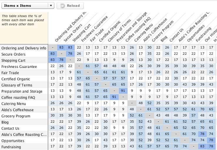
Figure 1. Sample item-by-item matrix
The information provided in the item-by-item matrix offers an ideal opportunity to test any initial assumptions for the IA. In fact, before looking at the data, some analysts will write a list of their hypothesis and then later determine whether their assumptions are borne out in the results. These assumptions can be framed around the question, “I think X and Y belong together because [your reason],” or “There is a strong relationship between [a few specific cards], indicating the need for an IA based on [your guiding principle].” Later, if your hypotheses are not supported by the results, you may wish to redefine your assumptions and revisit the data to see if your initial hypotheses have any validity or if new hypotheses should take their place.
Strong Item-to-Item Connections
To start analyzing the information in the item-by-item matrix, look at the strongest relationships and ask yourself: “What is the connection between these items? What relationships are participants seeing when grouping these cards together? And, how does that affect items that are not connected that I expected to be?” Ideally, patterns of connections will begin to emerge.
Often, surprisingly strong connections between items may not fit neatly once the IA is derived. Rather than totally dismiss these insights, they can give valuable guidance into the cross-links and cross-promotions to use in the final IA. Note any of these surprising results for later.
Weak Item-to-Item Connections
Next, reverse the process and look at the cards that have the lowest correlations with one another. Determine whether there are any surprises or outliers that demand further investigation. Are there items you expected to be connected but weren’t? Again, note these results as you continue your analysis.
Subgroup Analysis
If you have a very heterogeneous group of participants’ data, you may wish to segment your participants by behavioral and demographic criteria. This will allow you to perform the item-by-item matrix review across a variety of user types. By doing so, you can determine whether and how the data patterns change across user audiences. You can then, for example, create an IA that is best suited to the highest-priority user audiences. For example, separating the data of the “coffee connoisseur” user type from the more general “coffee drinker” user type would likely give you a more technically accurate categorization and labeling of the different coffees. Most automated tools allow you to segment the data in some fashion or other.
What About the Labels?
You may be curious at this point about what the participants labeled the categories. Category labels will be addressed soon. For now, it is best to focus on how the items have been grouped.
Examine the Dendrogram
At this point, assuming you conducted an unmoderated/remote study and used a tool that performed a cluster analysis, you should view the dendrogram (also known as a “dendrite diagram” or “tree diagram”). The dendrogram is a visual representation of item relationships (Figure 2, Sample Dendrogram).
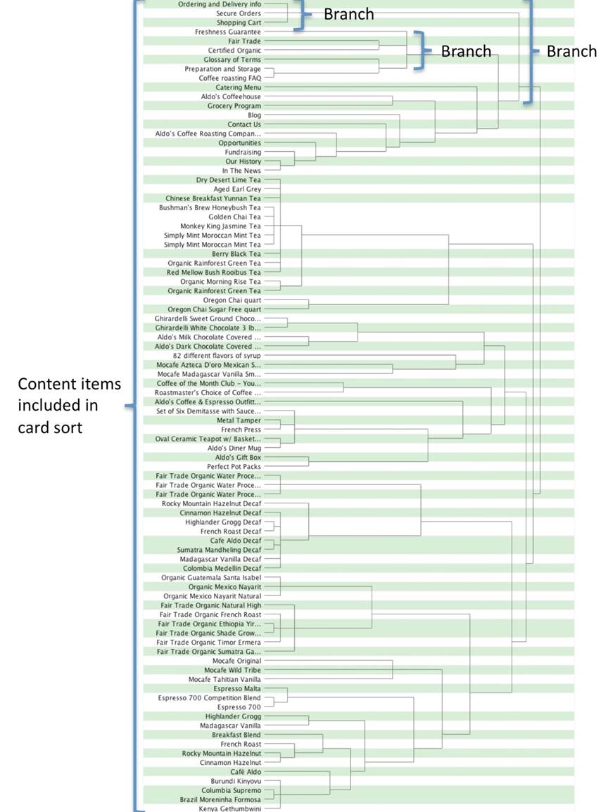
Figure 2. Sample dendrogram
The structure of the dendrogram is similar to that of a tree in that a large branch (represented by the square brackets to the right of item groupings) subdivides into smaller branches, each of which subdivides into still smaller branches, and so on, resulting in a hierarchy of categories and items. In a card sort, the ultimate goal is to derive a set of divisions and subdivisions of items that will translate into a reasonable IA.
Reading a dendrogram requires a basic understanding of how it is depicted.
The dendrogram begins at the left with the complete list of items that were presented to participants for sorting. Then, branching lines (brackets) are drawn between items, based on the degree to which participants grouped the items together. Items that are the most frequently grouped together are placed next to each other vertically, with a line joining them to indicate the association. For example, looking at the top of Figure 2, Ordering and Delivery Info, Secure Orders, and Shopping Cart form a group. That line represents the next level (or branch) in the diagram. It not only joins the items, but also extends to the right, pointing to the next highest level of relationship. If several items have the same correlation, there will be more than one item in a given branch level, as illustrated by each of the branch breakouts shown in Figure 2. At each successive level of the tree, the conjoined lines are represented by fewer and fewer numbers of aggregated units, until at the far right of the diagram only one line remains, representing the complete aggregation of all original items. How quickly the diagram reaches this final state depends on how cohesive the unit clusters are—more differentiation generates smaller clusters and, therefore, more branches. Less differentiation generates larger clusters and, therefore, fewer branches.
The use of online tools reveals the true power of the dendrogram to help visualize the structure of content within a specified number of categories to be represented in the IA. For example, to see where content would reside if all content were grouped into seven categories, you can manipulate the dendrogram to show where content would reside in a seven-category scheme. Online tools typically provide mechanisms, such as a slider and alternate shadings, for specifying the number of categories to depict (for example, Figure 3 shows the same dendrogram as in Figure 2, this time, manipulated to depict eight groupings).
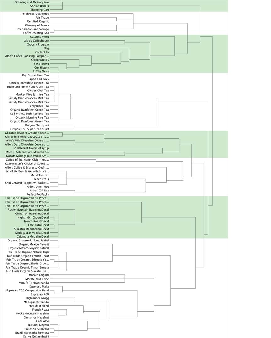
Figure 3. Dendrogram depicting eight groupings of items in alternate green and white shadings
Create the Top-Level Categories
After an initial look at the item-by-item matrix and dendrogram, you can now create your top-level categories.
Studies from over half a century have demonstrated that for most cognitive tasks, people are most comfortable with about seven plus or minus two distinct items to consider2. In terms of a card sort study, this corresponds to the number of top-level groupings on a website or application, often depicted as tabs. The interactive dendrograms generated by card sorting tools provide a slider, helping you to find the optimum point between about five to nine final content categories.
While trying to derive five to nine top-level categories for a website or application using the slider described above, it is also important to pay attention to the size of the categories. Categories with a relatively large amount of content may signal that the group needs to be broken into multiple subcategories. In one regard, analysis of card sort data can be considered a balance between the two competing objectives of number and size of categories.
Note that it’s typically not possible to define all categories with a single placement of the vertical line (slider). For example, you may find when you settle on a number of categories between five to nine, that most of the categories you have created are reasonable, except for one. In this case, you need to move the slider to the left to increase the correlation standard for group membership for that group only, creating more subdivisions within this group, while maintaining the structure of the other categories. In fact, this activity is how you can create subcategories from the data, even when the participants only sorted items at one hierarchical level. We will address this activity at greater depth later.
When you’ve reached a happy balance between the number of categories and the number of items within each group, by manipulating the slider in the dendrogram, go back to the item-by-item matrix. Look to see how many cells have high correlations (those cells with the darker background color in Figure 1). Realistically, if half to two-thirds of rows have a high correlation, your categories are in good shape, and you can move on to the next step in your analysis. If not, continue experimenting with the number and size of categories in the dendrogram and recheck the item-by-item matrix.
If you have fewer cells with high agreement, it may be a result of different participants having very different mental models for how your content should be organized. To test this hypothesis, try separating your participants’ data by user type and then recheck the matrix. If both sets of data show more items that correlate highly with one another, then you are probably working with participant groups who have very different mental models. At this point, you will need to decide how to accommodate the different groupings. Possible design solutions may include using one of the groupings for the IA and accommodating the other via crosslinks or search filters.
If splitting the data by participant groups doesn’t result in stronger agreements, then you should examine your data more closely. First, recheck for outliers as discussed earlier and try removing them from the data to see if results become clearer. The problem may also be that you didn’t have enough participants for a clear model to emerge3 or that your content space is very complex and not easily understood.
If you are concerned that your data set is too small to make any definitive conclusions, then you may consider running more card sorting sessions. Or, if the complexity of the data seems to be causing your participants a lot of uncertainty in their categorizations, then you may want to recruit more expert participants. However, this will skew results toward the expert user’s perspective, so you will need to provide additional supporting design elements for new users as they learn both the domain and your content.
2Miller, G. A. (1956). “The magical number seven, plus or minus two: Some limits on our capacity for processing information”. Psychological Review 63 (2): 81–97. Note that since this original article was published, there have been many studies that have provided more nuanced interpretation to this guideline; however, using seven plus or minus two categories is a widely accepted heuristic for IA development for most typical websites.
3Researchers have explored the issue of how many participants are required to generate valid card sort data, e.g., Tullis, T. & Wood, L., (2004), How many users are enough for a card-sorting study? http://home.comcast.net/~tomtullis/publications/UPA2004CardSorting.pdf
Label the Top-Level Categories
In addition to the number and contents of categories, it is of course critically important to determine the label names of those categories. Category labels can make the difference between users’ immediate recognition of the nature of the content residing there or cause delay and confusion. An excellently grouped set of content cannot overcome a label that does not reflect its content accurately or that is simply not intuitive or immediately recognizable.
To get a first, general idea of the labels of categories generated by participants, make an initial review of the category labels. The goal of this step is not to identify the final set of category labels, but to get a sense of the general types of category labels the participants provided.
To do so, first create an initial draft of category labels that are based on the labels study participants provided. A useful tool for this activity is the item-by-category matrix, which will show how participants grouped items and the category labels they used. See Figure 4 for an example. In this example, cells contain the percentage of participants who placed each item into a category, and the labels they created for each category. For example, participants placed Contact Us in the About Us category 30% of the time.
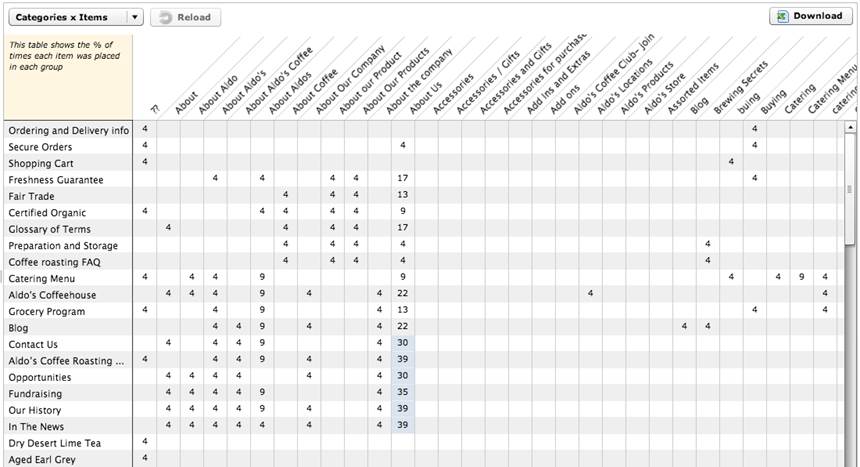
Figure 4. Item-by-category matrix
Because participants have the opportunity to create labels with no restrictions, the odds of exact matches across participants may be low. So, your role as analyst is to identify and group labels that are similar, if not exact. Examples from the sample card sort are the three labels “About,” “About Aldo’s,” and “About Aldo’s Coffee,” as well as the other “About” variations. In short, you will search for “themes” of labels. To find themes in card sort data, look for labels that
- use the same words, but contain typos,
- are variations on the same words (e.g., “Admin” and “Administration”),
- use synonyms (e.g., “Cart” and “Basket”),
- use similar words or phrases (e.g., “Contact Us” and “Contact Info”), and
- are similar in other ways (e.g., “Company Basics” and “About Us”).
For each of these themes, you will have to eventually choose one label to use. Your choice may be based on criteria such as the more common options you see on websites, specific terms preferred by the organization for whom you are creating the IA or even a preference for using short vs. verbose labels.
At this point, to help you manage your data, you may wish to create a table containing two columns. The first column should include a list of all of the category labels provided by all the participants. Once you create this list of category labels, go through the list and standardize the labels based on a theme as discussed above. In other words, reconcile any differences, whether they are due to plural disagreement (Chair vs. Chairs) or very close synonyms (Couch vs. Sofa). Place these standardized labels in the second column. Many online tools also allow you the ability to standardize the category labels.
For the moment, consider these labels placeholders. Remember, you still aren’t making a final decision about categories or labels. You’re just standardizing the data so you can determine the level of agreement you have at this point of your analysis.
Review the Items Placed in the Categories
Now that you have a first pass at your categories, and you have a first pass at standardized category labels, you will want to take a closer look at your data to see whether there is enough agreement between items within the category before moving on to the next step. This can be done with the item-by-category matrix (Figure 4). Results are presented in a table with categories on one axis and the individual content items on the other. As mentioned before, cells for each pair contain the percentage of times participants placed the item into that category. Cells are also color-coded to indicate how strong the association is. In some online tools, (Figure 4) the colored background cells indicate the highest percentage of times, whereas in other online tools, the background color graduates in darkness. The darker the background color, the higher the percentage is of participants who used this mapping.
Next, look at the percentages for an item across the different categories participants provided. Do you have a lot of items with high percentages across few categories (high agreement)? Or, do you have a lot of items with low percentages across many categories (low agreement)? If your answer is the latter, then you’ll need to understand why. Again, this may be due to having two or more distinct participant groups who have very different mental models of the content. If you haven’t already, try separating your participants into two different groups based on relevant demographics and recheck the matrix for each group separately. If splitting the data doesn’t result in stronger agreements, or if you didn’t even have enough agreement to get that far, then your dataset needs to be more closely examined. Again, recheck for outliers and try removing them from the data to see if results become clearer.
Finalize Categories and Category Labels
Up to this point, you’ve made a first pass at creating a set of categories for your IA. You’ve looked at how participants have grouped items using tools such as the item-by-item matrix and the dendrogram. You’ve made an initial pass at assigning labels to these categories using the item-by-category matrix and by standardizing the category labels to account for minor discrepancies. You’re about 85% of the way there! Now it’s time to take another pass at the data to choose the final category labels.
Finalizing a set of labels can be a challenge that requires you to truly understand what types of categories the participants created, and why they put a particular set of items into each category. Not only will this help you finalize the standard list of categories, it will also help you understand the strategies the participants used, which can be useful later when categorizing items that were not included in the card sort.
There are a couple of approaches to the task of selecting final labels. Approach 1 involves carefully reviewing each item in each of the categories generated by participants. This is the more thorough approach and is only really feasible when there are a limited number of categories, such as fewer than 10. Typically, the larger the number of participants and items, the more categories will be created, making this approach potentially unwieldy.
Approach 2 is to review the category labels participants provided for each item, without a detailed review of each category as a whole. This latter approach is more feasible when there are many category labels. Both of these approaches are described in the following sections.
Approach 1: Review the Items in Categories
Start with the standardized categories generated earlier, but be open to modifying them. As you review the labels, look for the following:
- Items that some participants grouped together but others kept separate (e.g., “Organic” and “Fair Trade”). Later, you will make some decisions to determine whether to keep them together or separate them.
- Cases where the participants took different strategies for grouping items. In these cases, items would appear with some items in one kind of category and with other items in a different kind of category. For example, items such as Fair Trade Organic Water Process Terra Linda Decaf Tea might be grouped by coffee type (e.g., “Decaf Coffee ”) or by process (e.g., “Water Processed Coffee”).
- “Miscellaneous” categories. These categories usually contain items the participants did not know where else to put. Review the items to see if they can reasonably fit into another standardized category. If not, you may need to add a new category.
In the “Label the Top-Level Categories” section, you drafted a list of labels for each of the category labels participants provided. Review that list, and consider what you have learned by reviewing the items in each category as described above. Perhaps by looking at the data in more detail, you have uncovered different strategies people have taken. Alternatively, by exploring the categories in more detail, you may be better able to identify the final label for the information covered by that category.
Approach 2: Review Category Labels for Each Item
In this approach, start with the item-by-participant matrix (Figure 5). This matrix contains items in rows and participants in columns, with each cell showing the category label that participants provided for that item, usually sorted in the order of the tree diagram.
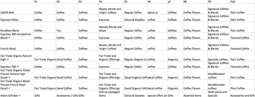
Figure 5. Portion of an item-by-participant matrix
You can review the matrix directly, but it may be helpful to create a document that displays one item per page, with all the category labels beneath it. This helps focus your attention on just one item at a time and allows you to see all the labels at once. You could easily do this by cutting and pasting the items and category names into an Excel spreadsheet.
Next, determine if the label you previously identified captures the essence of the strategy most commonly used for grouping that item. You may have to modify a standardized label slightly so that it better applies across related items.
Optional activities
At this point, you may wish to conduct a synonym analysis, in which you examine each label suggested by participants in light of the content of the categories. You can vet those labels that don’t seem to be a good fit by looking up their key terms in a thesaurus. If the term has more than a handful of synonyms, this suggests that differences among candidate terms may be subtle. In this case, you have some flexibility in choosing the exact term to substitute for one suggested by participants. However, if there are only a couple of synonyms, it’s hard to justify replacing one participant’s term with another. Having few synonyms indicates the term has rather specific meaning. Therefore, replacing it would likely forfeit its inherent character: You are essentially substituting your judgment for that of the participant. So, if there are only a couple of synonyms available for a key term, it’s probably best to accept the participant’s term if it seems to represent the content of a group.
You may also opt to use search engine and site search data to help you finalize your labels. You may use tools like Google Trends, for example, to compare words to see which one gets searched for more often. If you have access to actual site search data of the existing site (if one exists), or of other similar sites, you can also look up the words you are curious about and find out how many people searched for them, thereby comparing their popularity.
There are also other business considerations you should address prior to finalizing the category labels. These include the following:
- Branding and other business considerations. Certain words or phrases may be important for a business to use within the interfaces of its web properties. As such, category labels may benefit from including key marketing messages, tag lines, or branded words. It is critical, however, from a UX standpoint, to ensure that the needs of the business do not result in unclear category labels. The ultimate goal of a card sort is to help create a positive UX. If branded words or terms detract from ease of use or any other aspects of the overall user experience, they should be used elsewhere in the interface, rather than as category labels.
- Copyrights, trademarks, and other legal considerations. Certain terms may be unavailable due to copyrights or trademarks precluding their use.
- Adherence to standards and guidelines. A business may have in place a set of guidelines or standards that dictate practices around their interfaces, including terminology use. An example of such a standard would include, for example, “Whenever appropriate, use action verbs in category labels, such as ‘Apply for a Loan’ as opposed to ‘Loans’.”
- General editorial considerations. You should also address tone, tense, and other typical editorial considerations when determining the appropriateness of category labels.
Create Second-Level Categories
Depending on the number of items included in the original card sort study, and therefore in the resulting categories, it may be necessary to create subcategories from the top-level categories. The more content a website has, the more the need for subdividing categories so that the user can drill down through the content hierarchy as efficiently as possible4. The dendrogram included in most of the online card sorting tools makes this task relatively easy.
The other important point to realize before further subdividing the categories is that all of the rich data created by either manual methods or online tools to arrive at the top-level categories and labels will not be available for the subcategories. In other words, the participants did not create labels for the subcategories that you’re about to infer. But, at least your attempt will be based on the varying labels participants suggested for the top-level categories.
Once you decide to further break the large categories apart into subcategories, you have to first determine which categories are good candidates for such subcategorization. Characteristics of categories that are good candidates for subdividing include the following:
- Large categories, especially compared with others. By breaking the large categories into smaller subcategories, the users will not have to sort through a large amount of content to find what they are looking for. Rather, they can decide from among a small number of “chunks” of content, then drill down into the one most appropriate.
- “Large” is somewhat subjective and relative. Ideally, when possible, categories should be generally uniform in size (except for items such as “Contact Us” which may be very small by nature). And, it’s important to remember that because the content used for a card sort does not typically include all of the content in a website (just a representative sample), the size of actual categories when you’ve included all of the content will likely differ from what you see in the dendrogram.
- Categories whose content has a larger degree of heterogeneity of content than other categories. Although the content items may be related to one another, when you look at the content in the website that wasn’t included in the card sort, it may become obvious that the category could easily be broken apart to accommodate subcategories.
For this discussion, assuming that you settled on seven top-level categories for your IA, we’ll focus on a large category beginning with “Organic Guatemala Santa Isabel” that contains 26 content items (Figure 6).
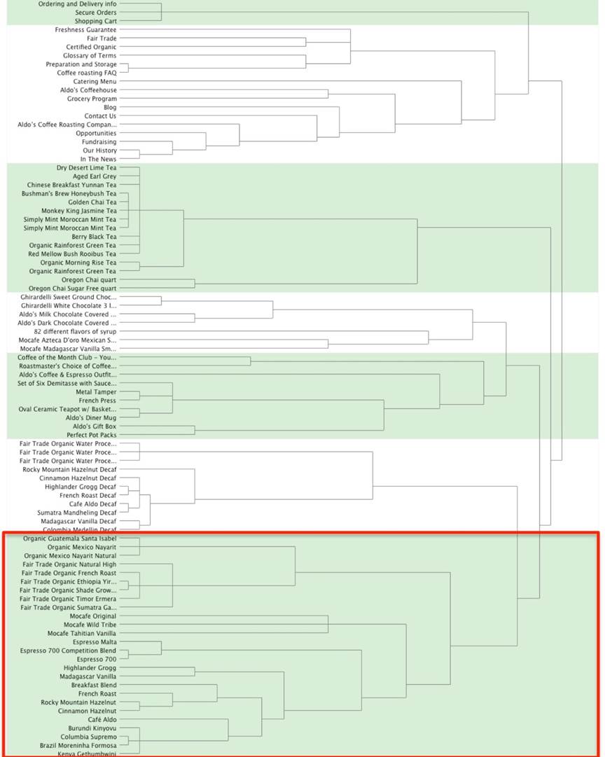
Figure 6. Dendrogram of all seven categories
The large category does not begin to break apart until you move the slider to create 12 categories. The large category breaks into two subcategories: one containing a group of organic and fair-trade coffee and another group containing everything else (Figure 7).
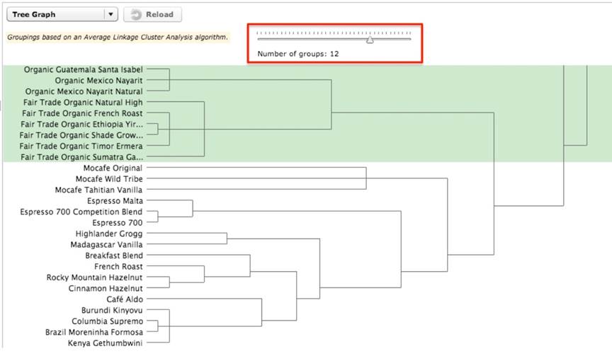
Figure 7. Seventh category subdivided into two categories
As you move the slider further to create 16 categories, another break occurs to create three subcategories from the original one large category (Figure 8). You can perform this process not just once, but multiple times, with each subsequent iteration consisting of creating more categories containing fewer items.
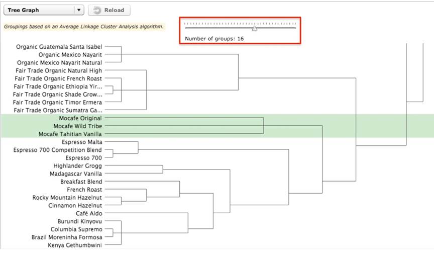
Figure 8. Seventh category subdivided into three categories
As you continue to “play” with the categories to see if they break up easily into subcategories, it’s important to continue referring back to all of the content of the website to see how it will fit into the new subcategories you’re creating. That should definitely influence your decision about the number of subcategories to create by manipulating the dendrogram slider.
As mentioned previously, you may be able to derive labels for the new subcategories by reviewing the item-by-category matrix. In this example, if you decide on a final category of “Coffees,“ by breaking out the large group further, you can see that the users grouped the organic and fair trade coffees together in Subcategory 1. Based on the category labels participants assigned, some variation of “Fair Trade Coffees” and “Fair Trade Organic Coffees” appear multiple times in the list. Settling on a label for the second category above is more difficult because there are not any labels specific to these few items in all of those participants assigned. At this point, you may need to conduct some independent research to better understand what a “mocafe” coffee is. Because one appears to be a vanilla flavored coffee, you might consider breaking this small group apart and grouping the “Mocafe Tahitian Vanilla” with the other flavored coffee.
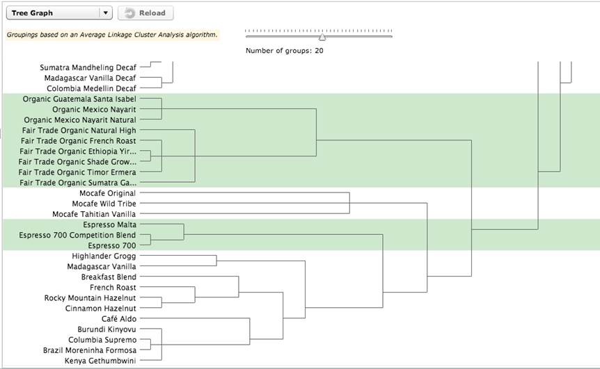
Figure 9. “Espresso” and “Blends” subcategories
In Figure 9, the espresso coffees and the blends and flavored coffees break apart further into subcategories. However, even in this blend and flavored category, some of the coffees, such as “French Roast” and “Columbia Supremo,” are not true blends or flavored coffees. You will probably need to remove them from this category and find a more appropriate group for them. Separating the data of the “coffee connoisseur” user type from the more general “coffee drinker” user type would likely give you a more technically accurate categorization and labeling of the different coffees. However, at this point, you will have to carefully consider the audience(s) for the website when attempting to determine subcategories and labels. If the audience does not largely consist of coffee connoisseurs, you will have to balance the categories and labels carefully to not alienate casual coffee drinkers, but also not to inaccurately categorize a coffee so that a connoisseur would be unable to find it on your site. Obviously, because the online tool used here as an example did not allow the users to create the subcategories and exact labels, you will be making subjective assumptions based on the data you do have.
If this exercise of further defining subcategories and labels seems too subjective, you could conduct subsequent card sorting studies for each of the top-level categories to arrive at second and third level categories and labels. Essentially, you’ll be conducting a card sort of the items within each of the top-level categories. Unfortunately, this is seldom feasible.
You have additional alternatives. Take a stab at defining the subcategories and labels and then do the following:
- Conduct a usability test of all levels of your IA. Identify the areas of concern, create representative tasks, and have users identify where in the IA they would navigate to find the items. Unfortunately, you typically will not be able to test each and every item, but you can structure the test so that you can test representative and key items of concern.
- Create a closed card sort of the second-level categories. Have your participants sort the items into each of those categories. Allow the participants to rename the labels you’ve assigned. You could also do this starting with the third level and then next the second level, depending on your time and resources.
Creating subcategories and labels using data that is really only intended for top-level categories is a bit of an art, and perhaps, more trial and error than most might find comfortable. On the other hand, that data has been created by the actual users—always a better alternative than starting from your own best guesses based on your individual experiences and knowledge that might be very different from your user population’s.
4Deciding on breadth vs. width of categories is a topic covered extensively in the IA literature and will not be discussed in depth here.
Summary and Conclusions
As we stipulated early in this article, with card sort data analysis, the devil is in the details. This article provides many of those details. But while it is not necessary to always perform all of these steps, the value of a rigorous approach to card sort data analysis is twofold:
- First, and most critically, by bringing rigor to this process, we can ensure that the IAs we create are truly informed by our users, resulting in IAs that work for them.
- Second, by bringing a strong measure of objective data gathering and analysis to this task, UX practitioners can continue to add unique value to the design and development process.
Our data driven perspective is, in large measure, what makes us valuable to product teams. Our methods do and should continually evolve, as we further strengthen our approaches and meld science and art to create useful, usable, and engaging user experiences.
The authors of this document acknowledge that tools and practices evolve over time, and we welcome the input of the reader to contact us with ideas and suggestions for new and better ways to analyze card sort data.
References
- Miller, G. A. (1956). The magical number seven, plus or minus two: Some limits on our capacity for processing information.
Psychological Review, 63 (2) 81–97. - Hudson, W. (n.d.). Card sorting–Introduction. Syntagm—Design for Usability. Retrieved December 2012 from http://www.syntagm.co.uk/design/cardsortintro.shtml.
- Sauro, J. (2012, April 3). 10 things to know about card sorting. Measuring Usability. Retrieved December 2012 from http://www.measuringusability.com/blog/card-sorting.php
- Sauro, J. (2012, July 17). Card sorting + tree testing: The science of great site navigation.
Measuring Usability. Retrieved December 2012 from https://www.measuringusability.com/blog/cardsort-tree-test.php - Spenser, D. (2003, April 7). Card-based classification evaluation. Boxes and Arrows. Retrieved December 2012 from http://boxesandarrows.com/view/card_based_classification_evaluation.
- Spencer, D., & Warfel, T. (2004, April 7). Card sorting: A definitive guide.
Boxes and Arrows. Retrieved December 2012 from http://boxesandarrows.com/view/card_sorting_a_definitive_guide - Tullis, T., & Wood, L. (2004, June 7). How many users are enough for a card-sorting study? Retrieved December 2012 from http://home.comcast.net/%7Etomtullis/publications/UPA2004CardSorting.pdf