
Abstract
The current study examines the key theoretical mechanism that underlies warm interface aesthetics—designs that evoke feelings of friendliness and comfort—with the aim to uncover their psychological impact on user perception and behavioral intention. We conducted an online experiment that varied corner shapes across the user interface components of a bill-split mobile app (rounded versus angular; N = 187), and we identified that curvature in the app design evoked greater perceived aesthetics and warmth, which subsequently increased perceived ease of use and user satisfaction. Further, we showed that the perceived warmth, which was evoked by the rounded app design, translated a visceral impact of beauty into users’ intentions to donate remaining funds to a local charity. Our findings expand the literature on human-computer interaction (HCI) with strategic communication to inform the persuasive design of digital interfaces in a way that optimizes the user experience of mobile apps for service providers and nudges users to act in the greater good.
Keywords
mobile app, interface design, aesthetics, usability, warmth, persuasion
Introduction
As an essential element of aesthetics, shapes serve as ubiquitous cues for us to form impressions of the individuals and objects we encounter. Whereas round features like those of an infant’s face can promote a sense of protectiveness and care (Papanek, 1995), sharp edges are associated with harmful objects such as knives, signaling threat in the environment (Bar & Neta, 2006). A stable preference for curvature has been validated across designs of products, typefaces, and architectural interiors, in which people consistently rated curved stimuli to be more visually attractive (Westerman et al., 2012; Wang & Hsu, 2020; Vartanian et al., 2013).
The automatic, implicit nature of human contour bias extends the way in which users investigate and heuristically process aesthetics in usability and web design, creating a halo effect that “what is beautiful is good” (Dion et al., 1972). Aesthetics seemingly imbue stimuli with human attributes such as emotions and personalities, and they provide a reliable first impression and social judgement beyond surface attributes (Lindgaard et al., 2006). This halo effect has been extended to digital interface research as “what is beautiful is usable” (Tractinsky et al., 2000), and mixed results have emerged regarding both direct and indirect links between the design and function of a media interface. For instance, perceived goodness, as an overall evaluation of the system, and emotional reactions were found to mediate the effects of design aesthetics on pragmatic quality (Hassenzahl & Monk, 2010; Bhandari et al., 2017). But what users perceive as goodness has remained an unanswered question. Further, while attractive interfaces were found to enhance purchase intention and loyalty for commercial vendors (Kumar et al., 2018; Arifah & Juniarti, 2021), whether—and how—surface beauty could add persuasive appeal to nudge individuals to act for the greater good has rarely been examined.
To address these gaps in the prior literature, the current study aimed to make two main theoretical contributions. First, we extended the prior literature on the aesthetic-usability effects in web design by introducing the perceived warmth of user interfaces (such as the friendly nature of a service provider) as the key theoretical mechanism to explain the positive psychological impact of aesthetics on usability and user satisfaction of a mobile app. Second, we expanded user interface research to the field of strategic communication to highlight the unique contribution of warm interface aesthetics that predict prosocial behavior. Specifically, by connecting a mobile payment app’s visual appeal with users’ intention to donate, we sought to demonstrate how the rounded aesthetics of the interface render the app a beautiful, warm source to relay prosocial messages and requests.
In summary, the current study first examined whether the aesthetic-usability effect was true in the context of a mobile payment app. We experimentally manipulated the corner shapes of interface elements in a between-subjects design, and we elevated the perceived aesthetics of the app. Further, to uncover the mechanism underlying the effects of a mobile app’s aesthetics on its perceived function and inherent goodness, we drew on perceived warmth as a social, affective factor to translate the visceral impact of beauty to usability (perceived ease of use and user satisfaction) as well as to users’ prosocial intention, which was credited to the warm interface.
Literature Review
Curvature in Design and Its Impact on Perceived Aesthetics
Rounded stimuli with curved contours endow positive emotions in users by implying semantic meanings such as safety and friendliness. When people smile, the curvature of their mouths and eyes acts as visual primitives that foster affinity; whereas the shape of angry faces resembles a downward pointing V with higher angularity, conveying toughness, threat, and confrontation (Aronoff et al., 1992). This implicit tendency of approach versus avoidance during social encounters has underlain people’s immediate judgment of curvature as aesthetic and appealing.
Curvature has also served as a pleasant atmospheric cue that is ubiquitous in physical and digital environments. Interior spaces with curved contours have been more likely to be judged as beautiful than rectilinear spaces (Vartanian et al., 2013). As such, Apple’s design system embedded diversified app icons within rounded squares across the board (Chen et al., 2021). The curvature of icons’ borders alludes to the concept of border radius in web design, which denotes how rounded an element’s corners are on an interface. Considerable research has shown that icons shaped as rounded squares have been rated as more aesthetic and visually pleasant, inducing higher user satisfaction (Deng et al., 2022; Liu et al., 2021; Niyazov et al., 2021). Research on the screen shapes of smartwatches also uncovered the associations between round (versus square) screens with positive emotional response and hedonic quality, suggesting the significant heuristic value of curvature to enhance wearables’ attractiveness (Kim, 2017).
Nonetheless, little research has examined the distinct merits of curvature in other ubiquitous interface components such as buttons, content cards, and dialogue boxes. Researchers have drawn on rounded or angular shapes as one interface element to manipulate aesthetics without systematic configuration of stimuli, confounding the effects of curvature with other interface attributes on attractiveness (Ben-Bassat et al., 2006; Thüring & Mahlke, 2007). Only one study to date isolated the effects of curvature applied in broader UI components through an affective lens, which revealed the positive correlation between curvature and soft, lively, and relaxed feelings (Deng, 2022). However, the participants evaluated the interface elements out of usage contexts—gray, blank boxes without content. The within-subjects design also challenged the validity of the derived efficacy of curvature as a subtle detail to enhance the interface’s visual appeal.
Therefore, our study sought to examine the unique contribution of curvature to users’ aesthetic experience by directly comparing rounded and angular corners across UI components in a mobile payment app. The between-subjects treatment of corner shapes and the applied usage scenario (for example, in a bill-split task) aimed to fill the gap in interface research by identifying curvature as an overlooked antecedent of perceived aesthetics in interface design. Thus, we proposed the following:
H1: Curvature in mobile app interface design will have a positive impact on perceived aesthetics; in other words, mobile apps with rounded corners will be perceived as more aesthetic than those with angular corners.
Aesthetic-Usability Effect
The visual appeal of an interactive system has evolved into a “must-have” from “nice-to-have” (Thielsch et al., 2019, p. 200) as users form their first impression of a web page within 50 ms (Lindgaard et al., 2006). This immediate judgment based on the website’s appearance has been shown to reliably influence users’ appraisal of other system attributes (Thielsch et al., 2019). Aesthetics in HCI design (such as colors, shapes, and symmetry) are the most accessible cues on an interface, and they activate users’ inference of other, less observable features including usability. Such a halo effect of initial aesthetic impression stems from the social psychology phenomenon that what is beautiful is good. This phenomenon, studied by Dion et al. (1972), links a person’s physical attractiveness with other favorable personality traits. This mechanism has been widely used to explain the aesthetic-usability effect; that is, users tend to perceive attractive products and systems as more usable. The original study, which put forth that what is beautiful is usable (Tractinsky et al., 2000), manipulated the aesthetics of a digitized ATM interface, finding that the interface’s aesthetics influenced perceived ease of use, both before and after actual system usage. Mobile interface aesthetics of bookmarked city guides and hotel booking sites were also found to influence perceived ease of use (Cry et al., 2006; Li & Yeh, 2010). Thus, in the current study, we proposed the following:
H2a: Higher perceived aesthetics will lead to greater perceived ease of use of the mobile app.
Combining H1 and H2a, we also proposed the following:
H2b: Curvature in interface design will indirectly influence perceived ease of use through perceived aesthetics.
The Halo Effect and the Role of Perceived Warmth in HCI
The halo effect of visual aesthetics is closely related to Norman’s discussion of emotional design (2004). Based on the three levels of design (Norman, 2004), visually appealing design elements have served as perceptual cues that are processed at the visceral level, evoking immediate affective reactions that induce a favorable evaluation of the system’s intrinsic quality at the reflective level. The generalized positive feelings induced by a visually pleasant interface may not only color users’ evaluation of the app’s functionality but also affect social responses toward the digital entity. Our study proposed that perceived aesthetics functions like the physical attractiveness of a mobile app, which prompts users to ascribe socially desirable attributes such as warm, friendly, and approachable to the app.
As a fundamental dimension of social judgment, perceived warmth pertains to the inference of an entity’s intent or motive, which has been shown to manifest in service encounters and brand personalities, fostering consumer-brand relationships (Fiske et al., 2007; Kolbl et al., 2019; Liu et al., 2018). In light of the phenomenon that what is beautiful is good, the perceived warmth of a mobile app was posited to translate the effects of design aesthetics into usability outcomes. In other words, warmth serves as the proxy for goodness and signals that the app’s user-friendly nature is devoid of ill intent from the service provider. Thus, we proposed the following:
H3a: Higher perceived aesthetics will lead to greater perceived warmth of the mobile app.
Combining H1 and H3a, we also proposed the following:
H3b: Curvature in interface design will indirectly influence perceived warmth of the mobile app through perceived aesthetics.
The Effect of Perceived Warmth on Usability
Research that established the direct link between perceived warmth and ease of use has been scarce, with most HCI studies on warmth perceptions focusing on virtual agents (not visual interface design elements). In a survey chatbot study (Kim et al., 2019), users described chatbots with a casual conversational style as warm and friendly, but this perception did not differentially impact the chatbots’ perceived ease of use compared to those with a formal tone of voice. In the context of human-AI collaboration, Khadpe et al. (2020) manipulated expectations of warmth by introducing the AI agent with metaphors, which indicated that the agent was modeled after social roles such as a toddler, teenager, professional, or executive; however, no main effect of warmth was found on perceived usability both before or after usage.
However, the studies above focused on textual stimuli to prime warmth perceptions, which may not have exerted the same visceral impact as the visual aesthetics of a digital system, thus differently affecting users’ inference of functionality. Gilad et al. (2021) also pointed out the need for research on the perceived warmth of the widely-deployed, abstract AI systems that do not “attempt to personify their behavior.” To this end, our study sought to examine whether warmth perceptions of a mobile payment app, without explicit conversational cues, would transfer to a favorable usability evaluation. We posited that the more users perceive the mobile app as a warm entity (that is, a friendly, good-intentioned service provider), the more they will perceive the app as easy to use and helpful to complete tasks with efficiency and little effort. Thus, we proposed the following:
H4a: Greater perceived warmth will lead to greater perceived ease of use of the mobile app.
Combining H1, H3a, and H4a, we also proposed the following:
H4b: Curvature in interface design will indirectly influence perceived ease of use through perceived aesthetics and perceived warmth.
As another key component of usability, user satisfaction has been critical to initial adoption and continued usage, given frequent context-switching and users’ lack of patience in mobile contexts. Prior research that linked aesthetics with user satisfaction focused on the overall positive impression and the mood-elevating effects of visual appeal, which translated to felt contentment in the user experience and toward the service provider. For instance, Liu et al. (2018) found that rounded environmental cues in restaurants and healthcare facilities enhanced satisfaction through perceived warmth. Lee et al. (2016) also suggested that lodging websites could foster customer satisfaction through a warm atmosphere and a sense of intimacy on the interface. Our study employed perceived warmth as a social response toward the mobile app to deepen the understanding of this transfer process.
Thus, we proposed the following:
H5a: Greater perceived warmth will lead to higher user satisfaction.
Combining H1, H3a, and H5a, we proposed the following:
H5b: Curvature in interface design will indirectly influence user satisfaction through perceived aesthetics and perceived warmth.
The Persuasive Effects of Warmth
Perceived warmth speaks to social attributions such as an entity’s kindness and integrity, which underlie the development of trust and cooperative intention (Aaker et al., 2010). While consumers’ warmth perceptions of sustainable brands and non-profit organizations have been shown to promote their public endorsement of these entities (Bernritter et al., 2016; Gao & Mattila, 2014), little research has explored whether such warmth perceptions of digital interfaces can be robust enough to persuade users into choosing acts of kindness. Design aesthetics on an interface have been shown to prompt a positive impression of a digital system, which activates the warmth stereotype that a nice person is usually trustworthy and more likely to receive help in times of need (Fiske et al., 2007; Qiu & Li, 2008). Thus, perceiving an app as warm and caring via inspection of the interface could lead users to trust that the app, as a service provider, would be dependable in delivering on its promise and less self-serving in advancing its commercial interests (Pengnate & Sarathy, 2017).
Our study aimed to expand interface research to show that mobile apps can also function as persuasive social agents that activate warmth stereotypes. When a warm mobile app requests a donation on the interface, the perceived warmth induced by the app’s visual attractiveness could promote users’ intention to follow through with the prosocial request. Alternately, a mobile app design lacking the sense of warmth could have detrimental effects on such buy-in. Thus, we also proposed the following:
H6a: Greater perceived warmth of the mobile app will lead to higher intention to donate.
Combining H1, H3a, and H6a, we also proposed the following:
H6b: Curvature in interface design will indirectly influence intention to donate through perceived aesthetics and perceived warmth.
Research Opportunities and the Summary of Hypotheses
In summary, whereas prior literature showed an aesthetic-usability effect with positive psychological impact resulting from warm designs, research that examined the direct link between usability variables and perceived warmth has been scarce. In addition, prior research often relied on textual stimuli to prime warmth perceptions, which has yet to address the specific potential of visual aesthetics in a digital system to influence users’ social responses. Our study sought to examine the unique contribution of curvature to mobile media experience by comparing rounded and angular corners across interface components in a mobile payment app. Combining the aesthetic-usability effect with perceived warmth and persuasion variables, we proposed that a mobile interface that looks warm not only enhances user evaluation of the app’s functionality, but it also induces greater social responses associated with the warmth perception. Therefore, our study aimed to expand the literature on the role of aesthetics in persuasion and the growing body of research that applies perceived warmth to HCI design. By aligning the usage context of a mobile payment app with the persuasion context of soliciting users’ donations to local charities, we sought to demonstrate how psychological warmth translates the perceptual merits of interface aesthetics into prosocial behavioral intention.
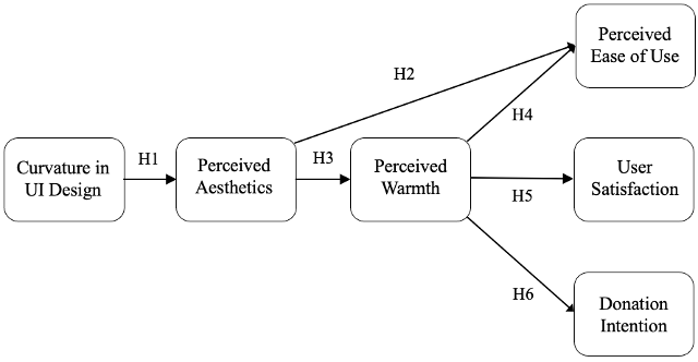
Figure 1. A summary of the research model that includes our hypotheses.
Motivation Example
To portray the relation between mobile app design and warmth perceptions that may foster donation intention, we drew on the interface designs of two bill-split apps in the market, Splitwise™ and eleia™, as contrastive examples. The cool-toned colors and rigid corners of the UI components of Splitwise imbue the app with a relatively serious, aloof personality. Such discrepancies between the app’s cold appearance and its socially warm donation request could deter users from being persuaded to opt for good deeds because the users might not have perceived the app’s request as genuine. In contrast, the app design of eleia is more compatible with a prosocial call-to-action, given its exuberant warmth on the interface. However, it has been difficult to confirm whether the lack of curvature (rigid, angular corners), independent of other design features (such as colors and illustrations), is responsible for such perceptions. Although warm colors could work as a strategy to compensate for the lack of perceived friendliness, we decided to focus on border curvature, a more subtle yet ubiquitous styling attribute, to investigate whether and how it can independently elevate users’ warmth perceptions toward the app in a way robust enough to persuade users into donation.
Methods
Study Design and Procedure
We conducted an online experiment with curvature as the between-subjects factor to examine the hypotheses. Curvature in mobile app design was the independent variable in the current study, which was operationalized by the corner shapes of UI components (rounded versus angular). Participants were randomized into either the rounded or angular condition after completing informed consent and a pre-survey about their media usage. They were instructed to imagine using a mobile payment app to split dine-out bills with friends by clicking through 11 interface screenshots. They were not allowed to advance to the next page until after 5 s for each screenshot. The last screenshot included a donation request with their remaining budget, followed by a question assessing their intention to donate. Afterward, participants evaluated the mobile app in a post-questionnaire that measured perceived aesthetics, perceived warmth, perceived ease of use, and satisfaction. Last, participants reported demographic information.
Our study adopted an ontological manipulation (Sundar, 2008) common in usability and design research to examine how objective design features impact users below their consciousness (Chen & Sundar, 2023; Dou et al., 2012; Sun et al., 2024; Sundar, 2008). Thus, a manipulation check that asks whether participants noticed the design element was not deemed meaningful in the current study’s context because the goal of curvature manipulation was to alter the intrinsic design property of the interface, rather than to ensure that participants consciously recognized the roundedness of design elements. O’Keefe (2003) pointed out that when media stimuli are defined in terms of their intrinsic features, conventional manipulation checks are unnecessary. Sundar (2008) also argued that interface cues (operationalized as curvature in our study) can impact judgment and attitudes through users’ unconscious processing of their media experience. Thus, our manipulation check measured the perceived aesthetics of the mobile app design as the theoretical mechanism that explains the psychological effects of rounded versus angular design.
Stimulus
Bill-split apps were selected as the focal stimuli in this study because of their rising popularity and the mixture of financial implications and social media affordances (Li et al., 2021). We chose this use case (specifically, splitting dine-out bills among friends) because of its hedonic and utilitarian contexts, so we could cover the varied mindsets that occur when users engage in different tasks (Acker & Murphy, 2020). To maximize ecological validity, 11 screenshots (Figures 3a and 3b) were created based on existing bill-split apps and industry guidelines for mobile interface design to encapsulate primary touchpoints of a bill-split task. The user interface components included navigation menus, content cards, icons, buttons, toggle switches, numeric-input fields, progress indicators, and dialogue boxes, which served informative functions or conveyed affordance in the context of mobile payment (Neil, 2014; Laubheimer, 2016). We systematically varied corner curvature (rounded versus angular) across all UI components within the same shape condition to ensure the validity of curvature manipulation. Further, all verbal and visual content and layout were held consistent across conditions except for how rounded the corners were for each interface component; neutral colors (such as gray, white, and muted brown) were used based on prior visual perception research to isolate curvature’s effects (Allen et al., 2017; Lavie, 1997).
Based on previous interface research on design aesthetics, participants viewed static screenshots—rather than interactive prototypes—to minimize potential confounding aspects from usability issues such as navigability and loading time (Chaouali et al., 2019; Mohadis et al., 2016; Kim & Fesenmaier, 2008). The current study focused on users’ visual impression of the mobile app interface and inference of usability from their anticipated user experience (Silvennoinen et al., 2014; Van Schaik et al., 2012). The screenshots were arranged in an order that simulated the actual user experience of splitting bills on the mobile payment app, with key interaction patterns that enhanced the participants’ perceived realism of experience. A homepage showing recent bills and friend groups was presented first to participants, followed by the Dine Out Buddies screenshots that depicted how users settle restaurant bills. Settling bills included responding to payment requests as well as sending requests to split amounts for shared items. Next, participants viewed a Monthly Spending page that summarized their expenses into categories and days of the week, followed by the final screenshot of a pop-up window with a request to donate $5 out of the initial $36 remaining in their weekly entertainment budget to a local conservation charity (Figure 4). We chose requesting donations with budget reminders to assess users’ prosocial intention given its alignment with the usage context of a mobile payment app; presenting the request as the final call to action of the simulated experience allowed users to perceive higher actionability and relevance of such a request at the end of the bill-split task while reviewing their spending summary. However, we recognized that clicking through static screenshots represented different interaction patterns from real app usage, in which users have more flexibility and engagement with interactive interfaces. Further, we discussed the constraints of this stimulus choice and made suggestions for future research, which appear in the “Limitations” section of this paper.
Figure 2a. Stimuli for the rounded design condition.
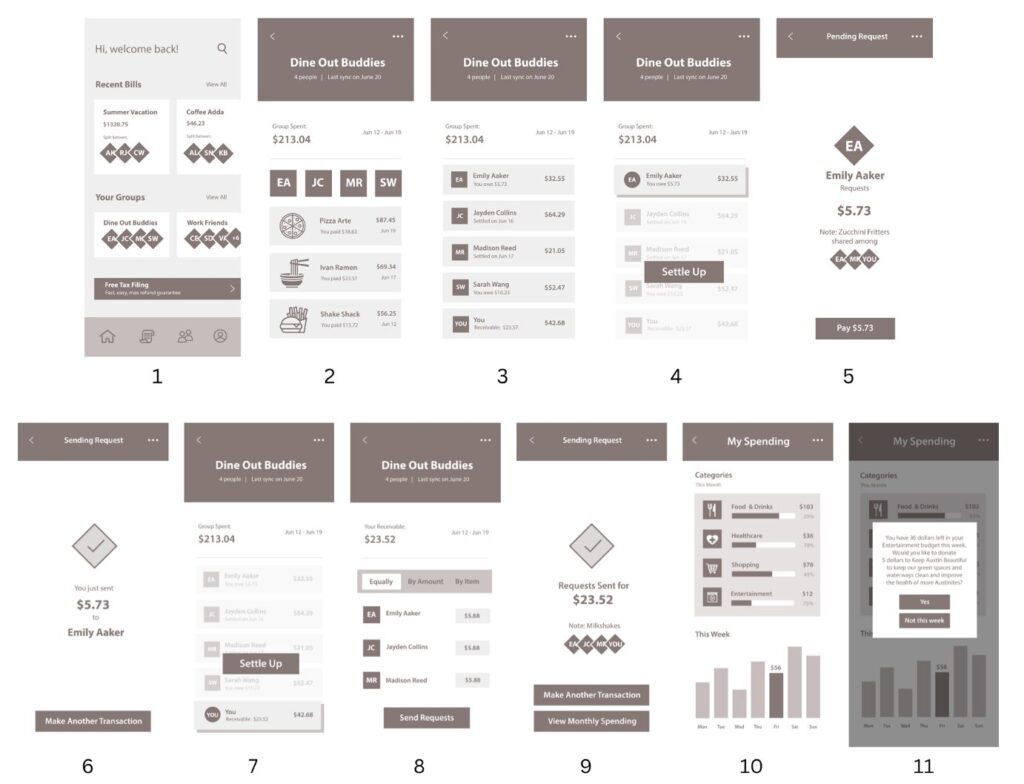
Figure 2b. Stimuli for the angular design condition.
Stimuli were presented to participants following the numerical order below each screenshot.
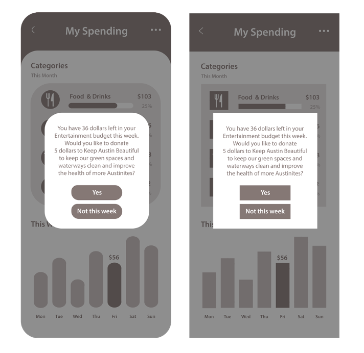
Figure 3. The pop-up window assessed donation intention in rounded (left) and angular (right) conditions, respectively.
Participants
One hundred eighty-seven undergraduate students (66.8% female, Mage = 20.35, SDage = 1.47) were recruited from a participant pool at a large American university. This research was approved by the Institutional Review Board at the university where the study was conducted (IRB# STUDY00003364). We obtained informed consent from participants prior to the pre-questionnaire. Students voluntarily participated in the study in exchange for the same amount of course credit regardless of performance and other individual factors in their responses. Data was collected through an online survey administered by Qualtrics® over the course of 22 days. Of the participants, 36.9% self-identified as Caucasian, 31.6% as Hispanic, 18.7% as Asian, 9.1% as African American, and 3.2% as other. The sample size (N = 187) was sufficient considering that curvature is the only between-subjects factor in our experiment. This student sample was deemed suitable for our study given their frequent usage of mobile apps, which afforded the appropriate level of familiarity and expertise to evaluate apps’ usability and user experience; the bill-split scenario also pertained to their daily consumption experience in college life, rendering them reflective of the user base of a mobile payment app (Lazar et al., 2017).
Measurements
Mediating Variables
Perceived Aesthetics
Perceived aesthetics was measured by 3 items (Li & Yeh, 2010): “The overall look and feel of the mobile app are visually appealing,” “The mobile app looks professionally designed,” and “The design of the mobile app is attractive” (M = 4.63, SD = 1.51, α = .89; 1 = Strongly disagree and 7 = Strongly agree).
Perceived Warmth
Participants rated the mobile app with the following 4 adjectives (Liu et al., 2018): “friendly,” “well-intentioned,” “trustworthy,” and “warm” (M = 5.25, SD = 1.04, α = .83; 1 = Not at all and 7 = Extremely).
Dependent Variables
Perceived Ease of Use
Perceived ease of use was measured by 4 items (Venkatesh et al. (2012): “Paying with the mobile app is clear and understandable,” “Paying with the mobile app would not require a lot of my mental effort,” “I find the mobile payment app easy to use,” and “I find it easy to get this mobile payment app to do what I want it to do” (M = 5.28 , SD = 1.14 , α = .90; 1 = Strongly disagree and 7 = Strongly agree).
User Satisfaction
Three items measured participants’ satisfaction from the simulated app experience (Zhou, 2013): “I feel satisfied with using this mobile payment app,” “I feel contented with using this mobile payment app,” “I feel pleased with using this mobile payment app” (M = 5.34, SD = 1.17, α = .95; 1 = Strongly disagree and 7 = Strongly agree).
Donation intention
The last screenshot in the stimulus included a donation request showing $5 out of their remaining budget of $36 on the app, immediately followed by a question asking their intention to donate. Participants indicated their intention to donate to a local charity on a 9-point semantic-differential scale anchored by “unlikely” and “likely” (M = 3.91, SD = 2.58, skewness = .487, kurtosis = -.943).
Control Variables
Three variables were controlled for all analyses. Since gender has been shown to influence aesthetic perceptions in prior research (Cyr & Bonanni, 2005; Tuch et al., 2010), we controlled for participants’ gender throughout the analyses (coded as female = 1, non-female = 0; 66.8% identified as female). Participants’ recall memory of the app design was evaluated by asking them to identify the interface style that they saw during the app evaluation. Four choices were presented, mixing rounded and angular designs. This question was asked at the very end of the study in order to avoid any priming effect. Only 64.2% of participants successfully recalled the precise design of the mobile app, which supported our argument that the design manipulation was more ontological than perceptual. We did control for this variable (1 = correct and 0 = incorrect) because the shape-matching ability could indicate their existing sensitivity to visual design elements. However, including this as a control variable did not significantly impact any of the results reported below. The current study was part of a larger study that manipulated cognitive load as another factor, so we also controlled for this manipulated factor throughout the analyses. Controlling for this factor, or not, did not change any of the results reported in Table 1.
Table 1. Summary of Measurement Items
| Variables | Α | M(SD) | Items |
| Perceived Aesthetics (Li & Yeh, 2010) | .89 | 4.63 (1.51) | “The overall look and feel of the mobile app is visually appealing.” “The mobile app looks professionally designed.” “The design of the mobile app is attractive.” |
| Perceived Warmth (Liu et al., 2018) | .83 | 5.25 (1.04) | “friendly,” “well-intentioned,” “trustworthy,” and “warm” |
| Perceived Ease of Use (Venkatesh et al., 2012) | .90 | 5.28 (1.14) | “Paying with the mobile app is clear and understandable.” “Paying with the mobile app would not require a lot of my mental effort.” “I find the mobile payment app easy to use.” “I find it easy to get this mobile payment app to do what I want it to do.” |
| User Satisfaction (Zhou, 2013) | .95 | 5.34 (1.17) | “I feel satisfied with using this mobile payment app.” “I feel contented with using this mobile payment app.” “I feel pleased with using this mobile payment app.” |
| Donation Intention | N/A | 3.91 (2.58) | “Please indicate how likely you are to donate to Keep Austin Beautiful with the leftover $5 in your Entertainment budget.” (9-point semantic-differential scale anchored by “unlikely” and “likely”) |
Note: Donation intention is a single-item measure.
Results
Data Analysis
SPSS® version 28.0 was used to analyze data from the experiment. A general linear model (GLM) was employed to examine the main effects of curvature on perceived aesthetics of the mobile app (H1). The indirect effects of curvature on user perceptions and intentions were examined by using Model 4 and Model 6 from the PROCESS macro (Hayes, 2018) with 5,000 bootstrap samples and 95% confidence intervals, which allowed for high study power and low risk of type 1 error (Hayes 2009; 2018). Model 4 enabled us to investigate how one variable mediates the effects of the key predictor on the outcome variable; Model 6 allowed us to examine the impact of one or more mediators within the same model because it calculated the indirect effects for different mediating paths as well as the standardized and unstandardized regression coefficients for each predictor (Hayes, 2018).
First, to validate the aesthetic-usability effect and then extend it with perceived warmth as the mechanism, we used Model 6 from the PROCESS macro (Hayes, 2018) to examine the serial mediation from curvature to perceptions of aesthetics, warmth, and ease of use. Specifically, we tested the significance of the following two indirect effects in this model to examine our proposed hypotheses: H2—Curvature leads to perceived aesthetics, which leads to perceived ease of use; H4—Curvature leads to perceived aesthetics, which leads to perceived warmth, which leads to perceived ease of use. Second, we used Model 4 from the PROCESS macro (Hayes, 2018) to examine the indirect effects of curvature on perceived warmth through perceived aesthetics (H3). Last, we conducted two serial mediation analyses (Model 6, Hayes 2018) to examine the affective and prosocial outcomes from perceived warmth induced by interface aesthetics with user satisfaction (H5) and donation intention (H6) as the dependent variables, respectively.
We acknowledge that, given the static nature of our stimuli, the measured outcomes might not accurately represent how users perceived and experienced a real interactive mobile app. Participants might have focused more on the visual design aspects of their simulated app experience without actionable UI components, potentially inflating their perceptions of aesthetics that set in motion other tested effects. However, this stimulus choice also disentangled the unique impact of curvature while controlling for interactive factors that confound usability evaluation. Because the central aim of our study was to examine and extend the aesthetic-usability effect and the halo effect of visual design on persuasion, testing with static screenshots devoid of interactive components more robustly demonstrated how the beauty heuristic alone could steer users’ social and usability judgment.
The following sections provide the results for the hypotheses we tested with each statistical method. Table 2 and Figure 5 summarize the results from the tested models.
Table 2. Summary of Hypotheses
| Hypotheses | Results |
| H1: Curvature in mobile app interface design will have a positive impact on perceived aesthetics; in other words, mobile apps with rounded corners will be perceived as more aesthetic than those with angular corners. | Supported |
| H2a: Higher perceived aesthetics will lead to greater perceived ease of use of the mobile app. | Supported |
| H2b: Curvature in interface design will indirectly influence perceived ease of use through perceived aesthetics. | Supported |
| H3a: Higher perceived aesthetics will lead to greater perceived warmth of the mobile app. | Supported |
| H3b: Curvature in interface design will indirectly influence perceived warmth of the mobile app through perceived aesthetics. | Supported |
| H4a: Greater perceived warmth will lead to greater perceived ease of use of the mobile app. | Supported |
| H4b: Curvature in interface design will indirectly influence perceived ease of use through perceived aesthetics and perceived warmth. | Supported |
| H5a: Greater perceived warmth will lead to higher user satisfaction. | Supported |
| H5b: Curvature in interface design will indirectly influence user satisfaction through perceived aesthetics and perceived warmth. | Supported |
| H6a: Greater perceived warmth of the mobile app will lead to higher intention to donate. | Not Supported |
| H6b: Curvature in interface design will indirectly influence intention to donate through perceived aesthetics and perceived warmth. | Supported |
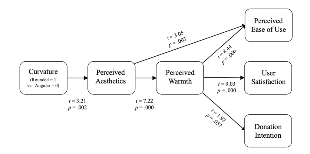
Figure 4. Summary of the results.
H1. The Effects of Curvature on Perceived Aesthetics
Supporting H1, which predicted the benefits of curvature in enhancing perceived aesthetics, the results from the GLM analysis showed that participants perceived the mobile app with rounded interface components to be more aesthetic (M = 5.00, SE = .16) than the app with angular interface components (M = 4.30, SE = .15; F (1, 182) = 10.29, p = .00, η2 = .05).
H2: Curvature, Perceived Aesthetics, Perceived Ease of Use
Model 6 of the PROCESS macro with 5,000 bootstrap samples (Hayes, 2018) was employed to examine the relationships among interface curvature and user perceptions of the app’s aesthetics, warmth, and ease of use. First, the mobile app with rounded corners (coded as 1) significantly enhanced aesthetic perceptions compared to the version with angular corners (coded as 0) (t = 3.21, p < .01) as reported above. Higher perceived aesthetics induced by curvature (rounded versus angular) positively predicted perceived ease of use (t = 3.05, B = .15, SE = .05, p = .003). As a result, the indirect path from curvature to perceived ease of use via perceived aesthetics was also significant (B = .10, SE = .05, 95% CI from .026 to .213). Thus, H2a and H2b were supported.
H3: Curvature, Perceived Aesthetics, and Perceived Warmth
Supporting H3a and H3b, results from Model 4 of the PROCESS macro with 5,000 bootstrap samples showed that perceived aesthetics positively predicted perceived warmth (t = 7.22, B = .33, SE = .05, p = .000). Further, the indirect path from curvature to perceived warmth via perceived aesthetics was also significant (B = .23, SE = .08, 95% CI from .090 to .397).
H4: Curvature, Perceived Aesthetics, Perceived Warmth, and Perceived Ease of Use
Data from the Model 6 reported above in examining H2 also showed that warmth perceptions of the app positively predicted perceived ease of use (t = 8.44, B = .59, SE = .07, p = .000). Further, the rounded interface significantly increased perceived ease of use through perceived aesthetics and perceived warmth (B = .14, SE = .05, 95% CI from .050 to .242); these results supported H4a and H4b. Table 3 summarizes the indirect effects of curvature on perceived ease of use via the serial mediation analysis (Model 6 of the PROCESS macro).
Table 3. The Indirect Effects of Curvature on Perceived Ease of Use
| B | SE | LLCI | ULCI | |
|---|---|---|---|---|
| Total indirect effect of CV on EOU | .16 | .11 | -.06 | .37 |
| Indirect effect 1: CV → PA → EOU | .10 | .05 | .03 | .21 |
| Indirect effect 2: CV → PW → EOU | -.08 | .08 | -.24 | .07 |
| Indirect effect 3: CV → PA → PW → EOU | .14 | .05 | .05 | .24 |
CV = Curvature, PA = Perceived Aesthetics, PW = Perceived Warmth, EOU = Perceived Ease of Use
H5: Curvature, Perceived Aesthetics, Perceived Warmth, and User Satisfaction
To examine H5, we conducted another indirect-effect test using the bootstrapped method reported above in which Model 6 of the PROCESS macro with 5,000 samples was run with satisfaction as the dependent variable, this time. The results showed that perceived warmth positively predicted satisfaction as well (t = 9.03, B = .67, SE = .07, p = .000). The serial indirect path from curvature to satisfaction through perceived aesthetics and perceived warmth was also significant (B = .16, SE = .05, 95% CI from .059 to .266). Thus, H5a and H5b were supported. Table 4 summarizes the indirect effects of curvature on user satisfaction.
Table 4. The Indirect Effects of Curvature on User Satisfaction
| B | SE | LLCI | ULCI | |
|---|---|---|---|---|
| Total indirect effect of CV on US | .09 | .11 | -.12 | .32 |
| Indirect effect 1: CV → PA → US | .03 | .04 | -.04 | .12 |
| Indirect effect 2: CV → PW → US | -.10 | .09 | -.27 | .09 |
| Indirect effect 3: CV → PA → PW → US | .16 | .05 | .06 | .27 |
CV = Curvature, PA = Perceived Aesthetics, PW = Perceived Warmth, US = User Satisfaction.
H6. Curvature, Perceived Aesthetics, Perceived Warmth, and Donation Intention
To examine the persuasive effects of interface design, we introduced intention to donate as the dependent variable in a serial mediation analysis using the same PROCESS Model 6 with 5,000 bootstrap samples. The positive effects of perceived warmth on intention to donate were marginally significant (t = 1.92, B = .40, SE = .21, p = .057), which does not support H6a. However, the indirect effect of a rounded interface on donation intention was still significant; the rounded interface was found to significantly increase perceived aesthetics and perceived warmth of the app, which in turn, enhanced donation intention (B = .09, SE = .05, 95% CI from .003 to .218). Thus, H6b was supported. Figure 6 summarizes the indirect effects of curvature on donation intention through the serial mediation of perceived aesthetics and warmth.
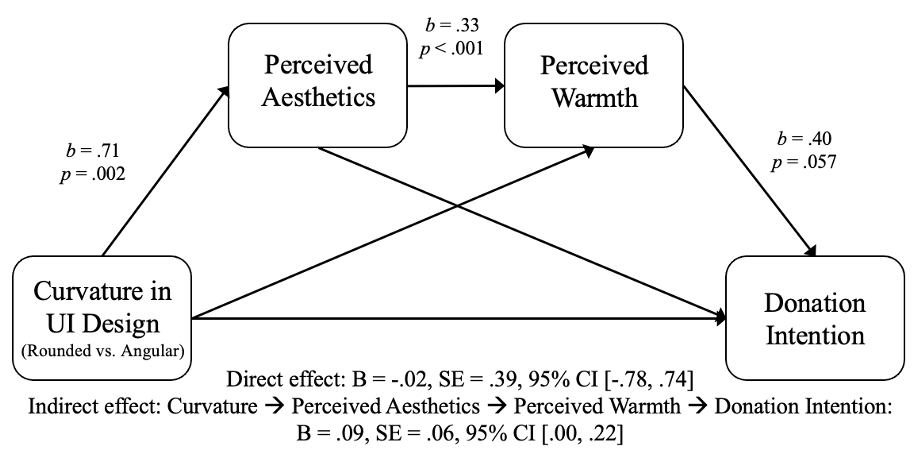
Figure 5. Results of the serial mediation analysis with donation intention as the dependent variable.
Discussion
Through an online experiment, the current study establishes curvature’s benefits to evoke aesthetic perceptions by varying the corner shapes of interface components within a mobile app (rounded versus angular). Perceived aesthetics of the app interface are shown to affect cognitive evaluation of the mobile app as a service provider and a digital product, which enhances perceived ease of use and user satisfaction. Moreover, by eliciting warmth perceptions toward the mobile app, the current study demonstrates the persuasive effects of aesthetics and perceived warmth on promoting users’ intention to donate to a local charity.
Highlighting the Role of Aesthetics in Usability Research
The current study extends the aesthetic-usability effect from web design to mobile contexts. In line with prior research that demonstrates the merits of beauty to enhance expected functionality and user experience (Cyr et al., 2006; Bhandari et al., 2015), the study provides further evidence that aesthetically pleasing design heightens perceived ease of use of a mobile payment app. Our study expands mobile interface research that calls for a different lens from web design to accurately interpret the impact of visual appeal in mobile contexts in which usage scenarios are more specific and demand easier navigation.
Our realistic bill-split scenario contextualizing aesthetic evaluation in the users’ environment adds to emerging research on app atmospherics (Kumar et al., 2018; Bhandari et al., 2017; Lee et al., 2018). The study identifies that curvature as an ambient interface cue strongly enhances app aesthetics. Our study complements extant literature that integrates interface research with Stimulus-Organism-Response model (S-O-R), which is rooted in environmental psychology (Mehrabian & Russell, 1974), and connects beauty with function in the digital space (Davis, et al., 1989; Zhang & Benyoucef, 2006; Kumar et al., 2018).
Our experimental design isolates curvature as a concrete design feature and responds to the need for methodically decomposing visual appeal amidst the digital clutter (Thielsch et al., 2019; Baraković & Skorin-Kapov, 2017; Pengnate et al., 2019). Although prior research has captured holistic evaluation of aesthetics (such as visual complexity and modernness) (Deng & Poole, 2010; Tuch et al., 2012; Rayburn et al., 2022), such high-level concepts render it difficult to tease out the unique impacts of design elements and avoid confounding beauty and usability. Our study delineated curvature as the key contributor to the overall look and feel of app design, which stably transfers to further evaluation beyond visual appeal.
Parsing the Effect of Perceived Warmth
Our findings on the role of perceived warmth enrich the understanding of how and why “attractive things work better” (Norman, 2002, p. 41). In our study, the indirect effects of curvature on user satisfaction and donation intention are serially mediated by perceived aesthetics and warmth. This pattern suggests that perceptual cues from mobile aesthetics (such as curvature) can nurture satisfaction and intention to donate only if users ascribe social warmth toward the mobile app as a digital entity.
While HCI researchers have widely explored how warmth can foster users’ approach tendency (Gelbrich et al., 2021; Kulms & Kopp, 2018; Lee et al., 2016), limited attention has been paid to less embodied, human-like interfaces such as virtual agents. We show that warmth attributions toward a mobile app as a service provider and a social actor (Nass et al., 1994) can be provoked by a subtle element in interface design. Given the increasing reliance on mobile apps for daily decision-making and social connection, our research deepens the understanding of how interface cues can speak to users’ cognitive and affective needs, fostering perceptions of mobile apps as warm partners that aid various functions in our lives.
Extending the Potential of Interface Design to Persuasion
The current study connects user interface research with strategic communication by highlighting the effects of interface design on persuasive outcomes. Specifically, our finding on users’ intention to donate provides valuable insights on digital nudging of prosocial behaviors. As the choice environment becomes increasingly crowded online, how the information is presented through interface design carries considerable weight in guiding users’ choices (Weinmann et al., 2016). The heuristic nature of contour bias and aesthetics makes them a powerful toolkit to increase users’ willingness to opt for a prosocial decision.
While prior research showed that attractive requesters were more successful at fundraising (Reingen & Kernan, 1993), our study extends the effect of the attractive message source to the realm of interface design. We show that a visually appealing interface makes users perceive an app as warm and good-intentioned, prompting them to donate their remaining budget to a local charity. Compared to charity websites or volunteering apps that require users to proactively opt for good deeds, donation requests with budget remainders are seamlessly integrated with prevalent use cases of mobile payment apps. We showed that such strategic alignment between contexts of usage and persuasion can be evoked through using interface aesthetics to activate warmth perceptions of the mobile payment app.
Recommendations
Optimize Mobile User Experience with Comforting Curvature
The competitive app market necessitates attention to design details that create a positive first impression and a pleasant user experience. Our findings show that the ensuing warmth of aesthetics can become decisive factors that make an app stand out and retain users. Specifically, strategic use of curvature can be a viable approach for mobile vendors and app designers to optimize user experience within the physical confines of smaller displays. The visual comfort and aesthetic pleasure afforded by curvature may render an interface intuitively operable in hasty mobile contexts (Pelet & Taieb, 2022), cultivating user satisfaction and approach intention.
Subtly Foster Brand Image and Affinity Across Platforms
Despite the persuasive advantage of prevalent yet subtle curvature to enact a smart push in mobile contexts, few studies have examined how the border curvature of UI components can impact perceived app aesthetics and foster affinity toward the app and service provider. Given the rise of branded apps and cross-channel engagement, our findings suggest that curvature, as a discrete design element, warrants careful consideration by designers and brands. When creating mobile interfaces for touchpoints, applying curvature may promote a harmonious brand image across platforms without overwhelming users with loud visual appeal.
Attractive Nudges with Warm Interfaces
Our findings also open avenues to implement attractive nudges in different sectors. For instance, a reminder to file taxes could be framed in a rounded content container to ease citizens into the filing process with greater perceived warmth. E-health systems could apply curvature to design a visually pleasant interface without clutter while conveying warmth and care (Lazard & Mackert, 2014). Because the aesthetic value of curvature is easier to decode than other higher-level visual appeal, such nudges bear significance for information seekers with low literacy, encouraging health outreach for oneself and others.
Conclusion
Our online experiment, which systematically varied the corner shapes of UI components within a mobile payment app (rounded versus angular), delineates curvature as a subtle yet crucial asset for the overall look and feel of app designs. We show that a rounded design enhances perceptions of aesthetics and warmth of the mobile app, which affects greater perceived ease of use and user satisfaction. In addition, perceived warmth translates the visceral impact of beauty into users’ prosocial intention to donate to a local charity.
Our study extends the aesthetic-usability effects to mobile contexts in a bill-split use case, uncovering perceived warmth as the key theoretical mechanism that explains why attractive things work better. Further, our novel outcome of donation intention contributes to prior work on a persuasive message source and digital nudging from the lens of interface design. In particular, our study extends social attribution of warmth perceptions from widely examined virtual agents to less personified yet prevalent mobile apps. Further, we show how rounded corners on the interface prompt users to perceive the app as an attractive, warm message source that encourages them to fulfil the app’s prosocial request. Our results call attention from both interface researchers and practitioners to the aesthetic value and persuasive potential of rounded design, which may inform design decisions with both commercial and prosocial implications across multiple domains, such as branded apps, tax filing, and e-health systems.
Limitations and Suggestions for Future Research
Internal Validity
The threats to internal validity of our experiment stem from the combination of stimulus choices, participant characteristics, and self-report measures. The task scenario in our study involves splitting a dine-out bill among friends on a mobile payment app. Given our sample of college students, the imagined social scenario may have primed their hedonic orientations and positively influenced their warmth perceptions of the app. In addition, other individual differences could have introduced confounding or boundary conditions to our results. For instance, users with higher design expertise may be more sensitive to app aesthetics, thereby allowing for greater transfer of the halo effect into perceived warmth. Users’ demographics, agreeableness, and cultural norms may also influence their baseline inclination for charitable behaviors. Future studies need to control for these individual factors. Last, even though behavioral intention has been found to significantly correlate with actual behavior in social science research through meta-analysis (Sheeran, 2002), self-reported donation intention in our online study may not accurately reflect participants’ actual willingness to donate. With only one type of action (donation likelihood) measured, we are not able to test whether roundedness simply encourages any type of action or a particular type of warm action. The fact that we found a significant mediation effect through perceived aesthetics (result of H6b) implies that there is a psychological mechanism underlying this interesting phenomenon, but future research should further investigate the behavioral outcome of our manipulation by employing other behavioral measures. For instance, future studies may provide an alternate cold action (such as dismissing the request) or ask a follow-up question about users’ likelihood to act on a neutral option unrelated to prosocial behaviors (such as signing up for more information about the app) to more accurately assess the kind of intent induced by interface manipulation.
External Validity
While our student sample represents frequent mobile app users, apps in the marketplace tend to be highly domain-specific and appeal to diverse profiles. Our findings may not generalize to older populations who are less familiar with mobile app usage as well as other app domains beyond digital payment. Future research could employ a more diverse sample and vary app types or use cases to identify whether the aesthetic advantage of curvature holds in different contexts, as well as examine how user traits may interact with situational factors to unfold curvature’s effects.
We also recognize that our manipulation choices (isolating curvature elements and using static screenshots) pose potential threats to ecological validity. Our experimental design parses how curvature uniquely contributes to warmth perceptions; thus, muted, neutral colors control for any potential effects from color tones. Given that a well-known warm color palette may adjust the contour bias and reduce (or increase) the effects of curvature on warmth perceptions, future studies can empirically test this proposition or explore how warm colors may work in concert with curvature to achieve the optimal aesthetics for apps with different perceived personalities. In addition, our simulation of real app usage via guided progression of static interface screenshots, motivated by minimizing potential variance that arises from users’ free interaction with UI components, may have biased their app evaluation beyond our study’s scope. However, the predefined user journey also limits the type and amount of information that users factor into app evaluation. Future research can use an interactive prototype with strategically implemented touchpoints to examine whether the persuasive effects of aesthetics via heuristic processing would be amplified in a more realistic decision context in which mobile users encounter digital nudges with greater distraction. Future work can also use ISO 9241 usability metrics (International Organization for Standardization, 2010) to more accurately and comprehensively measure actual usability from realistic user experience with interactive prototypes.
Tips for User Experience Practitioners
- Before launching large-scale redesigns, test subtle, consistent UI changes to gauge their influence on user perceptions. When the style guide limits flexibility in color palettes, consider how curvature may work with colors to support the intended tone of voice in the design system.
- Break down visual appeal into concrete design elements (such as border radius, spacing) and assess their individual impact on usability via A/B testing, or incrementally combine them with usability variables (such as navigation efficiency) to identify feasible steps to improve user experience.
- Conduct qualitative research to understand users’ social expectations of the brand or service provider (as warm partners in daily life or reliable tools for decision aids) to guide design iterations of mobile-friendly user experience.
- Align usage contexts with prosocial initiatives to encourage user buy-in. Embed donation prompts at moments in the user journey when they naturally resonate with users’ current mindsets or tasks to make the request more actionable and personally relevant to users.
Acknowledgements
We would like to thank all the participants who took part in this study as well as the faculty and researchers at the University of Texas at Austin who provided feedback on this work.
References
Aaker, J., Vohs, K. D., & Mogilner, C. (2010). Nonprofits are seen as warm and for-profits as competent: Firm stereotypes matter. Journal of Consumer Research, 37(2), 224–237.
Acker, A., & Murthy, D. (2020). What is Venmo? A descriptive analysis of social features in the mobile payment platform. Telematics and Informatics, 52, 101429.
Allen, R. J., Baddeley, A. D., & Hitch, G. J. (2017). Executive and perceptual distraction in visual working memory. Journal of Experimental Psychology: Human Perception and Performance, 43(9), 1677.
Arifah, I. D. C., & Juniarti, R. P. (2021, May). Interface aesthetic, perceived value, perceived ease of use, and perceived usefulness on purchase intention of smartwatch consumers. In International Conference on Business and Engineering Management (ICONBEM 2021) (pp. 25–33). Atlantis Press.
Biswas, D., Abell, A., & Chacko, R. (2023). Curvy digital marketing designs: Virtual elements with rounded shapes enhance online click-through rates. Journal of Consumer Research, 51(3), 552–570.
Bergmann, K., Eyssel, F., & Kopp, S. (2012, September). A second chance to make a first impression? How appearance and nonverbal behavior affect perceived warmth and competence of virtual agents over time. In Intelligent Virtual Agents: IVA 2012 (pp. 126–138). Lecture notes in computer science: Vol. 7502. Springer, Berlin, Heidelberg.
Baraković, S., & Skorin-Kapov, L. (2017). Modelling the relationship between design/performance factors and perceptual features contributing to quality of experience for mobile web browsing. Computers in Human Behavior, 74, 311–329.
Bhandari, U., Neben, T., Chang, K., & Chua, W. Y. (2017). Effects of interface design factors on affective responses and quality evaluations in mobile applications. Computers in Human Behavior, 72, 525–534.
Bar, M., & Neta, M. (2006). Humans prefer curved visual objects. Psychological Science, 17(8), 645–648.
Bernritter, S. F., Verlegh, P. W., & Smit, E. G. (2016). Why nonprofits are easier to endorse on social media: The roles of warmth and brand symbolism. Journal of Interactive Marketing, 33(1), 27–42.
Ben-Bassat, T., Meyer, J., & Tractinsky, N. (2006). Economic and subjective measures of the perceived value of aesthetics and usability. ACM Transactions on Computer-Human Interaction (TOCHI), 13(2), 210–234.
Chen, N., Jiao, J. J., Fan, X., & Li, S. K. (2021). The shape of loneliness: The relationship between loneliness and consumer preference for angular versus circular shapes. Journal of Business Research, 136, 612–629.
Chen, C., & Sundar, S. S. (2023, April). Is this AI trained on credible data? The effects of labeling quality and performance bias on user trust. Proceedings of the 2023 CHI Conference on Human Factors in Computing Systems, 1–11.
Chandra, W., & Wirapraja, A. (2020). The effect of application usability, service quality, and e-satisfaction on purchase intention of GoFood customers. Indonesian Journal of Information Systems, 3(1), 38–49.
Chaouali, W., Ben Yahia, I., Lunardo, R., & Triki, A. (2019). Reconsidering the “what is beautiful is good” effect: When and how design aesthetics affect intentions towards mobile banking applications. International Journal of Bank Marketing, 37(7), 1525–1546.
Chouchane, M., Soui, M., & Ghedira, K. (2021). The impact of the code smells of the presentation layer on the diffuseness of aesthetic defects of Android apps. Automated Software Engineering, 28, 1–29.
Cyr, D., & Bonanni, C. (2005). Gender and website design in e-business. International Journal of Electronic Business, 3(6), 565–582.
Deng, L. (2022). The influence of curvature and proportion on emotional preference for human-machine interface design. Multimedia Tools and Applications, 1–31.
Davis, F.D. (1989). Perceived usefulness, perceived ease of use, and user acceptance of information technology. MIS Quarterly, 13(3), 319–340.
Dion, K., Berscheid, E., & Walster, E. (1972). What is beautiful is good. Journal of Personality and Social Psychology, 24(3), 285.
Diorio, J. (2018, March). A few tips to speed up your mobile site and tools to test it. Think with Google. https://www.thinkwithgoogle.com/intl/en-emea/marketing-strategies/app-and-mobile/few-tips-speed-your-mobile-site-and-tools-test-it/
Dou, X., Walden, J. A., Lee, S., & Lee, J. Y. (2012). Does source matter? Examining source effects in online product reviews. Computers in Human Behavior, 28(5), 1555–1563.
Fiske, S. T., Cuddy, A. J., & Glick, P. (2007). Universal dimensions of social cognition: Warmth and competence. Trends in Cognitive Sciences, 11(2), 77–83.
Gilad, Z., Amir, O., & Levontin, L. (2021, May). The effects of warmth and competence perceptions on users’ choice of an AI system. Proceedings of the 2021 CHI Conference on Human Factors in Computing Systems, 1–13.
Gao, Y. L., & Mattila, A. S. (2014). Improving consumer satisfaction in green hotels: The roles of perceived warmth, perceived competence, and CSR motive. International Journal of Hospitality Management, 42, 20–31.
Gelbrich, K., Hagel, J., & Orsingher, C. (2021). Emotional support from a digital assistant in technology-mediated services: Effects on customer satisfaction and behavioral persistence. International Journal of Research in Marketing, 38(1), 176–193.
Hassenzahl, M., & Monk, A. (2010). The inference of perceived usability from beauty. Human–Computer Interaction, 25(3), 235–260.
Hayes, A. F. (2009). “Beyond Baron and Kenny: Statistical Mediation Analysis in the New Millennium.” Communication Monographs, 76(4), 408–420.
Hayes, A. F. (2018). Introduction to Mediation, Moderation, and Conditional Process Analysis: A Regression-Based Approach. New York, NY: The Guilford Press.
International Organization for Standardization. (2010). Ergonomics of human-system interaction—Part 210: Human-centred design for interactive systems (ISO Standard No. 9241-210:2010). https://www.iso.org/standard/52075.html
Kim, S., Lee, J., & Gweon, G. (2019, May). Comparing data from chatbot and web surveys: Effects of platform and conversational style on survey response quality. Proceedings of the 2019 CHI Conference on Human Factors in Computing Systems, 1–12.
Kim, H., & Fesenmaier, D. R. (2008). Persuasive design of destination web sites: An analysis of first impression. Journal of Travel Research, 47(1), 3–13.
Khadpe, P., Krishna, R., Fei-Fei, L., Hancock, J. T., & Bernstein, M. S. (2020). Conceptual metaphors impact perceptions of human-AI collaboration. Proceedings of the ACM on Human-Computer Interaction, 4(CSCW2), 1–26.
Kim, K. J. (2017). Shape and size matter for smartwatches: Effects of screen shape, screen size, and presentation mode in wearable communication. Journal of Computer-Mediated Communication, 22(3), 124–140.
Kulms, P., & Kopp, S. (2018). A social cognition perspective on human–computer trust: The effect of perceived warmth and competence on trust in decision-making with computers. Frontiers in Digital Humanities, 14.
Kumar, D. S., Purani, K., & Viswanathan, S. A. (2018). Influences of ‘appscape’ on mobile app adoption and m-loyalty. Journal of Retailing and Consumer Services, 45, 132–141.
Kolbl, Ž., Arslanagic-Kalajdzic, M., & Diamantopoulos, A. (2019). Stereotyping global brands: Is warmth more important than competence? Journal of Business Research, 104, 614–621.
Lavie, N. (1997). Visual feature integration and focused attention: Response competition from multiple distractor features. Perception & Psychophysics, 59, 543–556.
Laubheimer, P. (2016, February 28). Front-end style guides. Nielsen Norman Group. https://www.nngroup.com/articles/front-end-style-guides/
Lazar, J., Feng, J. H., & Hochheiser, H. (2017). Research methods in human-computer interaction. Morgan Kaufmann.
Lazard, A. J., & Mackert, M. S. (2015). E-health first impressions and visual evaluations: Key design principles for attention and appeal. Communication Design Quarterly Review, 3(4), 25–34.
Li, Y. M., & Yeh, Y. S. (2010). Increasing trust in mobile commerce through design aesthetics. Computers in Human Behavior, 26(4), 673–684.
Li, L., Freeman, G., & Wohn, D. Y. (2021). The interplay of financial exchanges and offline interpersonal relationships through digital peer-to-peer payments. Telematics and Informatics, 63, 101671.
Liu, S. Q., Bogicevic, V., & Mattila, A. S. (2018). Circular vs. angular servicescape: “Shaping” customer response to a fast service encounter pace. Journal of Business Research, 89, 47–56.
Liu, W., Cao, Y., & Proctor, R. W. (2021). How do app icon color and border shape influence visual search efficiency and user experience? Evidence from an eye-tracking study. International Journal of Industrial Ergonomics, 84, 103160.
Liu, L., Suh, A., & Wagner, C. (2018). Empathy or perceived credibility? An empirical study on individual donation behavior in charitable crowdfunding. Internet Research, 28(3), 623–651.
Lee, S. A., Jeong, M., & Jeon, M. M. (2016). Effects of experiential stimuli on customers’ responses: An example of bed and breakfast websites. Journal of Hospitality and Tourism Technology, 7(4), 390–404.
Lee, C. S., Goh, D. H. L., Lau, S. S., Low, W. Y., & Fan, S. (2022, November). Understanding users’ perception of cute aesthetics in mobile interface design. In HCI International 2022 – Late Breaking Posters. HCII 2022 [Virtual Event]. Communications in Computer and Information Science: Vol 1654 (pp. 164–171). Springer, Cham.
Lindgaard, G., Fernandes, G., Dudek, C., & Brown, J. (2006). Attention web designers: You have 50 milliseconds to make a good first impression! Behaviour & Information Technology, 25(2), 115–126.
Mehrabian, A., & Russell, J. A. (1974). A verbal measure of information rate for studies in environmental psychology. Environment and Behavior, 6(2), 233.
Mohadis, H. M., Mohamad Ali, N., & Smeaton, A. F. (2016). Designing a persuasive physical activity application for older workers: Understanding end-user perceptions. Behaviour & information Technology, 35(12), 1102–1114.
Nass, C., Steuer, J., & Tauber, E. R. (1994, April). Computers are social actors. Proceedings of the SIGCHI Conference on Human Factors in Computing Systems, 72–78.
Neil, T. (2014). Mobile design pattern gallery: UI patterns for smartphone apps. O’Reilly Media, Inc.
Nissen, A., Riedl, R., & Schuette, R. (2024). Users’ reactions to website designs: A neuroimaging study based on evolutionary psychology with a focus on color and button shape. Computers in Human Behavior, 108168.
Niyazov, A., Mellado, N., Barthe, L., & Serrano, M. (2021). Dynamic decals: Pervasive freeform interfaces using constrained deformable graphical elements. Proceedings of the ACM on Human-Computer Interaction, 5(ISS), 1–27.
Norman, D. A. (2004). Emotional design: Why we love (or hate) everyday things. Civitas Books.
Norman, D. A. (2002). Emotion & design: Attractive things work better. Interactions, 9(4), 36–42.
O’Keefe, D. J. (2003). Message properties, mediating states, and manipulation checks: Claims, evidence, and data analysis in experimental persuasive message effects research. Communication Theory, 13(3), 251–274.
Pengnate, S., Sarathy, R., & Lee, J. (2019). The engagement of website initial aesthetic impressions: An experimental investigation. International Journal of Human–Computer Interaction, 35(16), 1517–1531.
Pengnate, S. F., & Sarathy, R. (2017). An experimental investigation of the influence of website emotional design features on trust in unfamiliar online vendors. Computers in Human Behavior, 67, 49–60.
Pelet, J. É., & Taieb, B. (2022). Context-aware optimization of mobile commerce website interfaces from the consumers’ perspective: Effects on behavioral intentions. Computers in Human Behavior Reports, 7, 100225.
Qiu, L., & Li, D. (2008). Applying TAM in B2C e-commerce research: An extended model. Tsinghua Science & Technology, 13(3), 265–272.
Rayburn, S. W., Anderson, S. T., Zank, G. M., & McDonald, I. (2022). M-atmospherics: From the physical to the digital. Journal of Retailing and Consumer Services, 64, 102782.
Sarker, S., & Wells, J. D. (2003). Understanding mobile handheld device use and adoption. Communications of the ACM, 46(12), 35–40.
Sheeran, P. (2002). Intention—Behavior relations: A conceptual and empirical review. European Review of Social Psychology, 12(1), 1–36.
Silvennoinen, J., Vogel, M., & Kujala, S. (2014). Experiencing visual usability and aesthetics in two mobile application contexts. Journal of Usability Studies, 10(1).
Silvennoinen, J. M., & Jokinen, J. P. (2016, May). Aesthetic appeal and visual usability in four icon design eras. Proceedings of the 2016 CHI Conference on Human Factors in Computing Systems, 4390–4400.
Soui, M., Chouchane, M., Bessghaier, N., Mkaouer, M. W., & Kessentini, M. (2021). On the impact of aesthetic defects on the maintainability of mobile graphical user interfaces: An empirical study. Information Systems Frontiers, 1–18.
Sun, Y., Chen, J., & Sundar, S. S. (2024). Chatbot ads with a human touch: A test of anthropomorphism, interactivity, and narrativity. Journal of Business Research, 172, 114403.
Sundar, S. S. (2008). The MAIN model: A heuristic approach to understanding technology effects on credibility. MacArthur Foundation Digital Media and Learning Initiative.
Tuch, A. N., Bargas-Avila, J. A., & Opwis, K. (2010). Symmetry and aesthetics in website design: It’s a man’s business. Computers in Human Behavior, 26(6), 1831–1837.
Tuch, A. N., Roth, S. P., Hornbæk, K., Opwis, K., & Bargas-Avila, J. A. (2012). Is beautiful really usable? Toward understanding the relation between usability, aesthetics, and affect in HCI. Computers in Human Behavior, 28(5), 1596–1607.
Thüring, M., & Mahlke, S. (2007). Usability, aesthetics and emotions in human–technology interaction. International Journal of Psychology, 42(4), 253–264.
Thielsch, M. T., Scharfen, J., Masoudi, E., & Reuter, M. (2019). Visual aesthetics and performance: A first meta-analysis. Proceedings of Mensch und Computer 2019, 199–210.
Tractinsky, N., Katz, A. S., & Ikar, D. (2000). What is beautiful is usable. Interacting with Computers, 13(2), 127–145.
Vartanian, O., Navarrete, G., Chatterjee, A., Fich, L. B., Leder, H., Modroño, C., Nadal, M., Rostrup, N., & Skov, M. (2013). Impact of contour on aesthetic judgments and approach-avoidance decisions in architecture. Proceedings of the National Academy of Sciences, 110(supplement_2), 10446–10453.
Van Schaik, P., Hassenzahl, M., & Ling, J. (2012). User-experience from an inference perspective. ACM Transactions on Computer-Human Interaction (TOCHI), 19(2), 1–25.
Weinmann, M., Schneider, C., & Brocke, J. V. (2016). Digital nudging. Business & Information Systems Engineering, 58, 433–436.
Wang, J., & Hsu, Y. (2020). The relationship of symmetry, complexity, and shape in mobile interface aesthetics, from an emotional perspective—A case study of the smartwatch. Symmetry, 12(9), 1403.