
Abstract
Toggles are used extensively by all major software vendors and often in the form of sliders. Although they mostly all share an on oroff functionality, there are differences in how designers and developers represent these actions in the user interface. There can also be differences in the kind of state changes these toggles operate. We present in this paper a new contribution concerning the design of usable UI toggles. We designed and developed a series of prototypes that were evaluated experimentally and subjectively by real participants. The results clearly show that certain designs currently in use create confusion and negative user perceptions and therefore should be avoided. We present a series of toggle design guidelines based on the results that, if followed by designers and developers, will help to produce more usable UIs for better user experiences.
Keywords
toggles, toggle switches, toggle buttons, usability, user experience, UI
Introduction
Over the years, the field of human-computer interaction has matured; many current guidelines and suggestions for good user interface design are available in the literature. Benyon (2014) clearly states that interactive systems should be designed such that users enjoy using them and that these systems should make people’s lives better. Benyon (2014) argues that, for this to be achieved in a better way, human needs must be at the center of the design process.
Furthermore, Lidwell, Holden, and Butler (2010) argue for meeting accessibility in the design of artifacts; ideally, an artifact’s design should be easy to understand by all users, in which their levels of experience, literacy, and concentration do not influence their use of the artifact. Also, Darejeh and Singh (2013) suggest that users with less computer literacy would benefit from more usable UIs. In their review, they suggested several options for making software more usable. One of the suggestions was to use “appropriate graphical objects” to enhance usability (Darejeh & Singh, 2013).
The use of toggle switches and toggle buttons has become mainstream in recent years. All major operating system vendors use toggles in some way at some point in their user interfaces. Some websites also use toggle switches or toggle buttons as part of their interaction. A toggle switch is quite simply a soft or digital switch with two possible states: on or off (Joyce, 2018).
Toggle switches and toggle buttons can be useful controls ifdesignedcorrectly in the user interface. However, over time, one can see toggle switches and toggle buttons being implemented in many different ways. Differences in colors, labeling conventions, and contexts are all apparent in various websites and operating systems.
This suggests that, at times, toggle switches and toggle buttons are implemented almost indiscriminately with different colors and graphical sliders. Not all design options or contexts are suitable for toggle switches or toggle buttons. This can create confusion and errors for end users, and thus usability and accessibility can be seriously compromised. These issues also suggest that users have not been at the center of the design process for toggle design.
In this paper, we present the results of a new investigation into the usability of toggles. Our findings cover the expectations of end users, when they expect toggles, and in which contexts. This paper is therefore structured as follows: The Background section considers some works related to this topic. The details of the evaluation are presented along with our detailed results. The paper concludes with a discussion and subsequent conclusions.
Background
Toggle switches and toggle buttons have widely varying use in current user interfaces, and all major vendors use them in some way. However, during our investigation, we found very few current research-based and peer-reviewed studies investigating toggle switches and toggle buttons and aspects of usability.
To our knowledge, the earliest and most comprehensive research-based investigation into the use of toggle switches and toggle buttons as soft controls in a user interface was conducted by Plaisant and Wallace (1990, 1992). They tested six different toggle designs: 1. A one-button toggle, which looked and operated like a single push button. 2. A words toggle, which used the words “on” to the left and “off” to the right. The switch state was conveyed through color and labeling. 3. Two buttons, which used a 3D representation of two buttons (on and off) with color and labeling. This gave a visual cue regarding whether the state was on or off. 4. A rocker toggle, which used a 3D representation of a typical rocker switch. 5. A slider toggle, which had a sliding mechanism. The label “on” appeared to the left extremity and the label “off” appeared to the right extremity. This toggle also had audio feedback when an on- or off-state was achieved. 6. A lever toggle, which behaved like the slider switch but was complemented by a 3D representation of a lever along with appropriate labeling.
Plaisant and Wallace examined errors, subjective satisfaction, and how easy it was to manipulate the switches. None of the six switch types incurred errors. This meant that participants were able to correctly determine the states of all six switches. Observation indicated that participants in this study had the most problems in manipulating the slider and lever toggle switches. Overall preference for the various toggle switches was in the following order: 1. one-button toggle, 2. rocker toggle, 3. two buttons toggle, 4. words toggle, 5. slider toggle, and 6. lever toggle. For full details of the study, refer to Plaisant and Wallace (1990, 1992).
We also noted that the work of Plaisant and Wallace (1990, 1992) did not distinguish between a toggle switch and a toggle button. Furthermore, from our examination of some of the ISO standards, 9241-161:2016 and 9241-143:2012, only toggle buttons appear to be specifically described (International Organization for Standardization [ISO], 2012; ISO, 2016), but toggle switches are not.
However, many online user-interface design blogs and websites make a distinction between a toggle switch and a toggle button (Anthony, 2019; Costa, R., 2020). Although they both involve binary actions, these blogs and websites argue that a toggle button is meant to be used to alter a localized state and a toggle switch should alter a system state. Other articles provide some useful guidelines for designers wishing to use toggle switches. Joyce (2018) gives good guidelines for appropriate toggle switch use.
Major software vendors (Microsoft 2021a; Apple Inc. 2022a) and developer guides (Android Developers, 2021) have also commented briefly on the use of toggle switches and toggle buttons. However, in most cases these developer guidelines do not provide much detail on how to use toggle switches or toggle buttons in an appropriate way.
For example, the Android™ Guide available online (Android Developers, 2021) includes nothing about appropriate use of toggle switches or toggle buttons. Apple Inc.® (2022a) gives designers some high-level help in how to use toggle switches. However, the help also states to avoid labeling toggle switches (particularly for mobile platforms). This is in direct contradiction with the advice given by Joyce (2018) and Plaisant and Wallace (1990, 1992). Both argue for using well designed labeling. The Microsoft® (2021a) development guide on toggle switches is the most useful in terms of best design practice for a user interface as it more closely aligns with actual research findings (Plaisant & Wallace, 1990, 1992).
Further, the issue of differences between a toggle switch and a toggle button is not well-explained by the software vendors and developer guides discussed in this paper.
Microsoft (2021a) discusses toggle switches and their use; however, the differentiation between use in a localized state or system state is not made in the guide. Microsoft does have documentation on toggle buttons, which states that they “provide input to an application” (Microsoft, 2021b). While this could suggest that it is in line with the general explanation that a toggle button should deal with a localized state, we would suggest the whole context of use and explanation would need to be much more clearly described to avoid confusion and errors in designs and implementations. Apple Inc. discusses toggle switches (2022a) and toggle buttons (2022b) in different parts of their documentation. However, we could not identify any discussion regarding which of the two options could be, or should be, linked to changes in localized states or system states.
Android also has the option to choose a toggle switch or a toggle button (Android Developers, 2021). In the guide we consulted (Android Developers, 2021), a toggle switch was described as another type of toggle button. We could not identify any discussion regarding which of the two options could be, or should be, linked to changes in localized states or system states.
The ISO standards (ISO 2012; ISO, 2016) and the mainstream software vendors and developers do not seem to be completely clear about a distinction between differences in toggle buttons and toggle switches and the kind of state changes they should enable. So, in this paper we refer to toggle switches and toggle buttons as simply toggles. In doing this, we also follow the approach of Plaisant and Wallace (1990) who directly stated that they would refer to pushbuttons and toggle switches as toggles.
In the next section, we provide details and results of our evaluation that involved 18 different prototypes. Despite the one good research study (Plaisant & Wallace 1990, 1992) in this area, we feel that conducting a new research study is necessary for various reasons. The original study was done at a time when toggles were not extensively used in everyday applications or websites. Therefore, current perceptions, preferences, and expectations of users may differ when compared to previous decades because toggles are now extensively used in applications and websites. The original study used 3D representations of toggles rendered on a typical 2D screen. However, for some years, many software vendors have been using a form of flat design (Burmistrov et al., 2015) in user interfaces. This flat design may also have some effect on users’ interpretation of what they see when interacting with toggles, although we did not specifically evaluate flat design aspects. The original study on toggles evaluated various types of toggles. Today, the majority of all toggles are based on slider designs. Therefore, updating the prototypes and their context of use is necessary. Although the original study elicited preferences from the participants, more detailed preferences in an up-to-date user interface and a series of contexts reveal useful information that could be used in future designs.
Methods
Evaluation
To evaluate users’ understanding and preferences of what they saw in relation to toggles, we carried out an empirical evaluation of user interface toggles using a within-users experimental design. The potentially ambiguous and sparse nature of research on toggles made it unrealistic to attempt to devise hypotheses. However, we used a hypothetico-inductive approach (Popper, 1959; Murano & Holt, 2007). This allows for a more exploratory approach to collect data in a systematic way to address the issues raised in this paper.
Eighteen prototypes were developed in which each design was informed by real-life examples. The 18 prototypes were tested with a group of participants. Pairs of prototypes were compared together in a specific case. These prototypes represented different UI elements. We collected quantitative and qualitative data during the user test and analyzed the data.
Participants
The experiment was conducted with 20 participants: 12 males and eight females. We recruited participants amongst the university population and individuals known to the authors of this paper. The age ranges of the participants were as follows: six participants from 18–30, eight participants from 31–40, and six participants from 41–50.
Fourteen participants used Windows® 10 as the operating system for their computers, and six participants used the Apple operating system. For mobile phone use, half of the participants used iOS® and the other half used Android.
Apparatus and Materials
The following systems and materials were used to perform and analyze the evaluation study:
- Lenovo® laptop Intel® Core i5 processor with Windows 10
- Axure™ RP9 to create the prototypes
- Google™ Chrome™ Version 90.0.4430.212
- Microsoft Teams® and Zoom® to run the experiment
- Likert-type questionnaire (Likert 1932)
- IBM® SPSS® Statistics 27 to analyze the results
Procedure
The evaluation was carried out with the participants individually and remotely by video call through Microsoft Teams or Zoom. Each participant was treated in the same manner. Initially, participants were greeted and provided with brief information about the purpose of the study and the experiment’s details. Participants then read some information about the study and signed a consent form. All participants were treated ethically and according to Norwegian standards. Further, no identifying information was collected in this study.
In the next stage, the participants were asked some background questions. These included their age ranges, the operating system of their computer, and the operating system of their current mobile phone. Then participants were given the web link for the prototypes so they could freely interact with the prototypes. Participants were also asked to share their screens so that their interaction was viewable throughout the experiment.
Participant responses and answers were recorded manually in Microsoft Word® documents. When the participants completed the tasks, they were asked to stop sharing their screens.
Finally, the experimenter shared their screen with the participants to conduct a Likert-type questionnaire that consisted of 13 questions using a scale from 1 – Strongly Disagree to 5 – Strongly Agree. Their responses were manually recorded. The questionnaire asked for opinions regarding different design options for toggles.
The total time spent with each participant was about 50–55 minutes. The tasks involved interacting with pairs of prototypes. In each case, participants were asked to identify user interface states in relation to different kinds of toggle styles (see the Task Description and Cases sections for more detail).
Variables
The independent variables were 18 prototypes that contained toggles, checkboxes (Nielsen, 2004), or radio buttons (Nielsen, 2004). These prototypes were distributed into nine cases, and each case consisted of two related prototypes. The tasks were a part of the independent variables.
The dependent variables were success rate and subjective preference. The dependent measures for success rate concerned the ability of the participants to understand or correctly perceive the initial state of the UI element for each prototype before interacting with it.
The dependent measures for subjective preference were concerned with which prototype the participants preferred under each case. This was elicited by means of a verbal direct question. Furthermore, a post-experiment questionnaire elicited data on what kinds of toggle styles the participants preferred overall.
Task Description
Each case included a task and consisted of the following:
- Participants viewed the first prototype of a case and then were asked: “What is the current state of the UI element?” This process was repeated for the second prototype in the case.
- After viewing both prototypes, participants were asked: “Which prototype do you prefer? Why?”
- Participants viewed and responded to all the remaining cases consisting of different prototypes.
In each case all participant responses were carefully recorded. For some prototypes, the participants were asked some other questions in order to understand their perception of these UI elements. These supplementary questions are described in the detailed descriptions of each case.
Cases
Case 1: This case consists of two prototypes. The UI element for each prototype is a toggle. The color of on-state is blue, whereas it is gray for off-state. The toggle in Prototype1a is designed without an immediate response. The participant should press the save button to show the result. It was designed this way to examine how people react when there is no immediate response with UI toggles.
Figure 1. Prototype1a_Case1.
The toggle in the second prototype is designed with an immediate response.
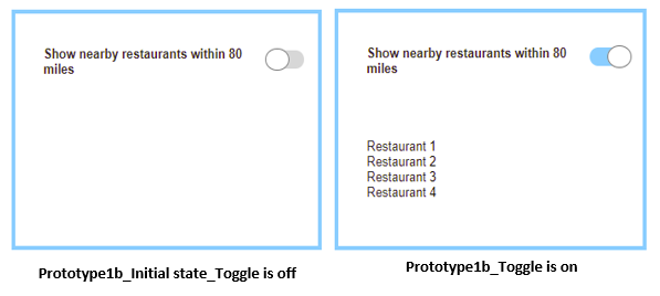
Figure 2. Prototype1b_Case1.
In addition to the task, and before interacting with each prototype, the participants were asked this question for both prototypes: “Do you expect to see the result immediately after the toggle on this switch?”
Case 2: The UI element for Prototype2a is designed with two radio buttons, and the initial state for these UI elements is not selected. There is no immediate response, and the user must click the save button to show the result.
In addition to the task for Prototype2a, the participants were asked: “Do you expect to see the result immediately after choosing one option?”
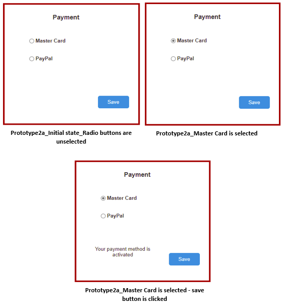
Figure 3. Prototype2a_Case2.
The UI element in Prototype2b is a toggle. The initial state for the toggle is that Mastercard® is selected. In Prototype2b the participants were asked: “What is your opinion about this UI toggle switch? Are you comfortable while using it?”
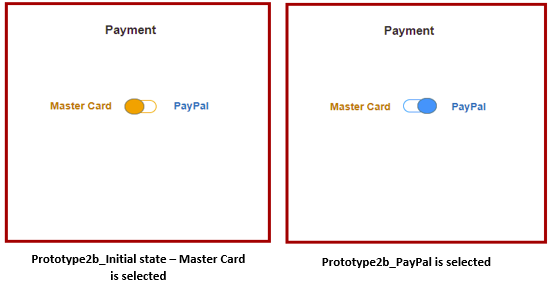
Figure 4. Prototype2b_Case2.
Case 3: In this case, there is a web form that contains a UI element. In Prototype3a, the UI element is a toggle with blue color for on-state and gray color for off-state. The initial state for this UI element is off.
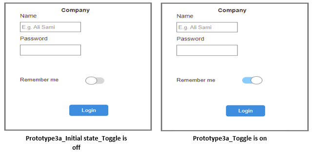
Figure 5. Prototype3a_Case3.
The UI element in Prototype3b is a single checkbox with a selected initial state.
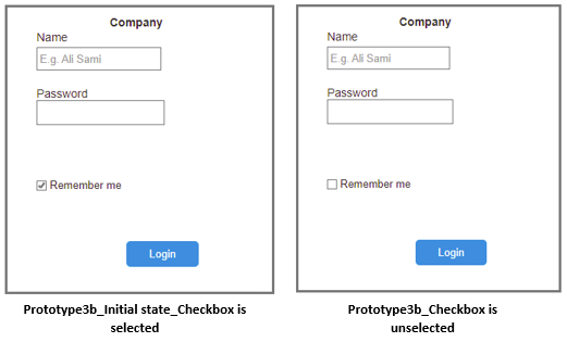
Figure 6. Prototype3b_Case3.
Case 4: In this case, there are several related choices to choose from. In Prototype4a, these choices are designed with unselected checkboxes as an initial state.
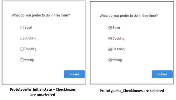
Figure 7. Prototype4a_Case4.
In Prototype4b, these options are toggles with a green on-state and a gray off-state. The initial state for these toggles is off.
Figure 8. Prototype4b_Case4.
Case 5: Prototype5a emulates Microsoft’s design to represent the toggle. There is only one state label that represents the current state of the toggle. This state label changes with the current state of the toggle.
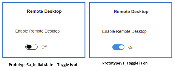
Figure 9. Prototype5a_Case5.
In Prototype5b, two state labels (“on” and “off”) are provided.
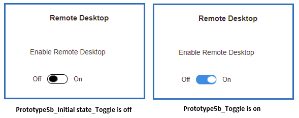
Figure 10. Prototype5b_Case5.
Case 6: In Prototype6a, the direction of the on-state of the toggle is to the left, and the color for the on-state is dark gray. There is no color to indicate the on-state, and the off-state is light gray and to the right.
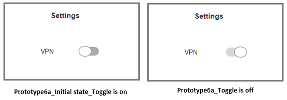
Figure 11. Prototype6a_Case6.
In Prototype6b, the toggle is the same as Prototype6a but with two state labels to indicate the on- and off-states.
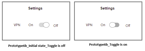
Figure 12. Prototype6b_Case6.
Case 7: In this case, the UI element in Prototype7a is a toggle. The toggle is provided with state labels (“yes” and “no”). The color for the on-state is red, and the placement for it is to the left. The color for the off-state is gray.
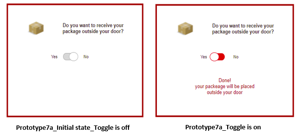
Figure 13. Prototype7a_Case7.
The UI element in Prototype7b is a single checkbox with a save button.
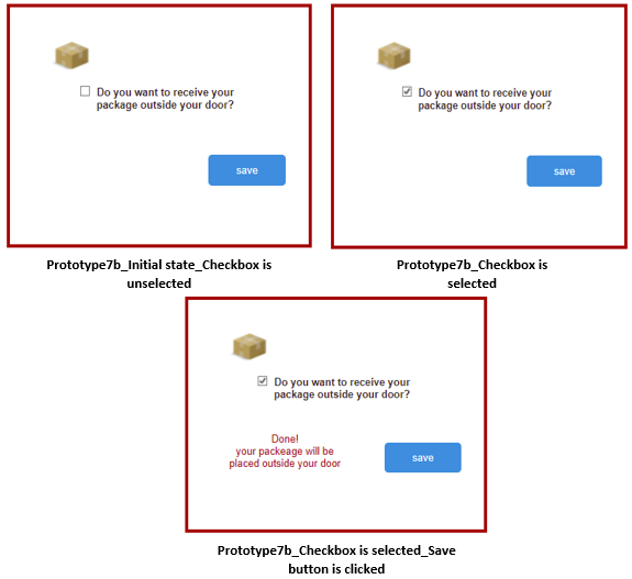
Figure 14. Prototype7b_Case7.
At the point of using Prototype7a, the participants were asked these two questions: ”Are you comfortable with ‘yes’ and ‘no’ labels instead of ‘on’ and ‘off’ labels?” and ”Are you comfortable with the red color for the on-state of the toggle switch?”
Case 8: In this case and in Prototype8a, color is not used to indicate the on-state. The on-state is to the right-hand side and the off-state is to the left-hand side. In this case “1” and “0” are used to indicate the on- and off-states.
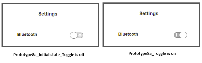
Figure 15. Prototype8a_Case8.
In Prototype8b, “on” and “off” labels are used.
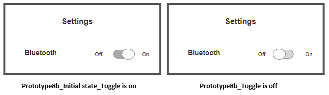
Figure 16. Prototype8b_Case8.
In using Prototype8a, the participants were asked: “Are you comfortable with ‘1’ and ‘0’ labels instead of ‘on’ and ‘off’ labels?”
Case 9: Prototype9a is designed with a single toggle. The color for the on-state is green, and it is to the right-hand side. The color for the off-state is gray, and the switch is to the left-hand side. A long sentence with a negative word describes the action for the toggle as a toggle label.
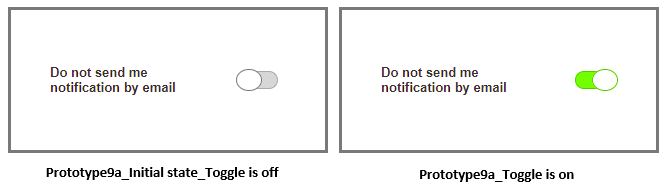
Figure 17. Prototype9a_Case9.
The design is the same in Prototype9b with a short and clear toggle label.
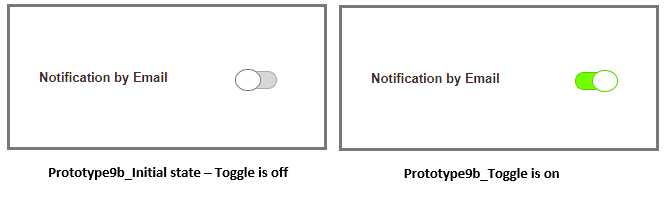
Figure 18. Prototype9b_Case9.
In addition to the main task, participants were asked to enable notification by email for both prototypes to see if they were able to understand the toggle label immediately.
Subjective Opinions Questionnaire
At the end of the experiment, each participant completed a questionnaire with 13 questions. The questionnaire used a Likert-type scale in which each question was to be ranked from 1–5 (1 = Strongly Disagree, 2 = Disagree, 3 = Neutral, 4 = Agree, 5 = Strongly Agree). The content of the questionnaire, given in detail in the Results section, contained questions eliciting opinions about various design features and use contexts of toggles.
Our detailed results involved quantitative and qualitative data elicited from the participants.
Results
As discussed above, the evaluation was carried out with 20 participants. The data collected for success rate concerned participants being able to understand, or correctly perceive (or not), the user interface’s initial state.
The data for success rate did not meet the requirements for analysis by a parametric test, therefore we used Wilcoxon signed-rank tests in IBM SPSS to analyze each case.
The data collected on subjective preferences were analyzed with high-level descriptives.
In Case 1, the participants were initially asked for both prototypes: “Do you expect to see the result immediately after the toggle on this switch?”
The results showed that, for Prototype1a, 85% of the participants expected to see an immediate response, although this toggle was designed without an immediate response. The same question was asked for Prototype1b, and all the participants expected to see an immediate response.
For the success rate of participants being able to understand, or correctly perceive (or not), the user interface’s initial state for both prototypes, Prototype1a achieved 90% success (M = 0.90, SD = 0.308) and Prototype1b 100% success (M = 1.00, SD = 0.00).
As expected from the percentages presented, a Wilcoxon signed-rank test showed that there is no significant difference in participants’ understanding of the initial state of the UI toggle between Prototype1a and Prototype1b: W = .00; z = -1.414; p = .157; effect size (r = .316).
Regarding which of the two prototypes participants preferred, all chose Prototype1b because they preferred to see the result immediately without the need to click any further buttons.
In Case 2, the participants were initially asked for Prototype2a: “Do you expect to see the result immediately after the toggle on this switch?”
The results showed that, for Prototype2a, 80% of the participants did not expect to see any result immediately after choosing one radio button option.
For the success rate involving participants being able to understand, or correctly perceive (or not), the user interface’s initial state for both prototypes, Prototype2a achieved 100% success (M = 1.00, SD = 0.00) and Prototype2b 90% success (M = 0.90, SD = 0.308).
As expected from the percentages presented, a Wilcoxon signed-rank test showed that there is no significant difference in participants’ understanding of the initial state of the UI elements between Prototype2a and Prototype2b: W = .00; z = -1.414; p = .157; effect size (r = .316).
In Prototype2b, the participants were asked: “What is your opinion about this toggle switch UI? Are you comfortable while using it?”
Of the participants, 85% answered that they were not comfortable while using the toggle in this scenario (payment selection). Some of them mentioned that they do not feel safe to see one option selected by default with the payment case.
Regarding subjective preference, 19 of 20 participants chose Prototype2a, and only one chose Prototype2b.
The participants were unfamiliar and uncomfortable with the type of toggle represented in Prototype2b. They did not want to see one option selected by default.
For Case 3, the success rate involving participants being able to understand, or correctly perceive (or not), the user interface’s initial state for both prototypes, Prototype3a achieved 95% success (M = 0.95, SD = 0.224) and Prototype3b 100% success (M = 1.00, SD = 0.00).
As expected from the percentages presented, a Wilcoxon signed-rank test showed that there is no significant difference in participants’ understanding of the initial state of the UI elements between Prototype3a and Prototype3b: W = .00; z = -1.000; p = .317; effect size (r = .223).
Regarding subjective preference, 16 of 20 participants chose Prototype3b, whereas only four chose Prototype3a.
Most of the participants said that they were more familiar with a checkbox in this scenario. However, many of them mentioned that they do not like to see selected UI elements as an initial state.
For Case 4, the success rate involving participants being able to understand, or correctly perceive (or not), the user interface’s initial state for both prototypes, Prototype4a achieved 100% success (M = 1.00, SD = 0.00) and Prototype4b 95% success (M = 0.95, SD = 0.224).
As expected from the percentages presented, a Wilcoxon signed-rank test showed that there is no significant difference in participants’ understanding of the initial state of the UI elements between Prototype4a and Prototype4b: W = .00; z = -1.000; p = .317; effect size (r = .223).
Regarding subjective preference, 13 of 20 participants chose Prototype4a. They were more familiar with checkboxes when there were several related choices to choose from. Some participants explained that it is better to review their choices before submitting. The remaining participants who chose Prototype4b said that it was easy to use toggles with these choices and that toggles are more attractive.
For Case 5, the success rate involving participants being able to understand, or correctly perceive (or not), the user interface’s initial state for both prototypes, Prototype5a achieved 65% success (M = 0.65, SD = 0.489) and Prototype5b 100% success (M = 1.00, SD = 0.00).
A Wilcoxon signed-rank test showed that there is a significant difference in participants’ understanding of the initial state of the UI elements between Prototype5a and Prototype5b: W = .00; z = -2.646; p = .008. The results indicate a strong effect size (r = .591). Therefore, Prototype5b fostered a significantly better participant understanding of the initial state of the UI when compared with Prototype5a.
Regarding subjective preference, 17 of 20 participants preferred Prototype5b, and only three of 20 chose Prototype5a. The participants who chose Prototype5b explained that the toggle in this prototype is more understandable and informative with two state labels that indicate an on and off status. Some of them felt confused with Prototype5a. A few of the participants preferred Prototype5a because they wanted to see only one state label that represents the current state.
For Case 6, the success rate involving participants being able to understand, or correctly perceive (or not), the user interface’s initial state for both prototypes, Prototype6a achieved 10% success (M = 0.10, SD = 0.308) and Prototype6b 95% success (M = 0.95, SD = 0.224).
A Wilcoxon signed-rank test showed that there is a significant difference in participants’ understanding of the initial state of the UI elements between Prototype6a and Prototype6b: W = .00; z = -4.123; p < .001. The results indicate a strong effect size (r = .921). Therefore, Prototype 6b fostered a significantly better participant understanding of the initial state of the UI when compared with Prototype6a.
Regarding subjective preference, all 20 participants preferred Prototype6b. It was difficult to predict the initial state for the toggle in Prototype6a because the on-state color was gray and the position for the on-state was not to the right direction. They preferred Prototype6b because the toggle was provided with state labels which made it easy to know the initial state immediately.
For Case 7, the success rate involving participants being able to understand, or correctly perceive (or not), the user interface’s initial state for both prototypes, Prototype7a achieved 65% success (M = 0.65, SD = 0.489) and Prototype7b 100% success (M = 1.00, SD = 0.00).
A Wilcoxon signed-rank test showed that there is a significant difference in participants’ understanding of the initial state of the UI elements between Prototype7a and Prototype7b: W = .00; z = -2.646; p = .008. The results indicate a strong effect size (r = .591). Therefore, Prototype7b fostered a significantly better participant understanding of the initial state of the UI when compared with Prototype7a.
Regarding Prototype7a, the participants were asked two questions in addition to the task: 1. “Are you comfortable with ‘yes/no’ labels instead of ‘on/off’ labels?” and 2. “Are you comfortable with the red color for the on-state of the toggle switch?”
For the first question, 55% of the participants answered that they were not familiar and not comfortable seeing toggles with “yes/no” labels instead of “on/off” labels.
For the second question, 85% of the participants answered that they were not comfortable seeing an on-state with a red color because the red color refers to danger or a stop sign.
Regarding subjective preference, 16 of 20 participants chose Prototype7b. The reasons for their choices were diverse. Some of them mentioned that checkboxes are more suitable than toggles with a question when the answer is yes or no. Other participants said that they do not feel safe having an immediate response in this scenario. Some of the participants were not familiar in having “yes/no” labels with toggles and this confused them. Only four participants chose Prototype7a because they felt it was more intuitive with the toggle and more understandable when compared with the checkbox in this scenario.
For Case 8, the success rate involving participants being able to understand, or correctly perceive (or not), the user interface’s initial state for both prototypes, Prototype8a achieved 75% success (M = 0.75, SD = 0.444) and Prototype8b 100% success (M = 1.00, SD = 0.00).
A Wilcoxon signed-rank test showed that there is a significant difference in participants’ understanding of the initial state of the UI elements between Prototype8a and Prototype8b: W = .00; z = -2.236; p = .025; effect size (r = .499). Therefore, Prototype8b fostered a significantly better participant understanding of the initial state of the UI when compared with Prototype8a.
Prototype8a was designed with “1/0” labels instead of “on/off” labels. “1/0” labels were included with iOS for accessibility. For Prototype8a, the participants were asked: “Are you comfortable with ‘1/0’ labels instead of ‘on/off’ labels?” Of the participants, 60% answered that they were comfortable but not familiar with it. Only one participant used this feature on their mobile phone. Some participants said that it was more useful to use “1/0” labels instead of “on/off” labels in mobile applications. The remaining participants mentioned that they were not comfortable seeing “1/0” labels.
Regarding subjective preference, 13 of 20 participants preferred Prototype8b because they felt the toggle in the prototype was easier and more understandable because of the “on/off” labels. They were not familiar with the “0/1” labels. The remaining seven participants who preferred Prototype8a mentioned that using “0/1” labels reduced display noise in a smart device.
For Case 9, the success rate involving participants being able to understand, or correctly perceive (or not), the user interface’s initial state for both prototypes, Prototype9a achieved 95% success (M = 0.95, SD = 0.224) and Prototype9b 100% success (M = 1.00, SD = 0.00).
As expected from the percentages presented, a Wilcoxon signed-rank test showed that there is no significant difference in participants’ understanding of the initial state of the UI elements between Prototype9a and Prototype9b: W = .00; z = -1.000; p = .317; effect size (r = .223).
In addition to the task, the participants were asked to enable the notification by email for both prototypes. Of 20 participants, 18 failed to enable the notification in Prototype9a whereas all 20 succeeded with Prototype9b.
Regarding subjective preference, all the participants preferred Prototype9b because the toggle label that described the action was short and clear. Some participants did not like to see negative words (such as “not”) in the toggle label. The high-level results of the nine cases are summarized.
Table 1. Summary Results for User Understanding and Preferences
| Findings for Toggle Designs | ||
| Case 1 | Toggle without immediate response versus toggle with immediate response | No significant difference in user understanding. |
| User expectations: Majority expect to see immediate response. | ||
| User preference: Toggles with immediate response | ||
| Case 2 | Unselected radio buttons with a save option versus default-selected toggle | No significant difference in user understanding. |
| User expectations: Majority do not expect to see any result immediately after choosing one radio button option. | ||
| User preference: Unselected radio buttons | ||
| Case 3 | Toggle initial state is off versus checkbox with the initial state selected | No significant difference in user understanding. |
| User preference: Checkbox | ||
| Case 4 | Related choices checkboxes versus toggles for related choices | No significant difference in user understanding. |
| User preference: Checkboxes for several related choices | ||
| Case 5 | Toggle with one state label versus toggle with two state labels | Two state labels were significantly easier to understand than one state label. |
| User preference: Toggles with two state labels | ||
| Case 6 | Toggle with no labels and light gray for on and dark gray for off versus toggle with two labels and light gray for on and dark gray for off | Two state labels with gray colors were significantly easier to understand than no state labels with gray colors. |
| User preference: Toggles with two state labels, even if gray colors are used | ||
| Case 7 | Toggles with “yes/no” labels, red for on, and gray for off versus checkbox for confirmation | Confirmation by checkbox was significantly easier to understand when compared with “yes/no” toggle responses. |
| User expectations: “Yes/no” labels, and red to indicate an on-state should not be used | ||
| User preference: Checkboxes for yes or no responses | ||
| Case 8 | Toggle indicating on or off using “1/0” labels and gray color versus toggle indicating on/off by means of two state labels and gray color | The toggle with two state labels and the gray colors were significantly easier to understand than the toggle with “1/0” as a state indicator. |
| User preference: Toggles with two state labels | ||
| Case 9 | Toggle action description using negative wording versus toggle action description positively worded | No significant difference in user understanding. |
| User preference: Toggles concise and positively worded | ||
The post-evaluation questionnaire elicited subjective opinions regarding various design approaches to toggles in certain use contexts. The 13 questions of the questionnaire elicited responses on a Likert-type scale ranging from 1–5 (1 = Strongly Disagree, 2 = Disagree, 3 = Neutral, 4 = Agree, 5 = Strongly Agree).
We calculated the mean responses to the questions and their standard deviations.
Table 2. Questionnaire Mean Responses and Context
| Questionnaire Questions | M | SD | Context |
| Q1: UI toggle switches must have an immediate response and there is no need for confirming button. | 4.70 | 0.470 | The mean score and standard deviation clearly suggest that participants strongly agreed with this statement. |
| Q2: It is important to provide two state labels (“on/off”) for the UI toggle switches. | 3.90 | 1.119 | The mean score and standard deviation clearly suggest that participants had above neutral opinions, tending toward agreement regarding this statement. |
| Q3: It is important to provide state labels (“1/0”) to indicate the current state of the UI toggle switches. | 2.75 | 1.293 | The mean score and standard deviation suggest that participants tended to disagree with this statement. |
| Q4: The position for on-state of the UI toggle switches should always be on the right side. | 4.20 | 1.196 | The mean score and standard deviation clearly suggest that participants were in agreement with this statement. |
| Q5: The color of the on-state of the UI toggle switches should always be green. | 4.05 | 1.191 | The mean score and standard deviation clearly suggest that participants were in agreement with this statement. |
| Q6: The color of the on-state of the UI toggle switches should always be blue. | 3.10 | 1.119 | The mean score and standard deviation clearly suggest that participants tended to have a slightly above neutral opinion, tending toward agreement with this statement. |
| Q7: Avoid using red color to indicate the on-state of the UI toggle switches. | 4.15 | 1.348 | The mean score and standard deviation clearly suggest that participants were in agreement with this statement. |
| Q8: The color of the off-state of the UI toggle switches should always be gray. | 3.80 | 1.322 | The mean score and standard deviation clearly suggest that participants had above neutral opinions, tending toward agreement with this statement. |
| Q9: The color of the on-state of the UI toggle switches should follow the color of the theme of the application. | 2.80 | 1.399 | The mean score and standard deviation clearly suggest that participants tended to disagree with this statement. |
| Q10: It is important to provide short, clear, and concise toggle labels that describe the action of the UI toggle switches. | 4.95 | 0.224 | The mean score and standard deviation clearly suggest that participants had high agreement with this statement. |
| Q11: Use checkboxes or radio buttons instead of toggle switches when the answer is yes/no and not on/off. | 4.10 | 1.210 | The mean score and standard deviation clearly suggest that participants were in agreement with this statement. |
| Q12: Use checkboxes instead of toggle switches when there are several related choices to choose from. | 3.70 | 1.174 | The mean score and standard deviation clearly suggest that participants had above neutral opinions, tending toward agreement with this statement. |
| Q13: The initial state of the UI elements should always be off or unselected. | 4.60 | 0.754 | The mean score and standard deviation clearly suggest that participants had high agreement with this statement. |
In the next section we will present our discussion, conclusions, and possible future avenues for further improvements in this area.
Conclusion
In this paper we investigated a series of toggles that we varied in appearance in different ways and in different contexts of use. In some cases, these were compared with radio buttons or checkboxes. All the toggles were of the slider type which is the most commonly used style in current user interface designs. The results presented above contain a mixture of quantitative results and qualitative subjective opinions from the participants that, when combined, give a very clear picture of the kinds of usable toggle designs one should employ. The results suggest a series of guidelines to ensure slider toggles are usable and give a good user experience. The guidelines are listed in detail in the Tips for Usability Practitioners section.
While some of the above guidelines may appear to be similar to those suggested by Minhas (2018), Joyce (2018), and Microsoft (2021a, 2021b), we suggest that our work makes a novel and significant contribution to this aspect of user interface design usability that distinguishes itself from other guidelines available. This is because, to our knowledge, no other guidelines presented have been validated in an experimental setting collecting quantitative and qualitative data from real participants. None of the other guidelines in circulation provide any scientific evidence for possible correctness in their recommendations. For these reasons we believe our work may be a first in the world in which the results are more scientifically validated.
Further, this research updates the work of Plaisant and Wallace (1990, 1992). In their original study, no participant made any errors, whereas some of the designs we evaluated, at times, incurred errors in understanding a specific state (see the Results section). Also, in their study the slider control was one of the designs that was least preferred by participants. However, in our study all the options we evaluated were sliders because most applications use slider toggle designs. We did not specifically evaluate different toggle designs like Plaisant and Wallace (1990, 1992). Our research shows that in many cases participants had strong expectations about what they expected when they saw and used a toggle. For example, participants did not like seeing red to indicate an on-state and for the most part red was not expected by participants (see the Results section for all the specifics).
In this research we also found several websites (Anthony, 2019; Costa, R., 2020) that made strong distinctions between the meaning or use of a toggle switch and a toggle button. Due to this, we refer to all these controls as toggles in this paper. We were not able to find any validated or official sources (ISO standards or similar) that made such distinctions. Therefore, currently we suggest such distinctions are likely to be purely based on opinion and the perpetuation of a certain informal practice. However, since this distinction is being made in practice, we would suggest that some official source, such as an ISO standard, should clarify the issues surrounding the two naming conventions and their perceived, intended context of use. Because both toggle switches and toggle buttons behave in essentially the same way (they have an on- or off-state only), we suggest that the two naming conventions should be interchangeable and not linked to a certain context. Contexts that make global (overall system changes) or local state changes should be differentiated in a different manner. Further, we would suggest that many users do not know the difference between a toggle switch and a toggle button. They are likely only concerned with what the toggle does and where the effect of the toggle takes place. Although we did not specifically evaluate these aspects, future work could take these into account to achieve more validated evidence for or against the above argument.
This study did not explore the reasons for designers not using toggles in the best way possible. Future work should investigate with a group of professional designers the possible reasons. Speculatively, some reasons could be about lack of knowledge, lack of will to learn the knowledge, lack of appropriate processes, or the incorrect people making the decisions.
The guidelines we have devised for the use of toggles have been validated experimentally with real participants. We obtained quantitative and qualitative data which was analyzed. We would suggest that designers and developers of interactions using toggles should follow our guidelines, because they will help to create more usable systems for better user experiences. Currently, in our background investigation we found too many apps and websites used toggles in the wrong manner or in a confusing way. Designers and developers should also remember to keep the users at the center of their design processes.
Tips for Usability Practitioners
Based on our findings with the prototypes and questionnaire that we designed for real participants, we validated the following tips for usability practitioners. Practical application of these when designing user interfaces and implementing toggles in the user interface will ensure better user experience. In the future, a more standardized approach to designing toggles should emerge.
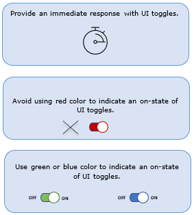
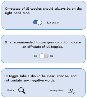
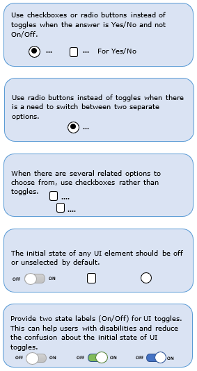
Figure 19. Tips for usability practitioners.
- Provide an immediate response with UI toggles.
- Avoid using red color to indicate an on-state.
- Use green or blue colors to indicate an on-state.
- On-states of toggles should always be on the right-hand side.
- Use gray color to indicate an off-state.
- UI labels should be clear, concise, and not contain negative words.
- Use checkboxes or radio buttons instead of toggles when the answer is yes or no.
- Use radio buttons when there is a need to switch between two separate options.
- For several related options to choose from, use checkboxes rather than toggles.
- The initial state of any UI element should be off or unselected by default.
- Provide two labels (“on” and “off”) for UI toggles to reduce confusion about the initial state.
References
Android Developers. (2021). Add toggle buttons. Retrieved November 2022 from https://developer.android.com/guide/topics/ui/controls/togglebutton
Anthony. (2019). Stop misusing toggle switches. UXMovement. Retrieved November 2022 from https://uxmovement.com/mobile/stop-misusing-toggle-switches/
Apple Inc. (2022a). Human interface guidelines: Toggles (2023). Retrieved July 2023 from https://developer.apple.com/design/human-interface-guidelines/toggles/
Apple Inc. (2022b). Human interface guidelines: Buttons (2022). Retrieved November 2022 from https://developer.apple.com/design/human-interface-guidelines/ios/controls/buttons/
Benyon, D. (2014). Designing interactive systems: A comprehensive guide to HCI, UX and interaction design (3rd ed.). Pearson.
Burmistrov, I., Zlokazova, T., Izmalkova, A., & Leonova, A. (2015). Flat design vs traditional design: Comparative experimental study. In Abascal, J., Barbosa, S., Fetter, M., Gross, T., Palanque, P., & Winckler, M. (Eds.), Human-computer interaction – INTERACT 2015 [Lecture notes in computer science] (Vol. 9297). INTERACT 2015. Springer.
Costa, R. (2020). Toggle switch design: The Full Run Through. Justinmind. Retrieved November 2022 from https://www.justinmind.com/blog/toggle-design-patterns-examples/
Darejeh, A., & Singh, D. (2013). A review on user interface design principles to increase software usability for users with less computer literacy. Journal of Computer Science, 9(11), 1443–1450.
Joyce, A. (2018). Toggle-switch guidelines. Nielson Norman Group. Retrieved November 2022 from https://www.nngroup.com/articles/toggle-switch-guidelines/
International Organization for Standardization. (2012). Ergonomics of human-system interaction—Part 143: Forms (ISO Standard No. 9241-143:2012).
International Organization for Standardization. (2016). Ergonomics of human-system interaction—Part 161: Guidance on visual user interface elements (ISO Standard No. 9241-161:2016).
Lidwell, W., Holden, K., & Butler, J. (2010). Universal principles of design, revised and updated: 125 ways to enhance usability, influence perception, increase appeal, make better design decisions, and teach through design. Rockport Publishers, Inc.
Likert, R. (1932). A technique for the measurement of attitudes. Archives of Psychology 22(140), 55.
Microsoft. (2021a). Toggle switches. Retrieved November 2022 from https://docs.microsoft.com/en-us/windows/apps/design/controls/toggles
Microsoft. (2021b). Toggle button. Retrieved November 2022 from https://docs.microsoft.com/en-us/windows/win32/windowsribbon/windowsribbon-controls-togglebutton
Minhas, S. (2018). Checkbox vs toggle switch. 7 Use-Cases of Forms Design. UX Planet. Retrieved November 2022 from https://uxplanet.org/checkbox-vs-toggle-switch-7fc6e83f10b8
Murano, P., & Holt, P. O’B. (2007). Anthropomorphic feedback in user interfaces: The effect of personality traits, context and Grice’s maxims on effectiveness and preferences. International Journal of Technology and Human Interaction, 3(4), 52–63.
Nielsen, J. (2004). Checkboxes vs. radio buttons. Nielson Norman Group. Retrieved November 2022 from https://www.nngroup.com/articles/checkboxes-vs-radio-buttons/
Plaisant, C., & Wallace, D. (1990). Touchscreen toggle switches: Push or slide? Design issues and usability study (CS-TR-2557, CAR-TR-521). University of Maryland. http://www.cs.umd.edu/hcil/trs/90-08/90-08.pdf
Plaisant, C., & Wallace, D. (1992). Touchscreen toggle design. CHI ’92: Proceedings of the SIGCHI Conference on Human Factors in Computing Systems, USA, 667–668. Popper, K. (1959). The logic of scientific discovery. Hutchinson.