
Abstract
This paper demonstrates the benefits and challenges of working collaboratively with designers and developers while conducting iterative usability testing during the course of Web site design. Four rounds of usability testing were conducted using materials of increasing realism to represent the user interface of a public government site: 1) low-fidelity paper prototypes; 2) medium-fidelity, non-clickable HTML images; and 3) and 4) high-fidelity, partially-clickable Web pages. Through three rounds of usability testing, usability increased, but in the fourth round, usability declined. Iterative testing enabled evaluators to collect quantitative and qualitative data from typical users, address usability issues, and test new, revised designs throughout the design process. This study demonstrates the challenges and value of working collaboratively with designers and developers to create tasks, collect participant data, and create and test solutions to usability issues throughout the entire cycle of user-interface design.
Practitioner’s Take Away
We realize that some of these take aways apply to all usability tests but we have included recommendations that are especially important for iterative testing.
- Encourage having an advocate on the management team who is a liaison between the usability team and the design-and-development team. If this is not possible, educate the design-and-development team every step of the way about usability.
- Take the initiative to set an expectation from the beginning that there will be iterative tests and that all of the key stakeholders will be part of the process.
- Acknowledge that schedule, cost, scale, and technical constraints of a project will influence decisions to make enhancements that are beyond the control of the design and development staff.
- Request early participation in requirements gathering activities.
- Start with paper prototypes, before any hard coding has been made, so developers can get on-board with the design-test-refine process.
- Plan to include some tasks that can be repeated in all of the iterations so that the team has a measure of progress as they proceed.
- Collect quantitative measures that can be repeated over the iterations.
- At the end of each session, discuss the usability issues and possible fixes with the observers; by doing so, get them into the mindset of anticipating modifications to their design when they are still willing to make changes.
- Encourage developers, project leads, and programmers to attend usability sessions as observers. Review the major findings and observations following each session.
- Have regular, ongoing discussions about the findings and recommendations with the design-and-development team.
- Give documented results to the development team as soon as possible, within a week or two of the last session, while the issues they observed are still fresh in their minds.
- Use iterative testing to highlight where usability recommendations work as well as to uncover instances where usability recommendations create new problems.
Introduction
Iterative testing is a well-known technique that is advocated by many usability practitioners (e.g., Bailey, 1993; Comaford, 1992; Lewis & Rieman, 1993; Mandel, 1997; Nielsen, 1993b). If we assume that stakeholders want users to be successful in using their site, iterative testing prior to launching a Web site should be effective in that developers are able to make quick changes based on the users’ interactions with the design and test the revised design using measures of success (e.g., efficiency and accuracy). Incorporating testing from an early stage in the design process allows for iterative testing. In iterative testing, a usability test is conducted with a preliminary version of a product; changes are made based on findings from that study; another round of testing occurs, perhaps with a slightly higher-fidelity product; changes are again made based on results from testing, and another round of testing occurs, and so on, until the usability goals are achieved or until a critical development deadline is reached (Mandel, 1997). In actual experience, however, practitioners and project managers often find that limited resources, such as time and money, management and developer resistance, and meeting the logistical requirements of multiple tests do not permit iterative testing and that the best they can do is conduct one usability test. Our experience shows that conducting iterative testing is worthwhile, and the benefits of iterative testing can be realized, even when challenges arise.
Although there is ample anecdotal evidence that iterative testing is advantageous, and many books, internal studies, and proceedings papers support the benefit of iterative testing (Bailey, Allan, & Raiello, 1992; Douglass & Hylton, 2010; Dumas & Redish, 1993; George, 2005; Health and Human Services, 2006; Karat, 1989; Lewis, 2006; Medlock, Wixon, McGee, & Welsh, 2005; Nielsen, 1993b; Norman & Murphy, 2004; Rubin & Chisnell, 2008), to date, few empirical studies have been published in peer-reviewed journals that demonstrate the usefulness of the method. In the present paper, we demonstrate the value of conducting iterative usability testing by presenting a case study of successive, iterative testing of the U.S. Census Bureau’s American FactFinder (AFF) Web site.
AFF is a free, online information-dissemination tool that allows the public to find, customize, and download the results of surveys and censuses related to the U.S. population and economy (http://factfinder.census.gov or available from the Census Bureau’s home page, www.census.gov). Large numbers of people with diverse backgrounds use the site daily. In 2010, the site received an average of 3,018,580 hits per day with an average of 369,683 unique visitors per month (AFF Monthly User Statistics, accessed May 10, 2011 from the U.S. Census Intranet). The volume of data in AFF exceeds 40,000 individual tables organized into detailed coding schemes for over 1,500 population groups, over 80,000 industry codes, and between 2 and 14 million geographic areas. Some of the major functions available to users on the AFF Web site include downloading tables and files, building tables, making comparisons, and viewing information and boundaries on a map.
There is evidence that users have difficulties using the legacy AFF Web site (i.e., the version of AFF that existed when this project began). Throughout its existence (about 11 years), AFF has received daily “feedback” emails from users of the Web site detailing their problematic experiences with the site. An online “pop-up window” survey that was administered to randomly selected users in 2010 resulted in identification of usability problems as well. In the delivery of the new AFF Web site, which had to be ready in February 2011 to begin releasing results from the 2010 Census, iterative usability testing was deemed critical for the discovery and remediation of any potential usability issues. The new bookmarking, presentation, and navigation capabilities, as well as new data services, user activity services, logging, and “shopping cart” services were designed with the intention of making the user experience easier, more efficient, and more satisfying. This series of usability tests was designed to test the usability of the new interface with typical users of the AFF Web site.
The usability team became involved with the project after the requirements-gathering stage was complete. The project manager approached the usability team for advice about usability testing, and the usability team recommended the iterative approach. Because we had done prior work together on the legacy site, the project manager trusted the usability team and our work. We agreed that we would meet regularly to plan the series of tests and, once testing began, to discuss findings and recommendations to improve the site. Usability was included in the contract with the contractor designers and developers and was expected to be incorporated throughout the project. Throughout the series of tests, we collectively worked with the project manager and the designers and developers (henceforth referred to as the AFF team) to design the study. Thus, together we planned to conduct iterative testing, though no one knew how many iterations we would undergo before the launch of the new site. We agreed that we would track usability metrics (accuracy, efficiency, self-rated satisfaction) with the hopes and expectations that these would increase across iterations. We encouraged the AFF team to attend the live usability sessions and observe users interacting with the Web site. We all agreed that at least one person from the AFF team would be present for each session.
Project Structure and Procedure
Four successive usability tests were conducted in an 18-month period; each test was tied to a corresponding development cycle of the new AFF. Given the scale of the project spanning multiple years, delivery of functions were divided into three separate cycles. See Table 1.
Table 1. Development Cycle and Usability Iterations
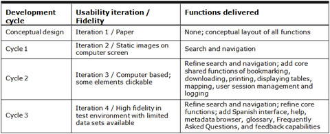
See Figure 1 for a timeline of the project. Iteration 1 (Conceptual Design) was a low-fidelity usability test of an early conceptual design that was represented on paper. Iteration 2 (Cycle 1) tested a design of slightly higher fidelity that was presented as static images on a computer screen. The user interface was semi-functional in Iteration 3 (Cycle 2) as it presented participants with some clickable elements. Iteration 4 (Cycle 3) was even more functional with all elements clickable but with fewer data sets loaded into the application than the live site. In each iteration, we evaluated the user interface of the new AFF Web site by examining participants’ success, satisfaction, and understanding of the site, as measured by their performance on tasks and self-rated satisfaction.
Prior to beginning the usability tests, the usability team met with the AFF team to discuss the test plan for the iterative tests and create a set of participant tasks that could be used across all iterations. Our objective was to create realistic tasks that people typically attempt on the AFF Web site. The AFF team had ideas about what tasks participants should perform, but their proposed tasks seemed to only test whether the user interface worked in the way the programmers had intended, and the wording of the proposed task scenarios provided too much information for the participants about what they should do on the site. For example, most of the AFF team’s suggested tasks contained precise terminology that could easily be found in labels and links on the Web site. Because the purpose of usability testing is to allow participants to interact with an interface naturally and freely and to test what users typically do on a site, it took some time to develop tasks that succinctly examined typical activities and did not “give away” too much information to participants1.
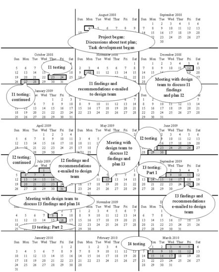
Figure 1. Project Timeline: I1 = Iteration 1, I2 = Iteration 2, I3 = Iteration 3, I4 = Iteration 4
Although we intended to use the same tasks throughout the iterations, as more functionality was available, it was important to test the available functionality. In addition, we worked with what we were given, and only certain data sets had been uploaded to the site. Thus, as we moved through the iterations, tasks had to be tweaked and new ones created to test the new functionality with the data sets that were available. We realized this and tweaked tasks in Iteration 2 and continued throughout the iterations. We knew that tasks should remain as close as possible to each other to allow for comparison across iterations, but given the iterative nature of the software development cycle, data was not available or only limited data was available for testing. With each iteration providing new/updated functionality, it was not always possible for the AFF team to focus on the same tasks from one testing cycle to the next. When they gave us the screen shots they had developed, we tweaked the tasks to fit what they gave us. In hindsight, we realize that we should have worked closer with the AFF team to encourage them to load data that we could use in our tasks, such that the tasks would not change much from one iteration to the next. For example, the geography, year, and topics should have stayed constant so the comparison across iterations could have been more reliable. In future testing, we plan on setting this “consistency standard” with designers and developers before they create screens to test. For example, if they are to only have one data set loaded, it should be the same data set that was available in an earlier round of testing. However, it is unrealistic to expect that one set of tasks will remain relevant as more functionality is added and as the design changes in response to earlier iterations. Keeping a few common tasks as others are replaced is a realistic expectation. See Table 2 for tasks (and accuracy, as detailed below) that were repeated across iterations.
Table 2. Mean Accuracy for Repeated Tasks, Across Usability Studies
|
|
Iteration 1 |
Iteration 2 |
Iteration 3 |
Iteration 4 |
|
1. Imagine that you are thinking about moving to Virginia and you want to do extensive research on that area before moving. A friend has recommended this American FactFinder site to you. Here is the Main page. How would you start your search? |
57% |
100% |
|
|
|
2. Your friend recommended this American Fact Finder site to you. Look for as much information as possible in California and Texas, including education, income, children, families, language, poverty, and elderly.* |
57% |
|
|
31% |
|
3. You decide that there is just way too much information here and you want to narrow your results to just California. What would you do? |
43% |
21% |
|
skipped |
|
4. You are interested in information about your sister’s neighborhood. You want to get as much information as you can about her home and the area that she lives in. She lives at 4237 Peapod Lane, Fairfax, VA 22030. How would you find all the available information about her neighborhood? |
0 |
86% |
|
50% |
|
5. You are doing a report on education in the United States and want to know how many men in California and Texas were White and college educated in 2005.** |
14% |
93% |
|
20% |
|
5a. Is there a way to visualize this information? |
14% |
|
|
skipped |
|
6. You’ve already done a search on place of birth by sex in the United States. You are now looking at a table of your results. You would like to see a map of all males by birth location, specifically in Florida. What would you do? |
|
46% |
79% |
|
|
7. You are currently looking at a map of males in poverty. How would you view a map of the same information but for females?*** |
|
|
94% |
60% |
|
8. You want to change the colors on the map to fit better with the presentation you will be giving. How do you do this? |
|
21% |
92% |
|
|
9. How would you add Alaska and Hawaii to this table?**** |
|
|
58% |
56% |
|
10. You don’t want to see the payroll information. What would you do to simplify these results?*** |
|
50% |
|
31% |
|
11. You decide that payroll is important for your project. How would you get that information back on the screen?*** |
|
63% |
|
skipped |
|
12. How would you make a map of your results? |
|
93% |
|
75% |
|
13. How would you zoom in to include only Florida on your map?**** |
|
79% |
|
86% |
|
14. You want to see a map of Sarasota, FL, but you don’t know where it is. How would you find Sarasota?**** |
|
86% |
|
86% |
|
15. Now you decide that it is late and you want to go home. You plan to come back tomorrow and know you will want to access the same exact search results. What would you do? |
43% |
|
|
33% |
* In Iteration 1, wording was slightly different.
**In Iteration 2, Nevada was used instead of California and Texas, and the year was changed from 2005 to 2006.
***In Iteration 4, wording was slightly different.
****In Iteration 4, different states were used.
In Iteration 1, testing took place over four days, and all members of the AFF team attended some of the sessions (across all iterations, attendance ranged from one to five AFF members). Our results from the first round of testing reaffirmed feedback from other parts of the Census Bureau and stakeholders. It led to an overhaul of the site in which the design was scaled back. The AFF team also had a number of staff changes, including the addition of a seasoned expert who had previously contracted at the Census Bureau and was brought back for this project. Both the overhaul and the changes led to a six-month break in the proposed iterative cycle.
Iteration 2, testing took longer than it had in Iteration 1 because finding and recruiting experts with the experience we needed to participate in the usability testing was difficult and took longer. We tested over the course of one month and, as with Iteration 1, some members of the AFF team attended all sessions. We sent a preliminary report to the AFF team eight days later and met with them two weeks later to recap findings and plan the next test. During that period, the developers worked on the back end of the site, on more Web pages and functionality.
Iteration 3 took place in two parts: first we had nine sessions with participants that we recruited, and some members of the AFF team attended the sessions; second, a three-day conference took place at the Census Bureau one week later, in which conference attendees were avid AFF users (and thus, they were the experts we were seeking). We learned about this conference from a person unrelated to this project, and we seized the opportunity to work with these users. From the conference, we recruited four additional experts to take part in Iteration 3 testing, and they tested the user interface in one day. Members of the AFF team were unable to attend the sessions due to the short notice, but we decided it was important to include these experts in our sample. The results were added into the final report and confirmed what we had seen with the previous experts.
Iteration 4, testing took place over a period of two weeks, and as with Iterations 1 and 2, members of the AFF team attended all sessions.
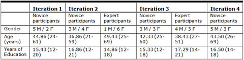
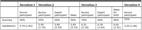
Novice participants were recruited for all iterations via the Census Bureau Human Factors and Usability Research Group’s database. The database holds information about potential and past study participants and is maintained solely by staff of the Human Factors and Usability Research Group. Information about study participants includes their age, education, level of familiarity with Census Bureau sites and surveys, and their level of computer experience. All novice participants reported being unfamiliar with the AFF Web site and having at least one year of computer and Internet experience. Experts were (a) Census Bureau employees who reported using AFF regularly but were not involved in the AFF redesign, (b) Census Bureau Call Center and State Data Center employees who assisted the public with finding information on the AFF site, and (c) graduate students in the Washington DC area who reported using AFF regularly as part of their studies. See Table 3 for participant demographics for each study, Table 4 for accuracy and satisfaction across all iterations, and Table 2 for accuracy for repeated tasks.
Table 3. Participants’ Self-Reported Mean (and Range) Demographics for Each Usability Study
Tasks were designed to expose participants to the AFF user interface without leading them in a step-by-step fashion. For each participant, the test administrator rated each task completion as a success or a failure. A success involved the participant’s successful navigation of the user interface and identification of the correct piece of information on the Web site based on the task objective. If the participant struggled to find the information but eventually arrived at the correct response, this effort was marked as a success. A failure was recorded when the user interface presented obstacles to the participant’s attempts to identify or find the correct piece of information, and thus the participant did not achieve the task objective. The average accuracy score is reported in two different ways: (a) mean accuracy across the participants and (b) mean accuracy across the tasks.
Table 4. Mean Accuracy and Mean (Standard Deviation) Satisfaction, Across All Participants, Across All Usability Studies
Participants began by reading each task aloud. While participants were completing each task, the test administrator encouraged them to think aloud using the communicative think-aloud protocol (Boren & Ramey, 2000; Olmsted-Hawala, Murphy, Hawala, & Ashenfelter, 2010). When the participants found the answer they were seeking, they told the test administrator what it was, and the task ended.
After completing the usability session, each participant indicated his/her satisfaction with various aspects of the Web site using a tailored, 10-item satisfaction questionnaire (displayed in Figure 2), which was loosely based on the Questionnaire for User Interaction Satisfaction (QUIS; Chin, Diehl, & Norman, 1988). The test administrator then asked participants debriefing questions about specific aspects of the site and/or about specific things the participant said or did during the session. Upon completion of the entire session, participants received monetary compensation. Each session was audio and video recorded.
Observers from the AFF team watched the usability tests on a television screen and computer monitor in a separate room. They did not interact directly with the participants, but they had the opportunity to ask questions of the participants: Observers wrote their questions for participants to answer during the debriefing, and the test administrator asked the participants the questions. At the end of each session, the test administrator and observers discussed the findings from that session and compared them to findings from other sessions. Early on, we realized that the development team was benefiting from watching participants struggle with their prototypes. Together we discussed the issues participants were having and how to reconcile the issues. The attendance of development team members was constant throughout the iterations. Each member of their team came to at least a few sessions, and at least one team member was present at every session. This attendance contributed to the commitment/collaboration of the team members.
1See Olmsted-Hawala, Romano Bergstrom, & Murphy (under review) for details about the communication between the design-and-development team and the usability team.
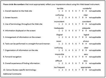
Figure 2. Satisfaction Questionnaire (based on the QUIS; Chin et al., 1988)
Iteration 1 – Conceptual Design
Iteration 1 was a low-fidelity usability test of the conceptual design, which was represented solely on paper (Romano, Olmsted-Hawala, & Murphy, 2009). The original design was created by the development team with input from the project’s requirements management team that was also responsible for the design phase of the project, a group independent of the usability team. The AFF project manager contacted us for usability testing once the conceptual design was ready. The primary purpose of the first low-fidelity usability test was to assess the usability of the conceptual design of the new Web site from the participants’ perspectives as revealed by their observed performance and self-reported satisfaction. Participants were not asked to identify usability issues as such, because doing so requires professional training and experience.
We tested the interface with seven novices. We did not recruit experts in the first round of testing because the goal was to see whether users grasped the conceptual design of the site, and we assumed that if novice users understood the site, experts would too (Chadwick-Dias & Bergel, 2010; Redish, 2010; Summers & Summers, 2005). Participants completed 11 tasks. The objectives were to identify the users’ expectations and logic as they attempted to find information and to identify design features that supported users’ expectations. The main objective was to compare the design concepts, known as the designer’s conceptual model of the product (Rubin & Chisnell, 2008), with participants’ understanding of the user interface. Through low-fidelity testing, we aimed to understand whether users readily grasped the concepts of the new AFF and understood the Web site’s capabilities.
Materials and Testing Procedure
We used preliminary paper versions of the Main page and Search Results page of the user interface and supporting materials (e.g., some “pop-up” pages). A member of the usability team created the paper prototypes based on mock ups that were designed by the development team and had been presented at an internal Census Bureau presentation. The participant and test administrator sat side-by-side at a desk in a 10 ft. by 12 ft. room, and the participants pointed at the paper prototypes to “walk through” tasks given to them by the test administrator. The test administrator acted as the computer (Snyder, 2003) and brought up paper versions of the screens and pop-up windows that would appear if it were a live Web site and overlaid them onto the paper prototype. The paper prototypes are shown in the left panels of Figure 3 (Main page) and Figure 4 (Search Results page). The right panels show the prototypes used in forthcoming iterations, as discussed below. Each session lasted about an hour.
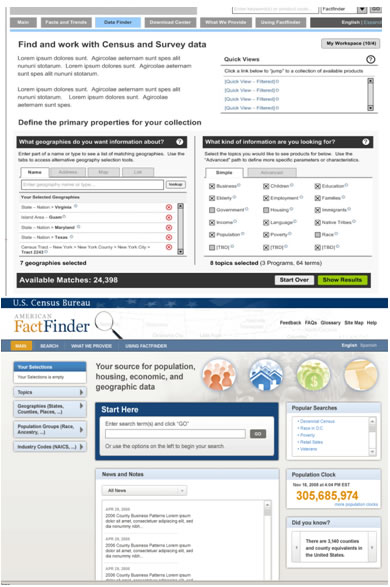
Figure 3. Main page. Iteration 1: left panel, Iteration 2: right panel
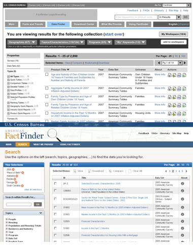
Figure 4. Search Results page. Iteration 1: left panel, Iteration 3: right panel
Results
This section highlights accuracy, satisfaction, and some of the high-severity issues that the usability team identified during testing. The average accuracy score across all tasks and participants was quite low: 40%. Some participants were unable to complete any of the tasks correctly, and some tasks were not completed correctly by any of the participants. Accuracy ranged from zero to 82% across participants and from zero to 71% across tasks 2. Satisfaction was also very low: The average satisfaction score was 4.79 (out of 9, with 1 being low and 9 being high).
While we may have been the “bearers of bad news,” no one on the AFF team was surprised at the findings because they had observed participants struggling with the prototypes during the test sessions, and we had been discussing the findings throughout testing. The contractors were not worried that their contracts might be at risk because usability testing had been planned for as part of the requirements; therefore results, feedback, and changes were expected. The AFF team responded readily to those results.
We examined participants’ behavior and comments, along with the accuracy and satisfaction scores, to assess the usability of the Web site and to infer the likely design elements that caused participants to experience difficulties. The usability team then grouped usability issues into categories based on severity ratings that were regularly used in our lab. The purpose of our rankings was to place the issues in a rough order of importance so the designers and developers were aware of the items that should be dealt with first. The lab defined high-severity issues as those that brought most participants to a standstill (i.e., they could not complete the task), medium-severity issues as those that caused some difficulty or confusion but the participants were able to complete the task, and low-severity issues as those that caused minor annoyances but did not interfere with the flow of the tasks. The AFF team was familiar with our scale from our previous collaborations. In the following sections, we highlight the high-severity issues discovered during this usability test.
Finding 1: There was no direct, useful guidance displayed about what the user needed to do.
In commenting on the two site pages we tested, participants said they were confused about what they needed to do to select information and how to proceed to get results. Some issues were related to placement of information and/or extra items on the page that led to participants being unsure whether parts of the page worked together or separately. On the Search Results page (left panel of Figure 4), participants did not know where to direct their attention because the page was overloaded with information. We found that the page needed more white space to allow the design to direct users’ attention to critical regions of a display (Mullet & Sano, 1995). Further, there was a need for clear directions on what users were supposed to do to understand, interpret, and act on the information they were seeing. We made recommendations to improve the design of the pages and the communication with the user (e.g., explicit instructions about what the user could do) based on participants’ experience and comments and based on the discussions we had with the observers at the end of each session. We expected that these changes would lead to users’ better understanding the site and for usability of the site to subsequently increase.
Finding 2: Jargon and poorly-worded statements confused participants.
Throughout the two pages tested, all participants said that they had trouble understanding Census-specific jargon and poorly-worded statements. For example, on the Main page, the phrase “Select the topics you would like to see products for below” was not clear. It was not clear what “below” modified. Did it modify “see,” as in “see below,” or did it modify “Select the topics” as in “Select the topics…below”? Also, the word “products” was not clear. Although it was meant to refer to data tables, charts, maps, and documents, participants said that it conjured up images of cleaning products, groceries, and items produced by manufacturers. Presumably, the typical, non-technical user does not associate the word “product” with a data table or a document. Participants said they did not know what many terms meant and that they would not know what to do with these terms on the site. We recommended reducing jargon and using plain language (Redish, 2007) to make the interface easier to understand. We gave examples of how the developers could re-word some jargon text. For example, we recommended they change the word “product” to a simpler term, such as “information,” which conveys the same meaning but isn’t as awkward for people who don’t know Census jargon.
Finding 3: Icons were confusing for participants.
Participants said they had difficulty understanding what the action icons along the right side of the Search Results page represented (See Figure 4, right side of left panel). Many of the participants said they were confused by the different icons, especially the comma-separated values (CSV) and the Excel icons. In general, participants had different interpretations of the icons. On the Main page and on some pop-up pages of the Search Results page, participants said they were confused by the red X within a red circle icon (shown in Figure 3, left panel), which was supposed to allow users to delete an item. On some pop-up screens, the icon was near a black X within a black box icon, which was supposed to show users which items were selected. People said they were not sure which X icon deleted items, and some said they thought they could select items by clicking on the icons. While actions, as opposed to objects, may be difficult to depict representationally (Nielsen, 1993a), we recommended creating user-identifiable icons that could be simply understood without text. We also recommended eliminating either the red X within the red circle icon or the black X within the black box icon. If these changes were implemented, we expected users’ understanding of the icons to increase.
Plans for Iteration 2
Over 13 days, we discussed findings with the AFF team and discussed potential changes to alleviate the usability issues (which their team had observed). We documented our verbal conversations in a preliminary report and sent it to the AFF team. The preliminary report documented the high-severity ranked usability issues and included some mock ups of recommended changes but did not contain the detailed introduction or methodology sections that were in the final report. We met with the design team three weeks later to recap findings and plan the next test.
There were no conflicts between the development team and the usability team on the recommendations because the problems with the Web site were clear to both teams from usability testing. The specific recommendations or design changes to ameliorate the problems were different and many. At the same time we were testing, the AFF team was in the process of conducting a technical assessment of the conceptual design that indicated it was highly complex and could not be built in the time frame allotted. It exceeded the resources available for the solution. The usability results confirmed that the user interface was difficult and more suited to experts, and it gave the contractors valuable feedback on how to go about simplifying the system.
The designers made major changes to the user interface design on both pages to improve usability. Some of the changes were in response to the sessions they had attended and our joint observations and recommendations, some were based on ideas from a senior member who had just been brought on to the project, and some were based on feedback from stakeholders in other areas of the Census Bureau3. See the right panel in Figure 3 for the new Main page and the left panel in Figure 5 for the new Table View page (one step past the Search Results page, tested in Iteration 1). This page was designed to appear once an item was selected on the Search Results page. With these changes in place, we planned usability testing for the revised Web site.
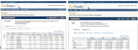
Figure 5. Table View page. Iteration 2: left panel, Iteration 3: right panel
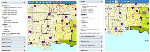
Figure 6. Map View page. Iteration 2: left panel, Iteration 3: right panel
2One middle-age participant with a Bachelor’s degree failed all tasks. All participants failed one task.
3We do not know how our recommendations matched the stakeholders’ recommendations; we only know that our findings were consistent with the feedback from other parts of the Census Bureau, as told to us by the AFF project manager. Stakeholders had not observed the usability sessions.
Iteration 2 – Cycle 1: Search and Navigation
Iteration 2 was a medium-fidelity usability test of static screen shots of the revised user interface (Romano, Chen, Olmsted-Hawala, & Murphy, 2010). Because the development team had begun coding the interface, we had screen shots to work with and conducted this iteration on a computer screen. Conducting the test on the computer allowed us to conduct eye tracking, as discussed below. As in Iteration 1, we examined the success and satisfaction of the participants, as measured by their performance and self-rated satisfaction. We repeated three tasks from Iteration 1 and introduced 11 new tasks to examine features that were not present in the Iteration 1 prototypes. As in Iteration 1, the Iteration 2 evaluation aimed to identify design features that supported participant success (accuracy) and satisfaction as well as design features that were problematic. The primary purpose of the second usability test was to see whether participants understood the new AFF Web site’s search and navigation capabilities and some table and map functions that were not available in Iteration 1.
Materials and Testing Procedure
We tested the interface with seven novice and seven expert users. In this round, it was important to recruit both novice and expert users because we were testing some of the site’s functionality. Members of the design team developed the screen shots used in this study. We tested the Main page (right panel of Figure 3), the Table View page (left panel of Figure 5), and the Map View page (left panel of Figure 6). The screen shots were not clickable, but participants were instructed to interact with the static Web pages on the computer screen as if they were part of a fully-functioning Web site.
The participant sat in front of an LCD monitor equipped with an eye-tracking machine that was on a table at standard desktop height. During the usability test, the test administrator sat in the control room on the other side of the one-way glass. We wanted to sit in separate rooms to avoid any confounds with the eye tracker (e.g., the participant might look at the test administrator if she was sitting beside him/her). The test administrator and the participant communicated via microphones and speakers, and the participant thought aloud while they worked4. As with Iteration 1, each session lasted about an hour.
Results
Overall accuracy was still low: The average accuracy score across novice participants was 55%, and across expert participants, it was 56%. Accuracy scores ranged from zero to 100% across participants and from zero to 100% across tasks (i.e., as in Iteration 1, some participants were unable to complete all tasks). Satisfaction was also low: The average satisfaction score was 5.69 out of 9, with 1 being low and 9 being high. The average for novices was 5.49, and the average for experts was 5.89.
Although overall accuracy was still low, accuracy increased for two of the three tasks that were repeated from Iteration 1 (see Table 2). With this increase in performance, team morale also increased. It appears that users better understood the areas of the Main page (that the tasks tested) in Iteration 2. For the task that decreased in accuracy, we inferred that the lack of guidance on the page played a key role.
Finding 1: There was no direct, useful guidance about how the user could modify tables and maps.
On the Table View page, shown in the left panel of Figure 5, participants were supposed to click on the “Enable Table Tools” button in order to modify tables. Some of the participants did not use the button at all, and some used it in later tasks. According to eye-tracking data, most participants looked at the button, yet they never selected it. As in Iteration 1, extra items on the Table View page, such as the gray line between the table functions and the table, shown in the left panel of Figure 5, may have led participants to be unsure whether parts of the page worked together or separately. On the Map View page, shown in the left panel of Figure 6, participants said they did not understand the process of mapping their results, and participants often clicked on the legend rather than on the modifiable tabs designed for that purpose. To support the user’s understanding of the page, we recommended removing elements on the page (e.g., the line that was between the button and the table) and moving other elements (e.g., the Enable Table Tools button) closer to the table.
Finding 2: Labels and icons were confusing to participants.
The label on the “Data Classes” tab on the Map View page (left panel of Figure 6) was not clear to participants—they were supposed to click on this tab to change the colors on their map, but only three of the 14 participants did so. When asked about this label during debriefing, none of the participants could conceptualize what Data Classes would offer. We recommended using clear, meaningful labels and an action verb as the first word in an option label, such as “Choose Color and Data Classes,” instead of Data Classes, to give users some sense of what might be available there. We suggested each of the options start with an action verb, like “Find a location,” but the developers didn’t want to change the labels in this way, as Data Classes is a label that is recognized by expert users. While we recognized this to be an important issue, we knew that this would come up again in future iterations, so we decided we could address it later. Participants also said that they did not understand many of the map icons because they were not commonly-used icons. This highlighted a tradeoff that was made on this Web development project: An industry-leading commercial-off-the-shelf (COTS) software that came with existing icons was used to avoid custom coding and to maintain a clear upgrade path. While this promoted cost savings and allowed the project to stay current with software developments and improvements, the true trade-off was that users did not understand the icons. For unclear icons, we recommended hover “tool tips” or “mouse overs” to appear when the cursor is placed over the icons, in addition to changing some of the unfamiliar icons to ones that are more easily recognized.
Plans for Iteration 3
We met with the AFF team and recapped findings and recommendations from Iteration 2. The designers and developers recognized the importance of usability testing and followed many recommendations, including changing Enable Table Tools to “Modify Table.” During our meeting, we hashed out ideas on how to improve icons, such as a zoom-out country-view icon on the map that was not easily recognized by participants. One of the usability team members suggested a United States-shaped icon, and the AFF team liked it and decided to try it. We then planned for a third round of usability testing of the newly designed site. See the right panel of Figure 4 for the new Search Results page, the right panel of Figure 5 for the new Table View page, and the right panel of Figure 6 for the new Map View page.
4While some have found that thinking aloud affects where people look on the computer screen during usability testing (e.g., Eger, Ball, Stevens, & Dodd, 2007), others have found no differences in fixations between concurrent think aloud and retrospective think aloud among young and middle-age adults (e.g., Olmsted-Hawala, Romano Bergstrom, & Hawala, in preparation).
Iteration 3 – Search and Navigation Plus Core Functions Available
Iteration 3 was a medium-fidelity usability test that was of slightly higher fidelity than Iteration 2, and screens were partially clickable (Romano et al., 2010). In this round, the testing evaluated specific aspects of the user interface by examining the participants’ success and satisfaction on a few selected tasks. Based on changes that were made following Iteration 2, we intended to evaluate whether the problematic elements of the interface, that were thought to have been alleviated with the changes that were made after Iteration 2, were resolved. We repeated two tasks from Iteration 2 and introduced four new tasks that tested new functionality.
Materials and Testing Procedure
We tested the interface with six novices and seven experts over eight days, and as with previous iterations, some members (one to four observers at each session) of the AFF team attended all sessions. In this round of testing, the screens were semi-functional such that not all of the buttons and links worked. The only active buttons and links were those needed to test the elements of interest in this usability test. We tested the Search Results page (right panel of Figure 4), the Table View page (right panel of Figure 5), and the Map View page (right panel of Figure 6).
The procedure was identical to Iteration 2, except the eye-tracking machine was down for maintenance, and so we did not collect eye-tracking data. While we had intended on collecting eye-tracking data, we proceeded with testing the new iteration in order to get results and feedback to the design team quickly. Each session lasted about 30 minutes.
Results
This section highlights accuracy, satisfaction, and some note-worthy findings that emerged during the third round of testing. Accuracy was higher than in previous iterations: For novice participants, the average accuracy score was 74%; for expert participants, it was 84%. Accuracy scores ranged from 50% to 100% across participants and from 40% to 100% across tasks. Satisfaction was also higher than in previous iterations: The average satisfaction score was 6.66 out of 9, with 1 being low and 9 being high. The average satisfaction score for novice participants was 6.51, and for expert participants, it was 6.78.
As with previous iterations, we examined participants’ behavior and comments, along with accuracy and satisfaction, to assess the usability of the Web site and to infer the likely design elements that caused participants to experience difficulties.
Finding 1: Modify Table caused new usability issues.
Although the new Modify Table label enabled participants to perform certain tasks that other participants had not been able to perform in Iteration 2, they now went to Modify Table to attempt to complete other tasks that were not supported by the functionality available there. Changing the label from Enable Table Tools to Modify Table on the Table View page (Figure 5) made it clear to participants that they could use that button to modify their table (e.g., remove margins of error from the table). However, the breadth of Modify Table implied that people could use that button to add items, such as additional geographies, to their table. The Modify Table label was so clear that participants were drawn to using it, but they could not apply all possible modifications to their table using that button.
For the purpose of adding geographies, the developers had intended participants to click on “Back to Search” to go back to their search results. During our previous meetings with the AFF team, we had discovered that from the developers’ perspectives, it was easier to deal with the complexities of the geography details from the original Search page. As such, the developers said they really wanted this to work, even though they, and we, suspected it would not. This was another example of the real life constraints of time and money at work: If Back to Search did not work, it would have required a complete redesign very late in the project timeline, and the deadline to release the first 2010 Census results would have been missed. The Back to Search function was already hard-coded at this point, and so we tested it, but as evidenced in usability testing, this concept did not match the participants’ mental models. This round of testing highlighted the button label Back to Search as an example of instructions worded from the programmer’s perspective that did not work for the end user. However, due to real costs and schedules involved, some of the results of usability testing had to be sacrificed or deferred to make the deadline and manage costs. We recommended having the options to modify the table and to go back to search on the same line so users could visually associate the options. We recommended adding a clear and simply-labeled “Add Data to Table” button next to the Modify Table button, and this new button would function in the same way as Back to Search.
Finding 2: “Colors and Data Classes” worked well for participants.
In this iteration, participants were able to successfully complete the task that asked participants to change the color of the map. Changing the label from Data Classes to Colors and Data Classes on the Map View page (Figure 6) was effective in making the tab more usable, as participants readily used this option when a task required them to change map colors. Note that we did not test whether participants understood Data Classes or whether the action verb helped; we only know that adding the word “Colors” helped participants to change the colors on the maps. This change satisfied the AFF team, but as usability professionals, we are not entirely convinced that this is the “right” solution and that users will completely understand the functions of the tab. We felt that including action verbs in the labels are still the best option, but under the time constraints of the impending launch of the new site, we did not test this further.
Plans for Iteration 4
Overall accuracy increased, and specifically, accuracy for the two repeated tasks increased. While usability increased, new usability issues were discovered. We met with the AFF team and recapped findings and recommendations from Iteration 3. Together we discussed design alternatives to resolve problems with the visibility of the Back to Search button. Some design options included changing the Back to Search label to “Change Geographies or Industries” and adding the recommended Add Data to Table button in the Modify Table call-out box. In the end, the designers chose to use a call-out box that read “Click Back to Search to select other tables or geographies,” rather than use the Add Data to Table label that we had recommended. The developers said they wanted to try the design change that would require the least amount of programming because it had already been hard coded, and the project deadline was approaching. We agreed to test this in Iteration 4 with the understanding that if it didn’t work, we would try alternatives in future testing.
Iteration 4 – All Functions Plus Help Available
Iteration 4 was a usability test of a medium-fidelity prototype, similar to Iteration 3 though with a higher degree of functionality in which the back end was working, but not all Census data sets were loaded (Olmsted-Hawala, Romano Bergstrom, & Chen, 2011). Thirteen tasks were repeated from earlier iterations and one new task tested new functionality (see Table 2).
As with the other iterations, this evaluation identified design features that supported participant success (accuracy) and satisfaction as well as design features that were problematic. The primary purposes of the fourth usability test were to assess whether participants understood how to use some of the Web site’s geography selection functions.
Materials and Testing Procedure
We tested the user interface with eight novice participants. In this round, we modified tasks to target specific areas where we knew we had data (e.g., a task referred to the year 2005 because that particular data was available and loaded into the system). We tested the geography overlay (right panel of Figure 7) that would appear once users selected geographies from the Search Results page (left panel of Figure 7). The testing procedure was identical to Iteration 3.
Figure 7. Search Results page from Iterations 2 and 4: left panel, Geography overlay from Iteration 4: right panel
Results
Accuracy dropped from Iteration 3: The average accuracy score across participants and tasks was 52%, and accuracy scores ranged from 7% to 96% across participants and from 20% to 86% across tasks. Satisfaction also dropped from Iteration 3: The average satisfaction score was 5.20 out of 9, with 1 being low and 9 being high. We did not have any preconceived ideas about how participants would interact with the new functionality, and we were all disappointed with the decrease in performance. Prior to this iteration, we had not observed participants interacting with the geographies, and in hindsight, we believe this should have been tested earlier with lower-fidelity testing because this is such an important part of the Web site.
As with previous iterations, we assessed the usability of the Web site. In the following sections, we highlight the high-severity issues discovered in this usability test.
Finding 1A: Using the geography overlay to add geographies was confusing for participants.
Participants often experienced difficulties adding in geographies. For example, most participants did not know that once they clicked on the state that they had in fact added it to the “Your Selections” box. The lack of feedback caused participants to click on the state numerous times, but still they did not notice that the state had been added to their selections. Participants did not seem to understand that they needed to add geography filters to the Your Selections box, and instead some tried to add in a geography using the geography overlay. Participants said they expected their actions to load their geography, and they expressed confusion about the outcome. Participants who had seen the Your Selections box were confused why their state did not pop up in that area.
Finding 1B: Participants did not see the search results that loaded beneath the geography overlay.
The geography overlay that appeared when users clicked on the Geographies tab on the main page was very large, and it obscured the search results that were beneath it. When participants added a topic using the geography overlay, they often missed that the results, which were beneath the overlay, had been updated based on their action. For the purpose of adding geographies, the developers had intended participants to open the overlay and select geographies—they said they thought it would be clear that the overlay covered results that changed when users selected additional filters, and they thought it would be clear that the additional filters would be seen in the Your Selections box (on the upper, left side of the right panel in Figure 7). This round of testing highlighted the geography overlay to be a real “show stopper.” Participants were unable to notice the subtle changes that occurred on the screen, and thus, they said they thought the filter was not working. They were unable to progress past this point in selecting filters/options, and this was reflected in the low accuracy score and satisfaction ratings. We recommended making the geography overlay smaller by either making it narrower or pushing it lower on the page. We also recommended changing the way all the other filters worked, such that they all would open to the right of the tabs, as users expect consistency within a Web site, and this functionality was not performing consistently among the different filters.
Summary
Accuracy for two of the 13 repeated tasks increased from Iteration 2, while accuracy for six decreased, and accuracy for two remained equal (see Table 2). In this iteration, participants were unable to attempt three of the tasks due to the show stopper that impeded them from getting to deeper levels of the site. We met with the design team and discussed findings and recommendations from Iteration 4. This version will be tested in mid-2011 with the live Web site. We plan on repeating many of the tasks from previous iterations and continuing with the iterative process until optimal usability is achieved.
Discussion
Participant accuracy in completing tasks increased successively with each iterative test from Iteration 1 to Iteration 3, for a total increase of 34% in accuracy across all three iterations, but then accuracy dropped from Iteration 3 to Iteration 4. Participant self-reported satisfaction also increased successively from Iteration 1 to Iteration 3 and decreased in Iteration 4. See Table 4 for accuracy and satisfaction scores across all four iterations and Table 2 for accuracy scores for the tasks that were repeated across iterations. Although some issues raised in earlier iterations were resolved, new issues emerged. The iterative process allowed the teams to identify these instances and work to correct them.
There is a lack of empirical support for many of the recommendations from well-known experts about iterative testing. This paper contributes to the “usability body of knowledge” by demonstrating empirical support for a practice that is often recommended yet seldom implemented (cf. the RITE method, in which changes can be made following each session, as soon as a usability problem is identified; Medlock et al., 2005). By repeating some tasks across iterations, we were able to evaluate whether there were continual improvements from iteration to iteration. With design changes from one iteration to the next, we were able to assess whether participants were successful with the new design or whether the changes and additional available functionality had caused new problems. With each progressive usability test, from Iteration 1 to Iteration 3, there were incremental improvements that we saw in user performance gains and in increased satisfaction, yet in Iteration 3, we also found that a design recommendation caused a new, unforeseen problem. Participants encountered a high-priority issue in Iteration 4 that we were not able to assess in earlier iterations because the functionality was not yet available. In Iteration 4, we were not able to evaluate solutions for the usability issue we encountered in Iteration 3 because the high-priority issue was such that participants were unable to get to deeper pages, as they were all stymied early on in the site with the difficulties of the geography overlay. This highlights the value of continued iterative testing, and once modifications are made, iterative testing should continue. It also shows that most of the value of an iteration can be lost if a “show-stopper” issue is introduced into it.
We believe that it was important to start with paper prototypes. Paper is a medium that is easy to manipulate and to change. When creating a working relationship with the developers, it helped that they had not yet created the back-end of the application (i.e., nothing had been hard coded, no application actually existed yet), which often weds developers to the design. We involved the designers and developers each step of the way, by encouraging them to attend sessions, to think of solutions to the usability issues, and to comment on and revise our ideas for recommended improvements. At the end of each session, we discussed the usability issues and possible fixes with the observers and thus got them into the mindset of anticipating modifications to their design when they were still willing to make changes. This had a lasting impact throughout the entire iterative cycle.
It is likewise important for the developers to be partners in the usability testing process. Our partnership was possible because we involved the developers in task development, invited them to observe usability testing sessions and post-test discussions, and met with the design-and-development team regularly to review usability findings and discuss recommendations. We had ideas for improvements, but we collaboratively came up with solutions to test. Each team valued and respected what the other offered.
The AFF prototype changed drastically from Iteration 1 to Iteration 2, but because we started the usability testing early in the design, the process of refining the design was manageable for the designers and developers. In each step of the process, we worked cooperatively with them, making use of our different skill sets, interests, and visions.
Although most design teams are accustomed to addressing usability at the end of the product development cycle, we addressed usability throughout the development cycle. We anticipated that few surprises would occur with the final product. Developers watched participants interact with their product and were able to see firsthand what worked and what did not. We got the product into the users’ hands, found out what they needed, and quickly identified usability issues: It was an efficient develop-test-change-retest process. As part of the process, we were able to find a “show stopper” and recommend changes to fix it, although it would have been more productive to have anticipated this issue. In future usability tests, we plan on asking for designs of key functionality earlier in the process so we can provide feedback prior to the screens being created for testing.
Some of the challenges associated with the project included the pressures of time and budget considerations. Even though these were government studies and not subject to market pressures, there were time (the approaching release deadline) and budget (for the design contractors) constraints. Working in our favor was the fact that the AFF team wanted a usable public site for the dissemination of Census data, and they agreed to a rigorous program of iterative usability testing. Additional challenges that we faced during the iterative cycle included the need to work under pressure for quick turnaround, as this involved the logistics of recruiting and bringing in participants in short order and producing preliminary reports quickly. As well, we were faced with the challenge of convincing the designers and developers that we had something to offer—this was where bringing the developers in to view the test sessions and to review the major observations and findings after the participant completed all the tasks made a big difference. We found that watching the participant interact with the prototype first-hand was a very valuable experience for programmers and project managers.
While we were invited into the process early, we found that it was not early enough. The project manager and a different team came up with the requirements document that the conceptual design was based on. Usability testing was only thought of after the initial conceptual design had been created in the form of paper prototypes. We tested the paper conceptual design and it performed poorly. The AFF team realized that the system could not be built as it was in the time allotted, so they went back to the drawing board. It then took 6 months to revise the prototype so we could test the new version. It is very possible that usability staff could have had a role in the requirements-gathering stage, which might have lessened the need to, in the words of the developers, “dramatically scale back” the design. We recommend future studies examine the impact of usability testing earlier than what we were able to do in this study.
During this series of tests, some of the team members worked part time at the Census Bureau. In addition, the Human Factors and Usability Research Group and the team members on this project had multiple ongoing projects. As such, the turn-around time in this series of tests from study completion to meetings with the design team to recap findings took 2½ weeks, on average. While this series of tests and the turnarounds were not as quick as we would have liked, designers and developers attended the sessions, and we had ongoing, regular discussions with the AFF team about the findings and potential solutions to the problems while they continued to code and work on the back end of the Web site. Thus, they were a part of the process and did not wait for our documented results to continue with the product. This series of tests could not have worked without the commitment and collaboration of both the usability team and the AFF team.
Future Directions
Iterative testing was a valuable process in testing the Census Bureau’s new AFF Web site. In successive, increasing-fidelity iterations, we were able to identify issues, recommend ways to resolve them, quickly turn around design changes, and test the site again. We obtained continuous feedback though the development of the new Web site because participants were involved in every round of testing. As measured by participant accuracy and satisfaction across iterations, the usability of the Web site improved considerably but then declined dramatically in the final iteration. As the accuracy scores dropped significantly in the last round, the usability team recommended that iterative usability testing continue on the live site until user performance reaches established goals as set forth by the development team.
In our experience, it was important for the AFF team to witness participants struggling with their Web site. In future tests, we plan on having a sign-in sheet for observers so we can monitor the number of observers, the number of repeat observers, and where they are from (i.e., company, division, group). In this study, we did not tabulate whether the early attendance from the AFF team led to increased attendance for later sessions, but this is something that we plan to record in future tests.
In summary, usability researchers on any Web site or software development team should aim to include several iterations in their test plans because, as we have demonstrated here, iterative testing is a useful and productive procedure for identifying usability issues and dealing with them effectively.
References
- Bailey, G. (1993). Iterative methodology and designer training in human-computer interface design. Proceedings of the ACM CHI 1993 Conference (pp. 198-205). Amsterdam, The Netherlands.
- Bailey, R. W., Allan, R. W., & Raiello, P. (1992). Usability testing vs. heuristic evaluation: A head-to-head comparison. Proceedings of the Human Factors and Ergonomics Society, 36th Annual Meeting (pp. 409-413). Atlanta, GA.
- Chadwick-Dias, A., & Bergel, M. (2010, October). UPA-DC User Focus Conference, Washington DC.
- Chin, J. P, Diehl, V. A., & Norman, K. L. (1988). Development of an instrument measuring user satisfaction of the human-computer interface (pp. 213-218). Proceedings of SIGCHI ’88.
- Comaford, C. (1992, November). Tips for truly rapid application development. PC Week, 60.
- Douglass, R., & Hylton, K. (2010). Get it RITE. User Experience, 9, 12-13.
- Dumas, J. S., & Redish, J. (1999). A practical guide to usability testing (Rev ed.). London: Intellect Books.
- Eger, N., Ball, L. J., Stevens, R., & Dodd, J. (2007). Cueing retrospective verbal reports in usability testing through eye movement replay (pp. 129-137). Proceedings of BCS HCI.
- George, C. (2005). Usability testing and design of a library website: An iterative approach. OCLC Systems & Services,21(3), 167-180.
- Health and Human Services. (2006). Research-based web design & usability guidelines U.S. Government Printing Office, (ISBN 0-16-076270-7) Chapter 18. Retrieved from http://www.usability.gov/pdfs/chapter18.pdf
- Karat, C. (1989). Iterative usability of a security application. Proceedings of the Human Factors Society, 273-277.
- Lewis, C., & Rieman, J. (1993). Task-centered user interface design: A practical introduction. Retrieved from http://hcibib.org/tcuid/index.html
- Lewis, J. (2006). Usability testing. In G. Salvendy (ed.), Handbook of human factors and ergonomics (pp. 1275-1316). Hoboken, NJ: Wiley.
- Mandel, T. (1997). The elements of user interface design. New York: Wiley.
- Medlock, M. C., Wixon, D., McGee, M., & Welsh, D. (2005). The rapid iterative test and evaluation method: Better products in less time. In R. G. Bias & D. J. Mayhew (Eds.), Cost-justifying usability: An update for the Internet age (pp.489-517). San Francisco: Morgan Kaufman.
- Mullet, K., & Sano, D. (1995). Designing visual interfaces. Mountain Grove, CA: SunSoft.
- Nielsen, J. (1993a). Usability engineering. San Diego, CA: Academic Press.
- Nielsen, J. (1993b). Iterative user interface design. IEEE Computer, 26, 32-41.
- Norman, K. L., & Murphy, E. D. (2004). Usability testing of an internet form for the 2004 overseas enumeration test (pp. 1493-1497). Proceedings of the Human Factors and Ergonomics Society.
- Olmsted-Hawala, E. L., Romano Bergstrom, J. C., & Chen, J. M. (2011). A high-fidelity usability evaluation of iteration 3 of the new American FactFinder Web site: Increased functionality. Center for Survey Measurement, Research and Methodology Directorate (Survey Methodology #2011-12). U.S. Census Bureau. Retrieved from http://www.census.gov/srd/papers/pdf/ssm2011-12.pdf
- Olmsted-Hawala, E. L., Romano Bergstrom, J. C., & Hawala, S. (in preparation). Think aloud affects eye movements in older adults but not young and middle-age adults: A comparison of concurrent and retrospective think aloud in a usability study.
- Olmsted-Hawala, E. L., Romano Bergstrom, J. C., & Murphy, E. D. (under review). Communicating usability in an iterative and exploratory study: How observation of test sessions, usability reports, and team meetings impacted the emerging Web site design.
- Olmsted-Hawala, E., Murphy, E., Hawala, S., & Ashenfelter, K., (2010). Think-aloud protocols: A comparison of three think-aloud protocols for use in testing data dissemination Web sites for usability (pp. 2381-2390). Proceedings of CHI 2010, ACM Conference on Human Factors in Computing Systems. New York: ACM Press.
- Redish, J. (2007). Letting go of the words: Writing web content that works. Morgan Kaufman, San Francisco, CA.
- Redish, J. (2010, November). Letting go of the words–writing web content that works. Invited talk presented at Census Usability Day, U.S. Census Bureau, Washington, D.C.
- Romano, J. C., Chen, J. M., Olmsted-Hawala, E. L., & Murphy, E. D. (2010). A usability evaluation of iteration 2.0 and iteration 2.5 of the new American FactFinder web site: Capabilities and functions (Statistical Research Division Study Series SSM2010-07). U.S. Census Bureau. Retrieved from http://www.census.gov/srd/papers/pdf/ssm2010-07.pdf
- Romano, J. C., Olmsted-Hawala, E. L., & Murphy, E. D. (2009). A usability evaluation of iteration 1 of the new American FactFinder web site: Conceptual design (Statistical Research Division Study Series SSM2009-05). U.S. Census Bureau. Retrieved from http://www.census.gov/srd/papers/pdf/ssm2009-05.pdf
- Rubin, J., & Chisnell, D. (2008). The handbook of usability testing, (2nd Ed.). Indianapolis, IN: Wiley Publishing, Inc.
- Snyder, C. (2003). Paper prototyping: The fast and easy way to design and refine user interfaces. New York: Morgan Kaufmann.
- Summers, K., & Summers, M. (2005). Reading and navigational strategies of web users with lower literacy skills. Proceedings from the American Society for Information Science and Technology, 42: n/a. doi: 10.1002/meet.1450420179.