
Abstract
This paper describes an experiment that was carried out on the positioning of menus (or navigational panels) on a Web site. A student cohort developed a Web site that sold Christmas trees, pots, and decorations. Two versions of the same Web site were produced—one with menus on the left and the other with menus on the right. In every other way the two sites were identical. Participants were asked to use one version of the Web site. After they used the Web site, they answered a short online questionnaire. They were unaware of the existence of the alternative version of the site.
The findings showed that there was very little difference in the time-to-buy performance of participants who saw either the left-hand or the right-hand version of the site. In conclusion, there was no significant time savings in sticking to the convention of placing menus on the left-hand side of a Web site, and there might be advantages to placing menus on the right side of a Web site.
Practitioner’s Take Away
The following are the key points in this paper:
- Don’t be constrained by conventional menu placement on the left-hand side of the screen.
- Consider either sides of the screen for navigation.
- Prefer the right side of the screen when scrolling is unavoidable because there is no significant difference between performance times for left and right-hand menus
Introduction
Web site layout was once an area of bitter dispute but over the last few years accepted best practice design principles seem to have emerged, resulting in a consensus about what makes a good Web page. Web sites today have remarkable conformity when one considers the size of the Web. How much this is attributed to Web designers copying what they see as successful designs, or as a response to real usability issues, is unclear.
Web site layout dictates how easy or difficult the navigation of a site will be, so getting it right is important. Also research shows that users can form an impression of a Web site in as little as 50 milliseconds (Lindgaard et al, 2006), and this might cause them to decide whether to stay on the site or to click to the next one. A Web site needs to grab the user’s attention and keep it for the duration of a sale, if the site is a commercial one. Keeping users on a Web page therefore becomes of paramount importance to the designer of a Web site and particularly for a commercial one.
The Web is huge and users are fickle so the problem for the Web designer is whether to stand out from the crowd and produce something different or to capitalize on the user’s Web skills and use a design s/he already knows. The thinking is that if a site follows the conventions of every other site then it is easier to use because the user knows exactly what to expect. Many usability experts would give this advice: Stick to what users know, and don’t try anything different. Jakob Nielsen, for example, has been vociferous in persuading Web designers to follow the trends because, he argues, it makes sense from a user perspective (1999a; 2004). However, there is an alternative view that if a Web page design echoes every other design on the Internet how can a Web site look special to the user and cause them not only to stay on the Web site but to return to it in the future?
A conventional Internet Web site displays menus on the left-hand side, often with the navigation panels (or menus) repeated at the bottom and/or top of the screen. Indeed, the left-hand justified menu accounts for the majority of Web interface designs, followed by navigational menus at the top (Mardiros, 2006). This consensus design and the reasoning behind it are probably best summed up by Mardiros Internet Marketing who in their guidelines for good Web page design say confidently: “Left Web site navigation is the most common type of navigation” (2006, Design good primary web site navigation section, para 1, bullet point 1).They go on to suggest that “For English language based Web sites people read from left to right. Thus, a menu situated on the right-hand side would be difficult to use” (2006, Design good primary web site navigation section, para 1, bullet point 3).
Certainly this view has common sense on its side. For example, English is read from left to right so perhaps it could be deduced from that fact that for a left to right language, menus would be better placed on the left in order to conform to expectations of a book or newspaper. In other words, the Web page should act like the pages of a book and treat everything as if it is a progression from left to right and top to bottom. Conforming to expectations is one of the principles of usability. A predictable model that fits in with the rest of the world is easier for people to use.
With common sense in mind, it is therefore not surprising that the popular view is that the main navigation elements on a Web site should be placed on the left-hand side of the screen. Usually, the left justified menu is accompanied by a section at the top of the screen that consists of a site’s identifying elements (for example, banners, site names, logo) and perhaps additional navigation components. This layout is referred to as an "inverted-L navigation" or "L-shaped navigation" (Kalbach & Bosenick, 2003), and this form of navigation is very popular on the Internet today.
Some usability experts believe that users categorize what they see on the screen into genres. The argument is that they do this very quickly and that the categorization helps them to navigate the Web site much faster than they would be able to if they didn’t have a fixed idea of a genre in their head. The conventions of a particular Web genre are the visual elements and components that the user expects and recognizes. The user will recognize and categorise those conventional elements before they examine the content, but the recognition will make it easier for them to navigate the Web site (Santa Maria & Dyson, 2008).
However, although research does suggest that violating expectations and conventions of the genre does have a negative effect on user performance, it also indicates that this negative effect does not last for long and that users rapidly recover from any lost performance levels. In other words, Internet users very quickly accommodate to a different design and its expectations (Santa Maria & Dyson, 2008). Research suggests that the second visit to the site sees none of the loss of performance time that the first visit might have possibly produced for the user. Novel design should not, therefore, be avoided because users can clearly adapt to the unconventional. However, this is a double-edged sword in that users might be put off by an unconventional design that looks complicated, and thus never persevere long enough to recover lost performance time.
Putting aside what common sense might tell us, there have been some small studies of left-hand versus right-hand menus that show conclusively that the left-hand menu is both faster and more popular with users than the right-hand menu. For example, Kingsburg and Andre carried out two studies with 16 users and found in both of their studies that selection from a left-hand menu was faster than from a right-hand menu (2004). However, their research also showed that selections were best done from the same panel, whether that was on the right or left. Thus it is better to have a single design, either on the left or the right, rather than a mixed navigational method that requires the user to select from both left and right panels (Kingsburg & Andre, 2004). This is hardly surprising and is both predicted and supported by Fitts’ Law. (1954).
There have been some experiments on right-hand menus, but these have tended to assume that left-hand menus would always perform much faster. There have been relatively few studies on where a navigation menu might be best placed on the screen. Kalbach and Bosenick mentioned this lack of research when they carried out their work on menu placement. They identified just a few studies prior to their comparison between left and right justified menus (2003). Spool’s study suggested that top and bottom placed menus were more successful than left justified ones (1997). However, the National Cancer Institute’s usability researchers suggested a right-hand navigation system is actually more effective. They showed that users click on menu items in the right-hand margin more efficiently than on menu items placed on the left. They concluded that this efficiency was because right-handed items are closer to the scroll bar thus allowing users to move the pointer quickly between the scroll bar and the navigational item (Kalbach & Bosenick, 2003).
Nielsen suggested that left-hand justified menus were becoming de facto in 1999, and that if “80% or more of the big sites do things in a single way… you have to comply” (1999b, para 2, bullet point 1). Although he conjectures that in theory right-hand navigational panels ought to be faster because they are closer to the scroll bar, he does not go on to suggest them as a better means of designing a Web page (Nielsen, 1999b). He was reluctant to suggest a method that was different from the norm because he believed that standards inevitably make for faster performance (Nielsen, 1999a, 1999b, 2004). Nielsen thought that sites that don’t stick to the norm were too difficult for users to use and he described the standard as when “80% or more of Web sites use the same approach” (2004, para 3, bullet point 1). Thus, by 1999, the left-hand justified menu was already entrenched as good design and therefore in Nielsen’s view it ought to be emulated by would-be Web site builders (1999a, 2004).
A study in 2008 on browsing behaviour by sighted users undertaken by Michailaidou and her colleagues suggested that common gaze patterns begin at the salient parts of the screen, move to the main content, the header, the right column, the left column, and then finish at the footer. In theory then the right column is scanned before the left one and ought to be marginally faster although in reality the rate of scan by the human eye is so fast that the difference in most cases would be negligible. However, given that psychologically the right column is given priority—in that it is scanned sooner—it follows that the right-hand area of the screen would be worth investigating as a possibility for the placement of the main navigational panel.
Kalbach and Bosenick’s study that compared right-hand and left-hand navigational menus found no evidence that left-hand menus were significantly faster though they did find a small difference between the performances of the two placements. They concluded that top-aligned menus performed the best, but found no evidence for right-hand menus being less attractive to users (2003). Their study is one of the few studies that set out with a hypothesis that there would not be a significant difference between the performance of the two navigational menu placements—left and right.
One of the reasons given for sticking to convention and following expectations is that users become disorientated when they are given layouts that don’t conform to their expectations. This is more of a problem with older users who prefer more predictable and unchanging systems (Arch, 2009). Disorientated users refer to themselves as “feeling lost.” However, a study by Santa Maria and Dyson found that although users are disorientated when faced with a layout they aren’t expecting, they do recover rapidly and search time reverts to what would be expected from using a conventional, anticipated layout (2008). This suggests that novel design has only a short term effect on user performance.
Finally, the reasons given for left-hand menus being faster seem vague and unclear and not well supported by any convincing psychological explanations or research findings. Similar arguments can be found over which side of the road it is best to drive on. There are equally valid arguments to support both left- and right-hand driving, and the fact that both solutions have been adopted probably indicates that neither one is better than the other. Although, one could argue that in this case standardisation is desirable and that a novel—drive which side you like—would not be suitable.
Therefore the question remains: If left-hand menus are indeed faster than right-hand ones why might that be? If Internet users look for content on the left side because they read from left to right (Mardiros, 2006), then what about Internet users who read from right to left? Do they look for content on the right? Have Internet users been conditioned to expect particular layouts by designers copying each other’s designs and therefore expect navigational tools to be on the left? In other words, have Internet users developed an expectation of a particular type of “Web genre”? Given these questions, it was decided to carry out an experiment to see if factors influencing the time to purchase differences between left- and right-hand justified menus could be isolated, and thus the left-hand preference be explained in terms of concrete human factors rather than conventional wisdom.
The demographic factors included in the sample were direction of writing of the initial language acquired by the user, gender, handedness, Internet experience, computer experience, time spent online each day, and age.
Hypothesis
The following hypotheses were formulated:
- The direction of the first language acquired for reading and writing will influence speed of performance when using a left or right justified menu. Those who first learned to read and write a right to left language first will perform faster with right justified menus. Those who first learned to read and write a left to right language will perform faster with left justified menus.
- Handedness will influence menu placement preference. Left-handed users will perform faster with right justified menus. Right-handed users will perform faster with left justified menus.
- Internet experience will influence menu placement preference. Those with more experience on the Web will be more accustomed to seeing left-hand menus and will perform faster with left-hand justified menus.
- There will be no differences between the genders with regard to performance and left or right menu placement.
- There will be no difference between age groups with regard to performance on left or right justified menus.
Methods
A Web site was built purporting to sell Christmas trees, pots, and decorations. This Christmas theme was decided upon because the experiment was carried out in December, and it was thought that this would be appealing and relevant to most participants. A version of the site was produced with the menus on the right-hand side, and once that had been developed and checked, a second version was produced with the menus flipped to the left. In every other way the sites were identical, having effectively been cloned. Figure 1 shows the Christmas Shop homepage. This is the left justified menu version.
Each participant saw only one version of the Christmas tree site and was unaware of the existence of the alternative menu system. Each participant was asked to choose a Christmas tree, a pot, and a decoration. Once this was done, s/he checked the shopping basket, proceeded to checkout, payment, and then delivery. Clicking on the “confirm payment” button directed each participant to a short 10 question questionnaire that was conducted online via Poll Daddy. The questionnaire consisted of multi-choice questions and ratings that were answered via tick boxes. It was fast and simple to complete.
In addition to the questionnaire, the participant’s actions were timed and logged by the Web site. This timing began when the participant launched the home page and stopped when they clicked on the “confirm payment” button that took them to the online questionnaire. The participants were not told that their actions were being timed and logged. They were told that the evaluation would not take long, and that they could leave whenever they wanted or take as long as they wished.
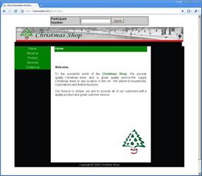
Figure 1. The Christmas Shop homepage (left-hand menu version)
The experiment was carried out on students and staff at a London based university. All participants were volunteers who were told that the site was newly constructed by the HCI group and was now being evaluated from a usability perspective. Participants were told they could be as critical as they liked, and observers were able to help and answer any questions. The volunteer participants received no payment for taking part in the experiment, but were offered a chocolate at the end and thanked for taking part. They did not know there was a very small reward when they agreed to take part.
The experiment was conducted by final year students on an HCI unit as part of a Computing degree course (BSc). They designed and built the Web sites and developed the experimental tools.
Findings
A total of 107 participants took part in the survey. There was a limited attempt to balance the genders by checking how many men and women had completed the experiment, and then attempting to redress the balance by approaching more of the required gender. There was no attempt to balance the direction of initial language acquired or handedness, because this would have required resources not available at the time. The survey ran during one afternoon only for four hours. It took place in one of the university laboratories set aside for this purpose. The experiment produced 107 questionnaires. The data was cleaned by removing any questionnaires that were not accompanied by a complete time log. Incomplete logs were missing a proper start or finish time. This was an issue that was encountered at the start of the experiment when the data for the log wasn’t collected correctly, and this accounted for 21 of the discarded questionnaires. One questionnaire was incomplete. No users abandoned the task because the questionnaire was completed only after the task (the purchase of a tree) was finished. Once the unusable data had been discarded, the collection provided 85 pieces of clean (that is complete) data that were then used in the analysis that follows.
The questionnaire measurement tool was supplemented by a single performance metric in the form of a time span for the completed activity. The timer for this started when the participant launched the homepage and stopped when he or she hit the confirm button after the purchase of their Christmas tree and related products. The confirm button also launched the online questionnaire. Users were asked about their background and experiences and answered two simple usability questions. Answers were provided via mouse click.
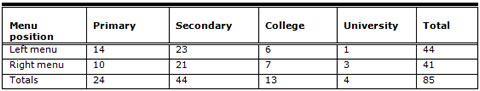
In all, a total of 41 participants used the right-hand version of the site, and 44 participants used the left, making a total of 85 participants. Of those, 36 were female and 49 male. Table 1 shows the breakdown for the participants and which version they saw of the Christmas Shop Web site, that is either the left-hand or right-hand version.
Table 1. Participant Gender and Menu Position
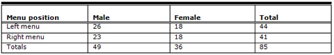
Table 2 shows the average time taken in minutes by each participant on the two versions of the Web site.
Table 2. Average Times in Minutes Taken to Perform the Task by Gender and Menu Position
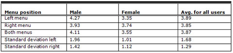
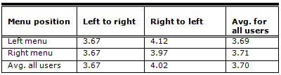
As can be seen from Table 2, the males took slightly longer on both versions of the Web site (males 4.27 minutes left, 3.93 minutes right; females 3.35 minutes left, 3.74 minutes right), but the times are not widely dissimilar. However, females were faster on the left-hand version and males were faster on the right. Given the very small differences in timings, these findings are in line with other research, though they don’t support the contention that left-hand menus perform faster. In other studies, the findings have shown a bias towards the left-hand placement in terms of speed, though this has not always been a very large one (Kalbach & Bosenick, 2003; Kingsburg & Andre, 2004). Standard t-tests were carried out on this data and there was no statistically significant difference in performance between the right- and left-hand versions. For the male and female times this was t = 0.14, p <.89. For males this was t = 0.69, p < .49 and t = 1.11, p < .27 for the females.
Thus, it can be concluded that the difference between the two genders is very slight indeed and is not statistically significant. Thus the hypothesis was upheld. Gender has no impact on performance times produced by left and right justified menus.
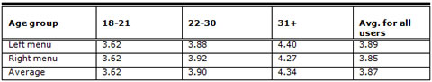
Table 3 shows the breakdown of the participant group by age group, and Table 4 shows their performance time in minutes relative to their age group.
Table 3. Breakdown by Age Group
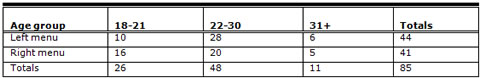
The youngest age group performed the fastest on both the left and right versions, and indeed there is no difference in their performances. The speed gradually decreases through the next two age groups (22 to 30) and (31+). There is a slight difference between left and right menu versions, but for the middle group (22 to 30) the left-hand is faster and for the oldest age group the right-hand is faster. However, the number of participants in this final group is small (only 11 participants overall), and the differences between the performance times are tiny. There is insufficient data to make confident predictions as to what this might mean. To all intents and purpose, the menus perform in very similar ways and certainly do not perform differently enough to suggest that menus should always be on the left-hand side in cases where user performance time is not critical to the Web site and/or the task.
Table 4. Menu Position by Performance Time by Age Group
The participants were asked about their Internet experience. This was divided into time spans according to when they first encountered the technology: primary school, secondary school, college, university. Table 5 shows the results.
Table 5. First Encounter with Internet Technologies
Most of the participants (44) encountered the Internet at secondary school. The next largest group (24) encountered the Web at primary school, a much smaller number at college (13), and a very few at university (4). These findings correlate very closely to the age groups shown in Table 3. That is the younger the participant the more likely s/he was to encounter Web technologies at primary school.
Table 6 shows the average times taken to perform the purchase by first encounter stage. There is very little difference in performance for those who encountered the Internet at primary and secondary school (average 3.70 at primary school and 3.59 at secondary school), but performance times increases slightly for those who encountered the Internet at college (average 4.88) and university (4.69). The numbers of participants here are very small though (13 overall at college and a mere 4 at university), so not much can be stated with any certainty. It may indicate a trend and something that would be worth looking at in the future.
Table 6. Performance Times According to First Encounter with Internet Technologies
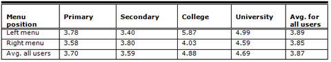
There does not seem to be any major differences between the performance of the left and right versions. Incidentally, an identical question was asked about computer usage, that is, when the participant first used a computer. These figures were the same for Internet use so that it can be concluded that these particular participants encountered computers and the Internet at the same time. This would not necessarily be true of older users who are much more likely to have encountered computers before the advent of the Web but it probably reflects the demographics of this particular group of participants.
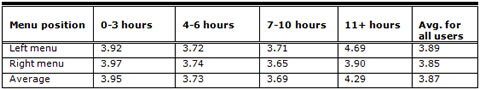
Average time spent on the Internet per day showed a similar trend to Internet experience with those using the Internet less frequently being slightly slower on both menus placements (3.92 minutes for the left menu and 3.97 minutes for the right menu). The time taken decreased for those who spent more time on the Internet (3.72 left and 3.74 right), but then increased at 11+ hours (4.69 left and 3.90 right). Again, though the number of participants is very small, 8 for 7 to 10 hours and 12 for 11+ hours, as in the earlier case it may indicate a trend. It would have to be tested again using a larger sample. See Tables 7 and 8.
Table 7. Average Internet Usage–Participant Numbers
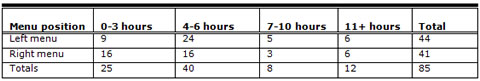
Table 8. Performance Times According to Hours Spent Online
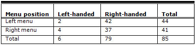
Disappointingly, the numbers of left-hand users who took part in the survey turned out to be very small indeed (6). In fact, the numbers are smaller than would be expected by chance so much so that the question over handedness was re-examined in order to consider the possibility that it had been misunderstood by the participants. See Tables 9 and 10.
Estimates for left-handedness seem to range from about 8% to 15% of the world population. (Hardyck & Petrinovich, 1977). It could therefore be expected about 1 in 10 of the participants would be left-handed so the results below are lower than could be reasonably expected.
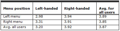
Table 9 shows the figures for participation by handedness. Table 8 shows the performance times.
Table 9. Participation by Handedness
Left-handed participants took longer than right-handed participants, but the number of participants is too small to say much about that. No notice was taken of which hand they used for moving the mouse so there is no way of explaining that figure. Left-handed computer users quite often use their right-hand for the mouse and the left for typing. They can increase input speeds because using a mouse tends to be easier than typing. However, as this experiment did not require typing there would be no speed advantage over their right-handed counterparts.
Table 10. Performance Time by Handedness
Tables 11 and 12 show the attempt to tie language acquisition as a factor in menu placement preference. This question tried to capture all of the right to left languages, but unfortunately had an “other” response to allow for languages that the questionnaire did not list—for example, languages that the questionnaire designers were unaware of. Consequently, a number of participants answered “other,” and there is no way of knowing if that was a right to left language or not. As can be seen, the number of participants who told us they learned to read a right to left language first was very small indeed.
Table 11. Direction of First Learned (Reading) Language
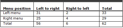
Table 12. Performance Time by Direction of First Learned (Reading) Language
Although it would be nice to say that menus are better placed on one side or the other, the differences in the performance figures are so slight that it is difficult to conclude that they have any real meaning. It would seem that once users know where the menu is they are quite able to operate either side. This was confirmed by the questions participants were asked about how easy it was to navigate on the site and how easy it was to purchase the products. These usability questions were offered to participants as a scalar question. The participants were asked to rate the ease of navigation and the ease of buying on a scale of 1 to 5 with 1 being easy and 5 being difficult.
Table 13. User Satisfaction with Menu Placement
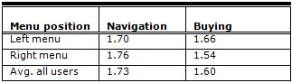
Table 13 shows the results of the user satisfaction portion of the questionnaire for all participants.
Those seeing the left-hand version rated navigation at an average of 1.70 and buying at 1.66. Whilst those seeing the right-hand version rated navigation at an average of 1.76 and buying at an average of 1.54. The statistical test confirms that there is no statistical difference between the two: for the left versus right menu placement for navigation this was t = (0.2003), p <.84; for males this was t = (0.2538), p < .80; and for the females this was t = (0.0000), p < 1.00.
Again the same statistical tests were carried out on male and female participants using the left and right menu placements for buying, and again there was no statistical significance in the findings: for the left versus right menu placement for buying this was t = (0.6279), p <.53; for males this was t = (1.5582), p < .13; and for the females it was t = (0.3847), p < .70.
More research would need to be done, but these findings are in line with other studies of left-hand versus right-hand placement (Kingsburg & Andre, 2004).
Recommendations
The following are our recommendations based on this study:
- Given the small differences in both performance and preference, the placement of a menu should not be dictated by convention.
- There might be good reasons for placing the menu on the right-hand side of the screen. For example, if the site has no alternative but to expect the user to scroll, then right-hand placement is preferable because the user will then have the mouse placed close to the scroll bar and this should speed up performance times.
- Where a novel solution is needed then a right-hand menu system might keep the user sufficiently interested in the design, which might keep them on the page for longer.
- Because users readily adapt when convention is flouted, designers should not feel constrained to the use of the traditional left-hand placement of the navigational panel.
Conclusions
Overall it has to be concluded that there was no real difference in the performance of the two menus, and that there does not seem to be any valid reason other than taste to place the menus on the left-hand side of the screen. There was no factor that influenced the positioning of the navigational panel. There was no evidence that longer experience and exposure to the Internet meant that users were more inclined to expect and want a menu on the left. Nor was there any evidence to support the contention that the right-hand menu appealed to the participants because of its novelty. It would seem that the position of the menu plays no serious part in browsing the Web and users are readily able to accommodate to the menu design wherever it is placed. This view is supported by the research of Kalbach and Bosenick (2003) and Kingsburg and Andre (2004), though in the both these cases they did find some small differences in performance time. Kalbach and Bosenick concluded that these differences were not significant and that left-handed menus were not significantly more efficient than right placed ones (2003). The conclusions from this experiment have to argue the same thing and rather more pointedly. The findings cannot support a significant difference in the performance of the two menus, and at times the results are conflicting. In defence of these findings, it has to be said that this study used larger numbers of people (85), but as the participants were all students and staff at a university, it might be argued that this particular study was biased by the particular group used for this experiment. Again, in defence of the findings, the students were taken from across the university and represented a wide range of backgrounds and ages.
Given the current state of this research, it has to be concluded that the positioning of the menu should be dictated by the needs of the user, the site, and the wishes of the designer. There appears to be no concrete evidence to support the placement of the navigational menu on one particular side of the screen. Convention should not dictate that placement. Web designers should place menu and navigational structures where they believe the user would like to see them, and that might be in different parts of the screen depending on the user, the task, and the nature of the screen design. Another way of viewing this issue is to notice that the right-hand menus performed with very little difference from the left-hand ones, and this is despite the fact that the major design on the Web is for left-hand justified menus. However, that does not mean that designers can swap between elements. A site should be left-hand menu driven or right-hand menu driven. It should not consist of some pages with left-hand menus and others with right-hand menus.
The Christmas Shop Web site itself was very simple indeed. Scrolling was kept to a minimum; there was no scrolling on the homepage, payment page, and about us pages. There was scrolling on the products page. So it might be that if a user needed to scroll more, the right-hand menu would have performed better than it did, despite its novelty value. However, not all users like scrolling, and some aren’t particularly efficient at it. For example, often the elderly are much slower at scrolling than younger users. If scrolling has to take place then perhaps it would be wise to consider a right-hand navigational panel in order to keep navigational controls close together and to save user effort in another direction.
There is a one final issue that perhaps would make the right-hand menu placement an attractive consideration for the Web site designer. Often designers encounter the problem of keeping a user on a Web site long enough to make a purchase, so choosing the fastest and most obvious design might not always be the best decision. Menu placement might thus be dictated by more than making the user’s activity as typical as possible. The issue might be is it possible to keep the user on the Web site long enough to buy a product or perform a task? At the same time, potential buyers need to be kept on the site in a positive frame of mind; they can’t be trapped there, frustrated by the difficulties of the Web site.
As this study found there was no statistically significant difference in performance time nor in ease of use. A right placed menu might be worth considering if the design would be improved by not placing the menus in a conventional position.
However, it has to be remembered that this study used a single performance metric—time. It did not attempt to gather qualitative data from the user other than their response to ease of use for buying and navigation. In other words no satisfaction levels were measured for either version of the site. And although there were no statistically significant differences in performance for between both versions, it might be that users had a preference for one version over another. Although an earlier study failed to prove any difference in user attitudes between left and right placed menus, again user satisfaction with menu placement remains an area that needs to be re-examined in any future work.
References
- Arch, A. (2009). Web accessibility for older users: Successes and opportunities. W4A ’09, Madrid, Spain, Proceedings of the 2009 International Cross-Disciplinary Conference on Web Accessibility (W4A). New York, NY, USA. ACM.
- Fitts, P. (1954, June). The information capacity of the human motor system in controlling the amplitude of movement, Journal of Experimental Psychology, 47 (6) June 1954, 381-391.
- Hardyck, C., & Petrinovich, L.F. (1977). Left-handedness, Psychological Bulletin, 84, 385-404.
- Kalbach, J. & Bosenick, T. (2003). Web page layout: A comparison between left- and right-justified site navigation menus, Journal of Digital Information, 4 (1).
- Kingsburg, J.R., & Andre, A.D. (2004). A comparison of three-level Web menus: Navigation structures. Proceedings of the Human Factors and Ergonomics Society Annual Meeting.
- Lindgaard G., Fernandes G. J., Dudek C., & Brown, J., (2006). Attention Web designers: You have 50 milliseconds to make a good first impression! Behaviour and Information Technology, 25, 115 – 126.
- Mardiros Internet Marketing (2006). Good Web site navigation – Reaching the information instantly. Retrieved July 2011 from http://www.mardiros.net/good-navigation.html
- Michailidou, E., Harper, S., & Bechhofer, S. (2008). Investigating sighted users’ browsing behaviour to assist Web accessibility. Proceedings of the 10th international ACM SIGACCESS conference on Computers and accessibility (121-128) Halifax, Nova Scotia, Canada.
- Niesen, J. (1999a, August). Do interface standards stifle creativity? Retrieved July 2011 from Alertbox, http://www.useit.com/alertbox/990822.html
- Nielsen, J. (1999b, November 14). When bad design elements become the standard. Retrieved July 2011 from Alertbox, http://www.useit.com/alertbox/991114.html
- Nielsen, J. (2004). The need for Web design standards. Retrieved July 2011 from Alertbox, http://www.useit.com/alertbox/20040913.html
- Santa Maria, L., & Dyson, M. C. (2008, September 22-24). The effect of violating visual conventions of a Web site on user performance and disorientation. How bad can it be? Proceedings of SIGDOC’08 (pp. 47-54) Lisbon, Portugal.
- Spool, J. (1997). Web site usability: A designer’s guide. San Francisco, CA: Morgann Kaufmann.