
[:en]
Prologue
In early 2012, I was in charge of defining SAP’s quantitative usability testing methodology. In search for a sound and solid efficiency KPI, I pondered the statistical properties of task completion times. Several papers (e.g., Sauro & Lewis, 2010) stated those times were not normally distributed, but what was their distribution? The distribution tests I knew at the time all failed. The data sets I had were too small for drawing meaningful histograms. In my despair, to have something to look at, I sorted my data smallest to largest and plotted them. OK, there was a curve with the long tail everybody was talking about. Well, on a hunch, I put one axis on a log scale and found myself looking at a straight line.
As an empirical researcher, when you see a straight line in your data, you get goosebumps.
Eight years later, there was a series of JUS papers outlining a methodology for analyzing task completion times which turns out I should have written the other way around. I started with the most complicated approach—a generic analysis method borrowed from reliability engineering (Rummel, 2014). After having found the standard distribution I was looking for, the Weibull (Rummel, 2017a), I figured out what its parameters mean—a key to understanding user satisfaction, at least its pragmatic aspect (Rummel, 2017b). Yet, after several tutorials and discussions with colleagues, I feel it is time to describe the methodology in simpler and more practical terms. Thanks to the editors of the JUS for kindly inviting me to do so.
The present paper is to turn the methodology on its feet, to make it more usable for practitioners. Statistics are only so interesting—unless they help figure out what is going on with users and interfaces. Well, let me show you how and why this toolkit has become indispensable for me, in particular in online user research.
Introduction
Time data resulting from random processes follow a typical pattern. Any deviation from this pattern indicates that some non-random influence is at work—exactly what we are looking for in usability testing.
The idea of the methodology presented here is to compare task completion times with the pattern expected for random processes using a visualization known as a probability plot (NIST 2012; Rummel, 2014). From such a plot, practitioners can quickly tell whether and where data deviate from the standard “random” pattern. Any such deviation indicates a non-random influence on the process and gives hints to the nature and impact of such influences. Deviations can be mere outliers (to be weeded out) or systematic (to be analyzed in detail). Examples are given below.
In a nutshell, the probability plot tells the researcher whether non-random influences on task completion time are present, where to look for them, and what to look for. Once the data are sufficiently cleaned up and understood, researchers can proceed to quantitative modeling, where required and meaningful (we will see cases where it is not).
While the method itself is based on statistical survival and reliability analysis (NIST 2012; Rummel 2014, 2017a), this paper focuses on qualitative insights that can be derived from simple visualizations. I discuss these first, using practical examples, as they are the most interesting for practitioners. Quantitative modeling aspects are described only briefly; for a comprehensive treatment, see Rummel (2017a).
Random Processes
Time-to-event data, such as waiting time in a restaurant, the lifetime of technical components, or duration of projects, have an interesting property. While single events may happen at unpredictable, random times, the overall process can sometimes be described in exact quantitative terms. Consider the decay of a radioactive element like iodine-131 (131I), as it is described in physics textbooks: Radioactive decay is a random process as one cannot say when exactly a single atom will decay—it’s a purely random event. However, when considering many atoms, they follow a precise law; we can precisely state which percentage of atoms have decayed at a certain time (Figure 1A). In the case of radioactive decay, it is common knowledge that the decay rate is constant: The first 50% of the substance takes as long to decay than the next half (=25%); we call this time the substance’s “half-life.” When we plot the remaining percentage of the substance on a logarithmic scale over time, we get a straight line.
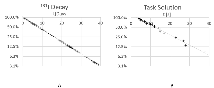
Figure 1. Radioactive decay curve for the isotope 131I vs. solution curve of a usability task.
Now consider Figure 1B. It shows task completion time data from a typical usability test in a so-called probability plot (NIST, 2012). Participants are of course not “decaying” but solving the task, so after a certain time only a certain percentage of participants is still working. The similarity is striking: Apart from some random fluctuations, the data points also form a straight line. Apparently, these data follow pretty much the same law as radioactive decay—as statisticians call it, an exponential distribution. But are they also resulting from a random process?
Partly, they are of course. There are quite a few random factors influencing task completion time: users’ experience and proficiency, their meeting and overcoming usability problems, their perceiving interaction affordances vs. overlooking them, and so on. The cumulative impact of such factors can be determined from the decay rate of the process, that is, the slope of the straight line in a plot like Figure 1: the higher the impact, the flatter the slope (users take progressively longer to solve the task).
Note that the prevalence of factors that influence task completion time (the likelihood to encounter a usability problem, the ease and proficiency at which a user can overcome them) essentially determines the tested UI’s usability and deeply influences the user’s experience. Indeed, the so-called characteristic time (the reciprocal value of the slope[1]) turns out to be a key predictor of users’ post-task satisfaction in business applications, even more important than the task completion rate (Rummel, 2017b).
Obviously, solving a test’s tasks is not a purely random process either. When and where non-random influences on task completion time occur is all the more interesting. In usability tests, this is exactly what we are looking for. The great value of plots like Figure 1 is that any deviation from a straight “stochastic decay” line indicates such a non-random influence and gives hints to where it impacts users’ performance.
Let’s walk through such deviations systematically. In particular, I discuss offset “click” time, fast and slow outliers, patterns, and systematic acceleration or deceleration.
Translation Offset: “Click Time” vs. “Think Time”
Consider Figure 1B again. Data points form a straight line, but this line does not originate at 0. In fact, it intersects the time axis at an offset time of roughly 3s. Apparently, the process is random all right, but it looks like a constant of 3s has been added to all data points, translating the entire solution curve to the right. What might this constant be?
Each interactive system has a response time that under constant conditions is roughly identical between trials. Also, elementary actions like positioning the mouse or clicking a button take a roughly constant amount of time—compared to the variation in overall task solution time, the variance contributed by these processes is negligible. For modeling’s sake, we may as well treat them as a constant.
Rummel (2017a) dubbed this constant offset time “click time,” as opposed to “think time” (the characteristic time). When comparing data from different test tasks, click time can be used to quickly identify differences in system performance or in the mere mechanical efficiency of clicking through tasks on the optimal solution path. A common question in UI design is whether it pays off to design a UI with clearer screen elements when they require more clicks. Analyzing click time vs. think time answers this question (Rummel, 2015); it does so even on a quantitative level.
From a qualitative point of view, differences in click time can be particularly interesting when they are unexpected. In an unmoderated online study, we asked participants to consider a static screenshot of a master-detail display (a common design pattern in enterprise software): A “master” list panel on the left-hand side of the screen showed a selectable list of items, and a “details” pane on the right displayed details for the selected item. Participants’ task was to click, as fast as possible, on the list item that they believed corresponded to the details displayed on the right-hand side of the screen. The task was not trivial because the screens contained several conflicting visual codings: The selection for executing functions was visualized with checkboxes and a light background color; the selection for detail display was displayed with other visual elements that were the actual subject of the test. To investigate whether participants could accurately and efficiently resolve the different visual codings, we measured the time and accuracy of the first click, which was on the list item participants thought was the one related to the details displayed.
Figure 2 shows probability plots from two test tasks in comparison, where different visualizations were used. Times were measured at 1s resolution; note how the regression lines in the plot average out this rather coarse granularity. The “Background” visualization apparently is the more efficient design: The slope of the line is steeper, indicating that at any time, a greater percentage of test participants solved the task, compared to the “Border” design. However, it is puzzling that the Background line intersects the time axis earlier than the Border line. Why would click time be different when system performance is no factor (we used screenshots), and the screen layout, mouse travel distances, and target sizes are virtually identical? Fitts’ law (1954) would predict exactly equal click times, but they are not.
Figure 3 offers an explanation for the phenomenon. When we first inspected the click maps for the two task conditions, we focused on whether participants clicked the right item. The time analysis inspired us to look again, this time for differences in the actual clicking behavior. Interestingly, participants in the Background condition clicked mostly on text, while many participants in the Border condition clicked on the checkbox—a substantially smaller target. Those who, incorrectly, clicked on the light-blue coded item selected for functions, again clicked on text. Apparently, the background design of the line items evoked click affordances differently in the two conditions—a subtle and rather unexpected effect, indicating that target size in Fitts’ law is not just given by geometry.

Figure 2. Probability plots of task completion times in two conditions of a remote, unmoderated first-click test.

Figure 3. Click maps in two conditions of a remote, unmoderated first-click test.
Outliers I: Speeders
A common challenge in online user research is telling valid participants from cheaters. Many survey and online testing platforms provide controls for identifying so-called “speeders.” Typically, researchers can enter a minimum time required for answering questions or tasks to screen out participants who merely click through questions to quickly get their incentive. Determining this minimum time is not trivial. If the time limit is too narrow, legitimate participants may get discarded; if it is too wide, cheaters are not caught.
The probability plotting technique offers an elegant way to spot speeders. The plot is essentially a visual model of the task solving process. The typical line pattern (or curve, see Figure 4) indicates that we can build a coherent model of the process. Individual data points who do not follow the overall pattern are suspect of participating in a different process—doing something else than legitimately participating in the study. For instance, cheating.
Figure 4 shows overall survey participation durations (note that the technique can be applied both on the task level and also on an entire study). Here, close to the time axis, there are five data points that deviate from the otherwise coherent pattern—the regression line calculated from the entirety of data points. Upon closer analysis, all turned out to have cheated.
Catching speeders early poses a great economical incentive for the researcher. Not only are invalid data removed from consideration, but recruiting platforms often do not charge for speeders caught as long as the study is still live, and the platform can replace them free of charge.

Figure 4. Study duration time in an unmoderated online usability test. Note deviation of data points from the regression line in the top left.
Outliers II: Slow Users or What?
Outliers are common not only on the fast end but also on the slow end of the process. In unmoderated online research, participants can get interrupted, take a break, or change their behavior during the course of the study (for instance, out of boredom). It is always a good idea to look for bends in the plot, which often occur 10–15 minutes into the study (Figure 4 shows such a bend after 25 minutes).
Sometimes however, outliers are the more interesting data. Outlier times exist because the respective test participants apparently did something different than the others; otherwise, their data would most likely fit the overall model. Probability plots let us identify critical cases, generate hypotheses about them, and verify those hypotheses.
Patterns
When outliers come in regular patterns, there is a suspicion that other processes than the “mainstream” process have been at work, which nevertheless follow systematic rules.
In a study on loading animations, we wanted to investigate whether users would benefit from “skeleton” screen animations, revealing structural information, before the screen was fully rendered. If animations would let users preview the structure of the screen, we hypothesized this would save them time in spotting relevant data by creating expectations where that data would be located. In an unmoderated online study, we asked participants to click on a certain information item as soon as they spotted it on the screen. We measured time and accuracy of the clicks.
Not unexpectedly, there were a few outliers in the study, taking substantially longer to click the target than others. What made us suspicious was that the additional time taken seemed to come in regular intervals. However, the number of outliers was not sufficient to draw definite conclusions.
A follow-up lab study, using an eye tracker, both replicated the suspicious data pattern and revealed its cause. Figure 5 shows data from two experimental conditions in a combined probability plot. Data points appear in three distinct groups, each about 1500ms apart. Although in one condition participants’ performance was clearly superior, the groups contain data from each of the two conditions. The regression lines drawn for each condition, which include the outliers as legitimate data points, clearly do not show a realistic picture. Given the outliers, a purely quantitative comparison would be obviously misleading.
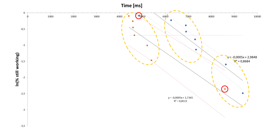
Figure 5. Probability plots of two conditions in a visual search task. Note the grouping of data points and groups containing data points from both conditions. Regression lines shown with 90% confidence bands.
Inspection of the outliers’ eye-tracking data gathered in the experiment explained the plot. Participants started the search task by scanning the screen for the target. Those who missed the target in the first pass started over, and they did so again when necessary. The individual data point groups each show roughly the same slope, indicating that the process as such is not very different in each scanning pass. However, designs apparently differed in the number of passes participants needed to eventually spot the target. Each extra pass led to a translation of the solution curve by a roughly constant offset. Interestingly, there is a “fast” outlier in one group and a “slow” outlier in the other (red circles), but each outlier fits in the other design’s overall “mainstream” pattern. The superior design was not really “faster,” but “safer” in the sense that participants were less likely to miss the target in the first scanning pass.
Note that the consideration described here does not claim to be scientifically exact evidence. However, it demonstrates how plotting task completion time data can complement other techniques, like eye tracking. In this study, neither method alone would have been as informative and efficient as their combination. The eye-tracking study became necessary because time data from the first online study raised questions. In the second study, the time plots were instrumental in guiding the eye-tracking analysis—which cases to look at and what to look for.
Curved Plots: Outlier or Weibull Distribution?
Every so often, there are test participants who take considerably longer than others to solve a task. Consider a purely random process, following an exponential law with a certain half-life (Figure 1A). The law predicts that 6.3% of users would be expected to take 4 times as long as the half-life of the process, more than 3 standard deviations away from the mean—without being actual outliers. In real-life usability test data, it is rather common that participants take even longer. When would you consider such participants outliers? How can you decide?
Often, slow participants are not outliers but legitimate data: In case of immature applications with many usability issues, users may be demotivated, frustrated, or simply tired. There may very well be influences on task performance that do not take effect suddenly but add up ever so slightly over time. Consider Figure 6. Figure 6 shows data from a usability test where three data points on the bottom right digress from the otherwise linear pattern. They might very well be outliers. An alternative interpretation of the plot would be that the data points follow a curve, instead of a line (here, drawn manually into the plot). Figure 7 investigates this hypothesis. It uses the Weibull distribution model, an extension of the exponential model that is frequently used in the analysis of technical components’ reliability.
The Weibull model incorporates systematic and steady influences on an otherwise stochastic process, adding a “shape parameter” to the exponential model. A shape parameter of 1 means that the distribution is indeed exponential. The plotting technique for this distribution is basically the same but with the time axis logarithmized and the percentage axis logarithmized twice. Rummel (2017a) gave a comprehensive introduction into Weibull modeling of task completion times and demonstrated its widespread applicability in usability testing.
Figure 7, a probability plot modeling a Weibull distribution, shows that the data points nicely line up along a straight regression line, indicating that they indeed fit a Weibull distribution with a shape parameter <1. This in turn indicates that a systematic slowing influence on participants’ performance might have been present. In particular, the three “outlier” data points in this plot are close to and randomly distributed around the regression line, indicating that a Weibull model would cover them as perfectly legitimate data.
Apparently, the data pattern in Figure 6 and Figure 7 can be explained by two alternative hypotheses. The data pattern could be the result of a random (exponential) process with three outliers or the result of a systematically slowed down (Weibull) process. To investigate the first hypothesis, a researcher can inspect the three critical data points for influences that are specific to them, explaining why they might be outliers. Alternatively, the second hypothesis would suggest inspecting the entire process for detrimental factors affecting all data points, explaining the Weibull shape of the distribution. Again, the visualization helps generate hypotheses and gives guidance where to find the relevant information.
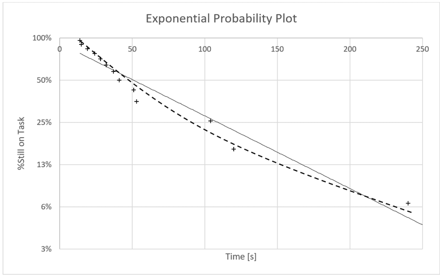
Figure 6. Exponential probability plot of the same data used in Figure 7 from a lab usability test task.
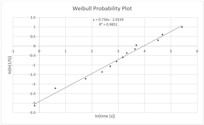
Figure 7. Weibull probability plot of the same data used in Figure 6 from a lab usability test task.
Generating Probability Plots
Probability plots are essentially scatterplots of times against their respective (estimated) percentiles in the population. The Excel spreadsheet available for download with this paper can be used for generating plots; instructions are included as comments. In the following, I shall briefly sketch how plots are generated (Rummel, 2014 provides a comprehensive description, statistical background, and plot templates for other distribution types).
In the radioactive decay curve example (Figure 1A), the vertical axis shows the percentage of the substance still available; in the task completion time examples, it shows the percentage of participants that would still be working on the task if all had started at the same time. The horizontal axis displays the corresponding times, that is, solution times of those participants (only) who solved the task.
This percentage of participants “still on task” is not quite trivial to determine. Suppose you had two participants—which percentile would each of them represent? If one of them failed the task, what would this mean for the percentile estimate? A well-established method to answer these questions is known as the Kaplan-Meier estimator, conveniently modified by Tobias and Trindade (2012) to cover different task completion rates with the same computation scheme. Rummel (2014) described it in detail for task completion times. For the present paper, let’s focus on what the algorithm does and how to apply it in practice.
The modified Kaplan-Meier (mKM) algorithm uses rank numbers to estimate percentiles. Suppose all test participants had started working on a task at the same time. The first ones to solve the task would get the smaller ranks, so we can simply sort times smallest to largest to determine rank numbers. When participants did not solve the task, further considerations become necessary to determine the proper ranking, as follows.
Participants who gave up on the task, came up with wrong solutions, or reached a time limit, might have solved the task eventually, but it is safe to assume that they would have taken very long to do so. For the mKM algorithm, those participants can simply be ranked after the slowest successful one. It is easy to see how this adjusts the percentile estimate: If 20% gave up on a task, they can obviously only occupy the last 20% of the observed ranks. In practice, those participants can be assigned an arbitrary very long time so they are ranked last after sorting. The actual number does not matter because times from unsuccessful participants are not plotted.
Every so often, participants cannot solve a task for random or arbitrary reasons: an interrupting phone call, an unprovoked system failure, and so on. For the mKM algorithm, the decisive question is whether the participant might very well have solved the task right after the critical event, had it not occurred. If this is the case, the respective time at which this event occurred is ranked among the successful times, but not plotted. The mKM algorithm then also corrects percentile estimates, but less sharply than in the previously described case.
In practice, the situation is not always clear-cut. Consider a visual search task like in Figure 3. Participants who clicked the wrong target might have corrected themselves immediately afterwards, but did not get a chance to do so because their mis-click was already registered. Some maybe could not be bothered with placing a second, correct click, or might have pondered their mistake for an unknown period of time. In such cases, practitioners need to simply make sense of the data, try alternative time assignments, and see what is plausible. Scientists of course need to come up with experimental procedures that exclude any doubt.
The mKM algorithm can easily be implemented in a spreadsheet. Task success vs. failure is 1/0-coded, so the algorithm can calculate the percentile estimate to be used in the plots.
Analysis Steps
Practitioners can simply sort data as described above and paste them into the spreadsheet. When sorting, it is important to keep participant IDs and success/failure coding in the respective data rows, so the researcher can follow up on anomalies, and the mKM algorithm takes proper care of task failures.
The exponential probability plot requires no further interaction to be interpretable. However, if outliers are present and the researcher decides to treat them as such, they must be removed: If data are deemed illegitimate, they must not affect the mKM percentile estimation. It has proven convenient to copy outlier data to a neutral “parking lot” in the spreadsheet, where they do not affect calculations. This way, it is documented what has been removed, and the why so can be easily investigated by copying the outlier data back into the dataset and inspecting the plot.
The Weibull probability plot requires that an offset “click time” is entered manually. For generating the plot, the offset time must be subtracted from observed times to calculate the plot, and the result must not be negative. To check outlier candidates, it will suffice to enter the minimum time minus 1 (the click time estimate from the exponential plot will be distorted by the suspected outliers). If the plot straightens up, it is likely that the Weibull model is applicable, and the outliers are actually legitimate data subject to systematic friction in the task solution process. For quantitative modeling of Weibull distributions, Rummel (2017a) provided extensive guidance and a specific calculation sheet.
A Disclaimer on Time Distributions
For interested readers, there are much more sophisticated mathematical models available in contemporary statistical literature, which go way beyond what I am presenting here and should be consulted for in-depth statistical analyses. To name two examples, Martin Schmettow (2019) is currently writing a textbook on modern, Bayesian statistics specifically for design researchers, which also treats task completion time analysis, and is publicly available as a draft. Specifically, for reaction times, Jonas Kristoffer Lindeløv (2019) compiled a very informative, interactive overview of distribution models and their respective generative mechanisms. Users can play with distribution parameters and watch the results of their changes in histograms and density functions, thereby checking out distributions that might match their problem. Readers will notice that in this literature, the exponential and Weibull distribution models are featured much less prominently than here.
The present paper and methodology aim at a different audience and a slightly different purpose. The exponential and Weibull distribution models have a number of advantages for practitioners. First, they can be calculated with everyday spreadsheet tools. Second, they are rather useful tools for informing an everyday design discourse with stakeholders. The notion of a stochastic process with a half-life illustrates that a handful of fixes will only help so much—there is no silver bullet for usability. On the other hand, when usability issues become immediately visible as deviations from the standard exponential pattern, this is both impressive and effective in driving further analysis. Third, the Weibull extension of the model may not capture the exact mechanisms that generated a particular observed distribution, but offers a straightforward interpretation on the backdrop of random processes. It further provides a generic quantification of inhibitory influences that is applicable to a wide range of test results (Rummel, 2017a). In reliability engineering, the Weibull is the analyst’s workhorse, which comes with further advantages, for instance, extensive and pragmatic frameworks for analyzing and modeling composite processes (e.g., Tobias & Trindade, 2012).
Last, not least, exponential probability plots once again illustrate the value of visualizing data—in an informed way—before jumping to quantification.
Tips for Practitioners
This paper focuses on quick, qualitative inspection of task (or study) completion times, which can be done in a matter of minutes with the spreadsheet available for download here. For quantitative modeling, refer to Rummel (2017a), where a more sophisticated spreadsheet is available, with instructions.
Here is a summary of what to look for in probability plots:
- Start with the exponential probability plot. The straighter the data in the plot align, the greater the role random factors play in the task solution process.
- “Left hooks” on the upper left of the plot (fast outliers) indicate possible cheaters.
- Kinks on the lower right of the plot indicate participants who worked the task differently from the others or did something else than work the task. They may have been interrupted, initially misunderstood, or otherwise not worked in a straightforward manner on the task.
- Repeated “pattern” kinks are not uncommon in search tasks, when participants start the search process over one or more times.
- A smooth bend in the plot indicates a systematic influence on task performance. Use the Weibull plot to tell bends (systematic, steady influence) from kinks and outliers (sudden or idiosyncratic influence).
References
Fitts, P. M. (1954). The information capacity of the human motor system in controlling the amplitude of movement. Journal of Experimental Psychology, 47(6), 381–391. doi:10.1037/h0055392. PMID 13174710
Lindeløv, J. K. (2019). Reaction time distributions: an interactive overview. Retrieved December 2019 from https://lindeloev.shinyapps.io/shiny-rt/
NIST/SEMATECH (2012). Probability plotting. In: E-handbook of statistical methods. National Institute of Standards and Technology. Retrieved December 2019, from https://www.itl.nist.gov/div898/handbook/apr/section2/apr221.htm
Rummel, B. (2014). Probability plotting: A tool for analyzing task completion times. Journal of Usability Studies, 9(4), 152–172.
Rummel, B. (2015). When time matters: It’s all about survival! SAP User Experience Community, retrieved December 2019 from https://experience.sap.com/skillup/when-time-matters-its-all-about-survival/
Rummel, B. (2017a). Beyond average: Weibull analysis of task completion times. Journal of Usability Studies, 12(2), 56–72.
Rummel, B. (2017b). Predicting post-task user satisfaction with Weibull analysis of task completion times. Journal of Usability Studies, 13(1), 5–16.
Sauro, J., & Lewis, J. R. (2010). Average task times in usability tests: What to report? CHI ’10 Proceedings of the SIGCHI Conference on Human Factors in Computing Systems (pp. 2347–2350). New York, NY: ACM Press.
Schmettow, M. (2019). New statistics for the design researcher. Retrieved December 2019 from https://bookdown.org/schmettow/NewStats/
Tobias, P. A., & Trindade, D. C. (2012). Applied reliability (3rd ed.). Boca Raton, FL: CRC Press.
[:]