
[:en]
Abstract
Expert-based usability evaluation methods offer valuable alternatives to traditional user testing in Human-Machine Interaction (HMI) development. While general measures of usability for user-based empirical studies are well-known throughout the community of researchers, expert-based approaches often lack such general measures of usability. This research introduces the Guideline Compliance Scale (GCS), a measure that can be applied during guideline reviews to assess the overall level of usability. Several guidelines relevant for the system being evaluated are rated by the evaluators according to their compliance.
In the case study for our research, an automotive user interface was empirically evaluated in a user study as well as a guideline review with experts. The usability problem lists, which form part of the output, were made comparable by classification using the Usability Problem Classifier (UPC). An in-depth analysis revealed differences and similarities in the problem identification of both applied methods. Comparing the results of the GCS from the guideline review with the results of the System Usability Scale (SUS) from the user study, regarding the overall level of usability, showed similar results for both scales.
Keywords
Human-Machine Interaction (HMI), Usability measure, Guideline review, Expert-based evaluation, In-Vehicle Information Systems (IVIS), Usability Problem Classifier (UPC), System Usability Scale (SUS)
Introduction
Because human-machine interaction (HMI) possibilities inside a car are no longer limited to a steering wheel, accelerator, and brake, the HCI research field is rapidly growing. The latest developments for in-vehicle technology and automated driving are leading to more features that present several new challenges in evaluating interfaces inside a car. The long-established companies in the automotive industry also have had to face new challenges because there are new players integrating their products into cars. Apple Senior Vice President of Operations Jeff Williams called the car “the ultimate mobile device” (Snyder, 2015). Alongside the typical instrument clusters with speedometer, rev meter, and basic information displays for operating the vehicle, modern cars are often equipped with a wide variety of in-vehicle information systems (IVIS). These systems cover features from displaying information about the vehicle status and navigational information to entertainment functions and several connectivity options for external devices.
Measuring the usability of these IVIS as early as possible during the development cycle plays a key role when designing for the automotive context (Harvey & Stanton, 2013). On the one hand, poor customer experience can be the result if usability is neglected in the development. Beyond the tasks performed using the IVIS, the driver of a car must always concentrate on the actual driving task. From a usability perspective this dual-task scenario represents a special challenge during the evaluation of an HMI. However, most car manufacturers are facing strict confidentiality guidelines in early development stages which makes user testing even more complicated. Expert-based approaches offer valuable alternatives to traditional user testing (Nielsen & Molich, 1990; Sears, 1997), especially when the development is in its early stages. Nielsen and Molich (1990) summarized the following advantages of an expert-based evaluation method they introduced—the heuristic evaluation (HE):
- It is cheap.
- It is intuitive, and it is easy to motivate people to do it.
- It does not require advanced planning.
- It can be used early in the development process.
Most of these advantages can be transferred to other expert-based approaches, as they all share the absence of the need for test users and advanced products or prototypes. Although expert-based evaluation methods are considered inferior compared to traditional user testing, their main advantage is that their simplicity makes them much more likely to be actually used in the industry.
A drawback of expert-based approaches is often the lack quantitative results. A collection of usability problems, which is often the result of expert-based techniques, does not provide a sufficient basis for effective communication about the project status with the stakeholders. Furthermore, collections of usability problems can often not be compared across the board between different versions of a product. The need for general measures of usability that can be compared is addressed by metrics like the SUS (Brooke, 1996) that is generally used after a user has had the opportunity to use the product. Other usability measures like the Software Usability Measurement Inventory (SUMI; Kirakowski & Corbett, 1993) or the Questionnaire for User Interaction Satisfaction (QUIS; Chin et al., 1988) use more items than the SUS (with its simplicity of only ten items) which can be seen as hurdle in industrial usability evaluation.
Our work presents an approach to close this gap between user-based and expert-based testing. The GCS introduces a tool to get an indication of the overall level of usability for a specific product from an expert-based evaluation. The presented case study shows a first proof of concept of the GCS. As discussed in the following section results from expert-based methods are often compared to user-based testing results throughout the literature to validate their suitability. Therefore, the presented case study shows an in-depth comparison of the detected usability problems from a user-based usability test as well as an expert review applying the guideline review method. In order to validate the GCS scores, they are compared to SUS scores raised during the usability test.
The following section “Expert-Based Usability Evaluation” gives an overview of related work on the application of expert-based usability evaluation methods, while the section “The Guideline Review Method” presents the guideline review method and an overview of different guidelines from the literature. After an introduction of the GCS in the section “The Guideline Compliance Scale (GCS),” we describe our case study comparing the GCS when applied during a guideline review with the application of the SUS during a usability test in the section “Case Study.” We also present the limits to generalizability and future work.
Expert-Based Usability Evaluation
Several studies have compared the results of expert-based approaches with empirical user testing. Throughout the literature, usability testing with real users is often considered the gold standard (Landauer, 1995) or standard yardstick (Andre et al., 1999, p. 1090) to which to compare Usability Evaluation Methods (UEM). This section gives an overview of publications comparing different UEMs using a literature review of the following digital libraries: ScienceDirect, IEEE Xplore, ACM, and Google Scholar. The topics for comparison are expert usability evaluation, usability inspection methods, and guideline review.
Miniukovich et al. (2019) presented a comparison study for the application of web readability guidelines collected through a literature review (Miniukovich et al., 2017) using the results of an eye-tracking experiment as the ground-truth readability. The authors investigated the readability of several web pages and collected the ground-truth readability through eye-tracking data and subjective readability ratings. In a manual guideline evaluation, 35 experts from different domains were asked to perform an online review of a subset of the web pages according to 39 readability guidelines. For another automatic evaluation, Miniukovich et al. (2019) matched the list of guidelines to different metrics of readability features and text complexity. While the manual approach highlighted several problematic aspects that were not rated consistently by the experts, the automatic evaluation had problems applying guidelines based on text content regarding understanding and interpretation.
Nielsen and Molich (1990) performed four different experiments with different user interfaces. While the studies were originally designed to show that there are approximately three to five non-expert reviewers needed to deliver comparable results to those raised by the authors, they also show applications of the method of heuristic evaluation of different user interfaces with different levels of maturity. In their first experiment, 37 computer science students were asked to investigate 10 screen dumps of a videotex[1] system based on the heuristics introduced by Molich and Nielsen (1990). The results were then compared to those raised by the authors, which state 52 usability problems in total. The 37 students found an average of 51% of the known usability problems, but when a random sample of 10 reviewers’ responses were aggregated, this revealed 97% of the problems on average were discovered. The second study used a written specification of an information system for customers of a fictional telephone company, especially designed for the experiment. The 77 evaluators were recruited through a contest in a magazine for industrial computer professionals. The evaluators found on average 38% of the usability problems and on average 83% of the issues for an aggregated random sample of 10 evaluators. For the third and fourth experiments, 34 computer science students evaluated two different voice response information systems. Each reviewer revealed on average 26% (78% for an aggregated random sample of 10 evaluators) of the first and 20% (71% for an aggregated random sample of 10 evaluators) of the second interface (Nielsen & Molich, 1990).
Frøkjær and Hornbæk (2008) performed three experiments using the metaphors of human thinking technique in comparison with the different methods of heuristic evaluation, cognitive walkthrough, and think aloud user testing. The first experiment comparing the metaphors of human testing with heuristic evaluation showed that both methods revealed an equal number of usability issues, while those found by the metaphors of human thinking (MOT) were categorized as “more serious, more complex to repair, and more likely to persist for expert users” (Frøkjær & Hornbæk, 2008, p. 14). For this experiment, 87 computer science students reviewed a student portal web application. The students identified 12% very critical and 52% serious problems with MOT (44 students used this technique) compared to 7% very critical and 42% serious problems with the heuristic evaluation. In the second experiment—evaluating two e-commerce web sites—MOT was compared to the cognitive walkthrough (CW). The 20 evaluators identified 31% more usability problems with MOT compared to CW, where the problems found by MOT “had a wider coverage of a reference collection describing important and typical problems with e-commerce web sites” (Frøkjær & Hornbæk, 2008, p. 20). In the final study, 58 participants evaluated a natural language interface in the form of a telephone dialog and a phonebook application on a mobile phone using two of the three methods: metaphors of human thinking (MOT), cognitive walkthrough (CW), and think aloud (TA). The results showed that MOT found more problems than CW and TA. For the phone application, 5% of the problems were only revealed by the TA method, and 11% were only identified by the CW method. Looking at the natural language interface, 7% of the problems were solely identified by the TA method, while 3% of the problems were only identified by the CW method. Therefore, TA and CW identified fewer or the same number of individual problems when compared to MOT with 13% (for the phone application) and 7% (for the natural language interface). Furthermore, Frøkjær and Hornbæk (2008) identified that the overlap of problems between techniques differed between the two investigated interfaces. In experiment two and three, the MOT technique was the preferred inspection technique (Frøkjær & Hornbæk, 2008).
Sears’s (1997) heuristic walkthrough technique combined the heuristic evaluation, cognitive walkthrough, and usability walkthrough. Sears’s study showed that the heuristic walkthrough could find more problems than using the cognitive walkthrough alone, which had fewer false positive results than using the heuristic evaluation alone. Sears used the heuristic evaluation, the cognitive walkthrough, and the heuristic walkthrough to evaluate a system that consisted of design documents of a visual e-learning application for rendering algorithms. Before Sears applied the methods, a usability test had identified usability issues. None of the three evaluation methods applied missed serious or intermediate problems already detected by the user testing sessions. Applying the measures validity, thoroughness, and reliability resulted in the heuristic evaluation appearing to be less valid than either of the other two methods because of the high number of false positives. Thoroughness generally increased with the number of reviewers for each method, but the cognitive walkthrough did not reveal the same number of intermediate and minor usability problems as the other methods. When it comes to reliability, heuristic walkthrough and heuristic evaluation appeared to be more reliable for small numbers of evaluators, but the difference decreased when the number of evaluators increased (Sears, 1997).
Tory and Möller (2005) used the heuristic evaluation to compare different visualization tools. For the specific context of use, the authors used heuristics based on standard GUI heuristics, generic visualization tasks, and visualization tasks specific to their investigated tools. The approach focused on the direct comparison of two interfaces for each trial and provided valuable insight into usability problems. However, Tory and Möller (2005) also highlighted that expert reviews “should not be used exclusively and should not replace user studies” (Tory & Möller, 2005, p. 11).
Andre (2000, pp. 59–61) provided a summary of several studies investigating the effectiveness of UEMs. For example, Desurvire et al. (1992) compared the problem detection for heuristic evaluation and cognitive walkthrough using three groups of evaluators to the problems reported from a laboratory study with 18 participants. The review methods were conducted by three groups: human factors experts, non-experts, and the system’s designers. Each group had three evaluators. The evaluators used paper flowcharts to simulate the same tasks that the study participants performed. The 18 participants in the study performed six tasks to evaluate a telephone-based interface. For the review, the heuristic evaluation method performed better than the cognitive walkthrough. However, the heuristic evaluation only reported 44% of the problems discovered by the laboratory study participants and 31% of the potential problems discovered by the study participants. Applying the cognitive walkthrough method, the human factors experts only detected 28% of the problems from the user study, but also 31% of the potential problems. The system designers ( ) and non-experts (
 ) performed worse than the human factors experts for both review methods.
Another study by Doubleday et al. (1997) compared user testing with heuristic evaluation (HE) for the evaluation of an information retrieval interface. The authors found that the HE method detected 86 heuristic errors compared to 38 usability problems reported from the user testing. Yet, 39% of the usability problems detected by user testing could not be identified through HE. According to the authors, this was influenced by the applied heuristics and the evaluators expertise. Therefore, HE often leads to subjective reports and usability problems that are not distinct. Doubleday et al. (1997) argued for a combination of several UEMs to fully assess an interface.
While Karat et al. (1992) identified the most problems as well as a significant number of relatively severe problems through empirical testing that was also reported by Desurvire et al. (1991), Jeffries et al. (1991) observed that the most serious problems were identified through heuristic evaluation. Karat et al. (1992) suggested using empirical usability testing for baseline and checkpoint testing during the development cycle, whereas walkthroughs can draw on its strengths as a cost-effective alternative in the early stages of development to support decisions between alternative designs.
Harvey and Stanton presented an application of several UEMs to evaluate in-vehicle information systems (IVIS) usability in their book (2013, Chapter 5). They described a case study investigating the following methods: hierarchical task analysis (HTA; Kirwan & Ainsworth, 1992), critical path analysis (CPA; Baber & Mellor, 2001; Wickens, 1991), systematic human error reduction and prediction approach (SHERPA; Baber & Stanton, 1996; Lyons, 2009), heuristic analysis, and layout analysis (Stanton et al., 2005). The study described a comparison of two in-vehicle information systems—a touchscreen as well as joystick operated system. As the aim of the study was to explore different analytic UEMs, the result showed that HTA was not useful for comparing IVIS but could be used as a starting point for CPA and SHERPA. While CPA was used as a measure of performance, SHERPA was applied to generate a comprehensive list of potential usability problems. Harvey and Stanton (Harvey & Stanton, 2013) argued that the CPA would require an extension in order to account for the dual task environment of the driving scenario. Furthermore, the SHERPA method lacked an assessment of error frequency and severity, while heuristic analysis was not suited for comparison of different IVIS. Whereas, heuristic analysis as well as layout analysis scored higher due to less training and lower application times. The authors highlighted the “trade-off between subjectivity and focus on context-of-use” (Harvey & Stanton, 2013, p. 101).
As a literature review by Lamm and Wolff (2019) showed, expert-based approaches—especially methods that are usually applied during earlier stages of development—are either not reported very often or seem to be unpopular in automotive HMI research. The presented studies in this section show that expert-based approaches are able to deliver important insights for the usability of a product. The presented approach in this paper starts exactly there and provides an in-depth comparison of an expert-based approach in addition to a separate usability test for an IVIS. Thereby, we are using the GCS to introduce an expert-based measure of the overall usability of an IVIS when compared to the SUS for usability testing.
The Guideline Review Method
The guideline review is quite similar to the heuristic evaluation approach. Several experts check the conformance of a system with specific guidelines. The potential issues detected by the reviewers are documented in a structured manner compared to heuristics (which contain abstract rules of thumb); organizational or other guideline documents are often a much larger collection of specific design instructions and recommendations.
As the guideline review method requires a collection of guidelines to evaluate an interface, a literature review of existing guidelines gives an overview of the state of the art. The search was focused on common guidelines from the HMI and human-computer interaction literature, regarding the interaction of humans with technology. Besides general HMI guidelines, the following list contains specific guidelines addressing accessibility, readability, situation awareness, and persuasion:
- Nielsen’s Heuristics (Nielsen, 1993, 1995)
- Shneiderman’s 8 Golden Rules of Interface Design (Shneiderman et al., 2018)
- A Guide to Carrying Out Usability Reviews (Turner, 2011)
- Ergonomic Criteria for the Evaluation of Human-Computer Interfaces (Bastien & Scapin, 1993)
- ISO 9241—Interaction principles (International Organization for Standardization, 2019)
- Design Guidelines for Web Readability (Miniukovich et al., 2017)
- Web Content Accessibility Guidelines (Caldwell et al., 2008)
- Self-Report Motivational Model (de Vicente & Pain, 2002)
- Criteria for the Assessment of Technological Persuasion (Némery et al., 2011)
- Situation Awareness Theory (Endsley, 1995)
- Simplified Situation Awareness Guidelines for Intelligent Transport Systems (Matthews et al., 2001)
- Guidelines for Designing User Interface Software (Smith & Mosier, 1986)
- Principles and Guidelines in Software User Interface Design (Mayhew, 1991)
- Apple Human Interface Guidelines (Apple Computer, 1995)
- Material Design Guidelines (Google Inc., 2019)
As the platform guidelines from Apple (Apple Computer, 1995) and Google (Google Inc., 2019) are very platform-specific to computer interfaces and mobile devices, and contain an enormous number of different specific guidelines, we did not consider these during the review. Furthermore, the guidelines from Mayhew (1991) were not available to the authors and therefore could not be considered. The collection of guidelines by Smith and Mosier (1986) contains 944 usability guidelines. Due to the sheer volume and their concreteness, the guidelines could not be used for the presented review.
While the Nielsen heuristics as well as the golden rules of interface design by Shneiderman contain relatively abstract instructions for designing interfaces, the expert review template designed by Turner (2011) holds 45 recommendations for website usability regarding different categories features and functionality, starting page, navigation, search, control and feedback, forms, errors, content and text, help, and performance. The interaction principles contain the following principles: suitability for the user’s tasks, self-descriptiveness, conformity with user expectations, learnability, controllability, use error robustness, and user engagement (International Organization for Standardization, 2019). Furthermore, the ISO/FDIS 9241-110:2019 contains a similar checklist, which was not available at the time the study was conducted. The guidelines for web readability by Miniukovich et al. (2017) contain 12 guidelines derived from workshops with design and dyslexia experts and address several aspects of readability. Among them are recommendations to structure sentences in a simple and direct style as well as avoiding complex language and jargon. Other guidelines address formatting of the text with a minimum font size, the avoidance of italics or large blocks of underlined text, as well as text and background color and a plain sans serif font style. The guidelines regarding accessibility by Caldwell et al. (2008) focus mainly on the presentation of content like text, images, or time-based media as well as on offering help for understanding the content and the page structure of a website. The collection of guidelines by de Vicente and Pain (2002) presents rules to evaluate students’ motivational state, and the guidelines by Némery et al. (2011) address persuasion of interfaces. While the recommendations by Endsley (1995) introduce detailed information about situation awareness using the example of military aircraft, the guidelines by Matthews et al. (2001) are based on the situation awareness theory but contain rather concise rules to increase situation awareness in driving situations.
The following guidelines have to be considered due to the specific context of use for IVIS and specific guidelines for the interaction in vehicles:
- Principles on Driver Interaction with Advanced In-Vehicle Information and Communication Systems (Alliance of Automobile Manufacturers, 2006)
- Principles on the Design of Human-Machine Interface (Commission of the European Communities, 2008)
- Guideline for In-Vehicle Display Systems (Japan Automobile Manufacturers Association, 2004)
- Human Factor Guidelines for the Design of Safe In-Car Traffic Information Services (Kroon et al., 2016)
- Visual-Manual NHTSA Driver Distraction Guidelines for In-Vehicle Electronic Devices (National Highway Traffic Safety Administration, 2013)
- The SAE Handbook (Society of Automotive Engineers, 2001)
- Designing Future Automotive In-Vehicle Devices: Issues and Guidelines (Bhise, 2002)
The automotive-specific guidelines (Alliance of Automobile Manufacturers, 2006; Commission of the European Communities, 2008; Japan Automobile Manufacturers Association, 2004; Kroon et al., 2016; National Highway Traffic Safety Administration, 2013) overlap in many parts and can therefore be easily consolidated. The different categories addressed in most of the guidelines are installation principles, information presentation, interaction with displays and controls, system behavior, and information about the system. The guidelines by the Society of Automotive Engineers (2001) and Bhise (2002) were not researchable and therefore are not discussed any further.
As the selection of guidelines is crucial for the suitability of the guideline review method, the same applies for the GCS. Therefore, the selection should be made under strict consideration of the context of use and the respective applicability of the guidelines. Experience in dealing with HMI guidelines is a basic requirement because the selection contributes significantly to the result, but on the other hand is difficult to control.
The Guideline Compliance Scale (GCS)
To meet the demand for a general measure of usability that can be applied by experts during a guideline review, we have developed the GCS. The GCS takes a list of selected guidelines for the review as items and assigns a Likert-type scale to each item. The range of the Likert scale represents the degree of compliance with the different guidelines. To match the construction of the SUS, the GCS uses a 5-point Likert scale ranging from “strongly agree” to “strongly disagree.” As with the SUS, the GCS uses a rating of 3 for items that are not applicable. An alternative approach as suggested by Lewis and Sauro (2017) to drop single items of the scale has not been investigated for the GCS. Like the SUS, the GCS is generally used after the evaluator has had sufficient time to use the product that is being evaluated. The strong interrelation with the SUS also leads to the decision to use the same range, although it is originated from a marketing perspective, rather than a scientific background (Brooke, 2013). As described by Brooke (2013, p. 35), a score between 0 and 100 tends to be easier to understand for project managers, product managers, and engineers. Therefore, and in order to keep both scales comparable, the results from the GCS are transformed by subtracting the minimum (rating every item with 1) from the score and dividing by the difference of the maximum (rating every item with 5) and the minimum. The following formula is then used to calculate a value between 0–100 from the given ratings:
![\[ GCS = 100 * \frac {\sum_{k=1}^n r_k - \sum_{k=1}^n r_{min}}{\sum_{k=1}^n r_{max} - \sum_{k=1}^n r_{min}} \]](https://uxpajournal.org/wp-content/ql-cache/quicklatex.com-2dd061e773d028c58090f097a86aec27_l3.png "Rendered by QuickLaTeX.com")
Where  is the number of guidelines,
  is the rating of a guideline,
  is the minimum possible rating,
  and is the maximum possible rating. To give a simple example of three items with ratings of 3, 4, and 5, the transformation is as follows:
![\[ GCS = 100 * \frac { (3+4+5) - (1+1+1) }{ (5+5+5) - (1+1+1) } \]](https://uxpajournal.org/wp-content/ql-cache/quicklatex.com-42e521cf3d45a652fb4c76e6c40b59b5_l3.png "Rendered by QuickLaTeX.com")
Unlike the SUS, where the individual item scores are not meaningful on their own (Brooke, 1996, 2013), the individual guideline scores of the presented GCS deliver meaningful insights into possible issues of an HMI. Because in most collections of guidelines, several items have more influence on the usability than others, the individual items could therefore be weighted beforehand. The weighting scale also uses a 5-point scale representing the severity of an individual item. This weighting procedure should be performed by several experts from the domain of the product, where each expert gives an individual rating for each item and the calculated mean determines the guideline weight. The above formula is then slightly adjusted with the weight of a guideline  to calculate a value between 0–100 from the given ratings:
![\[ GCS = 100 * \frac {\sum_{k=1}^n w_k * r_k - \sum_{k=1}^n w_k * r_{min}}{\sum_{k=1}^n w_k * r_{max} - \sum_{k=1}^n w_k * r_{min}} \]](https://uxpajournal.org/wp-content/ql-cache/quicklatex.com-dcebdd3ee4a6a18c1bbfe8c0ce84d015_l3.png "Rendered by QuickLaTeX.com")
Case Study
To compare both measures, we completed a case study in two parts: The first part was an empirical user test, and the second was an expert guideline review. An IVIS system that consisted of a configuration touchscreen was evaluated in both portions of the case study. The participants and experts were able to configure an individual layout for the driver display. Both studies used two different interface variants, varying in the way the current configuration is displayed as a preview. The moderation and evaluation for both parts of the case study were done by Lukas Lamm, one of the authors of this paper. Lamm holds an MSc in media informatics and has several years of experience in the execution of usability tests and expert reviews at Mercedes-Benz AG.
User Study
A within-participants usability test was used as an empirical user study. For the experiment, a combination of user observation and the thinking aloud technique was applied together with the SUS. The usability test was performed in a stationary 2015 Mercedes-Benz C-Class Sedan at the Mercedes-Benz Technology Center in Sindelfingen, Germany. The test vehicle was equipped with a driver display behind the steering wheel and a 15.4-inch flip notebook to simulate the touchscreen IVIS in the center stack. The center stack display, where the configuration screen was integrated, was controlled via touch gestures. The experimenter encouraged the participants to continuously express their thoughts and verbalize their goals and expectations, which were recorded in a written protocol.
Participants
The participants for the experiment were recruited via a mailing list for several departments. Therefore, all participants were employees at Mercedes-Benz from different departments like Quality Management, Marketing & Sales, and Research & Development. In total 18 participants (including the pre-study participant), 11 males and 7 females, finished the experiment. The participants had little to medium experience with the simulation mockup.
The age of the participants ranged between 22 and 53 years with an average of 30 years (SD = 7.7). Four of the participants were between 18 and 24 years old, 11 participants were between 25 and 39 years old, and one participant was between 40 and 54 years old. All participants had a valid driver’s license. The experiments were instructed and conducted in German, and all participants understood and spoke German. The usability tests took place during the participant’s work time.
Procedure
The experiments consisted of an interview with an introduction to the general operation of the vehicle’s controls and functions, an exploration phase, the testing of operating tasks, and a final survey. Each experiment lasted an hour in total. The experiment design was tested in a pretest with a single participant. As there were no changes in the design between the pretest and the actual experiment, the data from the pretest is included in the analyzed dataset.
Each participant was welcomed at the specified meeting point and brought to the test vehicle. After sitting down in the driver seat, the participant was instructed on the purpose of the study and the experiment procedure. Each experiment began with the pre-study interview for collecting demographic data, information on IVIS operation experience, and the participant’s attitude toward technology and individualization. Information about the participant’s age, gender, handedness, and job description was collected. The general attitude toward technology was raised through a self-assessment by the participant followed by two questions regarding individualization on their personal devices using a 7-point Likert scale.
After instruction on the general interaction concept—excluding the individualization feature—each participant was given some time on their own to explore the IVIS. The focus of this exploration was for each participant to get to know the different features of the system on the driver display; participants could customize the features during the experiment.
Following the introduction, the first variant was presented to each participant. The order of the variants was counter-balanced between the participants. After familiarizing with the individualization screen, the participant had to perform 7 tasks in order to depict a usage scenario for the core functionality of the system. The first task of copying a given configuration represented the situation of configuring the system with a specific result in mind from scratch. The second task the participant was asked to do was to overwrite the configuration with another given configuration. The tasks of switching content elements between containers, overwriting and deleting specific content elements and finalizing the configuration, represent typical use cases for a customizable system. For each task, the participant’s performance was rated by the investigator from the following options: independent without errors, independent with searching/errors, independent with help, and much help needed.
Besides these measurements, each participant was encouraged to constantly express their thoughts about the interface via the thinking aloud technique. The investigator noted down relevant statements from the participants, focusing on interface flaws and usability problems and reminding participants to think aloud. These notes were used as a basis for the list of usability problems that were classified according to the Usability Problem Classifier (UPC) in Figure 1 (Andre et al., 2000). We used the UPC to classify usability problems, because unlike other severity rating scales, the UPC uses a comprehensible theoretic foundation based on the temporal occurrence, attributes regarding the task, and object components dealing with the objects interacted with the user.
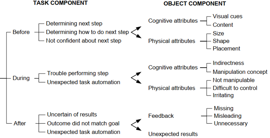
Figure 1. The third version of the Usability Problem Classifier (UPC). From “Andre, T. S., Belz, S. M., McCrearys, F. A., & Hartson, H. R. (2000). Testing a framework for reliable classification of usability problems. Proceedings of the Human Factors and Ergonomics Society Annual Meeting, 44(37), 573–576. (https://doi.org/10.1177/154193120004403707).” Copyright 2000, SAGE Publications. Reprinted by Permission of SAGE Publications, Inc.
After the last task, participants were asked to complete the SUS questionnaire for the first variant. When participants had finished all tasks using the first variant, they were presented with the second variant and again given some time for exploration. After completing the same tasks using the changed variant, participants were asked to complete the SUS for the second variant. In a post-study survey, each participant was asked about their favorite variant as well as rating on a scale from 1 to 10 for each variant.
Expert Review
The expert-based study within the described case study used the guideline review technique to identify usability problems of the interface. During the review, the experts evaluated both interface variants that were also presented to the participants of the user study. The reviews took place in a seating buck (a physical model of a car’s seat and steering wheel) at the UI Studio of the Mercedes-Benz Technology Center in Sindelfingen. The simulation mockup in the seating buck was also equipped with a driver display as well as an additional touchscreen display in the center stack with the same specifications and mounting position as in the test vehicle of the user study.
Experts
The experts were selected according to three dimensions of experts modified from the dimensions of users by Nielsen (1993). Therefore, four experts with different focuses on domain, system, and technique expertise were selected for the experiment. The expert in the dimension system was represented by an interaction designer who worked on a previous version of the interface. The technique expert was represented by a PhD student with a master’s degree in media informatics and experience in performing heuristic evaluations. Two domain experts were represented by interaction designers who were unfamiliar with the interface but had experience in designing interfaces for in-vehicle systems.
Apparatus
In order to review the interface according to guidelines for IVIS, several sources of guidelines that potentially relate to the domain were reviewed (see section The Guideline Review Method) and consolidated. The selection was performed manually by the authors and to the best of our knowledge taking into consideration the investigated IVIS as well as the specific context of use. While most of the guidelines address specific environments like accessibility of websites (Caldwell et al., 2008) or motivation of students (de Vicente & Pain, 2002), these are not applicable to our cases study so they were not included in this review. Other specific guidelines like the situation awareness guidelines by Matthews et al. (2001) are integrated in the form of abstract guidelines into most of the automotive HMI guidelines (Alliance of Automobile Manufacturers, 2006; Commission of the European Communities, 2008; Japan Automobile Manufacturers Association, 2004; Kroon et al., 2016; National Highway Traffic Safety Administration, 2013), and the ergonomic criteria by Bastien and Scapin (1993) are mostly covered by recent usability guidelines like the website usability guidelines by Turner (2011).
Because the guidelines by Turner (2011) already cover a broad range of categories, these guidelines were taken as a basis to adapt to the specific context of use. As the categories search, forms, and help do not apply to automotive user interfaces and describe specific elements for websites, the categories were removed from the base guidelines. The categories feedback and errors were consolidated together and adapted to the context of use by removing irrelevant items addressing form elements. Furthermore, several items addressing specific elements of a website like hyperlinks, traditional form elements, hardware issues, and mouse and keyboard interaction were removed. The list of guidelines was extended with items from the collected guidelines on automotive HMI (Alliance of Automobile Manufacturers, 2006; Commission of the European Communities, 2008; Japan Automobile Manufacturers Association, 2004; Kroon et al., 2016; National Highway Traffic Safety Administration, 2013). Some of these guidelines address hardware-specific issues like position or the luminosity and contrast of displays that do not fall within the responsibility of usability evaluation methods and were therefore not taken into account. Because the review was carried out exclusively with German native speakers, the guidelines were formulated in German and extended to include an additional description or examples. The English version of the 27 guidelines is listed in the Appendix.
The list of guidelines was sent via email to six independent HMI practitioners from different departments at Mercedes-Benz Research & Development with the request of weighting the guidelines according to their importance for usability on a 5-point Likert scale and to consider their application for expert evaluation of an IVIS. Figure 2 shows the distribution of the weightings the practitioners gave for each of the 27 guidelines including the corresponding mean weight.
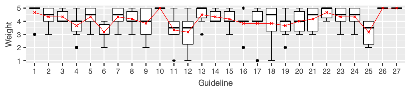
Figure 2. The distribution of guidelines weights returned from the six HMI practitioners. The red line indicates the mean weight.
Several guidelines (numbers 1, 3, 10, 13, 14, 22, 26, and 27) show relatively low scattering with average weights between 4 and 5 compared to items with a high disagreement (numbers 9, 12, and 18). While the former items seem to belong to a common understanding of HMI guidelines, the practitioners have disparate views on the latter items addressing easy access to the application, an indication for the current location, and the recovering from errors. The items with the highest importance according to the practitioners were related to an easily accessible and consistent navigation (10), performance (26), and system errors (27), with a weight of 5 by all six practitioners. Furthermore, guidelines addressing the fulfillment of user goals and objectives (1) and the influence on the driving task (22) showed high importance with a weight of 4.7, followed by guidelines on supporting the user’s workflow (2), often used tasks (3), the appearance of call to actions (5), orientation on the main screen (7), reversing of user actions (14), driving related guidelines on continuous gazing at the screen (23), and interruptible actions (24), with a weight of 4.3. For the calculation of the GCS, the mean weights were rounded to whole numbers.
Procedure
After welcoming the expert at the UI Studio, a briefing on specific personae, the context of use, and common tasks was performed. The personae were created by a partner department and described typical customers for two segments of Mercedes-Benz passenger cars. The context of use explained the basic concept of the instrument cluster display so the expert would understand the specific use case for the customizable screen. Furthermore, several prerequisites like the constraint to use the system while driving and the limited screen area due to technical restrictions and static display of information were discussed. The briefing also introduced typical tasks users would perform using the system (configuration, switch content elements, delete content, finish configuration) as well as similarities and differences of the two variants being observed. Finally, the selected guidelines that were used for the review and the classification of the usability problems with the UPC were presented to the expert.
During the review, the expert was asked to inspect the interface according to the guidelines and assign identified usability problems to the guideline that was violated. Furthermore, the usability problems had to be classified in the categories of the UPC. The two different variants of the system were counterbalanced, whereas each expert reviewed both variants. After the investigation of each variant, the expert was asked to rate the overall compliance with each of the selected guidelines on a 5-point Likert scale.
In a debriefing session with all four experts, the identified usability problems were reviewed together. The focus here was to refine and consolidate the list of usability problems, especially in cases where more than one expert described similar problems with slightly different classification in the UPC or different guidelines assigned to the problem. Furthermore, the experts were invited to discuss several problems in the group and review the individual inspection sessions. The inspection itself took about one and a half hours per expert with an additional hour for the debriefing session.
Results
While the SUS represents a subjective score assessing the usability by users, the introduced GCS served as a counterpart for the guideline review. Figure 3 shows a direct comparison of SUS scores with the weighted and unweighted GCS scores, separated by the two conditions, the interface variants.
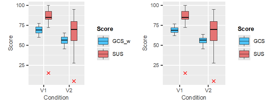
Figure 3. Comparing the results of the SUS rated by the user study with the GCS observed by the guideline review. While the boxplots on the left are comparing the SUS with the weighted GCS, the boxplots on the right show a comparison of SUS scores with the unweighted GCS.
Looking at the ratings for the two conditions, the SUS showed bigger differences for mean  , median
  , and standard deviation
  . While the SUS as well as the weighted GCS for the variant V1 were on average slightly higher than for the variant V2
  , the standard deviation was higher for the variant V2
  . Whereas the average SUS for both conditions were above the average weighted GCS
  , the standard deviation for the SUS was substantially higher for both conditions compared to the standard deviation of the weighted GCS
  . Therefore, the scores from the user study disseminate significantly more than those from the expert review.
In order to analyze the differences between both investigated interface variants, a paired t-test was applied to the data of the SUS  as well as a Wilcoxon signed rank test for the GCS scores due to the small sample size
  . As the paired t-test for the SUS scores assumes normally distributed data, a Shapiro-Wilk test was used to test for normality of the data. With
  and
and  , the Shapiro-Wilk test were only just not statistically significant. Therefore, the null hypothesis, that the data is normally distributed, was not rejected. The t-test for the difference of the SUS scores between the variants indicated a significant result. The SUS scores for variant V1
  showed significantly higher values than those for variant V2
  with
with  . The Wilcoxon signed rank tests for the GCS data did not showed significantly higher values for V1
  compared to V2
  with
with  .
.
As Nunnally (1978) noted, the correlation between weighted and unweighted measures is usually very high. Or as Nunnally described it in an article, research has shown “that in most instances such weights for items were at worst useless and at best an unnecessary bother” (Nunnally, 1975, p. 9). With  and
and  the correlation for both conditions is extraordinary. This finding strongly suggests that the weighting step is optional and adds unnecessary complexity to the score. For the sake of completeness, the Wilcoxon signed-rank test for unweighted GCS scores showed quite similar results. The scores for V1
  were not significantly higher compared to V2
  with
with  .
.
Looking at Figure 4, the most frequently violated guidelines with a total of eight violations reads as follows: The navigation within the application is easy to find, intuitive, and consistent (No. 10).
Other frequently violated guidelines were the following:
- Users are adequately supported according to their level of expertise (No. 4,
 ).
). - Features and functionality support users desired workflows (No. 2, ,
 ).
). - The main screen provides a clear snapshot and overview of the content, features, and functionality available (No. 6, ,
 )
) - Prompt and appropriate feedback is given (No. 13, , ).
- Users can easily undo, go back and change or cancel actions (No. 14, , )
- Text and content is legible and ascertainable, with good typography and visual contrast (No. 21, , ).
 ).
). ).
). )
)As most of the reported usability problems are variants-independent, most of the guideline violations were not assigned to a specific variant. Only the following two problems constituted a guideline violation that were unique for one of the two variants. While in V1, one usability problem violated the guideline “Features and functionality meet common user goals and objectives” (No. 1), another guideline “The navigation has sufficient flexibility to allow users to navigate by their desired means” (No. 11) was only violated once using the condition V2. For V2, 14 violations were reported, while V1 yielded only 6 violations and the greatest share of violations was variants-independent.
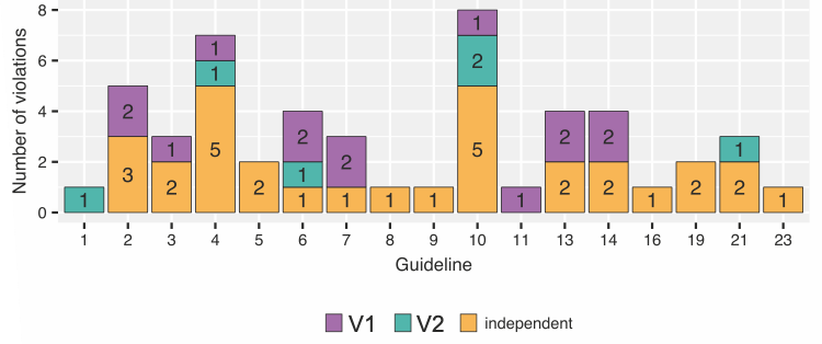
Figure 4. The distribution of guideline violations. The guideline number refers to the number from the list of guidelines in the Appendix. Unviolated guidelines are not listed. The different colors refer to the different interface variants.
Nine of the 27 guidelines were not violated by any of the interface variants. The Performance category that includes the two guidelines “Application performance doesn’t inhibit the user experience” and “Errors and reliability doesn’t inhibit the user experience” was not violated by the interface variants at all. Furthermore, the Driver Distraction category that includes the guidelines “The driver is able to assimilate the presented information with a few glances that do not affect driving,” “The driver is able to interrupt a system input at any time,” and “The system aids the driver when resuming a task after an interruption” did not have reported violations. The remaining satisfied guidelines are the following:
- The current location is clearly indicated.
- Errors messages are concise, written in easy to understand language and describe what’s occurred and what action is necessary.
- Users are able to easily recover from errors
- Terms, language, and tone are consistent.
In order to compare the problem sets from both studies, the sets were analyzed regarding similar problems. An additional step served to group several similar usability problems with different origins. For example, issues regarding the list scroll buttons where reported due to their size as well as their placement, which made them hard to recognize. These problems were assigned with the same ID as they described problems operating the list scroll. Evaluating the results of the consolidation of both individual problem sets, the expert review uncovered 45 usability problems, while the user study reported 54 issues. Together the two approaches gathered 78 usability problems in total with an overlap of 21 usability problems. Therefore, the list of usability problems contains 24 issues reported solely by the evaluators of the expert review, and 33 problems that were only detected by the user study.
Looking at the problems in detail, most of the problems that were only reported from the user study dealt with issues regarding the content of the application, initial difficulties, and problems with placement of different interactive elements. The participants of the user study asked for more flexibility regarding the size of the content elements as well as an improvement of recognition of individual content elements. Another category of problems that were often detected only by the user study were problems regarding the initial usage. Despite a short tutorial animation at the startup, some participants had problems recognizing how to perform the configuration. While the participants mentioned had problems after entering the configuration screen, the evaluators of the expert review assumed problems accessing the configuration via the steering wheel controls. Several problems that were only identified by the expert review address issues with the affordance of interactive elements like the buttons to activate the switch and delete mode. Moreover, the experts identified problems concerning the temporary storage that did not occur during the user test sessions. For example, deselecting or removing items from the temporary storage can therefore be considered as edge cases.
On the other hand, the usability problems detected by both approaches mostly address the plausibility of the configuration preview in V2. The behavior where the preview was placed was not clear; the preview itself occluded content elements, and the fade out of the preview appeared to be tardy. Established interaction techniques like swipe gestures to scroll in lists were expected but not supported, while the supported drag and drop interaction sometimes led to problems in individual cases. Other issues reported during both studies include content-related problems like the order of content elements or their self-descriptiveness.
Looking at the individual categories of the UPC, both approaches report the most problems in the temporal categories Before and During of the task component. The distribution within the task component in detail is presented in Table 1. In the category Before, most of the problems reported by the experts were issues regarding how the user was to determine how to do the next step. This was supported in the user study itself which yielded a higher share of problems where the user was not confident about the next step. Both studies uncovered several usability problems due to trouble performing the step in the During temporal category of the UPC, whereas the evaluators revealed slightly more issues regarding unexpected task automation during the expert review. Looking at the After category, the expert review reported slightly more problems in the categories “Outcome did not match goal” and “Unexpected task automation.” Therefore, the frequencies of problems in the different categories between the user study and the expert review show a significant relation to the applied UEMs. This is also supported by the results of Fisher’s exact test with p = .029. With an effect size calculated through Cramér’s V of V = .34 (p = .024), there is a medium relation (Cohen, 1988) between the number of problems in the different categories and the applied UEM.
Table 1. Distribution of Usability Problems Among UPC Task Component Categories
|
Task component |
Users |
Experts |
Overlap |
|
|
Before |
Determining next step |
4 (7.4%) |
3 (6.7%) |
3 (14.3%) |
|
Determining how to do next step |
13 (24.1%) |
11 (24.4%) |
6 (28.6%) |
|
|
Not confident about next step |
16 (29.6%) |
4 (8.9%) |
2 (9.5%) |
|
|
During |
Trouble performing step |
13 (24.1%) |
11 (24.4%) |
7 (33.3%) |
|
Unexpected task automation |
3 (5.6%) |
6 (13.3%) |
1 (4.8%) |
|
|
After |
Uncertain of results |
2 (3.7%) |
2 (4.4%) |
1 (4.8%) |
|
Outcome did not match goal |
2 (3.7%) |
4 (8.9%) |
1 (4.8%) |
|
|
Unexpected task automation |
1 (1.9%) |
4 (8.9%) |
0 |
|
Note. Deviations to 100% are due to rounding.
The same comparison could be performed for the object component of the UPC. Table 2 shows that the user study reported slightly more problems for both categories: Visual cues and Content of the main category and Cognitive attributes in the Before temporal classification.
Table 2. Distribution of usability problems among UPC object component categories
|
Task component |
Object component |
Users |
Experts |
Overlap |
|
|
Before |
Cognitive attributes |
Visual cues |
10 (18.5%) |
5 (11.1%) |
4 (19%) |
|
Content |
5 (9.3%) |
2 (4.4%) |
2 (9.5%) |
||
|
Physical attributes |
Size |
4 (7.4%) |
4 (8.9%) |
2 (9.5%) |
|
|
Shape |
2 (3.7%) |
0 |
0 |
||
|
Placement |
12 (22.2%) |
7 (15,6%) |
3 (14.3%) |
||
|
During |
Cognitive attributes |
Indirectness |
1 (1.9%) |
2 (4.4%) |
1 (4.8%) |
|
Manipulation concept |
5 (9.3%) |
3 (6.7%) |
2 (9.5%) |
||
|
Physical attributes |
Not manipulable |
4 (7.4%) |
4 (8.9%) |
3 (14.3%) |
|
|
Difficult to control |
2 (3.7%) |
3 (6.7%) |
1 (4.8%) |
||
|
Irritating |
4 (7.4%) |
5 (11.1%) |
1 (4.8%) |
||
|
After |
Feedback |
Missing |
1 (1.9%) |
4 (8.9%) |
1 (4.8%) |
|
Misleading |
1 (1.9%) |
3 (6.7%) |
1 (4.8%) |
||
|
Unnecessary |
1 (1.9%) |
2 (4.4%) |
0 |
||
|
Unexpected results |
2 (3.7%) |
1 (2.2%) |
0 |
||
Note. Deviations to 100% are due to rounding.
A similar observation is apparent for the Physical attributes category. Regarding the Cognitive attributes category of the During temporal classification, the evaluators reported slightly more problems due to “Indirectness” during the expert review than the users, whereas the users revealed more problems deriving from the “Manipulation concept.” In the Physical attributes category, the experts revealed slightly more issues for all three subcategories which also applies for the “Feedback” category. Unlike the task component, the relationship between the UEM and the number of problems in the different categories of the object component was not statistically significant applying the Fisher’s exact test  .
.
Discussion
A comparison of the two scores reveals a common trend. An important factor that must be taken into account here is the relatively small sample size for the guideline review compared to the number of participants of the user study. The statistical power of the applied t-test and Wilcoxon signed-rank test as well as their interpretation should be treated with caution. The findings comparing the results from weighted and unweighted scores strongly suggest that the weighting step during the construction of the score adds unnecessary complexity and should be omitted.
With an overlap of slightly more than a third of the overall problems, the results showed that the user study discovered several other kinds of problems compared to the expert review. Although the severity of the individual problems was not raised, both approaches detected most of the obvious usability issues regarding the preview handling in V2 as well as established interaction techniques like swipe or drag and drop gestures that were not supported. The results of the comparison of the classification according to the UPC showed that the choice of one approach over the other has an influence on the temporal character of the problems. While both approaches identify several problems due to issues determining how to do a next step before a specific action as well as issues with trouble performing a step during an action, the user-based approach also shows a peak for issues due to the user not being confident about the next step. However, the expert review approach classified several usability problems into diverse categories of the UPC. Looking at the object component of the UPC, the distribution among the different categories showed no significant differences between both approaches.
The fact that the problem sets from both studies overlap in almost only a third of the cases shows that the two approaches are suited to identify different kinds of problems. As already discovered by Desurvire et al. (1991), the expert-based method—several heuristic evaluations—tends to find usability problems that do not occur during user testing. Similar results are reported by Karat et al. (1992), where about a third of the significant problems were common across all methods. In their study comparing empirical testing and two walkthrough approaches, the expert-based methods miss several severe problems that occurred during user testing. Contrary results are reported by Doubleday et al. (1997) who compared user testing with heuristic evaluation. The expert-based approach identified more problems than the user-based approach. But when looking at the overlap of both problem sets as in the presented case study to ensure that issues actually affect the users, the overlap is 41%. For the presented case study, the guideline review method is able to identify the most severe usability issues in both interface variants, but also reported several problems that did not occur during the user testing used as a baseline. Karat et al. (1992) emphasized the influence of evaluator expertise for the result of the expert-based approaches. Unlike the results from Jeffries et al. (1991) who found a larger number of severe problems through heuristic evaluation rather than through usability testing, the severity in the presented case study was not raised explicitly. However, the results regarding the comparison of the UPC classifications show that user testing tends to find more problems related to the preparation of actions, while experts detect slightly more problems that occur during or after specific user actions.
As already stated by Desurvire et al. (1991), the expert-based methods are better suited when “competing interface alternatives are being considered” in order to narrow the variants for a following user study. Furthermore, Karat et al. (1992) suggested applying empirical usability testing for “baseline and other key checkpoint tests in the development cycle.” In other phases during the project, it may not be essential to identify all of the significant problems, but rather ease the choice between different interface variants. Other studies comparing expert-based approaches with user testing (Desurvire et al., 1991; Doubleday et al., 1997; Karat et al., 1992) support the fact that the “actual results produced by each technique are quite different in kind” (Doubleday et al., 1997). This leads to the conclusion that expert-based approaches are better suited to apply in earlier development phases or in order to eliminate interface variants. User-based approaches on the other hand can exploit its strengths as baseline testing or when it is necessary to identify most of the significant problems in an interface that actually affect real users. Therefore, the best results will be achieved by selecting a custom-tailored mixed methods approach for the specific research question of a project.
Limits to Generalizability and Future Work
The comparison of the two raised scores—the SUS from the user study and the GCS from the guideline review—shows a similar trend for both of the interface variants. Even though, there is further research needed in order to analyze the composition of the GCS. Several additional comparison studies between the SUS and the constructed GCS would be needed to make a meaningful conclusion on the relationship of both scores. As a matter of fact, the GCS depends strongly on the selection of relevant guidelines for the product. Therefore, the selection of guidelines that should be included in the GCS rating needs formalization to be comparable across multiple products. A faulty selection of guidelines can lead to a bias towards a specific interface variant or product, when several alternatives are tested against each other.
Moreover, the selection of guidelines needs to fit the definition of usability to be comparable with the results from user studies. The theoretical background of the SUS is based on the definition of usability of ISO 9241-11 (Brooke, 1996), which suggests to also select guidelines for the GCS that represent this definition of usability. A comparison of different questionnaires with randomly selected sub-samples (Tullis & Stetson, 2004) showed that the SUS ranks best for accuracy even with small sample sizes (8 to 12 users). Similar investigations would be necessary in order to ensure the accuracy of the GCS. Therefore, the flexible construction of the GCS has to be mentioned as a drawback due to the lack of validity studies. Nevertheless, once a project-specific version of the GCS has been constructed and checked for validity, it can be used as a measure in the course of a project or within several product developments.
As Lewis and Sauro (2017) pointed out, some research shows little or no effect of missing data from standardized usability questionnaires on the resulting scores (Lah & Lewis, 2016; Lewis, 2002). Similar research for the GCS could provide further insights into the impact of different guidelines to the resulting score. Furthermore, these results could support the comparability between the GCS scores and the SUS scores.
Due to its standardized form, results from the SUS can be compared across products and projects (Bangor et al., 2008, 2009; Sauro, 2011) which allows the positioning of individual SUS scores as percentiles. The interpretation compared to other products also benefits from these studies, as they provide an adjective rating scale as well as a grade scale for SUS scores. Because of the individual and flexible structure of the GCS, such observations are only meaningful for a specific instance of the scale.
Tips for Usability Practitioners
This research examined the development and application of a rating scale for expert-based reviews using guidelines and found the following:
- Expert-based usability evaluation approaches are better suited to apply in earlier development stages or to eliminate interface variants.
- Guideline review results depend strongly on the selection of the guidelines which should be formalized to be comparable across multiple products or variants.
- The developed GCS closes a gap for expert-based evaluation and provides a key indicator to compare different variants or products as well as for management reporting.
- The investigation of the scores compared between conditions suggests to omit the weighting of scores like the constructed GCS in order to remove unnecessary complexity.
Footnotes
[1] https://en.wikipedia.org/wiki/Videotex
Acknowledgments
The research was conducted in collaboration with Mercedes-Benz AG, and the authors gratefully acknowledge their support performing the empirical studies. Furthermore, we would like to thank all participants of the user study as well as the experts who participated in the guideline review. The authors would also like to thank Prof. Dr. Michael Burmester for his helpful comments.
References
Alliance of Automobile Manufacturers. (2006). Statement of principles, criteria and verification procedures on driver interactions with advanced in-vehicle information and communication systems. https://autoalliance.org/wp-content/uploads/2018/08/Alliance-DF-T-Guidelines-Inc-2006-Updates.pdf
Andre, T. S. (2000). Determining the effectiveness of the usability problem inspector: A theory-based model and tool for finding usability problems [PhD thesis, Virginia Polytechnic Institute and State University]. https://pdfs.semanticscholar.org/89a8/b40b7a06932509dc89c50d6529bf045965e4.pdf
Andre, T. S., Belz, S. M., McCrearys, F. A., & Hartson, H. R. (2000). Testing a framework for reliable classification of usability problems. Proceedings of the Human Factors and Ergonomics Society Annual Meeting, 44(37), 573–576. https://doi.org/10.1177/154193120004403707
Andre, T. S., Williges, R. C., & Hartson, H. R. (1999). The effectiveness of usability evaluation methods: Determining the appropriate criteria. Proceedings of the Human Factors and Ergonomics Society Annual Meeting, 43(20), 1090–1094. https://doi.org/10.1177/154193129904302007
Apple Computer. (1995). Macintosh human interface guidelines. Addison-Wesley Publishing Company.
Baber, C., & Mellor, B. (2001). Using critical path analysis to model multimodal human–computer interaction. International Journal of Human-Computer Studies, 54(4), 613–636. https://doi.org/10.1006/ijhc.2000.0452
Baber, C., & Stanton, N. A. (1996). Human error identification techniques applied to public technology: Predictions compared with observed use. Applied Ergonomics, 27(2), 119–131. https://doi.org/10.1016/0003-6870(95)00067-4
Bangor, A., Kortum, P. T., & Miller, J. T. (2008). An empirical evaluation of the system usability scale. International Journal of Human-Computer Interaction, 24(6), 574–594. https://doi.org/10.1080/10447310802205776
Bangor, A., Kortum, P. T., & Miller, J. T. (2009). Determining what individual SUS scores mean: Adding an adjective rating scale. Journal of Usability Studies, 4(3), 114–123.
Bastien, J. M. C., & Scapin, D. L. (1993). Ergonomic criteria for the evaluation of human-computer interfaces. In INRIA (p. 79). https://hal.inria.fr/inria-00070012/
Brooke, J. (1996). SUS: A quick and dirty usability scale. In P. W. Jordan, B. Thomas, B. A. Weerdmeester, & I. L. McClelland (Eds.), Usability Evaluation in Industry (pp. 189–194). Taylor & Francis.
Brooke, J. (2013). SUS: A retrospective. Journal of Usability Studies, 8(2), 29–40.
Caldwell, B., Cooper, M., Reid, L. G., & Vanderheiden, G. (2008). Web Content Accessibility Guidelines (WCAG) 2.0. W3C Recommendation. https://www.w3.org/TR/2008/REC-WCAG20-20081211/
Chin, J. P., Diehl, V. A., & Norman, L. K. (1988). Development of an instrument measuring user satisfaction of the human-computer interface. Proceedings of the SIGCHI Conference on Human Factors in Computing Systems – CHI ’88, 213–218. https://doi.org/10.1145/57167.57203
Cohen, J. (1988). Statistical power analysis for the behavioral sciences (2nd ed., reprint). Psychology Press.
Commission of the European Communities. (2008). Commission recommendation of 26 May 2008 on safe and efficient in-vehicle information and communication systems. http://eur-lex.europa.eu/legal-content/EN/TXT/PDF/?uri=CELEX:32008H0653&from=EN
de Vicente, A., & Pain, H. (2002). Informing the detection of the students’ motivational state: An empirical study. In S. A. Cerri, G. Gouardères, & F. Paraguaçu (Eds.), Intelligent Tutoring Systems (pp. 933–943). Springer Berlin Heidelberg. https://doi.org/10.1007/3-540-47987-2_93
Desurvire, H., Kondziela, J., & Atwood, M. E. (1992). What is gained and lost when using methods other than empirical testing. Posters and Short Talks of the 1992 SIGCHI Conference on Human Factors in Computing Systems – CHI ’92, 125–126. https://doi.org/10.1145/1125021.1125115
Desurvire, H., Lawrence, D., & Atwood, M. (1991). Empiricism versus judgement: Comparing user interface evaluation methods on a new telephone-based interface. ACM SIGCHI Bulletin, 23(4), 58–59. https://doi.org/10.1145/126729.1056062
Doubleday, A., Ryan, M., Springett, M., & Sutcliffe, A. (1997). A comparison of usability techniques for evaluating design. Proceedings of the Conference on Designing Interactive Systems Processes, Practices, Methods, and Techniques – DIS ’97, 101–110. https://doi.org/10.1145/263552.263583
Endsley, M. R. (1995). Toward a theory of situation awareness in dynamic systems. Human Factors: The Journal of the Human Factors and Ergonomics Society, 37(1), 32–64. https://doi.org/10.1518/001872095779049543
Frøkjær, E., & Hornbæk, K. (2008). Metaphors of human thinking for usability inspection and design. ACM Transactions on Computer-Human Interaction, 14(4), 1–33. https://doi.org/10.1145/1314683.1314688
Google Inc. (2019). Material design guidelines. Material Design. https://material.io/design/
Harvey, C., & Stanton, N. A. (2013). Usability evaluation for in-vehicle systems. CRC Press.
International Organization for Standardization. (2019). Ergonomics of human-system interaction—Part 110: Interaction principles (International Standard ISO/FDIS 9241-110).
Japan Automobile Manufacturers Association. (2004). Guideline for in-vehicle display systems – version 3.0 (jama-english.jp)
Jeffries, R., Miller, J. R., Wharton, C., & Uyeda, K. (1991). User interface evaluation in the real world. Proceedings of the SIGCHI Conference on Human Factors in Computing Systems Reaching through Technology – CHI ’91, 119–124. https://doi.org/10.1145/108844.108862
Karat, C.-M., Campbell, R., & Fiegel, T. (1992). Comparison of empirical testing and walkthrough methods in user interface evaluation. Proceedings of the SIGCHI Conference on Human Factors in Computing Systems – CHI ’92, 397–404. https://doi.org/10.1145/142750.142873
Kirakowski, J., & Corbett, M. (1993). SUMI: The Software Usability Measurement Inventory. British Journal of Educational Technology, 24(3), 210–212. https://doi.org/10.1111/j.1467-8535.1993.tb00076.x
Kirwan, B., & Ainsworth, L. K. (Eds.). (1992). A guide to task analysis: The task analysis working group. CRC Press. https://doi.org/10.1201/b16826
Kroon, E. C. M., Martens, M. H., Brookhuis, K. A., Hagenzieker, M. P., Alferdinck, J. W. A. M., Harms, I. M., & Hof, T. (2016). Human factor guidelines for the design of safe in-car traffic information services. DITCM.
Lah, U., & Lewis, J. R. (2016). How expertise affects a digital-rights-management-sharing application’s usability. IEEE Software, 33(3), 76–82. https://doi.org/10.1109/MS.2015.104
Lamm, L., & Wolff, C. (2019). Exploratory analysis of the research literature on evaluation of in-vehicle systems. 11th International Conference on Automotive User Interfaces and Interactive Vehicular Applications (AutomotiveUI ’19), 60–69, Utrecht, Netherlands. https://doi.org/10.1145/3342197.3344527
Landauer, T. K. (1995). The trouble with computers: Usefulness, usability, and productivity. MIT Press.
Lewis, J. R. (2002). Psychometric evaluation of the PSSUQ using data from five years of usability studies. International Journal of Human-Computer Interaction, 14(3–4), 463–488. https://doi.org/10.1080/10447318.2002.9669130
Lewis, J. R., & Sauro, J. (2017). Can I leave this one out? The effect of dropping an item from the SUS. Journal of Usability Studies, 13(1), 38–46.
Lyons, M. (2009). Towards a framework to select techniques for error prediction: Supporting novice users in the healthcare sector. Applied Ergonomics, 40(3), 379–395. https://doi.org/10.1016/j.apergo.2008.11.004
Matthews, M. L., Bryant, D. J., Webb, R. D. G., & Harbluk, J. L. (2001). Model for situation awareness and driving: Application to analysis and research for intelligent transportation systems. Transportation Research Record: Journal of the Transportation Research Board, 1779(1), 26–32. https://doi.org/10.3141/1779-04
Mayhew, D. J. (1991). Principles and guidelines in software user interface design. Prentice-Hall.
Miniukovich, A., De Angeli, A., Sulpizio, S., & Venuti, P. (2017). Design guidelines for web readability. Proceedings of the 2017 Conference on Designing Interactive Systems – DIS ’17, 285–296. https://doi.org/10.1145/3064663.3064711
Miniukovich, A., Scaltritti, M., Sulpizio, S., & De Angeli, A. (2019). Guideline-based evaluation of web readability. Proceedings of the 2019 CHI Conference on Human Factors in Computing Systems – CHI ’19, 1–12. https://doi.org/10.1145/3290605.3300738
Molich, R., & Nielsen, J. (1990). Improving a human-computer dialogue. Communications of the ACM, 33(3), 338–348. https://doi.org/10.1145/77481.77486
National Highway Traffic Safety Administration. (2013). Visual-manual NHTSA driver distraction guidelines for in- vehicle electronic devices. Federal Register, 78(81), 24818–24890.
Némery, A., Brangier, E., & Kopp, S. (2011). First validation of persuasive criteria for designing and evaluating the social influence of user interfaces: Justification of a guideline. In A. Marcus (Ed.), Design, User Experience, and Usability. Theory, Methods, Tools and Practice (pp. 616–624). Springer Berlin Heidelberg. https://doi.org/10.1007/978-3-642-21708-1_69
Nielsen, J. (1993). Usability engineering. Academic Press.
Nielsen, J. (1995). 10 usability heuristics for user interface design. NN/g Nielsen Norman Group. https://www.nngroup.com/articles/ten-usability-heuristics/
Nielsen, J., & Molich, R. (1990). Heuristic evaluation of user interfaces. In J. C. Chew & J. Whiteside (Eds.), Proceedings of the SIGCHI conference on Human factors in computing systems Empowering people—CHI ’90 (pp. 249–256). ACM Press. https://doi.org/10.1145/97243.97281
Nunnally, J. C. (1975). Psychometric theory—25 years ago and now. Educational Researcher, 4(10), 7. https://doi.org/10.2307/1175619
Nunnally, J. C. (1978). Psychometric theory (2nd. ed.). McGraw-Hill.
Sauro, J. (2011). A practical guide to the system usability scale: Background, benchmarks & best practices. Measuring Usability LLC.
Sears, A. (1997). Heuristic walkthroughs: Finding the problems without the noise. International Journal of Human-Computer Interaction, 9(3), 213–234. https://doi.org/10.1207/s15327590ijhc0903_2
Shneiderman, B., Plaisant, C., Cohen, M., Jacobs, S., & Elmqvist, N. (2018). Designing the user interface: Strategies for effective human-computer interaction (6th ed.). Pearson.
Smith, S. L., & Mosier, J. N. (1986). Guidelines for designing user interface software (ESD-TR-86-278). The MITRE Corporation.
Snyder, B. (2015). Apple exec: “The car is the ultimate mobile device.” Fortune. http://fortune.com/2015/05/27/apple-cars-tesla/
Stanton, N. A., Salmon, P. M., Walker, G. H., Baber, C., & Jenkins, D. P. (2005). Human factors methods: A practical guide for engineering and design. http://eprints.soton.ac.uk/id/eprint/76013
Tory, M., & Möller, T. (2005). Evaluating visualizations: Do expert reviews work? IEEE Computer Graphics and Applications, 25(5), 8–11. https://doi.org/10.1109/MCG.2005.102
Tullis, T. S., & Stetson, J. N. (2004). A comparison of questionnaires for assessing website usability [Conference Paper]. Usability Professionals Association (UPA) 2004 Conference, Minneapolis, MN.
Turner, N. (2011). A guide to carrying out usability reviews. UXM. http://www.uxforthemasses.com/usability-reviews/
Wickens, C. D. (1991). Processing resources and attention. In D. L. Damos (Ed.), Multiple-Task Performance. Taylor & Francis. https://books.google.de/books?id=_KfaN4gKP8MC
Appendix
This table presents the guidelines included in the review template with a description or examples. These guidelines have been translated from German.
|
No. |
Guideline |
Description/Examples |
|
Features & Functionality |
||
|
1 |
Features and functionality meet common user goals and objectives. |
Key and common user goals and objectives (e.g., carry out some transaction, find some information, carry out some research, etc.) should have been identified and addressed. Ideally the site or application should allow users to meet all of their key goals and objectives. |
|
2 |
Features and functionality support users desired workflows. |
The site or application should support or at least be compatible with the way that users wish to work. For example, users might want to be able to carry out bulk transactions or be able to save and return to their work.
|
|
3 |
Frequently-used tasks are readily available and well supported. |
For example, short cuts might be provided to speed up the completion of frequently carried out tasks. |
|
4 |
Users are adequately supported according to their level of expertise. |
For example, novice users are given help and instructions and features are progressively disclosed (e.g., advanced features not being shown by default, shortcuts for expert users). |
|
5 |
Call to actions are clear, well labeled, and appear clickable. |
Possible actions should always be clear and the primary call to action (i.e., the most common or desirable user action) should stand out on the screen. |
|
Main screen |
||
|
6 |
The main screen provides a clear snapshot and overview of the content, features, and functionality available. |
For example, an introduction and overview of the site is provided together with section snapshots and example content. |
|
7 |
The main screen is effective in orienting and directing users to their desired information and tasks. |
Users should be able to work out where they need to go to complete a given task. |
|
8 |
The main screen layout is clear and uncluttered with sufficient white space. |
Users should be able to quickly scan the homepage and make sense of both the content available and of how the site is structured. |
|
Navigation |
||
|
9 |
Users can easily access the site or application. |
The relating menu entry should be labeled clearly and positioned according to the importance of the application in the overall system. |
|
10 |
The navigational scheme is easy to find, intuitive, and consistent. |
Users should be able to very easily locate and use the navigational scheme, and it should not be significantly different across the application (unless a decision has been made to specifically differentiate a given section or area). |
|
11 |
The navigation has sufficient flexibility to allow users to navigate by their desired means. |
For example, a user might want to be able to search for an item or browse by size, name, or type. Although not all user preferences can or indeed should be addressed, the most useful and common navigational means should be supported. |
|
12 |
The current location is clearly indicated. |
Users should always know where they are in the site or application. |
|
Control, errors, and feedback |
||
|
13 |
Prompt and appropriate feedback is given. |
For example, a confirmation message is shown following a successful transaction, input errors are promptly highlighted, and it’s made clear to users when a page has been updated. |
|
14 |
Users can easily undo, go back, and change or cancel actions; or are at least given the chance to confirm an action before committing. |
If an action cannot be undone then users should at least be given the chance to confirm an action before committing. Where an action can’t be undone, this should be made clear to users. |
|
15 |
Common user errors have been taken into consideration and where possible prevented. |
Common user errors might be missing input, invalid input, or invalid selections. |
|
16 |
Errors are clear, easily identifiable and appear in appropriate location. |
Errors should be immediately apparent to users and ideally be located close to the offending interaction object.
|
|
17 |
Error messages are concise, written in an easy to understand language, and describe what’s occurred and what action is necessary. |
Errors should avoid using very technical terms or jargon and should be written from the user’s perspective. Additionally, the error message should provide instructions to resolve the error. |
|
18 |
Users are able to easily recover from errors. |
The application should avoid having the user start from the beginning in case of an error. For example, users might be able to re-edit and resubmit a form or enter a different value. |
|
Content |
||
|
19 |
Language, terminology, and tone used is appropriate and readily understood by the target audience. |
Jargon should be kept to a minimum and plain language should be used where ever possible. |
|
20 |
Terms, language, and tone used are consistent. |
Capitalization and grammar should be consistent, together with the use of formal or informal terms. |
|
21 |
Text and content are legible and ascertainable, with good typography and visual contrast. |
Users should be able to quickly scan headers and body text to get an overview of what’s available. |
|
Driver distraction |
||
|
22 |
The driver is able to scan the displayed information with few short glances, without influencing the driving task. |
The structure of the application should enable the user to get an overview of the offered functionality quickly without distracting the user from his main task, the driving. |
|
23 |
The system should not require interruptible sequences of manual/visual interactions. |
The information is presented in smaller packages which leads to several small steps instead of one big/long step. |
|
24 |
It is possible to interrupt the input at any time. |
For example, no time-critical input is required by the user. The application enables the user to fully concentrate on the driving task during interaction. |
|
25 |
The user should receive hints to resume his task when interrupting the interaction. |
For example, the application can give visual hints for which object the user interacted with before interrupting the task and what steps are necessary to finish the task. |
|
Performance |
||
|
26 |
Application performance doesn’t inhibit the user experience. |
Interactions taking longer than 1 second to respond should provide suitable feedback to show that something is taking place (e.g., an hour glass or swirling graphic). |
|
27 |
Errors and reliability issues don’t inhibit the user experience. |
The interaction should be possible without system errors. Incorrect presentation or bugs should be avoided. |
[:]