
Abstract
User experience (UX) designers asked to justify return-on-investment (ROI) for UX activities often rely on published ROI studies and UX metrics that do not address decision makers’ concerns. With a little knowledge of business strategy and metrics and an understanding of their own value to an organization, UX practitioners can (a) identify the financial and non-financial metrics and goals that drive change in their organizations, (b) draw a clear picture for decision makers of the connection between their value and the company’s goals, and (c) demonstrate a positive return on investment in UX activities.
Practitioner’s Take Away
This article discussed four aspects of metrics and strategy:
- Traditional measures of return on investment (ROI) in UX activities often are not connected to the concerns of business executives.
- UX practitioners can use metrics strategically by identifying business objectives that drive company action and by making explicit their own contribution to those objectives.
- Balanced Scorecard (BSC) is a well-articulated approach to understanding how to describe strategy and metrics. UX practitioners can use the BSC approach for direction on how to align their activities to company goals.
- Metrics are not the only way to illustrate ROI on UX activities—many companies are touting design and design process as the solution to many business problems, not just user experience.
Introduction
Good design produces customer value. It seems self evident to designers that usable applications and products that connect with customers’ needs and wants are central to the value of their company. Unfortunately, user experience (UX) practitioners sometimes struggle with getting decision-makers in the organization to see the connection between user experience and customer value. Quantifying one’s financial return on the investment made in UX seems an impossible task.
Within most companies there is a significant constituency that places enormous weight on metrics and meeting objective goals. Designers should know this constituency and learn how to approach them. Think of this exercise as the user-centered design of your own services to your internal business partners. If you do, there are significant opportunities for usability professionals with a background in measurement to favorably influence managers’ decisions that affect their companies’ UX practice.
Are ROI Metrics for Usability Unusable?
In 2004 Dan Rosenberg wrote a provocative article entitled “The Myths of Usability ROI.” While praising the groundbreaking book on usability return on investment (ROI) by Bias and Mayhew (1994), Rosenberg pointed out a large number of shortcomings in the literature published since 1994 on usability ROI.
- The lack of empirical data that support ROI claims for usability.
- ROI studies of usability ignore other contributing factors to product improvement.
- Overly simple ROI calculations for usability don’t address executives’ concerns.
- Studies don’t weigh the ROI for usability activities against other investments.
According to Rosenberg, the “traditional ROI approach to defining and measuring the value of usability” doesn’t show the true value of UX activities (p. 23). In essence, typical UX metrics for ROI are unusable. As a corrective action, he proposed thinking strategically by tying one’s own UX activities to the Total Cost of Ownership (TCO) of a company’s products and services. This is certainly a strategic approach to showing ROI, but only if one’s company competes on TCO. However, the article raised a valid point: How do designers show the link between their own value and what matters to their company?
What Makes a Good Metric?
To answer that question, we must first make a digression. Most designers understand that some metrics are more valuable than others. Often, management will insist that everyone’s work “align with company goals,” usually expressed as metrics. However, not all metrics are worth aligning to. So, what makes a good metric? Price and Jaffe (2008) identify the following five qualities of a good metric.
- Strategic alignment. Alignment assumes that the company’s strategy is known by all, including management. Does the metric support the organization’s strategy?
- The metric drives action. Good metrics act as a target for employees to aim at. If the objectives stated in the metric aren’t met, then it’s understood by all that strong corrective action must be taken. Are data being reported that aren’t used to drive action? Then the metric should be retired.
- The metric is important to stakeholders. Someone besides you needs to care about the metric, namely, people with power who can make trouble if the objectives for the metric isn’t being met: customers, customer service managers, heads of departments, and so on.
- The people being measured can change things. Suppose a design group is being measured on customer satisfaction with online applications. Does the design group have the authority and resources to change not only the interface design, but also integration with the mid-tier, database connectivity, etc.? In short, can the design group change everything that affects the performance of the applications? If not, then the metric may be valid, but it needs to be shared with another group.
- There’s a process in place to change things. Most usability professionals have been told, at one time or another, “go ahead and run your test and write your report on the product before it ships. We’ll make changes later,” only to realize that “later” never arrives. What’s missing here? A process that ensures timely changes are made based on the metric collected.
UX practitioners must learn to distinguish between good and bad metrics, and be willing to advocate for better metrics. In fact, relying on published studies for evidence of ROI in UX activities is unconvincing to executives because they were not conducted in the context of one’s own company. Different companies value different metrics. What UX practitioners need are not more published studies conducted at other companies, they need to learn how to collect the right UX data and derive metrics that demonstrate strategic value within the context of their own companies.
To Rosenberg’s point, a good business metric keeps a company focused on the right things, and helps executives make sound decisions. We now have a definition for the strategic use of metrics. Strategic thinking means (a) understanding UX’s value to the company, (b) identifying metrics that drive company—or department-wide decisions, and (c) drawing a clear and obvious connection between one’s measurable value and a company—or department-wide metric.
A Strategic Approach to Business Metrics: The Balanced Scorecard
Financials, of course, are a company’s preferred and best-understood metric, and one to which all other metrics should tie to. Much of strategy, product selection, and service offerings are presented in dollars, as in the promise of future revenue. The known shortcoming of financial metrics is that they are backward looking measures, i.e., they don’t necessarily predict future performance.
One well-known approach to developing strategy and effective metrics is the Balanced Scorecard (BSC; Kaplan & Norton, 1996). Its use is widespread among large companies; a survey of 1,430 executives globally revealed that 53% of companies use some form of the BSC (Rigby & Bilodeau, 2009). BSC addresses the shortcomings of financial measures by introducing three additional categories of measures: customer perspective, internal business perspective, and innovation and learning perspective. Strategy maps tie the four categories of measures together in the company’s theory of how each category of measures contributes to financial performance. All four perspectives provide UX designers with opportunities to contribute to strategic decisions.
Companies that adopt BSC recognize that return on investment doesn’t apply only to financial measures. They understand that investments can yield important returns in customer satisfaction, people, and process. This is invaluable information for usability practitioners who are trying to position their services within an organization, who must likewise realize that their own value may not tie directly to a company’s financials but to another category of measures.
If your company employs BSC, study the measures. If your company doesn’t employ BSC, then look at your company’s metrics for tracking performance. You will need to tie your performance to these measures, or introduce one of your own if possible. The following discussion refers to BSC, but can be used with other schemes, as long as the scheme contains metrics that are managed to—that is, the metrics satisfy the criteria for effective metrics.
Financial Perspective
Returns on investment are typically expressed in dollars. Dollar amounts are calculated using Net Present Value (NPV): the difference between an initial investment in a project and the cash flow the project generates, accounting for the time value of money. NPV is one of the main criteria used in selecting among new projects and services. NPV avoids the problems of the commonly-used payback period metric, which doesn’t consider cash flows after the project has paid for itself.
The data that estimate NPV for a given project are usually generated by the marketing department or another business unit to justify a project initially. Obtain the estimates. Then estimate the expense needed to conduct analysis, design, and usability testing for the proposed project. These estimates are fairly straightforward if your company keeps historical records of project costs per task. Then estimate the percentage increase in sales per year (or savings per year if improving the use of customer self service) if the product is designed and usability tested properly. These data are harder to find.
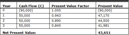
To illustrate the use of NPV, assume that a project with a significant user interface is initially estimated to cost $90,000 and will produce $40,000 per year in sales for three years. Convert these data into NPV by calculating NPV using these data with the NPV formula, as shown in Table 1.
NPV = -C0 + C1 / (1 + r) + C2 / (1 + r)2 + … + Cn / (1 + r)n
where
C0 = initial investment
C1 = cash flow in Year 1
C2 = cash flow in Year 2
r = company’s required rate of return on investment, or discount rate
Cn = number of years in the calculation
The term r, the discount rate, represents the percentage of profit the proposed investment must meet to be considered for funding. Proposals whose returns exceed the discount rate are then compared against others with the same level of risk for consideration. Companies that use NPV to compare projects determine their own discount rates.
Table 1. Net Present Value Without UX design
To show the benefit of usability on NPV, add the estimated cost of doing usability on the project to the initial investment, assumed here to be $4,500. Add the increase in cash flow to each year’s cash flow, assumed here to be 6%. Recalculate NPV, as shown in Table 2.
Table 2. Net Present Value With UX design
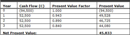
The decision then is between a product with or without design and usability testing. For best results, focus on projects with a significant user interface that handles large numbers of transactions, such that a small percentage increase in success rates contributes a significant financial return to the company. If there is a positive difference then the decision to add usability to the project is nearly pre-ordained. If the difference in NPV is great enough, it could mean the difference between a project being selected or not. For more on the use of NPV in usability studies, see Karat (2005).
Note that using NPV correctly answers two of Rosenberg’s criticisms about usability ROI metrics. First, the discount rate is determined by the company, typically the finance department, and is an important criterion used by management to fund a project. Second, NPV allows managers to compare the proposed investment with other investments, in this instance, comparing returns with and without an investment in usability.
Customer Perspective
The BSC customer perspective dimension answers the question "How do customers see us?" This is an obvious place for user experience metrics. Customer satisfaction, customer retention/defection, and time to delivery are examples of metrics for customer perspective. These metrics are usually owned by customer service or marketing functions, but the usability function should own a share of responsibility for a significant metric in the customer perspective. The metric should drive decisions, as discussed in regards to the What Makes a Good Metric section. For example, a customer metric that can drive improvements to an existing application is self service usage. It could be a percentage change in usage, as measured directly by automated reports or indirectly by customer survey. The wide range of customer experience measures were surveyed by Tullis and Albert (2008). From these metrics, select a candidate measure and work with customer service or marketing to include an appropriate UX metric in the customer metrics. If it takes its measures seriously, the company will need to devote significant, appropriate resources to the hitting goal stated in the metric.
Internal Business Perspective
These measures drive process improvement projects by answering the question "What must we excel at?" Driving the design of service improvement is one of best opportunities for designers and usability practitioners to gain visibility. Price and Jaffe (2008) gave an excellent example of how a good metric forced a great deal of process improvement at Amazon.com. Amazon was aware that it had a problem with the large number of calls to its call center despite its extensive web-based self service. It knew that the key to profitability was in persuading people to self serve. The company settled on cost per order (CPO) as a central metric. Obviously, calls handled by agents in the call center added to the cost of an order. Trying to reduce CPO pushed the company to discover the root cause for every call and to address each issue they found. It made a lot of decisions easier: improving the usability of its web site, simplifying the order process, and adding information on the site in the form of user-generated recommendations that were not available from its agents (Price & Jaffe, 2008). In short, the CPO metric drove decisions that required large investments be made to improve the customers’ user experience on the site.
Innovation and Learning Perspective
These metrics answer the question "What capabilities are needed to support the customer perspective and the internal business process?" That is, what does the company need to be able to do to meet its goals for customer satisfaction and process improvement? Aggressive customer satisfaction and process improvement goals nearly always require increased UX skills and capacity, as demonstrated in the Amazon example. The UX practitioner can act strategically by discussing with management the UX department’s needs for skill development, staffing increases, and increased visibility in the organization. If possible, put a “UX improvement” metric on the scorecard. The aim is to position UX as a valuable competency for meeting scorecard objectives. If the objective is on the scorecard, it will be tracked and decisions made based on outcomes.
Sidebar: How Effective Is Balanced Scorecard?
A large-scale study of companies that employ BSC showed some limited support for the effectiveness of BSC as a strategic tool (Malina & Selto, 2001). A primary finding was that it was difficult to isolate the contribution of a company’s approach to strategy from other factors such as the company’s ability to execute and the market it was competing in. Indeed, that is the very thing that makes it so hard to isolate the financial contribution of UX to an individual product or project: the entire team has to execute properly for the project to succeed.
An Application of Strategy to UX Metrics
The UX team at Autodesk, makers of the popular AudoCAD design software, was interested in determining their customers’ satisfaction, ease-of-use, and relevance of some of the important features in one of their software products, as well as overall product quality and value (Bradner, 2010). In addition to measuring customer satisfaction with the product, they also did something more. They included in their survey a question about whether the customer would recommend the product to a friend or colleague. This question is the basis of the Net Promoter score, a measure that is becoming widely recognized in marketing and sales departments as an important metric for customer satisfaction.
The Autodesk team correlated each individual score with the Net Promoter score to determine which aspects of which features or combination of features best predicted the Net Promoter score. They discovered that overall product quality, product value, and product usability were the “key drivers” of Net Promoter, rather than satisfaction with an individual feature. By tying their UX metrics to a metric that marketing and sales cared strongly about and educating their marketing and executive management about the connection between the two sets of metrics, the Autodesk team demonstrated to management the return on investment in their activities which helped themselves focus on those activities that improved their product’s overall value.
The Trouble With Metrics
In March 2009 Google head designer Doug Bowman resigned his post because he was forced to justify every design decision using metrics. A plaintive blog posting explained his reasons for quitting (Bowman, 2009). Metrics are not a substitute for expert judgment in design and aesthetics, and the Google episode demonstrates a case of trying to apply measurement to the wrong thing. People make decisions, but metrics are only data. Business decisions, as with design decisions, are based not only on data but on instinct, craft, emotion, and a compelling story.
Sidebar: A Bad Metric That Call Center Managers Love
An example of a bad metric is call containment rate for self service interactive voice response (IVR) telephony systems (Leppik, 2006). Containment is measured by the number of calls ending in the IVR divided by the number of calls ending in the IVR plus the calls routed to a live agent. Focusing on containment of calls “in the IVR” pushes managers to make bad decisions regarding IVR design, e.g., disabling the zero key or otherwise making it difficult for callers to reach a live agent. This often occurs over the protests of designers who know that people hang up for a variety of reasons, including getting lost or stuck in the IVR.
More appropriate metrics would include cost per call answered (both for live and in automation) and customer satisfaction levels for each channel. Then the designers and the business can discuss what should be automated and what calls should be handled by agents, and how the services of each can be designed to meet the objectives in each metric.
Sidebar: Metrics Are Very Political
There’s no getting around it. Putting a metric on the company’s scorecard or other top-level list of metrics is political, and so requires a good deal of support and savvy. If you don’t have the political clout to put a metric on the scorecard, make sure your own unit’s metric is (a) closely aligned in support of a valid scorecard metric and (b) pushes you to do things you really want to do. So, if a scorecard metric is “increase customer satisfaction scores for all web applications by 20%,” then make sure to have a unit metric in place to “practice full user-centered design on all significant customer-facing applications.”
Thoughts on Design Thinking
Metrics-driven managers represent a large constituency in many companies, the consumers of usability services. They aren’t, however, the only constituency. Many companies have discovered design as a differentiator not just for products and services, but for business process and strategy as well. “Design thinking” is being touted as a valuable complement to traditional linear, computational approaches to process improvement, strategy, and communications (Hopkins & Guterman, 2009). Unfortunately, many proponents of design thinking tend to recommend only that managers “think like designers,” rather than give designers a seat at the strategic table (Guterman, 2009).
A more effective way of promoting the value of design within companies, or “unleashing the power of design thinking," puts designers in role of training others in their organization on the application of design to business problems (Clark & Smith, 2008). UX designers who take the time to understand business language, business metrics, and strategy will get noticed by executives as business professionals who can translate and make explicit the linkage between user experience and business outcomes. Being able to understand and sell the value of both design and metrics allows the UX practitioner to move “towards modes of analysis more in sync with the thinking of executives who have to conceptualize product value strategically” (Rosenberg, 2004, p. 29).
References
- Bias, R.G., & Mayhew, D.J. (Eds.) (1994). Cost-justifying usability. San Francisco, CA: Morgan Kaufmann.
- Bowman, D. (2009). Goodbye, Google. Stopdesign blog entry March 20. Retrieved October 15, 2010, from http://stopdesign.com/archive/2009/03/20/goodbye-google.html
- Bradner, E. (2010). Recommending Net Promoter. Autodesk blog entry November 17. Retrieved November 18, 2010, from http://dux.typepad.com/dux/2010/11/recommending-net-promoter.html
- Clark, K., & Smith R. (2008). Unleashing the power of design thinking. Design Management Review, 19, 8-15.
- Guterman, J. (2009). How to become a better manager…by thinking like a designer. MIT Sloan Management Review, 50, 39-42.
- Hopkins, M.S., & Guterman, J. (2009). From the editors. MIT Sloan Management Review, 50, 10.
- Kaplan, R.S, & Norton, D.P. (1996). The Balanced Scorecard: Translating strategy into action. Boston, MA: Harvard Business School Press.
- Karat, C. M. (2005). A business case approach to usability cost justification for the web. In R.G. Bias and D.J. Mayhew (Eds.), Cost-justifying usability, 2nd ed., (pp. 103-141). San Francisco, CA: Morgan Kaufmann.
- Leppik, P. (2006). The Customer Service Survey: Developing metrics (part 1: bad metrics). Vocalabs blog entry Dec. 5. Retrieved November 9, 2010, from www.vocalabs.com/blog/developing-metrics-part-1-bad-metrics
- Malina, M.A., & Selto, F.H. (2001). Communicating and controlling strategy: An empirical study of the effectiveness of the Balanced Scorecard. Journal of Accounting Management Research, 13, 47-90.
- Price, B., & Jaffe, D. (2008). The best service is no service. San Francisco, CA: Jossey-Bass.
- Rigby, D., & Bilodeau, B. (2009). Management tools and trends 2009. Bain & Company, Inc.
- Rosenberg, D. (2004). The myths of usability ROI. Interactions, 5, 23-29.
- Tullis, T., & Albert, B. (2008). Measuring the user experience: collecting, analyzing, and presenting usability metrics. San Francisco, CA: Morgan Kaufmann.