
Introduction
Rather more than 25 years ago, as part of a usability engineering program, I developed a questionnaire—the System Usability Scale (SUS)—that could be used to take a quick measurement of how people perceived the usability of computer systems on which they were working. This proved to be an extremely simple and reliable tool for use when doing usability evaluations, and I decided, with the blessing of engineering management at Digital Equipment Co. Ltd (DEC; where I developed SUS), that it was probably something that could be used by other organizations (the benefit for us being that if they did use it, we potentially had something we could use to compare their systems against ours). So, in 1986, I made SUS freely available to a number of colleagues, with permission to pass it on to anybody else who might find it useful, and over the next few years occasionally heard of evaluations of systems where researchers and usability engineers had used it with some success.
Eventually, about a decade after I first created it, I contributed a chapter describing SUS to a book on usability engineering in industry (Brooke, 1996). Since then its use has increased exponentially. It has now been cited in (at the time of writing) more than 1,200 publications and has probably been used in many more evaluations that have not been published. It has been incorporated into commercial usability evaluation toolkits such as Morae, and I have recently seen several publications refer to it as an “industry standard”—although it has never been through any formal standardization process.
What is SUS, how did it get developed, and how has it reached this status of a de facto standard?
Where Did SUS Come From?
Back in the mid-1980s I set up a usability engineering program for DEC’s Integrated Office Systems Group (IOSG) in Reading, UK. IOSG was responsible for a number of products, the main one being ALL-IN-1, a system providing integrated email, word processing, and task and time management, as well as a development environment for other office applications based on VAX/VMS systems. Truth to tell, this was not a very exciting system from a user interface design point of view, having a menu interface on VT100 terminals. However, we also worked on a number of other products that were very much on the cutting edge of technology at the time, such as DECtalk Mail Access, which used the DECtalk text-to-speech synthesizer (the voice synthesizer used by Stephen Hawking sounds pretty much identical to DECtalk’s “Perfect Paul” voice) to read your ALL-IN-1 emails over the phone when you were out on the road—pretty new and exciting stuff for 1984.
Our bread and butter business, though, was improving the usability of ALL-IN-1, which at the time was a very big earner for the company. While it may not have been exciting to look at, it did a great job of connecting companies with offices in many places over proprietary networks and even out to the nascent Internet through mail gateways at a time when most people thought “Internet” was a misspelling of “interest” or “internal.” There was plenty of criticism of the usability of the system, both from engineers in other groups who sneered at the wimpy menu interface (real engineers used DCL, VMSmail, and an editor like EDT or TECO) and from product managers who had been seduced by the graphical user interfaces that Apple and Microsoft had started to ship at the time. Nonetheless, ALL-IN-1 had a large user base, and its users wanted improvements to make their lives easier; companies didn’t want to be told to trash their considerable investment and to use something else entirely, especially when the functionality on offer with the alternatives was less rich and less well integrated.
So, our task was to look at how people used the system as it stood, to identify where we could make improvements, and to provide some justification to engineering management that it was worth incorporating those improvements into a future product release—no easy task, because the project management process followed at DEC, known as the Phase Review process, was fairly demanding (somebody once estimated that even to release a new version of a product with no changes would take 6 months to work through the process). Coming up with some objective measures that would demonstrate the value of particular changes was fundamental to that justification in order to get UI changes included in a product release.
In order to do this, we set up a human factors laboratory1, complete with one-way mirrors, lots of expensive broadcast-quality video equipment, and special boxes of tricks that would allow us to take the (very non-standard) video signal out of the back of a VT100 and run it through a video mixer so we could see what was going on on-screen at the same time that we were filming people working in the lab (and later added a third source, a camera mounted in the ceiling above the desk so we could see what they were doing on the keyboard). Then we ran regular sessions where we brought groups of customers into the laboratory, got them to work through various tasks, and analyzed how they used the system.
This approach placed some very real constraints around what we could do with any individual user. If we had a group of half a dozen customers come for a visit, we could only run one user through an evaluation at a time, so we had to make sure that we limited the time any of these tasks took. Typically we would do three sessions in the morning and three in the afternoon, with the five customers not currently engaged in an evaluation having discussions with product managers, technical writers, educational services, and software engineers about other aspects of their use of the system (which provided a wealth of other information). A typical evaluation session therefore was limited to about 25-30 minutes, during which time we had to brief the user, run the evaluation, and do any post-evaluation debrief. This meant we had very little time to actually take any objective measures of usability during the course of the session.
Whilst this approach yielded a lot of valuable information, it very much depended on having access to the laboratories, the one-way mirrors, and all the video equipment that we used2 to try and find out what the users were actually doing. That meant that our samples of users were restricted to UK customers, and, in practice, to those working within a forty to fifty mile radius of Reading—if they had to come from further away than that, it meant even more restriction in terms of the time available for running evaluation sessions.
As our methods matured, however, we addressed some of the restrictions on our samples of users by packing up a portable version of the equipment, sans one-way mirrors, and taking the laboratory out to customer sites in the US and Europe to do similar exercises in a variety of different contexts3, including looking at internationalized versions of the products. However, although this gave us access to more users, it did not increase the time available for any individual user, if anything, it was rather more constrained as we were pulling people out of their day jobs to take part in the studies.
A Digression Concerning the Measurement of Usability
In my previous research, to do with the design of information displays and decision support systems, especially where they were concerned with the support of fault diagnosis for operators of continuous industrial processes (e.g., Brooke & Duncan, 1981, 1983) or for decision making by doctors (Sheldon, Brooke, & Rector, 1985), measures of usability focused primarily on the issues of effectiveness and efficiency, i.e., did people reach the right conclusion with a minimum expenditure of effort and as few mistakes as possible? Subjective opinions of the usability of an information display or a decision support system were, by and large, not a major factor to be considered; the main thing was to design the system so that it supported optimal performance, because effectiveness and efficiency were key to the safety of industrial processes, or decisions with potentially serious consequences.
However, in the case of office systems, subjective opinions were much more important. Whilst it is true that the choice of using the types of office system being built at the time was not elective (these were generally big, integrated systems supporting a variety of functions on large and expensive mainframe and minicomputer systems, so the decision to invest in them was made on a corporate level), the opinions of end users mattered much more. If a system gained a reputation for being difficult to use, that often led to greater requirements for support (and consequent costs), both within the organization deploying the system, and for the vendor of the system, and potentially had a major influence on initial decisions to purchase the system.
In addition, where systems were going through incremental development, and where early versions already had a reputation for not being well liked, it was important to be able to demonstrate that there were measurable improvements between one version and another, because each software release involved major expenditure on the part of the vendor. Consequently, in addition to the objective measures that could be defined for the effectiveness and efficiency with which the systems could be used, there was an obvious need to come up with a clear and repeatable way of recording and measuring subjective opinions about the usability of each system.
At the same time that I was running the usability engineering program, I was also working with an ISO committee that had the responsibility for defining international standards for software ergonomics. The group that I chaired was developing a standard for the definition and measurement of usability, which after many years of gestation finally saw the light of day as ISO 9241, part 11 (ISO, 1998). This standard made the point that there is no specific property of an artifact that you can call usability; rather, something which is usable is something which is appropriate to its context, where the context includes the task that is being done, the background and experience of the user who is doing it, and the environment in which it is being done.
To take a favorite example of mine, many people would claim that the original Unix shell command line interface, with many two-letter command acronyms, use of redirection and pipes, and general terseness and obscurity, is an example of a pretty unusable user interface. However, if you consider it in the context of its origins, it made a lot of sense and, I would argue, it was actually highly usable. It was developed by and for computer scientists who were used to manipulating symbolic expressions. They were doing tasks that involved the development and recombination of software tools to perform more complex operations. And last, but not least, they were doing it in an environment where (in the early to mid-1970s) the most likely I/O device they would be using was an ASR-33 teletype, which was capable of a speed of 110 baud (or 10 characters per second) and was extremely noisy. In that sort of environment, the last thing you wanted or needed was a verbose user interface. In that overall context, the shell CLI was actually very usable. Take it out of that context, and it is no longer usable.
So, given that usability in any given instance is defined by the context of the use of a system, it follows that in general, the way in which you measure usability will also necessarily be defined by that context. ISO 9241-11 breaks the measurement of usability down into three separate components that must be defined relative to the context of use:
- Effectiveness (whether people can actually complete their tasks and achieve their goals)
- Efficiency (the extent to which they expend resource in achieving their goals)
- Satisfaction (the level of comfort they experience in achieving those goals)
Thus a system that lets people complete their tasks, but at the expense of considerable expenditure of time and effort and which was felt to be very unsatisfactory by all concerned, could not really be said to be usable. (By the same measure, however, a system which people enjoyed using but which didn’t allow them to complete any tasks and on which they spent a lot of unproductive time could equally be argued not to be very usable.)
Of these different dimensions of usability, it is almost always going to be the case that if you are concerned with effectiveness and efficiency, it is going to be difficult to compare two systems that have different purposes and which operate in different ways. How, for example, could you compare a software development environment with a web-based banking system? The types of tasks that people use them for are so different that comparing them is always going to be a case of comparing apples with oranges. Effectiveness in particular will always need to be defined in terms of the tasks the system is being used for; you cannot really make a comparison between, say, using a development environment to build a web-page allowing a user to check their bank balance, to actually
using that web-page to do the check as an end user.
Measures of efficiency may have more in common across different application areas and are often expressed in terms of resource expenditure (time in particular) or unproductive activity such as making and correcting errors. But even here the ways in which efficiency can be expressed may differ radically between different applications and technologies, even when they are being used ostensibly for the same purpose. For example, if I am comparing two banking applications where one uses a voice response technology and the other a touch screen, I can compare the time taken using both technologies to achieve the same goal, but how do I make a meaningful comparison between, say, errors in voice recognition versus position-sensitivity errors on the touch screen?
On the issue of satisfaction, however, there is more chance that one will be able to make comparisons across systems. For the reasons pointed out above, this can never be the whole story, but it will at least give some insight into people’s perceptions of different systems. SUS was intended to address exactly that need. We wanted a tool that would allow us to take a quick snapshot of people’s satisfaction with using the systems that we were asking them to use, and that we could use as a yardstick to compare one system with another or to compare a new version of a system with an earlier incarnation. Is this more important than other facets of usability? Perhaps not, but as we will see later, subjective assessments of satisfaction are relevant to whether users are more likely to recommend the use of a system to others.
A Self-Referential Example of Usability in Context
The objectives of SUS, therefore, were
- To provide us with a measure of people’s subjective perceptions of the usability of a system and
- To allow us to do so in the very short time available to us during an evaluation session.
Something, in other words, fairly quick and dirty to administer. If we were to define how we would measure the usability of SUS itself, we need to take this context into account and define usability accordingly:
- Effectiveness? We were only trying to get a measure of the user’s subjective view of the usability of the system; we weren’t looking for anything that would provide us with diagnostic information. After all, if SUS indicated that people didn’t rate a system very highly on usability, we had video tapes of the sessions they spent interacting with the system to go to. So it provided us with that high level measurement of subjective usability, and over the years the work done by other researchers has indicated that it is a valid and reliable tool. Tullis and Stetson (2004) have shown that it is possible to get reliable results with a sample of 8-12 users. Bangor, Kortum, and Miller (2008) and Sauro (2011) have shown it to be applicable over a wide range of systems and types of technology, and there is now a body of normative data from both of these research groups allowing any particular system to be positioned on a scale somewhere between the extremes of dire and wonderful usability. It produces similar results to other, more extensive attitude scales that are intended to provide deeper insights into a user’s attitude to the usability of a system—Sauro (2011) compared SUS to the SUMI4 and WAMMI5 (Kirakowski, Claridge, & Whitehand, 1998) questionnaires. In the case of SUMI, Sauro found a correlation of .79 between SUS scores and SUMI Global scores, and SUS correlated very highly with simple average WAMMI scores (r = .948). SUS also has a good ability to discriminate and identify systems with good and poor usability; Tullis and Stetson (2004) found that SUS discriminated better than CSUQ6 and QUIS7 at smaller sample sizes, and Sauro (2011) found that while SUMI has slightly better ability to discriminate than SUS, this effect was modest. Sauro found that both WAMMI and SUS discriminated well. Sauro concluded that “…The high correlations, ability to discriminate, and small differences between SUS and SUMI suggest that SUS is comparable to other standardized usability questionnaires” (p. 79).
- Efficiency? The main criterion here was for SUS to be “quick.” After a 20-30 minute session trying to perform a task that was often frustrating or annoying, the last thing most people wanted to do was to fill out a long questionnaire, and all SUS required you to do was to check one box per question for ten questions. You didn’t need to write down your opinions about anything; you were able to vent your spleen in the post-session debriefing with the researcher, and that was recorded on video tape so it could be transcribed and analyzed at some later stage.
- Satisfying? Ah, there’s the rub. I suppose by these measures, I should really have got people to fill out a SUS about using SUS, but that is probably a level of recursion too far. However, its continued use for all this time probably indicates that it doesn’t do too badly—at least as far as researchers are concerned—and presumably if the people being asked to fill it out objected to it, then researchers would have stopped using it by now.
How Was SUS Constructed?
Although SUS was intended to be “quick and dirty” that refers only to its use; it was constructed with care. We assembled a pool of 50 potential questionnaire statements. We then selected two examples of software systems (one a linguistic tool aimed at end users, the other a tool for systems programmers) on the basis of general agreement that one was “really easy to use” and the other was almost impossible to use, even for highly technically skilled users. Twenty people from the office systems engineering group, with occupations ranging from secretary to systems programmer then rated the strength of their agreement with all 50 potential questionnaire statements for both systems on a 5-point scale ranging from “strongly agree” to “strongly disagree.”
The items constituting the final questionnaire were selected on the basis of several criteria:
- There had to be strong intercorrelations between all of the items selected.
- The total number of items had to be limited because of the constraints of time that we were working under when administering the questionnaire.
- Although we wanted users to be able to fill out the questionnaire quickly, we did want them to think about their responses and not just rush through it to get out of the lab as quickly as possible.
We selected 10 statements from the original pool; the intercorrelations between all 10 were in the range r=± 0.7 to ± 0.9. In addition, we selected statements so that the common response to five of them was strong agreement and to the other five, strong disagreement.
Why Does SUS Have Alternating Items?
We alternated the items in order to avoid response biases, especially as the questionnaire invites rapid responses by being short; by alternating positive and negative statements, our goal was to have respondents read each statement and make an effort to think whether they agreed or disagreed with it.
Sauro (2011) pointed out that for decades researchers have used alternating items with the intention of minimizing extreme response and acquiescence biases (i.e., the tendencies to either mark the extreme points of a scale rather than the middle rankings or to agree with all of the items in a questionnaire) but suggested that recent research indicated it created problems as well as solving them. Sauro and Lewis (2011) found that there were some problems both on the part of users in responding to questions and of researchers in scoring the questionnaires. They developed an “all-positive” version of SUS that they suggested addressed these problems without affecting the validity of SUS. (You can eliminate scoring errors on the part of the researcher by using automated tools. Some commercial applications of SUS provide that capability. In the mid-1980s, however, there were very few standard tools around for doing that; it took quite a while for standards to emerge so that a spreadsheet could be used without it being tied to a particular piece of software. Distribution of SUS as a document with instructions for scoring led to much wider reach.)
So, historically, when SUS was first constructed, it was a generally good practice to alternate positive and negative items; if I was starting out again, I might do things differently. As the researcher scoring errors can be addressed by technical solutions, I would have to decide whether user errors outweigh response biases. As it is, “SUS Classic” now has a mass of research to support it, but there’s always the option of using an “all positive SUS” if you worry about user errors.
Is SUS Only for English Speakers?
As pointed out above, the original context of use for SUS was with DEC’s UK customers. Taking the human factors lab on the road to the USA didn’t surface any problems with the language. When we took it to Europe, we had to look at the use of translated versions. Those were typically done by local staff in the countries concerned and didn’t have any validation. Unfortunately none of those translated versions have survived. Sauro (2011) reported that other unofficial translations into Spanish, French, and Dutch have been made8 and that, working with a Dutch research team, a translated version was shown to have similar internal reliability to the original English version.
Finstad (2006), however, reported that non-native English speakers had trouble understanding one of the statements in SUS that used the word “cumbersome” (if replaced with “awkward,” this generally clarified the item). He therefore suggested that this might have implications for the reliability and validity of SUS when used in such circumstances. Bangor, Kortum, and Miller (2008) and Lewis and Sauro (2009) have both confirmed that the word “cumbersome” can be replaced by “awkward,” and Bangor et al. have also confirmed that rather than using the term “system” using other terms such as “product,” “application,” or “website” does not change the results.
Why Is SUS Scored the Way It Is?
Some researchers have found the scoring of SUS complicated and Sauro (2011) suggested that it can lead to errors. Let me explain how we developed the scoring strategy. Each item’s score contribution ranges from 0 to 4. For items 1, 3, 5, 7, and 9 (the positively worded items) the score contribution is the scale position minus 1. For items 2, 4, 6, 8, and 10 (the negatively worded items), the contribution is 5 minus the scale position. You then multiply the sum of the scores by 2.5 to obtain the overall value of SUS.
Obviously, the use of both positive and negative items leads to one level of complexity; the responses to the questions indicate strength of agreement or disagreement, so strongly disagreeing with a negative statement is equivalent to strongly agreeing with a positive one. Hence these scores need to be brought into line. But why is there the rigmarole around converting the scores to be between 0 and 4, then multiplying everything by 2.5? This was a marketing strategy within DEC, rather than anything scientific. Project managers, product managers, and engineers were more likely to understand a scale that went from 0 to 100 than one that went from 10 to 50, and the important thing was to be able to grab their attention in the short space of time they were likely to spend thinking about usability, without having to go into a detailed explanation. (Also, where differences in perceived usability were achieved, having a scale of 0 to 100 was likely to make the differences be
perceived by team members as being greater than on a smaller scale—not that it makes any difference when it came to actual analysis.)
The downside of this approach, of course, is the tendency for scores between 0 and 100 to be perceived as percentages (see my discussion of Figure 1 below).
How Appropriate Is SUS to Modern Technology?
Since SUS was published, some people have felt that some of the terms it uses are not precise enough and other terms are not relevant to modern technology (websites, mobile phones, and all the other paraphernalia of modern life). Those people feel that way because the systems it was originally used to assess—big, integrated office systems running on mid-range and mainframe systems—are assumed to differ radically from the devices and applications in use today. Also, because they misunderstand why it is called “quick and dirty,” they feel it’s OK to change the wording (which, as discussed above, is OK up to a point) and to add or take out items (which changes its validity).
As Bangor, Kortum, and Miller (2008) and Sauro (2011) have shown, SUS can be applied to a wide range of technologies, many of which hadn’t been invented when SUS was first developed. The individual statements in SUS are not particularly meaningful in themselves and are generally applicable regardless of technology. They’re the 10 questions that, when presented with extreme examples of usable and unusable systems, lead to the most extreme responses, both positive and negative. The sum of the 10 ratings leads to a general measure of perceived usability. The individual statements aren’t supposed to have diagnostic value in themselves or to relate to the specific features of a particular system.
There’s More to SUS Than Just the Scale
SUS is more than 25 years old and, because it was made freely available, has been picked up and used in many usability evaluations. Consequently there’s a wealth of information out there about its use along with a body of normative data. Bangor, Kortum, and Miller (2008, 2009), for example, have collected data on the use of SUS over more than a decade with a variety of different systems and technologies and have a pool of more than 3,500 SUS results. Bangor, Kortum, and Miller looked at the relationship between SUS scores and people’s ratings of systems and products they were evaluating in terms of adjectives such as “good,” “poor,” or “excellent” and found that there was a close correlation. They propose that it’s possible to take the SUS score for a particular product and give it a grading score (see Figure 1).
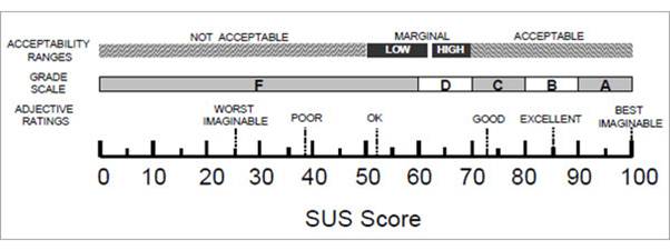
Figure 1. Grade rankings of SUS scores from “Determining What Individual SUS Scores Mean: Adding an Adjective Rating Scale,” by A. Bangor, P.T. Kortum, and J.T. Miller, 2009,
Journal of Usability Studies, 4(3), 114-123. Reprinted with permission.
As noted above, using a scoring system ranging from 0 to 100 often leads to researchers interpreting SUS scores as percentages, which they are not. The normative data collected by Bangor, Kortum, and Miller (2008) and Sauro (2011) provided the basis for positioning SUS scores as percentiles, providing a more meaningful basis for interpreting SUS scores. For example, Sauro commented: “A [SUS] score of a 70 is actually right around the average score of 68, meaning it is at or around the 50th percentile” (p. 36).
Tullis and Stetson’s (2004) research showed that using SUS enables you to get a measure of the perceived usability of a system with a small sample (say, 8-12 users) and be fairly confident that you’ve got a good assessment of how people see your system or product. As Figure 2 shows, using SUS means that you reach a “correct” conclusion quicker, and that you reach a greater level of consistency between respondents sooner than you do with other questionnaires.
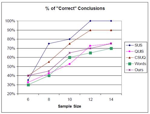
Figure 2. From “A Comparison of Questionnaires for Assessing Website Usability,” by T. S. Tullis and J. N. Stetson, 2004, Proceedings of UPA 2004 Conference. Reprinted with permission.
More recently, Sauro (2011) published an extensive guide and a set of tools for using SUS that is commercially available. Based on more than 5,000 SUS observations, Sauro provided a set of tools for analyzing SUS data. (Figure 3 shows an approximate distribution of SUS scores in percentile ranking terms, with Bangor, Kortum, and Miller’s “grade scale.”)
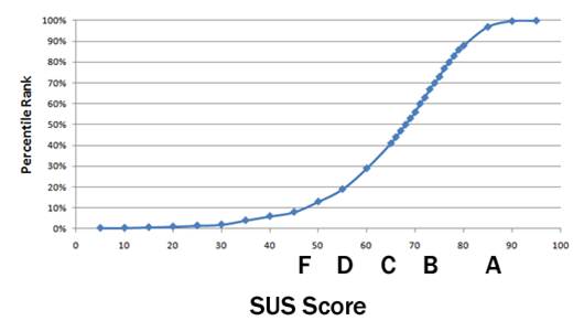
Figure 3. Percentile rankings of SUS scores from “A Practical Guide to the System Usability Scale: Background, Benchmarks, & Best Practices,” by J. Sauro, 2011, Denver, CO: Measuring Usability LLC. Reprinted with permission.
Sauro also carried out research in a number of other areas. He looked at the relationship between SUS scores and the “Net Promoter Score”9 (which in effect asks people how likely they are to recommend a system or product to a friend or colleague). He found that when people rate a system or product with a SUS score of 82 (±5), they also tend to be a “Promoter.”
He also carried out research that shows that if you get people to complete a SUS questionnaire within a very short time of being exposed to a system10 (say, after they’ve seen it for only 5 or 6 seconds), then the SUS scores that they give to the system turn out to be very similar to those that they give after using it for an extended period of time. (Interestingly, though, these scores differ from those given after somebody has been using a system for a slightly longer period of time, say, 10 minutes; the reasons for this are not clear. But it does seem to indicate that first impressions of the usability of something may not be too far off.)
Other work by Sauro and Lewis (2009) suggested that, although SUS was originally intended to yield just a single score indicating overall perceived usability of a system, factor analysis indicates that it incorporates two scales. One measures the “learnability” of a system, while the rest of the scale measures the overall “usability” of the system. Borsci, Federici, and Lauriola (2009) independently confirmed the two factor structure of SUS, also showing that those factors (usability and learnability) are correlated.
Sauro’s (2011) summary of SUS, based on extensive analysis of the data collected is as follows:
- SUS is reliable. Users respond consistently to the scale items, and SUS has been shown to detect differences at smaller sample sizes than other questionnaires.
- SUS is valid. That is, it measures what it purports to measure.
- SUS is not diagnostic. That is, it does not tell you what makes a system usable or not.
- SUS scores are not percentages, despite returning a value between 0 and 100. To understand how your product compares to others, you need to look at its percentile ranking.
- SUS measures both learnability and usability.
- SUS scores have a modest correlation with task performance, but it is not surprising that people’s subjective assessments may not be consistent with whether or not they were successful using a system. Subjective assessments of usability are only one component of the overall construct of usability.
Conclusion
When I first devised SUS, more than 25 years ago, it was intended primarily to meet some specific needs that arose from the way that we approached usability evaluations. As we used it in an increasing range of situations, it was clear that it might have value to others, and I am glad that we decided that making it freely available could have benefits both for our work and for other researchers, as has been proved over the years.
Usability practitioners have several choices when it comes to selecting a usability questionnaire. Because of the efforts of many researchers over the years, it’s now possible to choose SUS and be confident it is a valid and reliable measuring tool, be able to make a comparison between the scores you achieve and some normative standards (and thus with other systems or products), and to have some idea not only of whether people like your system, but also whether they would recommend it to others. You can do this quickly, and you can be fairly sure that you are getting reliable results by asking a small number of users and even, maybe, basing it on their first impressions of the system.
If, on the other hand, you feel that for a variety of reasons that SUS doesn’t apply to your situation, you can use an attitude scale that is specifically designed for it, if one exists. If your concern is specifically with websites, for example, you could use SUPR-Q (www.suprq.com ) or WAMMI (Kirakowski, Claridge, & Whitehand, 1998).
Finally, if there isn’t a relevant questionnaire for your situation, you can devise one.
SUS is particularly relevant when you want to compare two versions of an application that are based around different technologies. A home grown, technology-specific questionnaire will start to run into the same sorts of problems that you may perceive to be the case with SUS. You might want to decide, for example, whether it would be better to use a website or a voice-based system to access a bank account. SUS allows you to make that comparison, at least as far as perceived usability goes. Because SUS is pretty much technology-neutral, you can continue to use it as technology evolves over the years, and you don’t have to continually reinvent questionnaires. SUS, although created before anybody had even heard of the term “website,” has been successfully used with all manner of technologies—hardware, software, websites, business software, cellphones, operating systems… the list goes on.
SUS has proved its value over the years. The efforts of all those people who picked it up and did all of their work quite independently of me have provided additional evidence that it’s a tool worth using and probably has many more years of valuable life left in it.
References
- Bangor, A., Kortum, P. T., & Miller, J. T. (2008). An empirical evaluation of the System Usability Scale. International Journal of Human-Computer Interaction, 24(6), 574-594.
- Bangor, A., Kortum, P. T., & Miller, J. T. (2009). Determining what individual SUS scores mean: Adding an adjective rating scale. Journal of Usability Studies, 4(3), 114-123.
- Borsci, S., Federici, S., & Lauriola, M. (2009). On the dimensionality of the System Usability Scale: A test of alternative measurement models. Cognitive processing 10(3), 193–197.
- Brooke, J. (1996). SUS: A “quick and dirty” usability scale. In P. W. Jordan, B. Thomas, B. A. Weerdmeester, & A. L. McClelland (Eds.), Usability Evaluation in Industry. London: Taylor and Francis.
- Brooke, J. B., & Duncan, K. D. (1981). Effects of system display format on performance in a fault location task. Ergonomics, 24, 175-189.
- Brooke, J. B., & Duncan, K. D. (1983). A comparison of hierarchically paged and scrolling displays for fault finding. Ergonomics, 26, 465-477.
- ISO 9241-11:1998 Ergonomic requirements for office work with visual display terminals (VDTs) – Part 11: Guidance on usability.
- Finstad, K. (2006). The System Usability Scale and non-native English speakers. Journal of Usability Studies (1)4, 185-188.
- Kirakowski, J., Claridge, N., & Whitehand, R. (1998, June 5). Human centered measures of success in web site design. Proceedings of 4th Conference on Human factors and the Web. Basking Ridge, NJ, USA.
- Lewis, J.R., & Sauro, J. (2009). The factor structure of the system usability scale. Proceedings of International conference (HCII 2009), San Diego, CA, USA.
- Sauro, J. (2011). A practical guide to the System Usability Scale: Background, benchmarks, & best practices. Denver, CO: Measuring Usability LLC.
- Sauro. J., & Lewis, J. (2011). When designing usability questionnaires, does it hurt to be positive? Proceedings of the Conference in Human Factors in Computing Systems (CHI 2011). Vancouver, BC, Canada: ACM.
- Sheldon, M. G., Brooke, J. B. & Rector, A. L. (Eds.) (1985). Decision making in general practice. London: Macmillan.
- Tullis, T. S., & Stetson, J. N. (2004, June 7-11). A comparison of questionnaires for assessing website usability. Proceedings of UPA 2004 Conference. Minneapolis, Minnesota.
1This approach had been pioneered within DEC by John Whiteside and others in the Software Usability Engineering Group based in Nashua, New Hampshire, and by Charles Abernethy’s Human Factors Group in Maynard, Massachusetts.
2Although all the equipment we used did tend to restrict our flexibility in carrying out evaluations, it did have considerable PR value; customers were very impressed at the investment that was being made in addressing usability issues and were virtually queuing up to take part in evaluations. The Human Factors laboratory was also a fixture on customer tours of the engineering facility in Reading, even when they weren’t users of any of the products we were evaluating in the laboratory. When the new engineering building in which the laboratory was housed was officially opened (as usual, about 6 months after everybody had actually moved in) the laboratory was one of the things showcased to all the visiting dignitaries, including the Secretary of State for Industry.
3This presented quite a few logistical challenges in itself, mainly because at the time, the types of equipment we were using was still fairly bulky and very expensive; on one trip returning to New Hampshire after carrying out an evaluation with a customer in Delaware, I found myself driving north through Manhattan with about $100,000 worth of equipment, including prototype systems, in the back of an estate car, praying that the traffic lights weren’t going to turn red. On another occasion a colleague and I, on our way back from another evaluation we had done in Germany, spent the best part of a day twiddling our thumbs while customs officers rummaged through the equipment we were carrying, looking to see if we had technology that breached export control regulations—this was in the days before more open borders, Germany had not yet been re-united, and we were in the last stages of the Cold War. Life is much easier nowadays with miniaturized, cheap technology, more options for capturing user activities, and access through the Internet making it possible to do this sort of work remotely, if required.
4http://sumi.ucc.ie/
5http://www.WAMMI.com
6http://drjim.0catch.com/PsychometricEvaluationOfThePSSUQ.pdf
7http://lap.umd.edu/quis/
8There has even been an attempt to crowdsource a German translation of SUS: http://isitjustme.de/2012/01/crowdsourcing-the-translation-of-sus/
9http://www.measuringusability.com/usability-loyalty.php
10http://www.measuringusability.com/five-second-tests.php