
Abstract
A growing body of usability research suggests that the aesthetics of a system affects users’ perceptions of the usability of that system. But the causal relationship between aesthetics and usability and the direction of that relation have not been firmly established because of a shortage of experiments that have manipulated aesthetics and usability as separate variables. Furthermore, most existing studies measured the effect of aesthetics on usability after only one interaction with an interface, so the role that aesthetics plays in perceptions of usability over time has also not been well established. This study explored the hypotheses that aesthetics contributes disproportionately to judgments of usability, and that this influence of aesthetics on judgments of usability diminishes over time.
We developed a website and manipulated two variables— usability and aesthetics. The manipulations yielded four versions of the website: Higher Aesthetics Higher Usability, Higher Aesthetics Lower Usability, Lower Aesthetics Higher Usability, Lower Aesthetics Lower Usability. Participants performed tasks on the four versions. After each task, we gauged participants’ perceptions of usability and aesthetics, and we recorded performance measures. Participants repeated this procedure on four separate occasions. Results failed to show the hypothesized effect of aesthetics on participants’ judgments of usability and suggested that SUS ratings were not influenced by aesthetics. Instead, analyses showed a significant effect of occasion and manipulated usability, rather than aesthetics, on participants’ judgments of usability. Explanations for the results are discussed, including the possibility that participants’ perceptions of their own improved performance accounted for increased SUS scores.
Keywords
aesthetics, usability, aesthetics on usability, usability on
aesthetics, System Usability Scale, SUS, visual aesthetics of website
inventory, VisAWI-S, classical aesthetics, expressive aesthetics
Introduction
Including aesthetics in the design of products is as old as mankind, and the advent of digital media has extended the tradition to a new range of electronic products. In making aesthetic decisions, designers need a better understanding of how and when aesthetics affects user responses to a product. Importantly for user-centered design, a growing body of research suggests that the aesthetics of a system affects users’ perceptions of the usability of that system (e.g., Lee & Koubek, 2010; Tuch, Roth, Hobaek, Opwis, & Bargas-Avila, 2012). But the weight of this research points to a need to learn more about the contingencies and boundary conditions that affect this relationship. Only a handful of experimenters have manipulated aesthetics and usability as separate variables, so the causal relationship between aesthetics and perceived usability has not been firmly established. Additionally, how the role of aesthetics changes over time has not been thoroughly researched.
Problem Statement
In the study of usability and user-experience, the aesthetics of user interfaces is a growing area of interest, but this phenomenon is fairly recent. The relationship between aesthetics and user interfaces went largely unexplored prior to studies by Kurosu and Kashimura (1995) and Tractinsky, Katz, and Ikar (2000) that indicated that the aesthetics of the interface of a system might affect the users’ perceptions of the usability of the whole system. Since then, numerous studies have demonstrated the role of aesthetics on various outcomes, including trust and credibility (Karvonen, Cardholm, & Karlsson, 2000; Robins & Holmes, 2008), the perception of usability (Ben-Bassat, Meyer, & Tractinsky, 2006; Thüring & Mahlke, 2007; Tractinsky et al., 2000), and usability testing (Sonderegger & Sauer, 2010). Despite the proliferation of studies investigating interface aesthetics, it is still “… unclear under which circumstances the aesthetics of an interface influences perceived usability, or vice versa” (Tuch et al., 2012, p. 1596). In their overview of aesthetics and usability, Hassenzahl and Monk (2010) concluded that there was a shortage of studies that tested the effects of aesthetics on usability through experimental manipulation. Even though a correlation between aesthetics and usability was demonstrated in much of the research (e.g., De Angeli, Sutcliffe, & Hartmann, 2006; Tractinsky, 1997), there were few experiments that manipulated aesthetics and usability as separate variables. As a result, a causal relationship between aesthetics and users’ perceptions of usability has not been sufficiently established. Additionally, the existing studies have focused on the overall effect of aesthetics on users’ impressions of usability after a single use of the interface, so the role of aesthetics over multiple uses (i.e., as a time variant factor) has not been well researched.
Aesthetics Correlated With Usability
As previously mentioned, Kurosu and Kashimura (1995) was one of the studies that sparked increased interest in the relationship between the aesthetics of a user interface and its usability. However, Kurosu and Kashimura’s landmark study did not start out as an investigation of aesthetics, but as an attempt to study the relationship between inherent usability and something they called “apparent usability.” Designers were attempting to create user interfaces that were more efficient, easier to understand, and safer. Taken in sum, Kurosu and Kashimura named these properties “inherent usability.” They distinguished between inherent usability and apparent usability. The apparent usability of user interfaces is “… how much they look to be easy to use …” (p. 292). They pointed out that the inherent usability of an interface is meaningless for the user if the interface doesn’t have enough apparent usability to make them want to buy it. Stated another way, they wanted to investigate the relationship between the factors that make an interface look to be easy to use (apparent usability) and those that actually make it easy to use (inherent usability).
Kurosu and Kashimura developed 26 stimuli by having 26 participants each create a layout pattern for an automated teller machine (ATM) interface. The participants, a combination of graphic user interface (GUI) designers, industrial designers, engineers, and secretaries, used the same graphical elements, and they were free to vary the positions of the elements according to any strategy “… as they might think optimal in various senses” (p. 292). Then they had 252 subjects rate the 26 layouts on two criteria: (1) how much they looked to be easy to use (apparent usability) and (2) how beautiful they were. They correlated the two ratings and found that apparent usability was highly correlated to beauty (r = .589).
Next, they interviewed the 26 participants who had created the layouts to determine the factors that had contributed to the inherent usability of the layouts. The interviews yielded seven factors: (1) glance sequence, (2) familiarity, (3) grouping, (4) operation sequence 1, (5) hand dominance (6) operation sequence 2, and (7) safety. These factors of inherent usability were then correlated with the ratings of apparent usability. The results showed that apparent usability was not highly correlated with inherent usability. In other words, layouts that users said looked easy to use, were not necessarily the ones that were actually easy to use, and vice versa. This suggested that the user was strongly affected by the aesthetic qualities of the interface and, in conclusion, Kurosu and Kashimura recommended that, in addition to improving inherent usability, designers focus on improving the apparent usability.
Although Kurosu and Kashimura found that apparent usability correlated highly with beauty, this observation does not establish that interface aesthetics directly influences apparent usability. In fact, the reverse—that apparent usability might cause users to perceive greater beauty in the interface—might be true. Or, perhaps the relation between apparent usability and aesthetics is spurious. Nevertheless, Kurosu and Kashimura’s (1995) study marked a turning point in the study of the relationship between aesthetics and usability by demonstrating a correlation between users’ perceptions of an interface’s ease of use and its beauty.
Aesthetics-Usability Relation Persists After One-Time Use of a System
Another milestone in the growth of interest in the relationship between aesthetics and usability was a study by Tractinsky, Katz, and Ikar (2000). Tractinsky et al. (2000) noted that the mechanism linking affective and cognitive evaluations of user interfaces was unclear, and they surmised that the correlations found between aesthetics and perceived usability resembled findings in social psychology linking physical attractiveness and socially desirable characteristics such as social competence. They further surmised that three processes may be at play in the relationship between interface aesthetics and perceived usability. The first process is stereotyping—users associate beauty with other (or all) design dimensions. For example, the affective response that a customer feels toward a store as a result of its aesthetic qualities may affect how the customer feels about the customer service at that store. The second process is the halo effect—users perceive beauty early in the interaction and this tends to carry over to later perceptions about other characteristics. The third process is affective response—an affective response to the aesthetics of a design may improve a user’s mood and overall evaluations of a system. Additionally, Tractinsky, et al. (2000) noted that prior studies had established the relationship between aesthetics before users actually used the system, and they wanted to know whether this relationship persisted after users had actually interacted with the system. Again, borrowing from social psychology, Tractinsky, et al. (2000) noted that initial social perceptions persevere even after evidence to the contrary is presented, so users’ initial perceptions of usability might persist even after they experience an interface with low usability. So, their goals in this study were to investigate (1) whether the correlation of aesthetics and usability was the result of a general tendency to associate aesthetics with other attributes of a system and (2) whether the correlation of aesthetics and usability continues after use of the system.
Tractinsky et al. (2000) designed a 3 X 2 between-groups quasi-experimental study. The first factor was aesthetics, which had three levels, low, medium, and high. The second factor was usability with two levels, low and high. Tractinsky et al. created a computer program that presented participants with nine ATM layouts adapted from Kurosu and Kashimura’s (1995) study. They chose nine of Kurosu and Kashimura’s 26 layouts based on ratings of those layouts by participants in a 1997 study by Tractinsky. Three of the nine layouts had been rated as high in aesthetics, three had been rated as low in aesthetics, and the other three had been rated as in between. The experimental session was presented in three stages. In Stage 1, participants rated each of the nine layouts on a 1–10 scale on three attributes, including (1) aesthetics, (2) usability, and (3) amount of information on the screen. Before Stage 2, participants were assigned either to a high, medium, or low aesthetic condition. Participants in these conditions performed the subsequent experiment tasks only on the versions of the layouts that matched their own ratings. For example, participants who were assigned to the high aesthetic group performed the experiment tasks only on layouts that they had rated high on aesthetics. After being assigned to an aesthetic condition, participants practiced the use of the ATM by performing the type of task that they would actually be doing in the experiment. After the practice session, participants were assigned to one of the two usability conditions, high or low. The computer program then presented each participant with the 11 tasks to be performed on the ATM. Finally, in Stage 3, participants were asked to rate the system on (1) aesthetics, (2) usability, (3) amount of information on the screen, and (4) user satisfaction.
Results showed that pre-experimental perceptions of ATM interface aesthetics and their perceived usability were highly correlated, and that correlations between perceived aesthetics and usability remained high after the experiment. This addressed Tractinsky et al.’s (2000) second goal of the study, which was to investigate whether the correlation of aesthetics and usability continues after use of the system—it did. Furthermore, perceived aesthetics was only weakly and negatively correlated with the other pre-experimental measure, amount of information. This addressed Tractinsky et al.’s first goal of the study, which was to investigate whether the correlation of aesthetics and usability was the result of a general tendency to associate aesthetics with all other attributes of a system. The results suggested that it was not. Additionally, a 3 X 2 analyses of variance (ANOVA) revealed an unexpected finding: post-experiment perceptions of usability were affected by the interface’s aesthetics and not by the actual usability of the system.
Thus, Tractinsky et al. (2000) marked another important milestone in the study of the relationship of aesthetics to usability. Building on Kurosu and Kashimura’s (1995) findings that users’ perceptions of the usability of an interface are correlated with their perceptions of its beauty, Tractinsky et al. showed that the beauty-usability relation persists after the user actually uses the system, and that its persistence is not due to the relationship between actual usability and perceived usability. Taken together, Kurosu and Kashimura (1995) and Tractinsky et al. (2000) demonstrated convergent evidence for the relationship of aesthetics to usability. However, the ability to make additional inferences about the aesthetics-usability relationship was limited. Tractinsky et al. were aware that there might be numerous circumstances under which the relationship they found did not hold. They encouraged additional research “… to assess the contingencies and boundaries of the aesthetics-usability relationship” (p. 142). One such contingency that Tractinsky et al. did not explore was how user perceptions of aesthetics and usability changed as the user gained experience with the interface.
Shortage of Studies That Manipulated Aesthetics and Usability as IVs
Based on the findings from previous studies, it was unclear under which circumstances the aesthetics of an interface affects users’ perceived usability, or the direction of the relationship. Most studies were correlative and did not attempt to manipulate aesthetics and usability as independent variables. Hassenzahl (2004) and van Schaik and Ling (2009) suggested a causal relationship between aesthetics and usability, but this was mostly theoretical conjecture, and it remained untested, leading Hassenzahl and Monk (2010) to conclude that there was a lack of studies that tested the effects of aesthetics on usability through experimental manipulation.
Shortage of Studies With Multiple Observations
Tuch et al. (2012) noted Tractinsky et al.’s (2000) emphasis of the importance of establishing the contingencies and boundary conditions of the aesthetics-usability relationship, and set out to explore the possibility that different degrees of manipulation of aesthetics and usability might affect the relationship differently. They also noted the inferential limitations of earlier studies because of their reliance on correlation, and they pointed out that, although these earlier studies had established a relationship between aesthetics and usability, they had not established the direction of the relationship. In an attempt to address these limitations and establish a firmer causal relationship between aesthetics and usability, Tuch et al. systematically manipulated interface aesthetics and interface usability.
Tuch et al. (2012) created a three-factor, mixed design study in which participants performed tasks in four different versions of an online shop in which the interface usability and interface aesthetics had been independently manipulated. The between-subject independent variables were interface usability at two levels (low and high) and interface aesthetics at two levels (low and high). The within-subject variable was the time of measurement (pre-use and post-use). The dependent variables were perceived usability and perceived aesthetics. Before beginning their interaction with the interfaces for the online shop, participants were presented with a screenshot of the online shop for 10 seconds, and then they rated the screenshot on several scales of perceived aesthetics and usability. Next, participants were given four tasks in the online shop. Each task consisted of browsing for a target item and adding it to the shopping cart. After each task, participants rated their user experience. After completing all tasks, participants evaluated their entire interaction with the shop, including the perceived usability and perceived aesthetics of the shop. Tuch et al. (2012) had participants rate their user experience using multiple measures of these concepts. For example, to test the effect of the interface on perceived aesthetics, they used scales for classical aesthetics, hedonic quality identification, and hedonic quality stimulation. Similarly, to test the effect of the interface on perceived usability, they used scales for subjective usability, pragmatic quality, and perceived orientation.
Results revealed that, before use, interface aesthetics did not affect perceived usability. After use, low interface usability lowered users’ ratings of classical aesthetics and hedonic quality stimulation. Additionally, Tuch et al. found that the effect of interface usability on classical aesthetics and hedonic quality stimulation was mediated by the users’ affective experience with the usability of the online shop. Users who were frustrated by the interface’s low usability lowered their aesthetics ratings. Thus, Tuch et al. summarized their findings: “Our results show that Tractinsky’s notion (‘what is beautiful is usable’) can be reversed to a ‘what is usable is beautiful’ effect under certain circumstances” (p. 1604).
Evidence from studies prior to Tuch et al. suggested a directional relationship between aesthetics and usability in which increased aesthetics equaled increased usability. However, Tuch et al. showed that under certain circumstances the direction of the relationship was reversed—lower usability equaled lower perceived aesthetics. This finding was new, and it demonstrated the importance of exploring the contingencies and boundary conditions of the specific effects of manipulations of aesthetics and usability. Tuch et al. pointed out that additional research was necessary to understand the directions of these effects. They also pointed out that their results differed from prior studies in that users’ perceptions of the aesthetics of an interface changed after experience with the interface. However, their exploration of that particular contingency was limited to two observations, one made immediately before and the other immediately after users’ one-time interaction with the system. Recognizing this limitation, Tuch et al. encouraged future research that further manipulated aesthetics and usability to observe which effects occur under which conditions.
Research Questions and Hypotheses
The current research was designed to examine whether users’ judgments of usability and aesthetics, as well as any association between the two, might change with continued experience with a system. If, as previous research has suggested, aesthetics and usability are related prior to users’ interaction with a system and after one experience, does that relationship change as a user gains experience with the system? We hypothesized the following:
- (H1) With early use, aesthetics contributes disproportionately to judgments of usability.
- (H2) With continued use and the acquisition of experience, the role of aesthetics diminishes with respect to overall perception of usability.
We therefore designed this study to explore the relations between aesthetics and usability as a function of multiple experiences with an interface. We manipulated the aesthetics and usability of a system (a simulated portal for a health care system) and the experience with the system in a 2 x 2 x 4 design.
The measure of usability that we applied in this research is used commonly in practice, the System Usability Scale (SUS; Brooke, 1996), a 10-item scale that has been studied extensively (e.g., Bangor, Kortum, & Miller, 2008; Lewis & Sauro, 2009). For the measurement of aesthetics, we used two widely accepted (Altaboli & Lin, 2011) measures of users’ subjective perceptions of aesthetics, the classical and expressive instruments developed by Lavie and Tractinsky (2004) and the short version of the Visual Aesthetics of Website Inventory (VisAWI) tool developed by Moshagen and Thielsch (2010).
General Method
The two main elements of the study were Experiment 1, development of the website/patient portal, and Experiment 2, assessing the relation between aesthetics and usability. The goal of the study was to determine whether perceptions of usability and aesthetics changed over time as experience with a system increased. To this end, we varied the usability and the aesthetic appeal of an interface as two between-participant variables, and we observed participants complete three different tasks on the interface on four occasions. Accordingly, Experiment 2 was a 2 x 2 x 4 mixed model design. To determine participants’ judgments of aesthetics and usability after their experience with the system, we measured participants’ judgments of aesthetics and usability immediately after completion of the three tasks on each of the four occasions.
Experiment 1: Development of the Website/Patient Portal
In this part of the research, we developed the stimuli that we would use later in Experiment 2. The website was the electronic patient portal for a fictitious medical practice on which two variables were manipulated: aesthetics at two levels (higher and lower) and usability at two levels (higher and lower). These manipulations yielded four versions of the website/patient portal as detailed in Table 1.
Table 1. Aesthetics and usability as manipulated on a website for four versions of the website
|
Usability |
|||
|
Higher |
Lower |
||
|
Aesthetics |
Higher |
Version 1 (HAHU) · More Attractive · Higher Usability |
Version 2 (HALU) · More Attractive · Lower Usability |
|
Lower |
Version 3 (LAHU) · Less Attractive · Higher Usability |
Version 4 (LALU) · Less Attractive · Lower Usability |
|
We created working prototypes of each of these four versions with Axure RP wireframe and prototyping software. Before we could proceed withExperiment 2, we conducted two phases of Experiment 1: Experiment 1A (aesthetics) and Experiment 1B (usability) to confirm that the manipulations of aesthetics and usability were successful in producing differences in participants’ perceptions of aesthetics and usability. We provide details about each phase in the following sections.
Experiment 1A Aesthetics
A review of online resources for website design (e.g., Coolen, 2009; Laja, 2018; Woods, 2014) yielded several principles that are commonly used to influence the aesthetics of websites. We created higher and lower aesthetics versions of the patient portals/websites by manipulating on-screen elements according to those principles. Among the principles observed were the following:
- Color is more aesthetically appealing than black and white.
- Unifying graphic elements, such as tool lines and borders, can make a website more aesthetically appealing.
- Graphics in place of text where possible is more aesthetically appealing than dense text.
- Visually deep is more aesthetically appealing than visually flat.
- Less cluttered is more aesthetically appealing than cluttered.
MATERIALS
To confirm that our manipulation of aesthetics factors had indeed produced the desired difference in perceived aesthetics between the higher (HAHU, HALU) and lower (LAHU, LALU) aesthetics versions of the websites, we used the survey software Qualtrics to create a survey that presented three images from each of the four versions of the website. The images were screenshots of the actual websites. One representative image from each of the three tasks was chosen from each of the four versions of the website for a total of twelve images (1 image per task x 3 tasks per website x 4 versions of the website = 12 images). Additionally, a practice block of three images was created so that participants could become familiar with the procedure and format of the experiment. The practice block contained three images that were unrelated to the websites and bore no resemblance to them.
PARTICIPANTS
We recruited 50 online research participants through the Internet-based recruiting site Amazon Mechanical Turk (MTurk). Since MTurk’s introduction in 2005, studies have demonstrated that its participants are as representative of the U.S. population as traditional subject pools, and the studies have confirmed that the online tool is reliable for behavioral research (e.g., Goodman, Cryder, & Cheema, 2013; Paolacci, Chandler, & Ipeirotis, 2010).
Because this research made no hypothetical claim regarding the influence of age or gender on participants’ perceptions of aesthetics or usability, collection of such demographic data was not justified, and participants were not screened by age or gender.
PROCEDURE
After signing online consent forms, participants viewed the practice block of three images. The images were presented in random order for five seconds per image. After the presentation of the three-image practice block, participants were asked the following five questions about the images they had just viewed:
- Thinking about the 3 images you just saw, please rate the overall attractiveness of the images on a scale of 0 to 10, with 0 meaning not at all attractive and 10 meaning extremely attractive.
- Thinking about the 3 images you just saw, please rate how pleasing to the eye the images were on a scale of 0 to 10, with 0 meaning not at all pleasing to the eye and 10 meaning extremely pleasing to the eye.
- Thinking about the 3 images you just saw, please rate how pretty were the images on a scale of 0 to 10, with 0 meaning not at all pretty and 10 meaning extremely pretty.
- Thinking about the 3 images you just saw, please rate how attractive the colors were on a scale of 0 to 10, with 0 meaning that the colors were not at all attractive and 10 meaning that the colors were extremely attractive.
- Thinking about the 3 images you just saw, please rate how much pleasure you felt looking at the images, with 0 meaning that you felt no pleasure at all and 10 meaning that you felt extreme pleasure.
Participants then viewed the twelve full screen images of the websites presented one at a time in blocks of three for each version of the website. Participants viewed each image for five seconds. The blocks were presented in random order. The three-image blocks are shown in Figures 1–4. As explained in Table 1, the Higher Aesthetic and Lower Aesthetic versions of the website vary only by aesthetics and are otherwise identical.

Figure 1. Three-image block of Higher Aesthetics Higher Usability (HAHU) screenshots that were shown to participants.
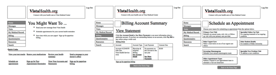
Figure 2. Three-image block of Lower Aesthetics Higher Usability (LAHU) screenshots that were shown to participants.

Figure 3. Three-image block of Higher Aesthetics Lower Usability (HALU) screenshots that were shown to participants.
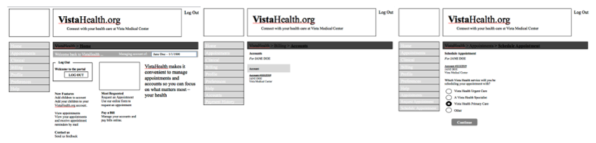
Figure 4. Three-image block of Lower Aesthetics Lower Usability (LALU) screenshots that were shown to participants.
After viewing each three-image block, participants answered the same set of questions that they received after the practice block. Participants answered the questions and were then shown the next block of three images, presented in random order, and the process was repeated until participants had rated the aesthetics of the images from all four websites.
RESULTS AND DISCUSSION
Matched samples t-tests comparing the ratings of the images from the higher aesthetics (HAHU, HALU) and lower aesthetics (LAHU, LALU) versions of the website indicated that, on all five questions, participants judged the higher aesthetics versions to be more attractive than the lower aesthetics versions. These results confirmed that the manipulation of aesthetics factors had indeed produced the desired difference in perceived aesthetics between the higher (HAHU, HALU) and lower (LAHU, LALU) aesthetics versions of the websites. Results of the t-tests are provided in Table 2.
Table 2. Results of matched samples t-tests comparing participants’ ratings of the higher (HAHU, HALU) and lower (LAHU, LALU) aesthetics versions of the websites
|
Mean |
Mean |
Df |
t |
p |
|
|
Overall attractiveness? |
2.24 |
5.26 |
99 |
12.96 |
<.001 |
|
Pleasing to eye? |
2.31 |
5.38 |
99 |
12.49 |
<.001 |
|
Pretty? |
1.61 |
4.46 |
99 |
11.61 |
<.001 |
|
Attractive colors? |
1.60 |
5.70 |
99 |
14.89 |
<.001 |
|
How much pleasure? |
1.60 |
4.38 |
99 |
11.19 |
<.001 |
Experiment 1B: Usability
A review of Nielsen and Loranger (2006) and online resources for website usability (e.g., Leung, 2016; Moran, 2017; Rawat, 2012) yielded several principles that are commonly used to influence the usability of websites. We employed these techniques/principles to create higher and lower usability versions of the patient portals/websites by manipulating elements according to those techniques and principles. For the low usability versions, the following techniques were applied to impair usability:
- Tasks were deliberately made “deep” rather than “shallow” so that navigation to the correct target page required more clicks and screen views.
- Shades of color were too similar in areas that needed to be visually distinct so that distinctions were not clear.
- Pages were organized in columnar format so that data had to be requested in one column but retrieved in another.
- CSS font-size property was set at small to reduce readability.
- The bar indicating location in navigation (e.g., VistaHealth>Home) was a different color as the selected “Home” in the navigation bar; had those colors matched, it would have been a clue that the user was in Home.
- Navigation bar labels had unclear meanings. For example, in one task, participants were asked to find results of the test for fasting glucose level. Those results were under Clinical>Medical Records, which didn’t necessarily indicate to the user that that was where a lab test result would be.
- The horizontal gray bar that indicated where the user was in the site had a black font on a dark gray background which made it very difficult to read.
To create the higher usability versions of the patient portal/websites, we applied the reverse of these techniques.
MATERIALS
To confirm that our manipulations of usability factors produced the desired differences in perceived usability, we used the online, remote usability testing tool, Loop11, to create an online, remote usability test of all four versions of the patient portal/website.
Tasks. Participants performed three tasks on the website version to which they were assigned. For example, participants who were assigned to the LALU version of the website performed three tasks on that version, and that version only. Those assigned to either the HAHU, HALU, or LAHU versions performed the three tasks on those versions. The three tasks were the following:
- Find the non-fasting glucose level for patient Jane Doe.
- Find how much patient Jane Doe owes.
- Schedule an appointment for patient Jane Doe.
PARTICIPANTS
We recruited 40 online research participants for each version of the website using MTurk. Because this research made no hypothetical claim regarding the influence of age or gender on participants’ perceptions of aesthetics or usability, collection of such demographic data was not justified, and participants were not screened by age or gender. After the data were collected, data for participants who had participated in Experiment 1A were deleted. The final number of participants who provided usability ratings for patient portal website are summarized in Table 3.
Table 3. Number of participants in Experiment 1B by website version
|
Website version |
n |
|
HAHU |
39 |
|
HALU |
37 |
|
LAHU |
38 |
|
LALU |
40 |
|
Total |
154 |
Procedure
The Loop11 software that we used to administer the tasks displayed two buttons in the margin of the website as participants worked through the tasks. One button was labeled “Task Complete,” the other “Abandon Task.” Participants were instructed to click Task Complete to indicate that they had finished a task, and to click Abandon Task if they were unable to complete a task. If participants arrived at the page that corresponded to the correct completion of the task and clicked Task Complete, the task was scored “Success.” Participants were taken to the next task and were not given feedback about whether they had completed the task correctly or not. If participants arrived at a page that did not correspond to the correct completion of the task and clicked Task Complete, they were also taken to the next task, but the task was scored “Fail.” Again, they were not notified whether they completed the task correctly or incorrectly.
After completing the three tasks, participants were asked the following questions:
- How usable was the website on which you just performed the task?
- How difficult to use was the website on which you just performed the task?
- How user friendly was the website on which you just performed the task?
Participants were asked to answer the three questions on a 1–10 scale, with 1 meaning low and 10 meaning high.
RESULTS AND DISCUSSION
Participants judged the higher usability versions (HAHU, LAHU) of the website more usable, more user friendly, and less difficult to use than the lower usability versions (HALU, LALU). The mean ratings for the three questions are summarized in Table 4. The ratings were also compared using independent samples t-tests. The analyses confirmed that participants’ perceptions of the usability of the websites were significantly higher for the higher usability versions than for the lower usability versions. Results of the two-sample t-tests are also found in Table 4.
Table 4. Results of two-sample t-tests comparing participants’ ratings of the higher (HAHU, LAHU) and lower (HALU, LALU) usability versions of the websites after completing the three tasks
|
Mean |
Mean |
df |
t |
p |
|
|
How usable? |
5.39 |
7.31 |
475 |
-7.2 |
<.001 |
|
How difficult? |
5.37 |
3.70 |
476 |
6.2 |
<.001 |
|
How user friendly? |
5.04 |
7.19 |
470 |
-8.3 |
<.001 |
Additionally, performance data in the form of Success/Fail/Abandon rates on each task were collected, and chi-square tests were performed on the data. The differences in the Success/Fail/Abandon rates on the higher usability (HAHU, LAHU) and lower usability (HALU, LALU) versions of the website were significant by a chi-square test, Χ2(2, N = 154) = 8.7, p < .05. These chi-square results confirmed that our manipulation of the usability of the websites had affected not only participants’ perceptions of the usability of the websites as demonstrated by the earlier t-tests, but user performance as well.
The results of Experiment 1A (aesthetics) and Experiment 1B (usability)confirmed that the manipulation of the two variables, aesthetics and usability, produced differences in participants’ perceptions of the aesthetics and usability of the four versions of the websites, and thus justified proceeding with Experiment 2: Assessing the relation between aesthetics and usability.
Experiment 2: Assessing the Relation Between Aesthetics and Usability
For this study, participants were randomly assigned to one of the four versions of the website/patient portal. On four consecutive days, participants performed three tasks on the version of the website to which they were assigned. After each task, participants rated the website on measures of usability and aesthetics.
Participants
For each version of the website (Table 1), participants were recruited on the Internet-based recruiting site Amazon Mechanical Turk (e.g., Goodman, Cryder, & Cheema, 2013; Paolacci, Chandler, & Ipeirotis, 2010). The Mechanical Turk add-on, TurkPrime, was used to perform all actions on Mechanical Turk. TurkPrime is an Internet-based interface that integrates with Mechanical Turk to offer additional functionality, including the ability to include or exclude participants on the basis of previous participation (Litman, Robinson, & Abberbock, 2017). TurkPrime’s built-in screening tools were used to limit participants to those only from the United States and to those who had a Human Intelligence Task (HIT) approval rate of at least 95%. Because this research made no hypothetical claim regarding the influence of age or gender on participants’ perceptions of aesthetics or usability, collection of such demographic data was not justified, and participants were not screened by age or gender. Participants were paid $0.55 for their participation. The HIT description also informed participants that the study was longitudinal, that the HIT would be made available again on the morning of the next three consecutive days, and that they would again be compensated $0.55 for each day they completed.
As is typical for longitudinal studies, some participants failed to participate in subsequent days/observations. Data for those participants were not included in the study. Additionally, connectivity and other technical issues resulted in incomplete data for some participants, and their data were also excluded. Only data sets that were complete for all four observations were used in the study, and the number of participants who provided complete data after attrition and technical issues are shown, organized by website, in Table 5. We therefore made the decision to conduct another round of data collection to increase the number of participants for each website. Round 2, which ran from October 3–6, 2017, was conducted exactly like Round 1, except that TurkPrime was used to exclude all participants from Round 1. Additionally, due to cost considerations, the number of participants was limited to 20 participants per version in Round 2. Again, a combination of technical issues and participants’ attrition resulted in excluded data for several participants. The final count of participants from whom complete data was collected in the two rounds is shown in Table 5.
Table 5. Number of participants (n) from each website for whom complete data was available after four observations
|
n |
HAHU |
HALU |
LAHU |
LALU |
Total |
|
Round 1 |
22 |
26 |
23 |
20 |
91 |
|
Round 2 |
6 |
7 |
7 |
6 |
26 |
|
TOTAL |
28 |
33 |
30 |
26 |
117 |
MATERIALS
We again used the remote usability testing tool, Loop11, to administer an online usability test of all four versions of the patient portal/website.
Measure of usability. Because of the widespread use and acceptance of the System Usability Scale (SUS) as a measure of usability (Brooke, 1996), this study employed the SUS as the primary measure of usability (Appendix A). Participants were asked to perform three tasks on the website/patient portal and to complete the SUS after each task.
Measure of aesthetics. This study employed the short version of the Visual Aesthetics of Website Inventory (VisAWI-S) tool developed by Moshagen and Thielsch (2010, 2013) and the classical and expressive aesthetic instruments developed by Lavie and Tractinsky (2004). These instruments are provided in Appendices B and C.
Tasks. Participants were asked to perform three tasks on the website/patient portal on four successive days/occasions/observations. The three tasks were ecologically valid in that they were representative of typical tasks that patients might perform on patient portals of real-world medical practices. The three tasks were the following:
- Find the non-fasting glucose level.
- Determine what amount, if any, that the patient still owed.
- Schedule an appointment.
PROCEDURE
Participants were asked to perform the three tasks on the website/patient portal, and we again used the Loop11 software in the manner described previously in the Procedure section of Experiment 1B.
After completion of the tasks, in addition to completing the SUS, participants completed Lavie and Tractinsky’s (2004) classical (CA) and expressive (CE) instrument, as well as the short version of Moshagen and Thielsch’s (2013) VisAWI-S tool. To measure changes in perceived usability and aesthetics over time, the same groups of participants performed the three tasks on the same version of the patient portal on four successive days/occasions/observations, and they completed the measurements of usability and aesthetics after each task on all four occasions.
Results and Discussion
The following sections discuss participants’ performance and perceptions of usability and aesthetics.
PARTICIPANTS’ PERFORMANCE
We examined changes in participants’ performance on three usability-related variables: (1) overall average time spent on tasks (response time), (2) overall average page views on tasks, and (3) Success/Fail/Abandon rates. The performance measures for each version of the website are shown in Figures 5–7.
As part of our examination of performance changes, we first performed correlations to analyze the relationships between the three usability-related variables: (1) overall average time combined over the four observations/occasion spent on tasks (response time), (2) overall average page views on tasks, and (3) overall average SUS scores. For two of the participants, we did not have complete data for the overall time spent on tasks, and we therefore excluded those two participants from the correlations. The correlations showed that response time was unrelated to SUS, r(113) = -.10, p =. 30, as were page views, r(113) = -.06, p = .50. However, as one might expect, more page views were related to longer response times, r(113) = .59, p < .001.
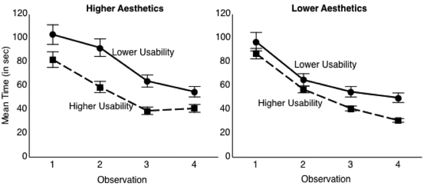
Figure 5. The mean amount of time that participants took to complete the three tasks for each version of the website over four observations. Error bars represent the standard errors of the means.
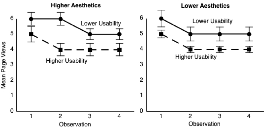
Figure 6. The mean number of page views that participants took to complete all three tasks for each version of the website over four observations. Error bars represent the standard errors of the means.
Also, as part of our examination of performance changes, we performed a chi-square test to determine whether the observed performance changes on the Success/Fail/Abandon measure were affected by usability and aesthetics. The manipulations of usability had a significant effect on overall Success/Fail/Abandon rates, Χ2(2, N = 117) = 99.3, p < .001, whereas the manipulation of aesthetics did not, Χ2(2, N = 117) = 5.1, p > .05. This result was similar to the chi-square test in Experiment 1, in which there was a significant effect of usability on performance, but not of aesthetics on performance. However, that Experiment 1 result occurred at a one-time, single observation, whereas the results reported here for the main experiment included all four observations. For this reason, we decided to conduct a chi-square test on the Success/Fail/Abandon measure using just the data for Observation 1 of Experiment 2. Our rationale for performing this analysis was that Observation 1 of Experiment 2 was similar to Experiment 1 in that Experiment 1 was the participants’ first experience with the website. In the earlier Experiment 1 result, manipulating usability affected the success/fail/abandon rates, whereas manipulating aesthetics did not. In Experiment 2, however, the chi-square test, which we performed on Observation 1, results only showed that both usability and aesthetics manipulations affected success/fail/abandon rates: Χ2(2, N = 117) = 24.7, p < .05 for usability and Χ2(2, N = 117) = 7.2, p < .05 for aesthetics. This suggests that, at least in their initial interaction with the website, the manipulations of both aesthetics and usability had some effect on participants’ performance.
Thus far, these analyses showed changes in participants’ performance. The chi-square tests, while showing that usability affected performance, yielded ambiguous results on the role of aesthetics on performance. Although the earlier Experiment 1 chi-square tests suggested that aesthetics did not play a role in participants’ performance, the chi-square tests in Experiment 2 suggested that aesthetics did influence performance on the initial experience with the website.
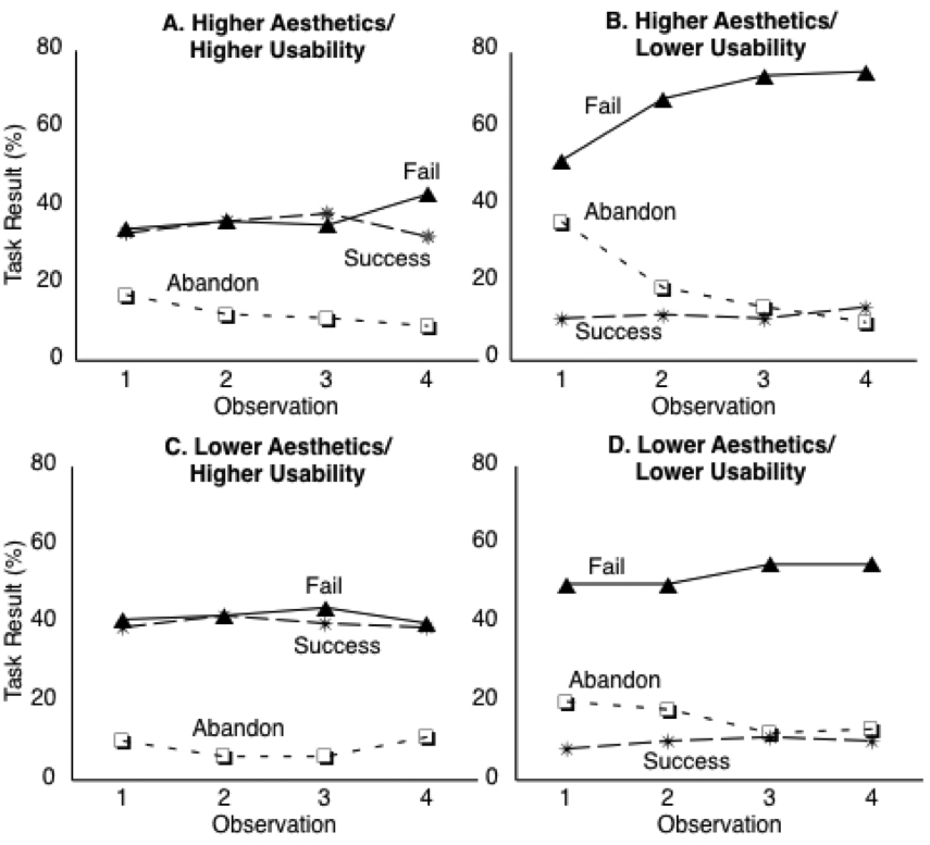
Figure 7. Participants’
success rates on the three tasks for each version of the website over four
observations.
We also performed analyses of participants’ success rate on the three tasks based on what appeared to be a discernible pattern. Figure 7 shows participants’ success rates on the three tasks for each version of the website/patient portal over four observations. The graphs suggest that the success rates differed by version. Not surprisingly, correct completion (Success) rates were higher for the HU versions than the LU versions. Additionally, in all four versions, there was a gap between fail and abandon rates. On the HAHU and LAHU versions, success rates were roughly equal to Fail rates and were fairly constant, but on the HALU and LALU versions, success rates were lower than fail rates and success rates decreased over successive observations. Furthermore, participants’ success rates decreased over observations on the low usability versions, even as SUS scores (Figure 8) increased. To examine the effect of trial/observation on participants’ success rates, we conducted a single-factor ANOVA with trial/observation as the predictor variable and success rate as the criterion variable. Success rates did not differ significantly as a function of trial observation, F(3, 464) = .29, p = .84, η2 = .002. However, a single-factor ANOVA with the version of the website/patient portal as the predictor variable and success rate as the criterion variable confirmed that success rates differed by version F(3, 464) = 93.84, p < .001, η2 = .38. Bonferroni and Tukey HSD comparisons revealed that participants’ success rates were significantly higher on the higher usability versions of the website/patient portal (HAHU: M= 1.24, LAHU, M = 1.33) than on the lower usability versions (HALU: M = .36, LALU, M = .37).
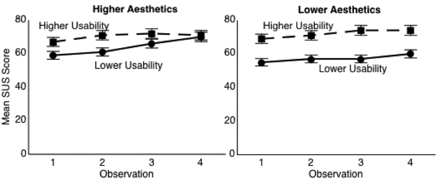
Figure 8. Participants’ mean rating of usability for each version of the website over four observations as measured by the SUS. Error bars represent the standard errors of the means.
PARTICIPANTS’ PERCEPTIONS OF USABILITY AND AESTHETICS
We also examined changes in participants’ perception of usability and aesthetics of each version of the website. The average ratings of participants’ perceptions of usability and aesthetics for each website are shown in Figures 8–10. Participants’ perceptions of usability rose slightly over the four observations while perceptions of aesthetics changed very little.
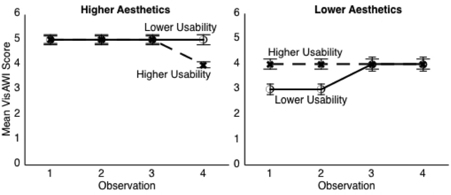
Figure 9. Participants’ mean rating of aesthetics for each version of the website over four observations as measured by the VisAWI. Error bars represent the standard errors of the means.

Figure 10. Participants’ mean rating of aesthetics for each version of the website over four observations as measured by Lavie and Tractinsky’s (2003) classical instrument (CA). Error bars represent the standard errors of the means.
To examine more closely the contributions of usability and aesthetics to participants’ perceptions of usability and aesthetics over time, we conducted several 2 X 2 X 4 repeated measures ANOVAs. In these analyses, the within-subjects factor was occasion (observations 1, 2, 3, and 4 of the SUS, VisAWI, CA, and CE scores). The between-subjects factors were aesthetics (higher, lower) and usability (higher, lower). The results of these analyses are shown in Tables 6–9.
The absence of main effects of the interface aesthetics manipulation on SUS ratings or of the interface usability manipulation on VisAWI, CA, or CE ratings suggest that usability and aesthetics were perceived separately in this experiment. Likewise, the failure to observe an interaction between the usability manipulation and the aesthetics manipulation for the SUS, VisAWI, CA, or CE measures indicates the lack of a joint effect on perceptions of usability or aesthetics. Finally, the significant effect of occasion on SUS ratings, but not on VisAWI, CA, or CE shows that repeated experience affected usability perception but not aesthetic perception.
Table 6. Results of 2 (Aesthetics: Lower, Higher) X 2 (Usability: Lower, Higher) X 4 (Occasion: Observations 1, 2, 3 and 4 of overall SUS scores, averaged across the three tasks) repeated measures ANOVA showing a significant effect of occasion and usability, but no interaction of occasion with aesthetics or usability.
|
F |
df |
p |
η2 |
|
|
Occasion |
12.284 |
2.5, 339 |
<.001 |
.098 |
|
Occasion * Aesthetics |
0.663 |
2.5, 339 |
.55 |
.006 |
|
Occasion * Usability |
1.482 |
2.5, 339 |
.23 |
.013 |
|
Aesthetics |
0.696 |
1, 113 |
.41 |
.006 |
|
Usability |
11.317 |
1, 113 |
.001 |
.091 |
|
Aesthetics * Usability |
2.042 |
1, 113 |
.156 |
.018 |
Note. Due to violations of assumption of sphericity, reported results are Greenhouse-Geisser. Statistically significant outcomes (p < 0.05) are denoted in bold.
Table 7. Results of 2 (Aesthetics: Lower, Higher) X 2 (Usability: Lower, Higher) X 4 (Occasion: Observations 1, 2, 3 and 4 of overall VisAWI scores, averaged across the three tasks) repeated measures ANOVA showing a significant effect of aesthetics, but no effect of occasion and no interaction of occasion with aesthetics or usability.
|
F |
df |
p |
η2 |
|
|
Occasion |
0.888 |
2.3, 339 |
.43 |
.008 |
|
Occasion * Aesthetics |
0.681 |
2.3, 339 |
.53 |
.006 |
|
Occasion * Usability |
0.273 |
2.3, 339 |
.79 |
.002 |
|
Aesthetics |
14.114 |
1, 113 |
<.001 |
.111 |
|
Usability |
0.555 |
1, 113 |
.46 |
.005 |
|
Aesthetics * Usability |
1.331 |
1, 113 |
.25 |
.012 |
Note. Due to violations of assumption of sphericity, reported results are Greenhouse-Geisser. Statistically significant outcomes (p < 0.05) are denoted in bold.
Table 8. Results of 2 (Aesthetics: Lower, Higher) X 2 (Usability: Lower, Higher) X 4 (Occasion: Observations 1, 2, 3 and 4 of overall CA scores, averaged across the three tasks) repeated measures ANOVA showing a significant effect of aesthetics, but no effect of occasion and no interaction of occasion with aesthetics or usability.
|
|
F |
df |
p |
η2 |
|
Occasion |
0.649 |
2.1, 339 |
.53 |
.006 |
|
Occasion * Aesthetics |
0.880 |
2.1, 339 |
.42 |
.206 |
|
Occasion * Usability |
0.327 |
2.1, 339 |
.73 |
.003 |
|
Aesthetics |
10.706 |
1, 113 |
.001 |
.087 |
|
Usability |
1.672 |
1, 113 |
.20 |
.015 |
|
Aesthetics * Usability |
1.151 |
1, 113 |
.29 |
.010 |
Note. Due to violations of assumption of sphericity, reported results are Greenhouse-Geisser. Statistically significant outcomes (p < 0.05) are denoted in bold.
Table 9. Results of 2 (Aesthetics: Lower, Higher) X 2 (Usability: Lower, Higher) X 4 (Occasion: Observations 1, 2, 3 and 4 of overall CE scores, averaged across the three tasks) repeated measures ANOVA showing no significant effect of aesthetics, no effect of occasion, and no interaction of occasion with aesthetics or usability.
|
|
F |
df |
p |
η2 |
|
Occasion |
1.972 |
2.4, 339 |
.13 |
.017 |
|
Occasion * Aesthetics |
1.023 |
2.4, 339 |
.37 |
.009 |
|
Occasion * Usability |
0.390 |
2.4, 339 |
.71 |
.003 |
|
Aesthetics |
2.941 |
1, 113 |
.09 |
.025 |
|
Usability |
0.295 |
1, 113 |
.59 |
.003 |
|
Aesthetics * Usability |
0.027 |
1, 133 |
.87 |
<.001 |
Note. Due to violations of assumption of sphericity, reported results are Greenhouse-Geisser.
The above analyses showed a main effect of the manipulation of interface usability on participants’ perceptions of usability as reflected in SUS scores, as well as a main effect of aesthetics on participants’ perceptions of aesthetics as reflected in VisAWI and CA ratings. Interestingly, the manipulation of aesthetics features did not significantly affect CE ratings, suggesting that that scale represents a different kind of perception of aesthetics from that of VisAWI or CA.
ADDITIONAL ANALYSES
The data for SUS scores show an increase as a function of occasion. To examine this more completely, we conducted a 2 X 2 X 4 repeated measures ANOVA on response time by each participant on all three tasks combined at each of the four observations. The within-subjects factor was occasion (average time taken on all tasks at observations 1, 2, 3, and 4). The between-subjects factors were aesthetics (higher, lower) and usability (higher, lower). Results of this analysis are shown in Table 10. Results show a significant reduction in the time it took participants to complete the tasks over the four observations. Furthermore, results showed a significant effect of usability on the time it took to complete the tasks, with participants in the higher usability condition using less time to complete the tasks than participants in the lower usability condition. In other words, participants got faster on successive observations, and they were faster on the more usable versions.
Table 10. Results of 2 (Aesthetics: Lower, Higher) X 2 (Usability: Lower, Higher) X 4 (Occasion: Observations 1, 2, 3 and 4 of average time taken by participants to complete all tasks) repeated measures ANOVA showing significant effect of occasion and significant effect of usability.
|
F |
df |
p |
η2 |
|
|
Occasion |
34.667 |
2.6, 339 |
<.001 |
.235 |
|
Occasion * Aesthetics |
1.579 |
2.6, 339 |
.20 |
.014 |
|
Occasion * Usability |
0.470 |
2.6, 339 |
.68 |
.004 |
|
Occasion * Aesthetics * Usability |
0.921 |
2.6, 339 |
.42 |
.008 |
|
Aesthetics |
0.996 |
1, 113 |
.32 |
.009 |
|
Usability |
4.390 |
1, 113 |
.04 |
.037 |
|
Aesthetics * Usability |
1.711 |
1, 113 |
.19 |
.015 |
Note. Due to violations of assumption of sphericity, reported results are Greenhouse-Geisser. Statistically significant outcomes (p < 0.05) are denoted in bold.
To investigate further the contributions of the time taken to participants’ perceptions of usability at each observation, we conducted the following simple regression analyses with (1) response time at each observation predicting SUS score and (2) page views at each observation predicting SUS score. We also conducted a multiple regression analysis with (3) both response time and page views predicting SUS scores. The simple regression analyses showed that page views did not affect SUS sores (b = -.08, p = .10, r2 = .006), whereas response time was significantly related to SUS scores (b = -.14, p = .003, r2 = .02). The multiple regression, with both response time and page views predicting SUS scores, showed that, controlling for page views (ß = -.004, p = .94), SUS scores increased when response time decreased (ß = -.14, p = .01, sr 2= .013).
Finally, one approach in the previous literature on the relation between usability and aesthetics was simply to correlate ratings of usability and aesthetics. Accordingly, we performed correlations separately for each of the four groups, HAHU, HALU, LAHU, and LALU, on the first trial. Results of this analysis are shown in Table 11. The data show significant correlations in several cases, and high, though not quite significant, correlations in several others. The CE scale did not show any significant correlations with SUS ratings. Thus, despite finding little evidence that usability and aesthetics are related in the manipulation part of the experiment, the correlations show some degree of association between ratings of usability and aesthetics.
Table 11. Results of correlation between usability (SUS scores) and measures of aesthetics (VisAWI, CA, CE) for Observation 1 on each of the four websites
|
r |
p |
|
|
HAHU |
||
|
SUS with VisAWI |
.45 |
.02 |
|
SUS with CA |
.34 |
.07 |
|
SUS with CE |
.02 |
.91 |
|
HALU |
||
|
SUS with VisAWI |
.55 |
.001 |
|
SUS with CA |
.31 |
.07 |
|
SUS with CE |
.29 |
.11 |
|
LAHU |
||
|
SUS with VisAWI |
.26 |
.17 |
|
SUS with CA |
.11 |
.58 |
|
SUS with CE |
-.25 |
.18 |
|
LALU |
||
|
SUS with VisAWI |
.37 |
.06 |
|
SUS with CA |
.43 |
.03 |
|
SUS with CE |
.12 |
.58 |
Note. Statistically significant outcomes (p < 0.05) are denoted in bold.
General Discussion
Based largely on previous studies (e.g., Ben-Bassat, Meyer, & Tractinsky, 2006; Tractinsky, Katz, & Ikar, 2000; Thüring & Mahlke, 2007), this study hypothesized that aesthetics contributes to judgments of usability in early interactions with systems, and that, with continued use, the role of aesthetics diminishes with respect to overall perception of usability. The results provided only limited support, at best, that aesthetics played any role in participants’ perceptions of usability, both in early interactions and with continued use. H1 proposed that, at Observation 1, aesthetics would contribute most strongly to judgments of usability, but the results of the experiment (Tables 6–10) failed to show an effect of manipulation of interface aesthetics on participants’ judgments of usability. Instead, the results showed a significant effect of occasion and manipulation of interface usability on participants’ judgments of usability.
Interestingly, a chi-square test for Observation 1 of Experiment 2 did show a significant effect of aesthetics not on perceptions of usability or aesthetics, but on performance. However, a chi-square test of all four observations of Experiment 2 combined failed to show the same effect of aesthetics on performance, and a chi-square test for Experiment 1 similarly failed to show an effect of aesthetics on performance.
Weak Effect of Aesthetics
A possible explanation for these results is that the initial effect of aesthetics on participants’ judgments of usability is weak and that it diminishes very quickly as the user gains experience with the system. If H1 were supported, it would be at Observation 1 that the role of aesthetics would be the strongest in both performance and judgments of usability, and indeed, the present research found a significant effect of the manipulation of aesthetics on performance at Observation 1 of Experiment 2. However, the failure to observe the same effect in Experiment 1 suggest that the effect is not strong, especially given that Experiment 1 most closely resembled the conditions of Tuch et al.’s (2012) study in that only one observation was made after participants’ one-time interaction with the system. Tuch et al. (2012) made only two observations, one immediately before and the other made immediately after participants’ one-time interaction with the system, and the first observation of aesthetics and usability was made before participants began their interaction with the system. Tuch et al. found that, before use, interface aesthetics did not affect perceived usability, but after use, they found a significant main effect of interface usability on classical aesthetics. Participants who were frustrated by the low usability of the low usability versions of the system lowered their aesthetic rating after their interaction with the system. As in Tuch et al.’s study, Experiment 1 of the current research made only one observation after participants’ one-time interaction with the system. A future experiment could attempt to duplicate Tuch et al.’s observation of this early change in participants’ perceptions of aesthetics by recording participants’ impressions of the system’s aesthetics and usability before they interacted with it.
Conflation of Aesthetics and Usability
It is possible that, had we taken measurements of aesthetics and usability before participants began the tasks, we might have observed an effect of usability on aesthetics, or vice versa, similar to the changes in aesthetic perceptions of the interface noted by Tuch et al. (2012) between observations 1 and 2. However, it seems that experience with a system is a prerequisite for any judgments of its usability, and when Tuch et al. asked participants to rate the usability of the website before using it, those participants had not yet acquired a basis for making judgments about its usability. One could surmise that, at the first observation, Tuch et al.’s participants confused, or conflated, aesthetics and usability. However, Tuch et al. specifically addressed this possibility. Finding no effect of interface aesthetics, nor of interface usability on perceived usability at the pre-use phase, as well as no interaction, Tuch et al. concluded that “… participants did not use the interface’s aesthetics as a proxy for pre-use perceived usability” (p. 1602). But in this case, it is still unclear on what basis participants made those pre-use assessments of usability.
The chi-square analyses at Observation 1 and the significant, or nearly significant, correlation between usability (SUS scores) and measures of aesthetics (VisAWI, CA, CE) for Observation 1 on each of the four websites (Table 11) might provide some support for an early effect of aesthetics, but the lack of pre-use measures precludes further corroboration and provides an additional reason to attempt to replicate Tuch et al.’s observation of this early change in participants’ perceptions of aesthetics.
Spurious Correlations
In some of the published studies that preceded this experiment, results were purely correlational. As seen in the within-version correlations between aesthetics and usability (Table 11), the present experiment replicated some of those purely correlational results. But in light of other results from this study, including RMANOVA that show no interaction between aesthetics and usability and similar chi-square results, we believe that these correlations, though mostly significant, could be spurious. We believe that the correlations might be accounted for by the tendency of participants who use high ratings on one scale also to use high ratings across multiple scales, and similarly, for participants who use low ratings to use them across multiple scales. When taken together, results from such participants will have high results on one scale associated with high results on the other scale, and low results on one scale associated with low results on the other. It is possible that this phenomenon might account for what appears to be the aesthetics/usability correlation. In other words, what appears to be a correlation might instead be an effect of scale use by participants.
User Performance
There is more than one possibility for how a user’s usability ratings might be influenced by repeated interactions with a low usability interface. One possibility is that participants would recognize that the interface has poor usability and would be struck, more so each time they used it, with how poor the usability was. In such a case, the participants’ usability ratings would decrease over time.
The other possibility is that the user would learn to work within the confines of the interface and complete the tasks, despite the poor usability. In such a case, a positive affective response associated with the completion of the task might make participants’ usability ratings increase over time. This latter case could explain the results seen in this research, which is that SUS ratings increased with repeated interactions with the interface. Previous researchers have observed this effect of amount of experience, both in cross-sectional comparisons (see Kortum & Bangor, 2013; Kortum & Sober, 2015; Lah & Lewis, 2016; McLellan, Mudimer, & Peres, 2012; Sauro, 2011) and longitudinal comparisons like the ones in this study (Kortum & Johnson, 2013).
That the increased SUS ratings seen in this study might be the result of improved user performance was hinted at in an observation made by Tuch et al. (2012). Tuch et al. found that the effect of interface usability on classical aesthetics and hedonic quality stimulation was affected by the participants’ affective experience with the usability of the website. Participants who were frustrated by the interface’s low usability lowered their aesthetics ratings. In other words, participants’ poor performance tended to lower their assessments of the websites’ aesthetics. Tuch et al. summarized this finding thusly, “Our results show that Tractinsky’s notion (‘what is beautiful is usable’) can be reversed to a ‘what is usable is beautiful’ effect under certain circumstances” (p. 1604).
However, results of the current study suggested that participants’ poor performance tended to lower their judgments not of aesthetics, but of usability instead. For example, results of regression analyses confirmed the results of the earlier repeated measures ANOVA that showed that observation was predictive of participants’ perceptions of usability, that is, that participants’ perceptions of the usability of the websites increased over the four observations. Additionally, the regression analyses demonstrated a significant negative relationship between response times and SUS scores, that is, as response times decreased, SUS scores increased. The RMANOVA of time taken (Table 10) also supported the notion that ratings of usability were influenced by performance. Results of the RMANOVA show a significant reduction in the time it took participants to complete the tasks over the four observations and a significant effect of usability on the time it took to complete the tasks. Participants in the higher usability condition used less time to complete the tasks than participants in the low usability condition. In other words, participants got faster on successive observations, and they were faster on the more usable versions (usability, p = .04). The fact that these improvements in performance coincided with an increase in SUS ratings across observations, even on the low usability versions, while aesthetics ratings remained flat suggest that participants’ affective experience with the usability of the website affected their assessments not of the aesthetics, but of the usability of the website.
Limitations
In the following sections, we discuss limitations of the procedure and the stimuli.
Limitations of the Procedure
Two limitations of this study are that (1) participants did not receive feedback that informed them whether they had completed the tasks correctly, and (2) participants interacted with the same version of the website on all four occasions/observations. Two results that may have been affected by these limitations were usability ratings, which increased over occasion, and “Success” rates on the tasks, which did not increase over occasion. In fact, “Failure” rates increased. If failure rates increased, how could this lead to an increased positive affective response due to perceived success on the tasks? The answer requires an explanation of what is meant by the terms “Success, Fail, and Abandon” in the context of this study.
Success, Fail, and Abandon were terms that were assigned to participants’ arrival at the page on the website that corresponded to the correct completion of the task. The software that was used to administer the tasks displayed two buttons, one labeled “Task Complete,” the other “Abandon Task.” Participants were instructed to click Task Complete to indicate that they had finished a task, and to click Abandon Task if they were unable to complete a task. If participants arrived at the page that corresponded to the correct completion of the task and clicked Task Complete, the task was scored a Success. However, when they clicked Task Complete, participants were not notified that they had completed the task correctly. They were simply taken to the next task. If participants arrived at the wrong page and clicked Task Complete, they were also taken to the next task, but the task was scored a Fail. Again, participants were not given feedback that they had completed the task incorrectly.
So, the Success, Fail, Abandon labels could more accurately be renamed Correct Completion, Incorrect Completion, Abandon, respectively. Because they were not given feedback, participants could end a task incorrectly (i.e., Fail/Incorrect Completion) while thinking that they had ended it correctly. They would come away from their interaction believing that they had completed the task correctly. Early on, they may have abandoned a task because they could not figure out how to do it. But on successive interactions, they may have begun to figure out how to get through to the end of the task. Even if “the end” was the incorrect completion of the task, they did not know that it was incorrect. Believing that they had completed the task correctly, they became less frustrated. They no longer abandoned the task. They “completed” it, but they did not necessarily get the right answer. As a result, success (as scored by Success/Fail/Abandon) did not increase. In fact, the Success/Fail/Abandon graphs show that participants were replacing Abandons with increased Fails/Incorrect Completions.
This could account for the increased usability ratings over occasions despite the fact that Failure rates increased, and Success rates did not change. One could conclude that, in this study, the SUS ratings were related to participants’ belief that they had completed the task successfully, whether they were right or wrong. For these participants, to get to an answer, even a wrong one, was perceived as success and it was reflected in the higher SUS scores.
Limitations of the Stimuli
It is possible that, for aesthetics to play a measurable role in perceptions of usability, the stimuli might need to be more beautiful. The higher aesthetic websites that we created for this experiment, with a mean overall attractiveness of 5.26 in Experiment 1A, were not especially beautiful compared to the 2.24 rating of the lower aesthetics versions. Indeed, on a 0–10 scale, one could make the case that instead of comparing beautiful websites to unattractive ones, this experiment in fact compared medium aesthetic websites to low aesthetic ones.
Nevertheless, the current research did not ask whether only high levels of aesthetics contribute to perceptions of usability, but rather what role in general does aesthetics play in participants’ perceptions of usability. Thus, for the purposes of this study, it was necessary only to establish that the higher versions differed significantly from the lower versions in both aesthetics and usability.
Implications for Future Research
The following sections discuss how pre-test measures and participants trained in usability could affect future research, as well as, how establishing a greater contrast between higher and lower aesthetic versions of websites could be useful in future research.
Pre-Test Measures
The chi-square test for Observation 1 of Experiment 2 of the current research provided some support for Tuch et al.’s (2012) finding of an effect of aesthetics on usability early in participants’ interactions with the websites. Nevertheless, since, in this study, we did not measure participants’ perceptions of aesthetics and usability prior to their first interaction with the websites, we cannot be certain that the effect is the same one that Tuch et al. (2012) observed. Future studies could therefore include measures of aesthetics and usability prior to participants’ first interaction with the system to allow for a more direct comparison between the conditions and results of those future studies and Tuch et al.’s.
Participants Trained in Usability
As mentioned in the User Performance section of this discussion, there is more than one possibility for how a user’s affective response might be influenced by repeated interactions with a low usability interface. One could hypothesize that participants trained in usability might be among those who recognize that the interface has poor usability and would be further struck, each time they used it, with how poor the usability was. In such case, one would expect the participants’ usability ratings to decrease over time, rather than increase as in the current study. A future study might therefore include such participants, trained in heuristic evaluation or other basic usability methodologies.
Establish Greater Contrast Between Higher and Lower Aesthetic Versions of Websites
As described in the Limitations section, there is a question of whether the weak effect of aesthetics observed in this experiment was due to the fact that the higher aesthetics websites were not particularly attractive. Perhaps if the higher aesthetics websites had achieved higher ratings of attractiveness, say, in the top quartile of the scale, we would have observed a stronger effect of aesthetics.
In both the current and other prior studies, researchers encountered difficulties in producing versions of websites that consistently elicited high user ratings of aesthetics. In order to allow for experimental manipulation of the independent variable of aesthetics, both Tuchet al. (2012) and the current study employed systematic modification of graphical elements in the higher aesthetic versions to create the lower aesthetics versions. This was so that the higher and lower aesthetics versions would remain similar enough that differences in aesthetics ratings could be attributed to this manipulation, rather than from a difference in kind between them.
In the current research, we manipulated on-screen graphical elements according to principles commonly used to influence the aesthetics of websites. We then confirmed through user ratings that the manipulations had been successful. User ratings of aesthetics for the higher and lower aesthetics versions of the websites were statistically significant, but participants did not find the higher aesthetics versions particularly attractive in Experiment 1A (mean overall attractiveness = 5.26) compared to the lower aesthetics versions (mean overall attractiveness = 2.24). Tuch et al. (2012) used another method. They employed a panel of 4 experts to choose 10 beautiful websites and then created 10 “ugly” counterparts, for 10 ugly-beautiful pairs. Participants then rated the beauty of each of the 20 design versions. Tuch et al. then selected the ugly-beautiful pair with the largest difference in rating between the ugly and beautiful version. The beautiful version received a mean rating of 4.3 on a 7-point scale, and the ugly version a rating of 2.21. Thus, despite the use of expert evaluators, Tuch et al.’s higher aesthetics version received only mid-scale ratings roughly in line with the current study.
Future research might emphasize producing high aesthetics versions that consistently scored in the top quartile of whichever scale of aesthetics is used. A method that combined the use of expert evaluators, as in Tuch et al., with a broader use of online communities to identify existing websites that have been lauded for their attractiveness might yield such designs. These could perhaps be copied and modified until they consistently achieved overall attractiveness ratings near the top of any aesthetics scale, as opposed to the mid-scale ratings that were observed by Tuch et al. and in the current research. However, with the ubiquity of the Internet, participants may have become so habituated to websites in general that they no longer consider them objects of beauty, and thus would never rate them in the top quartile on any aesthetics scale.
Conclusion
The current research suggests that, if aesthetics influences perceptions
of usability in early interactions with a system, the effect is not a strong
one, and repeated experience with a system reduces it further. The absence of a
main effect of the manipulation of aesthetics on SUS ratings suggest that SUS
was unaffected by aesthetics, and the absence of a main effect of the
manipulation of usability on VisAWI, CA, or CE ratings suggest that these
measures of aesthetics were similarly unaffected by usability. Thus, within the
conditions imposed by this research, it appears that usability and aesthetics
were perceived separately.
Tips for Usability Practitioners
We make the following recommendation for designers, who are balancing aesthetics and usability in their creation of multi-page websites, and for future studies:
- Privilege usability over aesthetics. Make the users’ ability to complete tasks correctly/successfully the primary consideration in the development of a website.
- When measuring the aesthetics of multi-page online media, do not expect to see particularly high user ratings of aesthetics. In this study and others, the higher aesthetics versions of the stimuli received only mid-scale ratings of aesthetics from participants.
- When testing the usability of the same or similar systems, be careful interpreting analyses of within-subjects data. Increased usability scores might indicate increased skill by users rather than improvements of the interface.
- Anticipate users’ goals with enough specificity that failure to achieve them can be identified, or detected, by the system/website. Provide feedback about whether users’ goals were achieved correctly/successfully.
- Use callouts or other indicators at the completion of tasks to call attention to often-repeated mistakes. For example, if a user has selected the next calendar year for an appointment and that year is still a long way off, a callout could prompt the user to confirm their intention to make an appointment in the following year.
- Take pre-test measures. Provide a guided, passive “walkthrough” of the interface for users before they attempt to complete any tasks.
- Take measures of users’ perceptions of aesthetics and usability immediately after the walkthrough, but before users perform tasks on the interface.
Acknowledgements
Many thanks to Janey Barnes, PhD, Principal of Raleigh-based usability firm User-View, for her generous support and donation of company resources to this research.
References
Altaboli, A., & Lin, Y. (2011, July). Objective and subjective measures of visual aesthetics of website interface design: the two sides of the coin. International Conference on Human-Computer Interaction (pp. 35–44). Berlin Heidelberg, Germany: Springer-Verlag.
Bangor, A., Kortum, P., & Miller, J. A. (2008). The System Usability Scale (SUS): An empirical evaluation. International Journal of Human-Computer Interaction, 24(6), 574–594.
Ben-Bassat, T., Meyer, J., & Tractinsky, N. (2006). Economic and subjective measures of the perceived value of aesthetics and usability. ACM Transactions on Computer-Human Interaction (TOCHI), 13(2), 210–234.
Brooke, J. (1996). SUS-A quick and dirty usability scale. In P. Jordan, B. Thomas & I. McClelland (Eds.), Usability evaluation in industry (pp. 189–194). London: Taylor & Francis.
Coolen, J. (2009, October 15). 7 key principles that make a web design look good. Retrieved June 2018 from https://www.noupe.com/design/7-key-principles-that-make-a-web-design-look-good.html.
De Angeli, A., Sutcliffe, A., & Hartmann, J. (2006, June). Interaction, usability and aesthetics: what influences users’ preferences? Proceedings of the 6th Conference on Designing Interactive Systems (pp. 271–280). University Park, PA, USA: ACM.
Goodman, J. K., Cryder, C. E., & Cheema, A. (2013). Data collection in a flat world: The strengths and weaknesses of Mechanical Turk samples. Journal of Behavioral Decision Making, 26(3), 213–224.
Hassenzahl, M. (2004). The interplay of beauty, goodness, and usability in interactive products. Human-Computer Interaction, 19(4), 319–349.
Hassenzahl, M., & Monk, A. (2010). The inference of perceived usability from beauty. Human–Computer Interaction, 25(3), 235–260.
Karvonen, K., Cardholm, L., & Karlsson, S. (2000, October). Cultures of trust: A cross-cultural study on the formation of trust in an electronic environment. Proceedings of the 3rd Nordic Workshop on Secure IT Systems (pp. 89–100). Reykjavik, Iceland: Tartu University Press.
Kortum, P., & Bangor, A. (2013). Usability ratings for everyday products measured with the System Usability Scale. International Journal of Human-Computer Interaction, 29, 67–76.
Kortum, P., & Johnson, M. (2013). The relationship between levels of user experience with a product and perceived system usability. In Proceedings of the Human Factors and Ergonomics Society 57th Annual Meeting (pp. 197–201). Santa Monica, CA: Human Factors and Ergonomics Society.
Kortum, P., & Sorber, M. (2015). Measuring the usability of mobile applications for phones and tablets. International Journal of Human- Computer Interaction, 31(8), 518–529.
Kurosu, M., & Kashimura, K. (1995, May). Apparent usability vs. inherent usability: Experimental analysis on the determinants of the apparent usability. Conference companion on Human factors in computing systems (pp. 292–293). ACM.
Lah, U., & Lewis, J. R. (2016). How expertise affects a digital-rights-management sharing application’s usability. IEEE Software, 33(3), 76–82.
Laja, P. (2018, February 8). 8 Effective Web Design Principles You Should Know Retrieved June 2018 from https://conversionxl.com/blog/universal-web-design-principles/.
Lavie, T., Tractinsky, N. (2004). Assessing dimensions of perceived visual aesthetics of websites. International Journal of Human-Computer Studies 60(3), 269–298.
Lee, S., & Koubek, R. J. (2010). Understanding user preferences based on usability and aesthetics before and after actual use. Interacting with Computers, 22(6), 530–543.
Leung, F. (2016, July 19). 7 critical website usability principles you should learn. Retrieved June 2018 from https://www.advisorwebsites.com/blog/blog/general/7-website-usability-principles-you-should-know.
Lewis, J. R., & Sauro, J. (2009). The factor structure of the System Usability Scale. In M. Kurosu (Ed.) Human centered design. HCD 2009. Lecture notes in computer science, Vol 5619. (pp. 1–10). Berlin: Springer.
Litman, L., Robinson, J., & Abberbock, T. (2017). TurkPrime. com: A versatile crowdsourcing data acquisition platform for the behavioral sciences. Behavior Research Methods, 49(2), 433–442.
McLellan, S., Muddimer, A., & Peres, S. C. (2012). The effect of experience on System Usability Scale ratings. Journal of Usability Studies, 7(2), 56–67.
Moran, K. (2017, January 27). Flat design decreases user efficiency. Retrieved June 2018 from https://www.nngroup.com/videos/flat-design/.
Moshagen, M., & Thielsch, M. T. (2010). Facets of visual aesthetics. International Journal of Human-Computer Studies, 68(10), 689–709.
Moshagen, M., & Thielsch, M. (2013). A short version of the visual aesthetics of websites inventory. Behaviour & Information Technology, 32(12), 1305–1311.
Nielsen, J., & Loranger, H. (2006). Prioritizing web usability. Berkeley, CA, USA: New Riders.
Paolacci, G., Chandler, J., & Ipeirotis, P. G. (2010). Running experiments on Amazon Mechanical Turk. Judgment & Decision Making, 5(5), 411–419.
Rawat, D. (2012, March 12). A 7 step guide to website usability. Retrieved June 2018 from https://usabilitygeek.com/a-7-step-guide-to-website-usability/.
Robins, D., & Holmes, J. (2008). Aesthetics and credibility in web site design. Information Processing & Management, 44(1), 386–399.
Sauro, J. (2011). Does prior experience affect perceptions of usability? Retrieved January 2019 from http://www.measuringusability.com/blog/prior-exposure.php.
Sonderegger, A., & Sauer, J. (2010). The influence of design aesthetics in usability testing: Effects on user performance and perceived usability. Applied ergonomics, 41(3), 403–410.
Thüring, M., & Mahlke, S. (2007). Usability, aesthetics and emotions in human–technology interaction. International Journal of Psychology, 42(4), 253–264.
Tractinsky, N. (1997, March). Aesthetics and apparent usability: empirically assessing cultural and methodological issues. Proceedings of the ACM SIGCHI Conference on Human factors in computing systems (pp. 115–122). Atlanta, GA, USA: ACM.
Tractinsky, N., Katz, A. S., & Ikar, D. (2000). What is beautiful is usable. Interacting with computers, 13(2), 127–145.
Tuch, A. N., Roth, S. P., HornbæK, K., Opwis, K., & Bargas-Avila, J. A. (2012). Is beautiful really usable? Toward understanding the relation between usability, aesthetics, and affect in HCI. Computers in Human Behavior, 28(5), 1596–1607.
van Schaik, P., & Ling, J. (2009). The role of context in perceptions of the aesthetics of web pages over time. International Journal of Human-Computer Studies, 67(1), 79–89. Woods, S. (2014, April 3). 10 top principles of effective web design. Retrieved June 2018 from http://shortiedesigns.com/2014/03/10-top-principles-effective-web-design/.