Abstract
Although reading is the main function of electronic reading devices (e-readers), previous studies demonstrated that a critical factor for perceived legibility is the usability of the device. If users have problems with the handling of a device, they will not like using the device for reading. Therefore, easy handling is a critical factor for a user’s reading experience. One important device feature seems to be a touch screen. A touch screen tends to be very intuitive and saves space as no keyboard or mouse is required, which also tends to make for easier hand-eye coordination than a mouse or keyboard. This study investigated the effect of touch screen technology on the usability of electronic reading devices. Three different types of devices were compared: two e-readers with e-ink display (the Sony PRS 600 with a touch screen and the Sony PRS 505 without a touch screen) and one tablet PC with a backlit LCD (Apple iPad with a multi-touch screen). Participants completed different use case scenarios for each device. Participants then completed a questionnaire that asked them to rate the usability of the navigation, design, handiness, and handling of each device. The results show that e-reading devices with touch screens correlate with better navigation ratings. Participants rated the navigation significantly better for the devices with a touch screen compared to a device without a touch screen. Overall results suggest that a touch screen allows for an easier and more intuitive interaction. Nonetheless, participants were not able to solve all tasks without problems, and significant differences were found between the devices. In conclusion there is still room for improvement, for the devices tested, in regards to usability aspects.
Practitioner’s Take Away
For UX-professionals, consider the following:
- Navigational structure should be adapted to the type of user interface (touch, multi-touch, without touch).
- Users past experience with touch screens should be considered.
- When evaluating input technologies with short tasks, setting a time limit for each task ensures that participants get to attempt all of the tasks.
- Alternative technologies, such as touch vs. physical buttons, can be evaluated for usability even when newer models of the products may soon be released.
For consumers who want to buy an e-reading device, consider the following:
- Think about the purpose and context (e.g., work, education, etc.) for which you want to use an e-reader. Choose the e-reader model depending on the required functions.
- Before you buy an e-reader, test it and check whether you can handle the device.
- Touch screen technology tends to allow for easier and more intuitive interactions. There is a tendency that a more sensitive touch screen may enhance navigation.
Introduction
By the end of September 2010, 11 million Americans were expected to own at least one digital reading device (Fowler & Baca, 2010). U.S. e-book sales grew 183% in the first half of 2010 compared with the year-earlier period, according to the Association of American Publishers (Fowler & Baca, 2010). E-reading is a trend. There are many advantages associated with an e-reading device; for example, you can carry an almost endless number of e-books with you, or you can search the e-book for keywords to locate information quickly. Two different types of e-reading devices are prevalent: dedicated e-book readers (such as the Nook Reader, the Kindle Reader, the Kobo Reader or the Sony Reader, which all use e-ink screen technology) and tablets. E-ink technology has low power consumption, thereby increasing battery life and allowing for a more lightweight device. For example, the new Kindle reader can run up to a month with one battery charge. Another advantage is that e-ink devices can be used outside without glare being a big issue. E-ink displays almost look like printed paper. However, e-ink screens have some disadvantages, most of them are black and white and the pages do not refresh as quickly as devices with an LCD screen. E-ink screens are not illuminated, which means you cannot read in the dark, and you must depend on an external light source. E-ink e-readers are specialized e-reading devices, and they are limited to reading. By contrast, tablet-PCs (tablets) are small computers; their use is not limited to reading. The LCD screens found on all tablets (and the Nook Color e-ink reader) are color displays. But those advantages have downsides: The reflective screens on LCD tablets have higher power consumption, most of the devices are quite heavy, and the glass-like display surface makes it hard to read in bright light. However, it has been reported that under artificial light conditions that are often present in offices or living rooms, expected differences in reading behavior can vanish (Siegenthaler, Wurtz, Wyss, & Bergamin, 2012; Siegenthaler, Bochud, Bergamin, & Wurtz, 2012). Reading is the main function of e-ink readers and also an important function of tablets. Previous studies show that the legibility of text, as presented on specialized electronic reading devices, is comparable to printed paper under specific light conditions for both short term reading and reading over extended periods of time (Siegenthaler et al., 2012). Some of the results even show an advantage for electronic reading devices over classic paper books (Siegenthaler et al., 2012). Previous results also demonstrated that new functions in electronic reading devices, such as font size adjustment, increase legibility (Siegenthaler, Wurtz, Bergamin, & Groner, 2011). Furthermore, the results show that a critical factor for perceived legibility is the usability of the device. If readers have problems with the handling of a device, they will not like reading with it (Siegenthaler et al., 2010). Therefore, easy handling can be a critical factor for the reading experience. One important feature seems to be the touch screen. A touch screen tends to be very intuitive and saves space as no keyboard or mouse is required, which also tends to make for easier hand-eye coordination than a mouse or keyboard. All tablets (iPad, Android, Blackberry, etc.) are operated through a touch screen interface. Originally, e-ink readers didn’t have touch screens; however, many of the newer e-ink devices are equipped with touch screens, but there are still popular e-reading devices without touch screens. Nonetheless, e-ink devices (Sony PRS-600, Neonode’s optical touch screen technology) do not have the same sensitivity and reaction time as tablets (iPad, multi-touch TFT-LCDs). But the question remains: Do touch screens enhance the reading experience? If yes, is the sensitivity of the touch screen important? Is the interaction with a multi-touch display more usable for the user? Does it really provide a more direct and inviting interaction with the device?
A previous study has shown that readers have some difficulties when using e-ink reading devices without a touch screen (Siegenthaler et al., 2010). But there are only a few empirical studies about the usability of specialized e-reading devices. Nielsen (2009) tested the Kindle 2 Reader (e-ink-reader, without a touch screen). He noted problems in navigation and criticized the navigation of Kindle 2 as non-intuitive. He concluded that reading non-linear texts (like newspapers) is not comfortable on the Kindle 2. However, he noted that the Kindle 2 was well suited for linear texts (Nielsen, 2009). In general, Nielsen found some advantages in the use of e-readers, like the low weight or the possibility to adjust font size. Also equal-to-print legibility and the multi-device integration were mentioned as a benefit (Nielsen, 2009). Other studies that investigated the usability of specialized reading devices (e-ink reading devices) in an applied field found that users have problems in the handling of the current e-ink reader generation (Lam, Lam, Lam, & McNaught, 2009; McDowell & Twal, 2009; Thompson, 2009). Empirical studies on the usability of tablets are sparse. A German research institute (Phaydon) tested the usability of the Apple iPad (multi-touch) with 18 users (Oberg, 2010). Their results suggested that the Apple iPad could be used intuitively and easily. Another conclusion was that the Apple iPad is good for reading because of its navigation via touch screen, the possibility of adjusting background illumination, the ability to adjust the font size, and because of the search functions. Users also liked the design of the Apple iPad. But the users disliked the reflections on the display depending on the position they held the device (Oberg, 2010). In another study on touch screens, Haywood and Reynolds (2008) found that touch screen delays frustrated and confused users. Developers of touch screen technology should maximize sensitivity levels, uniformly across all areas of the screen, to improve a user’s experience. They also found that if users have problems with the most basic functionality, they would feel negative about the product.
To summarize so far, previous studies do not clearly answer the question whether touch screen technology significantly enhances the usability of e-reading devices. There is some evidence that touch screen interfaces could improve the usability, but because there is no study with a direct comparison of the devices, this remains speculative.
For this reason, we developed a study in which we investigated the usability of three e-reading devices. We compared two e-ink-readers, one with a touch screen and one without a touch screen, and one tablet with a multi-touch display. The usability measures that we used were completing different use cases for each device, asking participants to provide subjective ratings about each device, and asking participants to complete questionnaires about their experiences with each device. We hypothesized that touch screens contribute to the improvement of the usability of an e-reading device. Furthermore, we hypothesized that the sensitivity of a touch screen has a positive influence on the usability.
Methods
The following sections discuss the participants, apparatus and stimuli, and the design and procedures used in this study.
Participants
Twelve participants (6 female, 6 male) volunteered to participate in the experiment. The participants were students from the University of Bern. Their age ranged from 20 to 26 years. Because previous studies (Siegenthaler et al., 2010) showed that age is a critical factor in usability testing of electronic reading devices, we decided that a participant’s age should not exceed 26 years. None of the participants had previous experiences with e-reading or tablet devices (no iPhone users). Their mean subjective media competence as self-rated on a scale from 1 (very low) to 6 (very high) was 4.125. Self-reported cumulative reading duration per week was on average 16.83 hours.
Apparatus and Stimuli
Three e-reading devices were compared in this test: the Sony PRS-505 (without a touch screen), the Sony PRS-600 (with a touch screen), and the Apple iPad (first generation). Figure 1 depicts the three devices, and technical specifications are provided in Table 1.
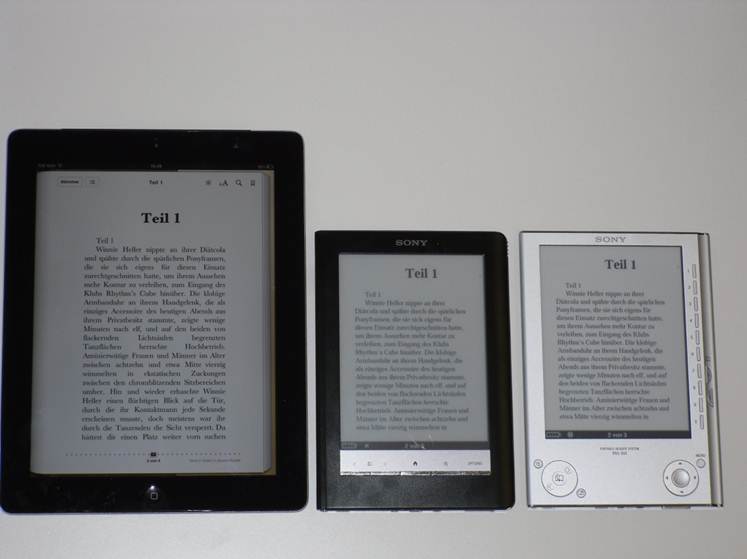
Figure 1. The three e-reading devices compared in the usability test: left, Apple iPad; center, Sony PRS-600; right, Sony PRS-505.
Table 1. The Three E-Reading Devices Compared in the Usability Test

There are big differences in the handling of the three devices. The Sony PRS-505, without a touch screen, has to be operated with buttons (see Figure 1). For example, when changing font size, users have to navigate through the main menu with the buttons. The Sony PRS-600 is equipped with a touch screen; the touch screen reacts relatively slow, which is caused by the e ink technology. The Apple iPad is equipped with a multi-touch screen, resulting in high touch sensitivity. Due to the fast development in the electronic market, newer versions of the devices will soon replace the existing devices. But the differences in touch screen technology will remain. There are still new devices without touch screens, and there are still technical limitations along with the different screen technologies. Therefore, the touch screen vs. button debate will persist.
Design and Procedure
Each participant tested all three devices sequentially within one session. The order of devices was counterbalanced between participants. Dependent variables were usability measures. Each participant was given a questionnaire to rate the navigation, design, handiness, and manageability of each device. An additional usability questionnaire with closed questions about usability and acceptance of the device, based on the questionnaire of Huang, Wei, Yu, and Kuo’s (2006), was given. We also measured each participant’s success rate and time it took to complete the seven usability tasks. The usability assessment lasted approximately 60 minutes.
The experiment took place in a quiet room at the University of Bern with constant artificial light conditions. First, participants were given instructions on how to complete each task and about the procedure of the experiment. After the instruction, we gave each participant written instructions on how to complete a series of use cases. The descriptions of each task the participants completed are described in Table 2.
Table 2. Task Descriptions and Requested Operations for Each Device
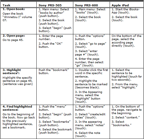
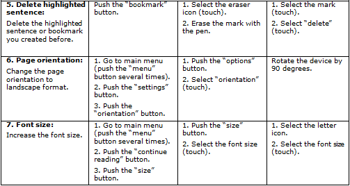
1Because the highlighting function is not available on the PRS-505, participants had to insert a bookmark instead (accordingly, they had to find the bookmark in task 4 and delete the bookmark in task 5).
A time limit of two minutes was set for each task. If a task was not solved after this delay, it was considered as a fail. After solving the usability tasks, participants rated the different aspects of each device (such as design, navigation, handiness, and handling) on a scale: 1 (very bad), 2 (bad), 3 (rather bad), 4 (rather good), 5 (good), and 6 (very good). Based on an earlier study (Siegenthaler et al., 2010), we asked the participants the following evaluation questions:
- How do you like the design?
- How do you judge the navigation?
- How handy do you rate the reading device?
- How easy was it for you to handle the reading device?
After completing the usability tasks and the ratings, participants completed an additional questionnaire with closed questions about usability and acceptance of the device based on the questionnaire by Huang, Wei, Yu, and Kuo (2006). The questionnaire contained eight items in the German language and assessed the aspects of learnability, handling, and errors of a device. Answers were given on a five-point Likert scale from 1 (strongly disagree) to 5 (strongly agree).
Results
Statistical analysis was performed using F-statistics based on a repeated measures ANOVA with the within factor “reading device” (Sony PRS-505, Sony PRS-600, Apple iPad). In cases of unequal variances within the groups, Friedman tests (using x2-statistics) were employed.
Use Cases
The percentage of task completion is summarized in Table 3. On average, on every device, each task was completed by more than 90% of the participants within the time window of two minutes.
Table 3. Usability Tasks: Percentage of Successful Task Completion
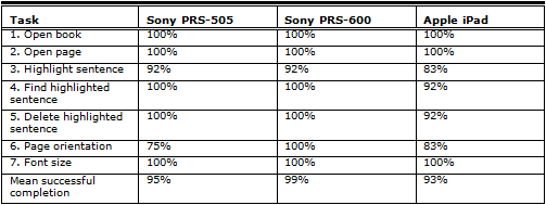
The time required for successful task completion is shown in Table 4. On these completion times, a repeated measures ANOVA with the within factor device was computed. A critical p<0.05 was used for statistical significance in all analyses. Huynh-Feldt adjustment was used in correcting for violation of sphericity when necessary to adjust non-uniform variances.
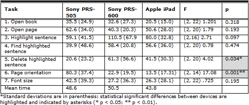
For five out of seven tasks no significant differences were found between the devices.
Table 4. Usability Tasks: Mean Time in Seconds Required To Solve the Task*
Usability Ratings
The following sections discuss the design, navigation, handiness, handling, and questionnaire results of this study. Participants were asked to evaluate each device using a Likert-type scale from 1 (very bad) to 6 (very good).
Design
Participants were asked “How do you like the design?” The ratings about the design of the reading devices was significantly different between devices, x2 (2, N=12) = 10.4, p
< .01. Results of the subjective ratings are shown in Table 5. Post-hoc tests (Wilcoxon-test) showed that the design rating for the Sony PRS-505 was significantly worse than the ratings for the two other devices.
Navigation
Participants were asked “How do you judge the navigation?” We found significant differences between the devices, x2 (2, N=12) = 10.867, p
< .01. Table 5 shows the mean ratings. Post-hoc tests (Wilcoxon-test) showed that the navigation rating for the Sony PRS-505 was significantly worse than the ratings for the two other devices.
Handiness
Participants were asked “How handy do you rate the reading device?” We found significant differences in handiness of the reading devices, x2 (2, N=12) = 11.529, p
< .01. Table 5 shows the mean ratings. Post-hoc tests (Wilcoxon-test) showed that the handiness rating for the Sony PRS-600 was significant better than the ratings for the two other devices.
Handling
Participants were asked “How easy was it for you to handle the reading device?” We did not find significant differences in manageability between the reading devices, x2 (2, N=12) = 4.941, p = .085. Table 5 shows the mean ratings.
Table 5. Usability Questionnaire: Mean Rating*

Usability questionnaire
We did not find significant differences between the usability questionnaire based on the questionnaire by Huang, Wei, Yu, and Kuo (2006); x2(2, N=12) = 1.512, p = .469.
Conclusion
Our study shows that e-reading devices with touch screens correlate with better navigation ratings. Participants rated the navigation significantly better for the Sony PRS-600 (4.3) and the Apple iPad (5.0) compared to the Sony PRS-505 (3.5). This result was in line with previous studies (Nielsen, 2009; Oberg, 2010). Our study shows that a more sensitive touch screen correlates with better navigation ratings. The difference in navigation ratings between the Sony PRS-600 and the Apple iPad was not significant; however, the Apple iPad has a more sensitive touch screen that might account for its slightly higher navigation rating. This finding is in line with the results of Haywood’s and Reynold’s (2008) study.
If we take a look at the use cases, a differentiated picture can be drawn. Over all tasks, participants spent the shortest mean time with the Apple iPad, but the longest time with the Sony PRS-600 (with a touch screen). Only two tasks, “delete mark” and “page orientation,” differed significantly. We observed that participants who succeeded in solving some tasks, for example the task “page orientation,” were extremely fast on the iPad (multi-touch screen), but not all the participants figured out how to bring the text into a landscape format. To switch from portrait to landscape format using the iPad, you just have to turn the device and the text turns automatically. This function is very quick, if you use it intuitively. But not every person tries it out, maybe because of past experiences with other devices.
Results in design ratings show a significant difference between devices; the design of reading devices with touch screens (Sony PRS-600 and Apple iPad) was significantly better. The Sony PRS-505 and the Sony PRS-600 do not look completely different, but because the Sony PRS-505 has no touch screen, there are a lot more buttons on the device. Based on the higher design ratings for the two touch screen devices, it seems that a touch screen may enhance the appearance of a device significantly, which could have an influence on the user’s experience. The touch screen technology also has its advantages in terms of a higher intuitiveness and flexibility for adaptations of the navigation (e.g., due to firmware updates) compared to devices with static buttons. Furthermore, a touch screen allows for much more functionalities in a device, because the user interface can be adapted to a certain task (position and number of “buttons,” etc.). The multi-touch device (iPad) tested in this experiment has the disadvantage of being relatively heavy weighted. Participants rated the handiness of the iPad worse than the handiness of the two other devices. We think that this could be a big disadvantage for reading (at least compared to devices especially designed for reading) and should be optimized in the future. Because there are also disadvantages for sensitive touch-devices (e.g., shorter battery life and higher weight), devices without a multi-touch screen will likely stay on the market; therefore, the debate will most likely persist in the future.
Overall, this study shows that touch screen technology has a positive influence on some key aspects of usability, especially for an efficient navigation. There is a tendency that more sensitive touch screens enhance navigation. Nevertheless, users still have some problems when interacting with the device; some functions are not intuitively usable, and there is still room for improvement.
References
- Fowler, G. A., & Baca, M. C. (2010, August 25). The ABCs of e-reading: New devices are changing habits. People are reading more, even while in a kayak. The Wall Street Journal. Retrieved from http://online.wsj.com/article/SB10001424052748703846604575448093175758872.html
- Haywood, A., & Reynolds, R. (2008, October 3). Serco experience lab: Usability guidelines for touchscreen design. UX Alliance. Retrieved from http://www.uxalliance.com/ideas/publications/serco-experiencelab-usability-guidelines-touchscreen-design
- Huang, S.-M., Wei, C.-W., Yu, P.-T., & Kuo, T.-Y. (2006). An empirical investigation on learners’ acceptance of e-learning for public unemployment vocational training. International Journal of Innovation and Learning, 3(2), 174 – 185. doi:10.1504/IJIL.2006.008419
- Lam, P., Lam, S. L., Lam, J., & McNaught, C. (2009). Usability and usefulness eBooks on PPCs: How students’ opinions vary over time. Australasian Journal of Educational Technology, 25(1), 33-44.
- McDowell, M., & Twal, R. (2009). Integrating Amazon Kindle: A Seton Hall University pilot program. EDUCAUSE. Available from http://www.educause.edu/Resources/IntegratingAmazonKindleASetonH/163808
- Nielsen, J. (2009, March 9). Kindle 2 usability review (Jakob Nielsen’s Alertbox). Retrieved on March 1, 2011 from http://www.useit.com/alertbox/kindle-usability-review.html
- Oberg, N. (2010). Couchpotato 2.0 ? Das iPad im Nutzer-Test. Phaydon. Retrieved on August 13, 2011 from http://www.phaydon.de/ipad-erste-deutschsprachige-nutzerstudie.html
- Siegenthaler, E., Wurtz, P., Bergamin P., & Groner, R. (2011). Comparing reading processes on e-ink displays and print. Displays, 32 (5), 268-273. http://dx.doi.org/10.1016/j.displa.2011.05.005
- Siegenthaler, E., Wurtz, P., Bochud, Y. & Bergamin, P. (2012). Reading on LCD versus e-ink displays: Effects on fatigue and visual strain. Ophthalmic and Physiological Optics, under revision.
- Siegenthaler, E., Wurtz, P., & Groner, R. (2010). Improving the usability of e-book readers. Journal of Usability Studies, 6(1), 25-38.
- Siegenthaler, E., Wurtz, P., Wyss, M., & Bergamin, P. (2012). LCD vs. e-ink: An analysis of the reading behaviour. Journal of Eye Movement Research, under revision.
- Thompson, C. (2009). Digital readers: Fact and fictions. Presentation at IATUL Conference. Leuven, Belgium.
