
Abstract
A common issue that occurs after conducting usability tests is how to prioritize issues for the next design iteration, that is, which should enter production first. It is also necessary to prioritize these issues in an easy-to-understand manner for internal stakeholders and in accordance with their criticality.
With these two goals in mind, we propose an analysis framework with data visualization schemes to help UI/UX research teams analyze and present data from usability tests. This framework visually indicates the most problematic interaction areas. Ranked in a four-level user experience criticality scale of a digital product or prototype, the framework highlights functionalities that require improvements.
To exemplify the innovative issues of this framework, we also applied it to a proof-of-concept prototype: a Unified Communications & Collaboration (UC&C) scheduling system. We had 27 participants test the prototype. The usability test proved to be particularly valuable when it came to validating the framework. This framework has enabled us to identify the most critical interaction and graphical interface problems of the prototype that need attention before the next design iteration.
Overall, our results highlight the framework’s innovative nature and relevance for companies or organizations concerned with the efficiency of their development process. The proposed method would enable them to make an augmented analysis and also help to optimize iterative design cycles.
Keywords
Usability Test Analysis, Data Visualization, UC&C, User Experience Research, Usability, Severity Rating, Problem Criticality Matrix, Radar Plot
Introduction
When researchers carry out usability tests, they end up with a collection of raw data. It doesn’t matter if this is qualitative and/or quantitative, the evaluation method will depend on the system or service being studied, along with the evaluation purpose and pragmatic constraints such as time and budget (Roto et al., 2011). Whatever method the researchers use, it will give them a list of problems, prioritized according to the problem’s impact on the user’s experience.
Researchers have long debated about methods and indicators of the severity of issues, which would indicate the need for them to be resolved. Methods and criteria can differ, depending on the author.
Hassenzahl (2000) explored both data and judgment-driven severity estimates, highlighting the advantages and disadvantages between these methods. Hassenzahl (2000) also explored the problem-handling time metric in the data-driven approach. Calculating the amount of time users spent handling interaction issues would directly indicate the severity of the problem, regardless of its frequency.
Judgment-based assessments present another approach in which either usability experts assess and determine the impact and severity of issues or potential users are asked to evaluate the criticality of each issue, while considering how the issue would affect their actual use of the system. However, as Hassenzahl (2000) pointed out, users are out of context while performing this assessment and could potentially tolerate more stress, thus risking the data viability. On the other hand, when researchers classify severity themselves, can researchers really be sure that it truly represents the users’ point of view? Some level of data would be needed, even if just frequency of occurrence. Sharon (2012) presented a case that showed a 3-level-scale of issue severity, but the case exemplified the fact that if a low-impact issue occurs to more than 10 users, it was classified as a high-severity problem and (as demonstrated later by Sauro, 2014) frequency and severity are independent factors. To support a decision, Travis (2009) presented a flowchart (decision tree) to help researchers define the severity of an issue on a four-level scale. This flowchart integrates questions that could be answered with data-driven metrics.
Other scholars have proposed ways to automate the identification and measurement of usability problems to streamline this process. For example, Jeong’s et al. (2020) automated approach is a recent example for mobile apps, though it still has some flaws. Because it relies on finding dissimilarity of behaviors, it cannot detect situations that only occurred to a few users, and if a lot of participants demonstrate the same behavior, it won’t detect any problem.
When it comes to a more established procedure, the System Usability Scale (SUS; Brooke, 1996) has long been widely adopted as a quick method to measure a system’s usability score, which can then be used to compare with other systems’ scores. It’s useful during the discovery research phases, but because it scores the whole system, it won’t be useful for detecting and pinpointing specific interaction problems, nor in calculating their severity.
Other options are also available. In an industry-oriented context, Google introduced the HEART framework that aimed to give advice about the purpose of different metrics in user-centered research (Rodden et al., 2010). Rodden’s et al. framework aims to triangulate findings from several sources (like quantitative web usage metrics in line with qualitative user experience findings) in order to understand the real cause behind the values shown. The HEART acronym stands for qualities resulting from human-computer interactions: happiness, engagement, adoption, retention, and task success. Designers and researchers are encouraged to consider each category and verify which makes sense to include or exclude in each analysis (Rodden et al., 2010). As Rodden et al. wrote that “No matter how user-centered a metric is, it is unlikely to be useful in practice, unless it explicitly relates to a goal, and can be used to track progress toward that goal” (p. 3). Rodden and colleagues also introduced the Goals-Signals-Metrics process which aims to articulate the product’s goals with signals that would indicate its success and build “metrics to track on a dashboard” (p. 3).
As seen, in a UX study, researchers can (and are encouraged to) use several methods and techniques to track signals and metrics. For example, Abrantes et al. (2018) used implicit data from an eye-tracking workstation to corroborate explicit data that participants shared in concurrent think-aloud UX evaluation sessions. Trukenbrod et al. (2020) demonstrated how subjectively experienced time can be measured and correlated with UX metrics. In mixed methods studies like these, researchers can be overwhelmed with data such as face expressions, audio, video, and their textual transcriptions, and even biometric data such as eye-gaze or heart-rate monitoring. In this context of research, Franco et al. (2019) created a platform for UX studies based on the analysis of feelings in multimodal inputs. Their tool condenses the distinct data in a dashboard for a coordinated visualization, aiming to ease the management and analysis process of several projects, representing the users’ feelings at any given time of the recording.
However, one distinct problem remains: How can we apply gathered metrics and prioritize issues in a user experience perspective and also show project stakeholders which issues are more critical, beyond just reporting quantitative data and statistics?
Tullis and Albert (2008) wrote: “Severity ratings help to focus attention on the issues that really matter” (p. 105). Hertzum (2006) also pointed out that the major cost of usability evaluations is not in finding the problems themselves, but in fixing them. Therefore, the chosen prioritization method should be “reliable, valid, and sufficiently persuasive to justify the cost of fixing problems” (p. 125).
In this paper, we explain how we applied a prioritization method, based on the studies and recommendations of Sauro and Lewis (2012), Nielsen (1993, 1994), and Rubin and Chisnell (2008). Furthermore, we also explain and show two data visualization techniques that could be meaningful in determining areas that need further investigation and to represent the criticality of issues based on the problem’s impact on the user experience and frequency of occurrence. These visualizations could prove to be meaningful not only to justify re-designs and interventions, but also as a valuable asset to represent findings to a broader audience.
In the following sections, we first describe our innovative visualizations. We then show how we applied this framework to evaluating a Unified Communications & Collaboration (UC&C) and scheduling a proof-of-concept prototype.
UX Mixed Method Analysis Framework Application
When analyzing and evaluating the results of a given usability test, we follow these four steps: groundwork, testing, holistic diagnosis, and data analysis. Each phase is briefly explained in the following subsections.
Groundwork: Identify Scenarios, Associated Tasks, and Assignment of a Criticality Factor
Before testing or analyzing a prototype, product, or service, we need to identify the various interaction scenarios that a user can interact with. These scenarios are made up of the functionalities available in the prototype, and within each functionality, a task should be established. For example, for a blog creator prototype, one of the scenarios could be “create a new post,” and the associated tasks “add a title,” “compose the main text,” and “add an image/link.” Then, the research team should associate a criticality factor to each task, depending on its impact in achieving the product’s goal. We suggest a criticality score ranging from 1 to 4:
- Not a critical functionality
- Nice to have functionalities (if not completed won’t impact the experience)
- Necessary task, but there are different ways of accomplishing it
- Absolutely necessary to accomplish the prototype’s goals
Testing: Iteratively Execute UX Sessions for Each Scenario
For each identified scenario, iteratively execute UX sessions (usability tests) with a purposeful sample of participants. You can apply several methods, including and not limited to observation of user actions, time measurement, annotations of errors and problems, an implicit measurement with an eye tracker, or annotations of user comments with the “think aloud” procedure. Independently of the chosen method(s), make sure you can record the session (screen, video, and/or audio).
After completing a UX scenario (and its required tasks), we suggest that you also give each participant a brief questionnaire (with one to three questions) that would allow you to gather the user’s perceived usability. In the questionnaire, you should ask your participants to rate the overall experience (numerically, e.g., with an ordinal scale or using SEQ) and/or as open questions to gain a better understanding of a given score, problems, and/or positive remarks (subjective, qualitative data). To reduce bias in open-ended questions, it is important to ensure that the wording is kept open-ended and neutral (Sauro & Lewis, 2021).
Holistic Diagnosis
In order to adhere to strict research and development deadlines, this step is optional. It is meant to be seen as a holistic diagnosis, highlighting areas that need to be further reviewed, but it doesn’t point out specific issues (the symptoms). Rubin and Chisnell (2008) also suggested a “preliminary analysis” phase that was intended to find the “hot spots” (most problematic areas) so that designers can start to find solutions. So, depending on how the study has been planned, this could be seen as an extra step or a way to bypass research time and start working on the product/prototype improvement.
This phase starts by processing the questionnaires’ quantitative data (rating of experience, gaining an idea of its relevance) so that a first holistic diagnosis of the UX study can be made. The quantitative data taken from the questionnaire (the classification given to each prototype scenario/dimension) rates each participant’s perceived performance for each one of the prototype’s scenarios. For each scenario, the classification is determined through descriptive statistical data—the median (50th percentile) and the upper and lower limits of the interquartile range (25th and 75th percentiles).
With these values you can create a radar visual representation—a holistic experience diagnosis instrument of the complete prototype/product, exemplified with fictitious data in Figure 1.
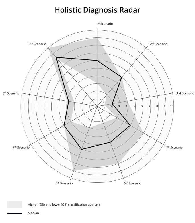
Figure 1. Exemplified radar with nine interaction scenarios, one per axis.
The radar axes represent the different scenarios. The bold line depicts the median of all participants’ ratings, being contextualized by lower and upper limits of the interquartile range. This visual radar systemization of data gives a holistic view of the participants’ rating in each of the prototype’s scenarios that were included in the corresponding UX scenario testing. The integration of the limits of the interquartile range in comparison to the median score in this holistic radar representation helps to highlight the discrepancy of opinions on the UX performance of the cohort.
You should iteratively process the qualitative data obtained from the open-end questions by clustering participants’ positive and negative comments into diverse criteria clusters (you can start by finding common themes and similarity of opinions). This allows you to obtain a substantive understanding for each one of the scenarios’ discrepancies, as related to the median score so that you know where to look for severe problems in more detail.
Analysis of Qualitative and Quantitative Data
While watching the recordings of the UX sessions, make a list of the participants’ unexpected interaction behaviors and link them to the corresponding task ID and relevance. The problem’s relevance is organized into five degrees of influence based on the user experience and associated with impact values (IV) scored on a 4-point scale (inspired by Sauro and Lewis’s [2012] impact score, Nielsen’s [1993, 1994] severity of usability problems rate scale, and Rubin and Chisnell’s [2008] problem severity rating) with the observational guidelines described in Table 1.
Table 1. Classification Taxonomy of Identified Issue’s Impact Value (Relevance)
|
Impact value score |
What was experienced |
Interpretation/observed behavior |
|
1 |
Suggestion |
Participant suggests an improvement to the prototype. |
|
2 |
Minor problem |
Participant stops to think, but successfully finishes the task. |
|
3 |
Strong suggestion |
There is a suggestion for an issue that clearly annoys the participant (divergent mental model). |
|
Major problem |
Participant takes a long time to accomplish the task or tries in several locations before concluding (low efficiency). |
|
|
4 |
Blockage |
Participant can’t conclude the task without aid. |
These criteria produce a classification based on the user’s experience; the impact value score determines the relevance of each problem associated with each task. One task can have a myriad of problems associated with it, ranging from minor suggestions to blockages.
Now you can calculate the problem classification. Multiply the criticality of each task (attributed in the groundwork phase) by its corresponding impact score (see Figure 2). It is then possible for you to quickly understand which are the most critical situations from the user’s perspective and which of those need attention and should urgently be solved.

Figure 2. Problem classification calculation.
Following the problem classification formula in this example, a score above 7 implies that at least one of the variables (criticality or relevance) may have been given a meaningful value (4 or both variables are 3) and denotes an issue with inherent problems. You can compare the problem classification with the percentage of users who struggled with it (frequency of occurrence), making it easier to distinguish the most impactful issues for the user experience. Similar to Nielsen’s (1993, p. 104) scale to identify low, medium, and high impact issues, Figure 3 represents a visualization scheme of a “pertinence board” that helps to identify four levels of issue pertinence, holistically representing the detail of problems identified in the UX tests. The graph in Figure 3 has been divided into four symbolic quadrants (where vertical and horizontal thresholds signal critical UX points: frequency above 50% of participants and a problem classification equal to or above 7), numbered according to the experience impact of the situations being covered:
- Quadrant 1—Critical Situations: high problem classification score and participants frequency count above 50%
- Quadrant 2—Serious Situations: high problem classification score with an occurrence frequency below 50%
- Quadrant 3—Relevant Situations: low problem classification score with high frequency
- Quadrant 4—Secondary Situations: both low problem classification and frequency scores. A “cosmetic rating,” usually addressed if time and budget allows (Nielsen, 1993; Tullis & Albert, 2008, p. 106)
These thresholds should be established by the design team aligned with their iterative design goals. Hall (2019, p. 115) mentioned a similar method, defining the frequency threshold at 30%, whereas Barendregt et al. (2006) used integer values and not percentages (though in their research this value is used for impact severity calculation), using integer values in the frequency threshold would allow for a better data interpretation when using a small sample (say, under 10 users). In Rubin and Chisnell (2008, p. 263), frequency of occurrence is measured by an estimation of how many times a problem can occur to a user while using the product and then translated into a ranking of four levels.
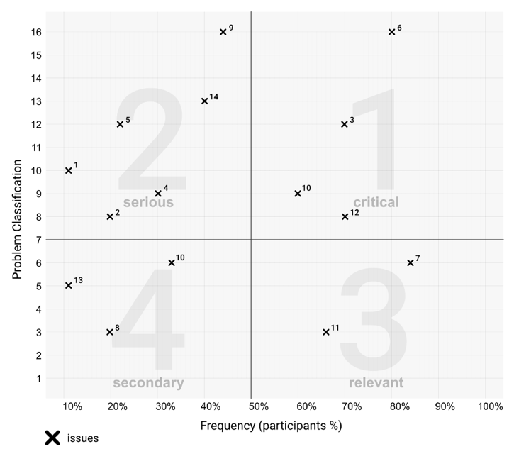
Figure 3. Exemplified pertinence board with a total of 14 issues.
As a first design iteration, attention should be centered on finding solutions for the issues placed in the most critical situations quadrant, as these have the greatest impact on the users’ experience, followed by the serious situations and so forth. Within each quadrant you would prioritize the issues within the upper right section and be less interested in the ones in the bottom left. Depending on how many issues you’ve found, you could end up with quadrants that are fuller than others. In this scenario, you could use a final ranking score to rank issues within a quadrant, instead of having to interpret their placement on the pertinence board.
For this final ranking score, multiply the problem classification with the issue frequency (depending on your method or sample size, it could be an integer or a percentage as in our example). The obtained value is your final score. Prioritize issues with higher values, which will correspond with their position on the board.
The Test Artifact: UC&C Scheduling Prototype
To test the presented analysis framework, we’ve designed a proof-of-concept prototype that includes all the info-communicational situations of a scheduling interaction. Therefore, not only is the personal schedule management (personal availability) included, but also the meeting agenda discussion or negotiation (also named pre-meeting), the actual meeting moment, and the post-meeting (support the preparation and afterwards serving as a meeting summary and/or [in]formal minutes/memo). The relation between the prototyped interfaces is represented symbolically in Figure 4.
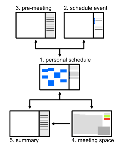
Figure 4. Relation between scheduling prototype’s pages.
Each interface has an objective and associated functionality, listed as follows:
- Personal schedule: The user’s schedule is the starting point of all functionalities or interaction scenarios. It displays the following scheduled events and tasks.
- Schedule event: To schedule a new event, the user has to complete a form that sequentially answers and influences the textual input narrative. The user has to start by writing or selecting an event subject, which will influence the prompt for participants, available time slots, and rooms. Finally, some meeting objectives and/or files can be added before sending the invites.
- Pre-meeting: This area was envisaged as the agenda negotiation and management area. Here the participants can suggest and discuss meeting objectives and add relevant files.
- Collaborative meeting space: Envisaged as a digital space, serving as a meeting coordination instrument where local and remote participants can collaborate using an audio-visual telepresence call.
- Summary (post-meeting): Once the meeting has been completed, participants are redirected to its automatic summary that is available and accessible to users at any given time.
Experimental Application of the Framework
To test this analysis method, we’ve conducted 27 UX evaluation sessions. The only requirement in participant screening was that each one had or has regular contact with a scheduling system, regardless of the main purpose (academic, professional, personal) or medium (digital or analog). Imposed by the COVID-19 pandemic limitations, two different setups were employed. Nine individual UX sessions took place in a closed and controlled setting, with implicit and explicit measurements. In these sessions the UX technical setup included a desktop computer; access to InVision[1] that provided the web based, proof-of-concept prototype; a Tobii[2] eye-tracking system; and a webcam. The remaining 18 sessions were carried out remotely via recorded Zoom[3] meetings, and the prototype access was handled through the Maze[4] platform. Though there was no need to enroll so many participants (recalling Barnum [2019], Nielsen [2000], and Tullis & Albert’s [2008] tips), the remote sessions turned out to be more appealing as participants didn’t need to travel in order to join a session. These remote usability sessions had the added value of participants joining in from their natural interaction context (using their own devices and in their current working environment), and as Takahashi and Nebe (2019) stated, “helping them to evaluate the prototype in a genuine way” (p. 17).
In both settings, and in order to test all main prototyped interactions, participants were contextualized in five different interaction scenarios that integrated the main functionalities of the prototype: (a) navigate and access past events, (b) determine a shared availability to schedule a meeting, (c) receive and reply to invitations, (d) negotiate a meeting agenda, and (e) navigate the collaborative digital meeting space and its main functionalities. These situations acted as enablers and motivators for the participant-prototype interaction and stimulated the participants to speak freely about the experience. For the sake of this experimental application, we just selected Scenario 1 and each one of its tasks to be displayed in Table 2, with corresponding attributed criticality scores. Although the evaluation followed five distinct interaction scenarios, the prototype analysis was organized into six dimensions. Dimensions 2 and 3 refer to the same functionality (with only one set of tasks) evaluated following two different perspectives: a meeting where all participants are physically together (Dimension 2) and a meeting with one or more remote participants present virtually (on voice or audio-visual chat, Dimension 3).
Table 2. Prototype’s Scenario 1 Analysis Dimensions, Associated Tasks, and Attributed Criticality Scores
|
Scenario 1 |
Task ID |
Task |
Criticality |
|
Schedule a meeting. |
1.1 |
Find and select the option to create a new event. |
3 |
|
1.2 |
Add a suggested subject. |
4 |
|
|
1.3 |
Add two suggested participants. |
4 |
|
|
1.4 |
Select date and time. |
4 |
|
|
1.5 |
Add two meeting objectives. |
3 |
|
|
1.6 |
Re-schedule event through notification prompt. |
3 |
After exploring and completing each scenario and required tasks, participants answered a brief questionnaire (three questions for each scenario/dimension). A 1-to-10-point ordinal scale was used to rate the experience potentiated by the different scenarios (descriptive statistics extracted from quantitative data). In the remaining two open-ended questions, participants pinpointed the best/most pleasant features and what was lacking or confusing for each participant’s scheduling mental model (qualitative data). In the remote sessions, context, tasks, the prototype, and the questionnaire were integrated in Maze.
During this study and along with the questionnaire data, the audio, participants’ faces, and their interaction with the prototype were recorded. In the face-2-face UX sessions, their eye-gaze behavior was also recorded. The mixed method approach was used to compare the self-stated explicit user inputs (recorded in the audio and questionnaire answers) with their implicit behavior (captured by the eye tracker and recorded interaction, as seen in Abrantes et al., 2018), allowing for a deeper understanding of users’ frustrations and interaction errors.
The method employed to gather UX testing results is supported by two data sets: the questionnaire answers (both quantitative and qualitative data) and the observation notes related to the interaction procedures during each test (confronted with the eye-gaze behavior and screen recordings). These notes were of utmost importance for the relational analysis of explicit opinions (reported in the questionnaire and expressed during the prototype interaction testing) and implicit actions (performed and recorded in video) during the UX test.
The quantitative data taken from the questionnaire (the classification given to each prototype scenario/dimension) represents each participant’s perceived performance for each one of the prototype’s dimensions and is integrated in Figure 5 and Table 3. This visual radar systemization of data gives a holistic view of the participants’ rating for all the prototype dimensions that were included in the corresponding UX scenario testing. Usually, the second dimension (meeting with face-2-face participants) has the lowest overall participant rating.
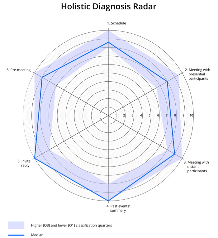
Figure 5. Holistic view of the participant’s UX performance valorization. Median (bold line), interquartile range (colored area).
Table 3. Radar’s (Figure 5) Median, 25th, and 75th Percentile Values
|
1.Schedule |
2. Face-2-face meeting |
3. Distant meeting |
4. Past summary |
5. Invitation |
6. Pre-meeting |
|
|
Median |
8,6 |
8 |
9 |
10 |
10 |
9 |
|
25th percentile |
8 |
6,5 |
8 |
8 |
8 |
7,13 |
|
75th percentile |
10 |
9,5 |
10 |
10 |
10 |
10 |
Each scenario’s open-ended answers were clustered based on equivalent criteria, both for positive as well as negative feedback. The first dimension gathered the most positive feedback. The second and third dimensions had some suggestions for improvement.
While watching the recordings of the sessions (participants’ eye-gaze, actions, facial expressions, and audio), the list of participants’ unexpected interaction behavior was compiled, with each issue linked to the corresponding task ID and then classified considering its relevance (1 to 4). In total, 33 unique interaction issues were identified (numbered in Table 4): Scenario 1 with a total of nine issues, Scenario 2 and 3 with 11 issues, Scenario 4 with four issues, Scenario 5 had only one issue, and the Scenario 6 had eight issues. This distribution is represented in the chart in Figure 6, while Table 4 highlights Scenario 1 and depicts the type of identified issues.
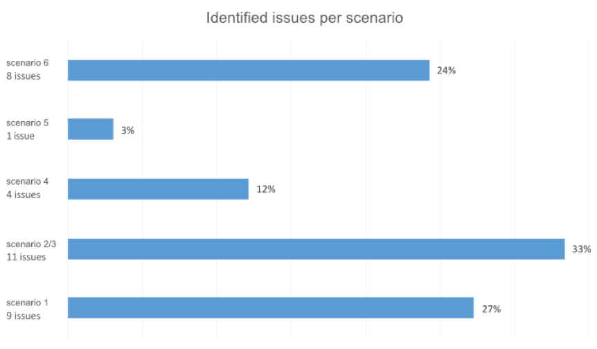
Figure 6. Distribution of identified unique issues per scenario/dimension.
Table 4. Identified Issues in Scenario 1
|
Scenario 1 |
ID |
Task |
Issue |
% Part. |
Prob. class. |
Ranking score |
|
Schedule |
1 |
1.1 |
Tries to click on the calendar date to schedule a new event |
48,1% |
9 |
4,33 |
|
2 |
1.1 |
Delay to find the schedule meeting button |
25,9% |
9 |
2,33 |
|
|
3 |
1.1 |
Tries to click on the contacts to schedule a meeting |
7,4% |
12 |
0,88 |
|
|
4 |
1.4 |
Doesn’t understand the displayed schedule options |
44,4% |
16 |
7,1 |
|
|
5 |
1.4 |
Can’t understand/read the open schedule time (meeting slot suggestion) |
3,7% |
12 |
0,44 |
|
|
6 |
1.5 |
Delay in moving to the next scheduling step |
29,6% |
9 |
2,66 |
|
|
7 |
1.5 |
Assumed meeting objectives input was a design element |
3,7% |
9 |
0,33 |
|
|
8 |
1.5 |
Can’t activate text input for new meeting objectives |
14,8% |
9 |
1,33 |
|
|
9 |
1.6 |
Does not realize that the displayed options are system suggestions |
22,2% |
9 |
2 |
Following the problem classification calculation and pertinence board representation that is proposed, each issue was positioned in its corresponding quadrant represented in Figure 7.
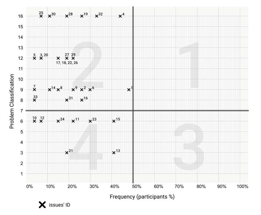
Figure 7. Issue pertinence board: X axis represents the percentage of participants who encountered the issue, and Y axis denotes the problem classification valorization.
The results showed that there were no critical situations (1st quadrant) or relevant situations (3rd quadrant). In the serious situations (2nd quadrant), there were 76% of issues (25), and the remaining 24% (8) were classified as secondary situations (4th quadrant). Each scenario issue distribution is represented in the graph in Figure 8.
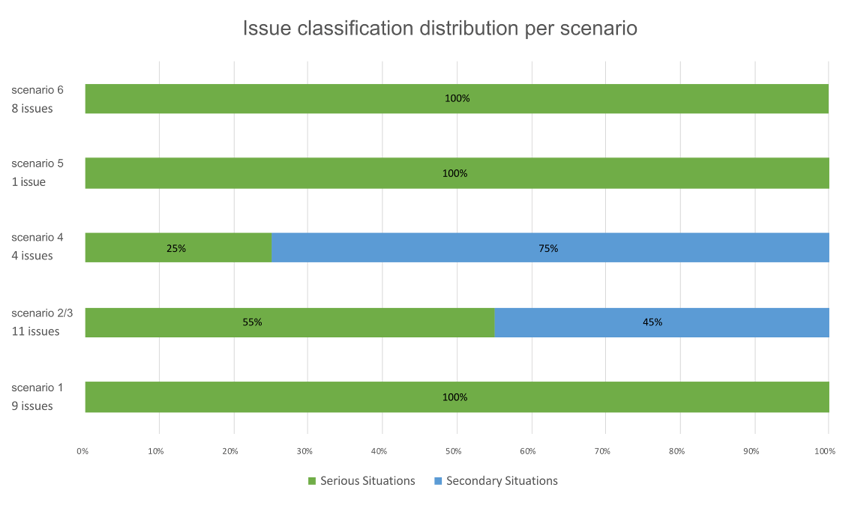
Figure 8. Issue classification distribution per scenario.
As a first design iteration, attention should be focused on finding solutions for the issues located in the serious situations quadrant as these have the greatest impact on the users’ experience.
All of the nine issues identified in the first dimension are classified as serious situations. In the issue pertinence board, it is evident that of the whole prototype, Issue 4 is in pole position as it is closest to the 1st quadrant, achieving the top position of the final ranking score with 7.1 points. As far as the absolutely necessary Task 1.4—select date and time is concerned—Issue 4 reports a blockage in the reading of the displayed schedule options. It is followed by Issue 1 that together with Issues 2 and 3 reports difficulties in beginning event scheduling. Also prominent in observation notes, the time-slot selection and finding the option to start scheduling (“create new event” button) are the two most serious interaction areas of this dimension.
Even though time-slot availability and rescheduling functionalities were highly appraised in the questionnaire open questions, most of the negative feedback points to flaws in symbology use and icon positioning, which are quite evident in the first task—where there is a delay and many mis-clicks to find the new event button (Issues 1, 2, and 3), in the fourth task of time-slot selection (Issue 4), and in the navigation between scheduling steps (Issue 6).
To improve this dimension, it is suggested that the following design iteration focuses on evidencing the schedule new event button (represented in Figure 9, which interestingly enough, received no comments from the participants, even though about 56% of participants struggled to find it) and in the problematic time-slot selection functionality.

Figure 9. Schedule new meeting button highlighted in a red circle.
The complexity of this classification scheme led to many other discussions and design reviews, similar to the previous one, which we left out of this article. We did not consider it to be of relevant substance, but just a first proof of pertinence and usefulness of the visualization schemes included in this UX analysis framework.
Discussion
In this paper, we present a UX analysis framework supported by visualization techniques based on significant scientific literature. This framework was applied in testing a UC&C prototype, with a sample of 27 participants. The mixed methods approach meant that we could gain a comprehensive understanding of the innate experience and interaction issues inherent to the studied artifact as well as gauge their potential impact on the user’s experience.
As described, the first analysis phase (holistic diagnosis) acts as an initial diagnosis where it is evident which scenarios potentially need more time to be studied. In the proposed proof-of-concept, some issues in the digital collaborative space became clear, especially in face-2-face meetings use-scenario, as this was the least-rated dimension by participants. The explicit answers gathered from each of the task’s questionnaires helped us to understand which of the features, solutions, problematic situations, and issues experienced remained in the participant’s mind after each scenario was completed, meaning that they had some kind of impact on the user (both for positive and/or frustrating experiences). This subjective, participant-shared information is valuable and can indicate which areas need to be revised, but it is not enough to truly inform a design and functionality reform. We therefore reviewed all UX sessions and made notes and observations, as well as a list of interaction issues, through task criticality and problem relevance multiplication. We also attributed a problem classification score to each issue and compiled a hierarchy. When compared to its corresponding frequency in the issue pertinence board quadrants, we became aware of the experience impact of each reported issue.
Alongside the holistic diagnosis as a preliminary representation to emphasize problematic areas, the scores achieved with the problem classification calculation represented a quick way to understand the most critical issues and separate these from secondary ones. We identified two levels of priority by means of the pertinence board, and this enabled us to inform the next design iterations of the prototype. This cartesian representation informed us about the rich interaction details undetected in the diagnosis radar. With the augmented visualization schemes, it’s possible to not only confirm, but also pinpoint the exact issues innate to the artifact under study, uncovering problems that are difficult to detect and prioritize in a traditional UX or usability questionnaire-based (interview) analysis. We have also calculated a final ranking score to highlight the most critical situations that need to be addressed and to complement the visuals.
This method is capable of discerning four levels of issue criticality. The criticality ranking is directly affected by the number of participants included in the study and is represented on the frequency axis. The ranking rates criticality according to the given conditions of the number of participants and issues found (which in turn could be related to the number of tasks provided). Therefore, criticality scores won’t be the same if the sample differs in size. We have followed Nielsen’s advice of using a minimum of five participants in order to achieve an adequate level of saturation of problem discovery in formative usability testing. If your study requires a larger sample, it will still be applicable. Criticality is relative to each context and study; therefore, we suggest that the frequency threshold should be edited and aligned to the objectives of each individual study. Another suggestion for better readability is to avoid reporting frequency as percentages if you have a small sample (up to 10 participants). Use the absolute integer value instead.
We verified that the tested UC&C scheduling prototype has concept and functionality misconceptions. Furthermore, some design and symbology issues were very clearly identified by the framework, considering their pertinence in the holistic landscape of design problems.
Timewise, the completion of this process will depend on several factors: the number of participants, session duration (which could be influenced by participants’ willingness to talk and/or explore the prototype), and its length (how many scenarios and tasks do the participants have to complete?). In a similar way to Nielsen’s curve of number of usability tests versus number of problems found (2000), the same phenomenon happens here: The more participants you have, the less issues you’ll have to list. While reviewing the recordings from the sessions, it became clear that you will need to spend some time on reporting the initial issues, but the more test sessions you have to review, the less time they’ll take. If the development funnel has tight deadlines, the holistic diagnosis radar can be left out, but this visualization scheme can be pertinent to decide if further usability investigation is needed. As in our case, we were able to prioritize and focus research efforts on the second quadrant’s issues, allocating less effort and time into the issues placed on the fourth.
This analysis method could prove to be useful in fast paced work environments where UX can sometimes be devaluated due to highly restricted schedules in the technological deployment funnels. Although it takes some time to prepare at the beginning, the final results can justify the extra development time by pinpointing the exact critical issues that need to be tackled, therefore avoiding excessive design iterations.
In the exemplary case study, most issues were placed in the second quadrant of the pertinence board. In the future, it would be relevant to experiment and apply the proposed visualization techniques on other usability studies, using different participant samples and research objectives and altering the board thresholds accordingly. This will surely augment the validation of the proposed method’s flexibility. We also propose that the value of this visualization technique is beyond the quadrants’ scope for naming. By applying this method, the researcher isn’t just defining which issues are critical, versus which are secondary ones, they are pinpointing which issues are more relevant to the user experience in comparison to the rest. And thanks to the final ranking value, our ability to discern these differences could be even easier.
Conclusion
It is a common scenario for UX practitioners in industry to be faced with a list of usability problems and then to be asked to choose which are more important. As we were faced with this problem ourselves, we strove to come up with a framework that was backed up by relevant previous research. A common method in this context is for UX researchers to classify criticality, based on their research background and UX best practices. The problem is that different researchers attribute different criticality scores, and therefore to reach consensus could be an arduous task. Bearing these discrepancies in mind, we chose methods that would remove or minimize researcher’s subjective opinions, and we composed a 4-step framework that includes participants’ opinions (subjective/qualitative data) and experience rating (nominal scale), along with a predetermined product objectives rating (applied to the test tasks).
Once testing and analysis have been completed, the framework provides us with a criticality ranked list and a graphical visualization of issues classified as critical, serious, relevant, or secondary, while also taking pre-established product and testing objectives into account.
For this paper, we’ve applied the framework in a UC&C scheduling prototype evaluation and described the main findings. We have also highlighted the pertinence of some details that the visualization schemes really helped to clarify in the holistic landscape of identified design problems.
Tips for Usability Practitioners
Some tips and recommendations regarding usability research that we’ve learned during this process:
- Consider having two very different but complementary analysis instruments side-by-side—a holistic and a detailed qualitative/quantitative data representation technique to decide on the most pertinent re-design issues, as well as to pinpoint the features at stake.
- Visualization techniques and descriptive statistics can be important tools in establishing a relationship between experience rating and qualitative data. By doing so, the criticality impact of detected interaction design problems is valorized.
- When justifying UX testing sessions and design iterations for project stakeholders and you want to go beyond just trying to gather and show quantitative user data, you should consider using visualization techniques to depict problems and their corresponding criticality.
- Choose adequate data visualization schemes to show your results and depict your usability problems, and bear in mind that some visual narratives are more efficient in doing this job than others.
- Nominal scales for experience rating, alongside subjective usability test opinions, help to systematize and cluster problems into criticality priorities.
Acknowledgments
Special thanks to all anonymous participants that donated their time to support this research process before and especially during the COVID-19 pandemic.
We also extend our gratitude to the anonymous reviewers and Jim Lewis for their constructive feedback during the extended review process. This work has been greatly improved thanks to your comments.
This work was supported by the European Regional Development Fund (FEDER), through the Competitiveness and Internationalization Operational Programme (COMPETE 2020) of the Portugal 2020 framework [Project Smart EnterCom with Nr. 021949 (POCI-01-0247-FEDER-021949)].
References
Abrantes, C., Mealha, Ó., Gomes, D., Barraca, J. P., & Ferreira, J. (2018). Human-centric design of unified communications: e-collaboration features. International Journal of E-Collaboration, 14(2), 1–18. https://doi.org/10.4018/IJeC.2018040101
Barendregt, W., Bekker, M. M., Bouwhuis, D. G., & Baauw, E. (2006). Identifying usability and fun problems in a computer game during first use and after some practice. International Journal of Human Computer Studies, 64(9), 830–846. https://doi.org/10.1016/j.ijhcs.2006.03.004
Barnum, C. (2019). The state of UX research. Journal of Usability Studies, 15(1), 1–7.
Brooke, J. (1996). SUS: A quick and dirty usability scale. In P. W. Jordan, B. Thomas, B. A. Weerdmeester, & I. L. McClelland (Eds.), Usability Evaluation In Industry (pp. 189–194). Taylor & Francis. Retrieved from http://www.tbistafftraining.info/smartphones/documents/b5_during_the_trial_usability_scale_v1_09aug11.pdf
Franco, R. Y. da S., de Freitas, A. A., Lima, R. S. do A. D., Mota, M. P., dos Santos, C. G. R., & Meiguins, B. S. (2019). UXmood: A tool to investigate the user experience (UX) based on multimodal sentiment analysis and information visualization (InfoVis). In 2019 23rd International Conference Information Visualisation (IV; pp. 175–180). IEEE. https://doi.org/10.1109/IV.2019.00038
Hall, E. (2019). Just enough research (2nd ed.). A Book Apart.
Hassenzahl, M. (2000). Prioritizing usability problems: Data-driven and judgement-driven severity estimates. Behaviour and Information Technology, 19(1), 29–42. https://doi.org/10.1080/014492900118777
Hertzum, M. (2006). Problem prioritization in usability evaluation: From severity assessments toward impact on design. International Journal of Human-Computer Interaction, 21(2), 125–146.
Jeong, J. W., Kim, N. H., & In, H. P. (2020). Detecting usability problems in mobile applications on the basis of dissimilarity in user behavior. International Journal of Human Computer Studies, 139. https://doi.org/10.1016/j.ijhcs.2019.10.001
Nielsen, J. (1993). Usability engineering. AP Professional.
Nielsen, J. (1994). Severity ratings for usability problems. NN/g Nielsen Norman Group. https://www.nngroup.com/articles/how-to-rate-the-severity-of-usability-problems/
Nielsen, J. (2000). Why you only need to test with 5 users. NN/g Nielsen Norman Group. https://www.nngroup.com/articles/why-you-only-need-to-test-with-5-users/
Rodden, K., Hutchinson, H., & Fu, X. (2010). Measuring the user experience on a large scale: User-centered metrics for web applications. In Proceedings of ACM CHI 2010 Conference on Human Factors in Computing Systems (Vol. 4, pp. 2395–2398). https://doi.org/10.1145/1753326.1753687
Roto, V., Law, E., Vermeeren, A., & Hoonhout, J. (Eds.). (2011). User experience white paper: Bringing clarity to the concept of user experience. In Dagstuhl seminar on Demarcating User Experience. All about UX. Acta Materialia Inc. http://www.allaboutux.org/uxwhitepaper
Rubin, J., & Chisnell, D. (2008). Handbook of usability testing: How to plan, design, and conduct effective tests (2nd ed.). Wiley.
Sauro, J. (2014). The relationship between problem frequency and problem severity in usability evaluations. Journal of Usability Studies, 10(1), 17–25.
Sauro, J., & Lewis, J. R. (2012). Quantifying the user experience. Morgan Kaufmann.
Sauro, J., & Lewis, J. (2021). Five reasons to use open-ended questions. MeasuringU. https://measuringu.com/open-ended-reasons/
Sharon, T. (2012). It’s our research. Getting stakeholder buy-in for user experience research projects. Elsevier. https://doi.org/10.1016/C2010-0-66450-9
Takahashi, L., & Nebe, K. (2019). Observed differences between lab and online tests using the attrakdiff semantic differential scale. Journal of Usability Studies, 14(2), 65–75.
Travis, D. (2009). How to prioritise usability problems. Userfocus. https://www.userfocus.co.uk/articles/prioritise.html
Trukenbrod, A. K., Backhaus, N., & Thomaschke, R. (2020). Measuring subjectively experienced time in usability and user experience testing scenarios. International Journal of Human Computer Studies, 138. https://doi.org/10.1016/j.ijhcs.2020.102399
Tullis, T., & Albert, B. (2008). Measuring the user experience: Collecting, analyzing, and presenting usability metrics. Elsevier. https://doi.org/10.1016/C2011-0-00016-9
[1] InVision – www.invisionapp.com
[2] Tobii – www.tobii.com
[3] Zoom – www.zoom.us
[4] Maze- www.maze.design</p2