
Abstract
Most companies today place their job
advertisements online and frequently require that applications for jobs be
submitted online. Unfortunately, many online employment Web sites are
inaccessible to users with disabilities, preventing these individuals from
even applying for jobs online. Previous studies have used automated tools or
expert reviews to evaluate the accessibility of online employment
applications. This study involved 16 blind, screen-reader users, attempting
to apply for jobs online. Two applications were submitted to each of 16
companies in the southeastern United States, for a total of 32 applications
submitted. Many of the online employment application processes were
inaccessible to blind users, and users repeatedly asked for assistance from
the researchers when they faced accessibility problems. Only 9/32 (28.1%) of
application attempts could be completed independently without any
assistance. This report details the problems discovered during the usability
testing and discusses the most common problems for blind users, as well as
problems related to general usability. It also provides suggestions for
improvement, including providing accessible feedback, unique and clear
hyperlink text, properly structured layout, logical grouping of questions,
clearly identified data format and required form fields, and conducting
regular accessibility evaluations. It is essential that companies ensure
that their online employment applications are accessible and usable for all
individuals, including individuals with disabilities.
Practitioner’s Take Away
The following are key points for practitioners from this study:
- Usability testing of Web interfaces should include individuals with disabilities in order to verify that an interface can be used by all individuals. It is not enough to simply assume such usability based on automated accessibility evaluations. This is especially true in transactions or applications where multiple subtasks must be successfully completed to reach the task goal.
- When conducting usability tests with blind participants, we suggest that the length of the session should be estimated in advance so that participants can be informed in advance of the usability testing session.
- When conducting usability evaluations of interfaces with individuals who are blind, it is sometimes necessary to consider a modified approach to usability testing, in order to ensure that the usability of the entire interface is evaluated, rather than relying on a limited evaluation due to possible accessibility obstacles that are discovered during the usability testing.
- In addition to observing users during usability testing, encouraging users to think aloud may help to identify more issues during the testing exercise.
- Many of the core usability problems for people with disabilities are actually the same usability problems as for people without disabilities.
Introduction
Employers today commonly place job advertisements
and applications online (Braddy, Meade, & Kroustalis, 2008; Bruyere,
Erickson, & VanLooy, 2005; Nakamura, A., Shaw, Freeman, Nakamura, E., &
Pyman, 2009), and job recruiters consider online job applications to be
fast, efficient, and cost-effective. Many job seekers view online
applications as both convenient and enhancing their prospects of securing
jobs (Breen, 2000; Capellli, 2001; Meskauskas, 2003; Younger, 2008).
Individual companies advertise jobs on their Web sites or outsource the
task to recruiting companies or job boards, which also place the jobs
online (Williams & Verhoeven, 2008). Both sighted and non-sighted (blind)
job seekers go to the same sources online to search and compete for jobs,
but many Web sites that post these jobs are not accessible to blind people
who depend on assistive technologies to access Web sites (Bruyere,
Erickson, & VanLooy, 2005; Lazar et al., 2011). The purpose of this
project was to evaluate the level of difficulty that blind users have when
attempting to submit job applications online, and to determine what
specific components of the application (e.g., finding an open position,
previous education, references, account creation) cause the greatest
problems. Previous usability evaluations of employment Web site
aggregators, such as hotjobs.com and careerbuilder.com, focused on using
assistive technologies and expert reviews (Bruyere, Erickson, & VanLooy,
2005; Lazar et al., 2011), but no usability testing involving individuals
with disabilities attempting to apply for jobs online has previously been
conducted. The goal of this project was to evaluate the accessibility and
usability of online employment Web sites, by having blind users attempt to
apply for jobs online.
Background
Employment is a core ingredient in self-esteem,
independence, and happiness (Frey & Stutzer, 2002). In a recent study in
the UK to measure the nation’s wellbeing, having a job was linked to
happiness and self-esteem (Ross, 2011), and unemployment has been shown to
have a negative effect on happiness (Frey, 2008). Historically, the
unemployment rate for people with disabilities, especially blind
individuals, is high (Wang, Barron, & Hebl, 2010), despite the fact that
blind people want to work and be productive, pay taxes, and be financially
independent (National Federation of the Blind [NFB], 2010). As an example
of how accessibility challenges hinder blind people who want to work, a
study has shown that computer frustrations (such as inaccessibility of Web
sites) can negatively impact the mood of blind individuals, but only when
it impacts their work (Lazar, Feng, & Allen, 2006). In the US, about 70%
of working-age blind people are unemployed (NFB, 2011), and the estimates
in other countries also reflect high unemployment—about 66% in the UK
(Royal National Institute of Blind People [RNIB], 2011a) and about 75% in
Canada (Canadian Federation of the Blind [CFB], 2011). This figure is high
compared to the general unemployment rate of approximately 8.6% in the US
(Bureau of Labor Statistics [BLS], 2011), 8.3% in UK (Office for National
Statistics [ONS], 2011), and 7.4% in Canada (Statistics Canada [SC],
2011). It is obvious that the goal of equal employment for the blind is
still far from being realized.
Today, the recruitment world has moved from the
traditional method of job advertisement (handbills, job boards,
newspapers, etc.) to online advertisement (news, social networking, blogs,
job boards, recruiting Web sites, employer Web sites, etc.). There is a
proliferation of general online job application Web sites (often known as
“job aggregator Web sites”), and most companies also advertise job
openings on their own Web sites. Convenience, scope, efficiency, and
cost-effectiveness among other factors, have endeared many job seekers,
employers, and recruiting companies to prefer the online approach
(Capellli, 2001; Mehkauskas, 2003; Younger, 2008). For blind people who
use assistive technologies to access the Web, the opportunity to apply for
jobs online could, theoretically, be good news, however, inaccessible job
application Web sites actually lead to discrimination and an inability to
even apply for a job (Hastings, 2010; Everett, 2011).
Legal Status of Employment Web Sites
Currently, there have not been any known court
cases in the US relating to the legality of inaccessible online employment
applications. Online employment applications are likely covered under
Section 503 of the Rehabilitation Act of the US, which requires that all
employers that have federal contracts or subcontracts of at least $10,000
“must take affirmative action to hire, retain, and promote qualified
individuals with disabilities” (60-741.1).In July 2010, the Office of
Federal Contract Compliance Programs at the U.S. Department of Labor
issued an advance notice of proposed rulemaking (ANPRM) to strengthen the
regulations relating to Section 503 of the Rehabilitation Act, and the
ANPRM included a question (#13) relating to accessible online hiring
processes, with comments due on September 21, 2010 (Department of Labor
[DOL], 2011). Specifically, the text of the ANPRM was “What impact would
result from requiring that Federal contractors and subcontractors make
information and communication technology used by job applicants in the job
application process, and by employees in connection with their employment
fully accessible and usable by individuals with disabilities?1
What are the specific costs and/or benefits that might result from this
requirement?” No further action has been taken yet by the Department of
Labor related to this advanced notice of proposed rulemaking.
Within the Americans with Disabilities Act, Title I
addresses discrimination in employment, and Title III addresses
discrimination in the 12 categories of “public accommodations.” The ADA
was signed into law in 1990 before the advent of online employment Web
sites. However, since the mid-1990s, U.S. Department of Justice statements
and various court rulings (such as National Federation of the Blind vs.
Target) have stated that the Americans with Disabilities Act does apply to
Web sites of public accommodations. Furthermore, the Department of Justice
began the rulemaking process in 2010 for creating specific guidance for
Web accessibility within the ADA, with an advanced notice of proposed
rulemaking, titled “Nondiscrimination on the Basis of Disability;
Accessibility of Web Information and Services of State and Local
Government Entities and Public Accommodations” (Department of Justice
[DOJ], 2010). While the ANPRM does not specifically mention online
employment applications, it is expected that online employment
applications would be automatically covered as a part of the requirement
for accessibility of the Web sites of public accommodations.
Many other nations have supported the call to make
Web sites accessible to people with disabilities that use assistive
technologies (Lazar et al., 2011). Laws have been enacted, such as the
Equality Act 2010 in the UK (RNIB, 2011b), and the Financial
Administration Act (containing Common Look and Feel standards) in Canada
(Treasury Board of Canada Secretariat [TBCS], 2007). The World Wide Web
Consortium has also developed standards and guidelines for designing
accessible Web sites (W3C, 2011a). However, the goal of a fully accessible
Web is far from being realized, as research has shown that many Web sites,
including Web sites required to be accessible by law (such as government
Web sites covered by Section 508) aren’t accessible (Olalere & Lazar,
2011).
Previous Evaluations4
A number of evaluations have previously been
conducted on the accessibility of employment Web sites, but these
evaluations used automated tools, expert inspection, or a combination of
both. Previous research has not involved having blind users attempt to
apply for jobs online. In addition to validating that the problems
identified by automated tools or expert reviews are real, user-based
testing may clarify what the problems are, and identify additional
problems. While usability testing takes additional resources to conduct,
it provides more depth about problems and solutions. Furthermore, while
expert reviews can be most effective for evaluating compliance with
regulations on one Web page, usability testing with people with
disabilities is most effective in determining whether people with
disabilities can successfully complete a task involving a series of
interrelated subtasks, such as applying for a job online or completing an
e‑commerce transaction, or requesting government benefits (Lazar et al.,
2011).
Many job application Web sites have been found to
be inaccessible. Bruyere, Erickson, and VanLooy (2005) conducted an
accessibility evaluation of 10 job boards and 31 e-recruiting Web sites
for accessibility using an automated evaluation tool (Bobby v3.2) and an
expert-simulation of the application process using a screen reader. From
the results, none of the job boards evaluated were accessible; a majority
of the e-recruiting Web sites were inaccessible and only three out of the
12 corporate Web sites were accessible enough for the expert-simulated
process to go through. Lazar et al. (2011) also performed accessibility
evaluations on eight job aggregator Web sites. Aggregator Web sites (such
as careerbuilder.com and hotjobs.com) are those that provide job postings
from multiple employers and allow users to submit applications directly
through the site for many of those employers (Williams & Verhoeven, 2008).
Lazar et al. (2011) used expert inspections to determine job aggregators’
Web site compliance with Section 508 guidelines. The results showed that
seven of the eight employment aggregator Web sites evaluated had
accessibility violations.
1For example, requiring that contractors ensure that application
and testing kiosks are fully accessible and usable by individuals
with disabilities, and that contractors strive to ensure that
their Internet and Intranet Web sites satisfy the United States
Access Board’s accessibility standards for technology used by the
Federal Government and subject to section 508 of the
Rehabilitation Act.
Methods
This study focused on evaluating the accessibility
and usability of online employment application Web sites in eight
southeastern US states: Alabama, Florida, Georgia, Kentucky, North
Carolina, South Carolina, Mississippi, and Tennessee. These states were
chosen because they are the states served by the Southeastern ADA Center
(http://adasoutheast.org/), which funded this project. Also, the
Southeastern ADA Center has connections with businesses in these states,
so the results of the usability evaluation can be communicated to
companies in the southeastern US, and could result in the improved
accessibility of online employment Web sites. The staff of the
Southeastern ADA Center chose two companies that had online employment
applications from each of the eight states, for a total of 16 Web sites
evaluated. For each state, the largest 50 employers were selected. Then,
in each state, the top 10 high growth fields were selected. Then, two
companies were selected from the 10 top growth fields in each state,
making sure that no field was represented twice in the sample. This way,
not only would there be geographic diversity, but also diversity of
different fields and industries. So as not to embarrass any of the
companies, they will not be identified by name. Two attempts were made to
apply for jobs on each Web site (for a total of 32 attempts at submitting
a job application).
Participants
A total of 16 participants were involved in the
usability evaluation. Most participants were recruited through a
partnership with the Maryland Division of Rehabilitation Services, Office
of Blindness and Vision Services. Participants were required to be blind,
at least 18 years of age, must have been employed at some point within the
last few years, and must be screen-reader users unable to use screen
magnification (meaning that the participants did not have enough residual
or partial vision to use their vision in the usability evaluation). It was
also stated in the recruitment email that the testing would require an
average of three to four hours per participant. Note that one participant
showed up for data collection, but it was determined that the participant
did not meet the screening qualifications. No data was collected from that
user, and a replacement user was selected. All 16 participants were
currently either unemployed or part-time employed, and were seeking
full-time employment. None of the participants were fully employed; so,
the participants were very representative of the typical blind persons who
would be attempting to apply for jobs online. Of the 16 participants, 11
were female, and five were male, and the average age was 36.5 years (with
a range of 21-65 years old). All of the 16 participants were blind users
with a great deal of experience using screen reader technology (an average
of 12.06 years of experience) and a great deal of experience using the
Internet (an average of 10.94 years). Three of the participants had never
applied for a job online before, but the other participants had previous
experience applying for jobs online. Of the 16 participants, two had high
school degrees, three had Associate’s degrees, nine had Bachelor’s
degrees, and two had Master’s degrees. Participants were paid $250 for
their participation. While some participants took public transportation,
others had friends or family members drop them off, however, the
friends/family members were not allowed to stay in the computer room or
assist the usability evaluation in any way. There was a 5-to-15 minute
break in between the two attempts to apply for applications. Participants
did not have any additional documented disabilities, aside from their
vision loss. Note that while the university Institutional Review Board
(IRB) requires signed paper copies of both the IRB form and the payment
form, printed copies logically do not make sense for blind participants,
so the participants received electronic copies of the documents in advance
that they could read. When the participants arrived for the data
collection, they were asked to sign the paper copies, with Braille
stickers saying “sign above” to let them know where to place their
signature.
No personal participant information was used, and
each participant had a name, resume, and email account prepared for them
for use in the study. All resumes submitted were marked “not a real
application—submitted for training purposes only” so as not to confuse or
waste the time of employers who received the application. There was no
stated time limit for how long it took participants to attempt to submit
an employment application.
Data Collection
For the data collection, participants were given
the URL of the home page of the company/organization and were told to
apply for a job of a certain category (e.g., help desk manager, or
software engineer). We interacted with all of the job application Web
sites beforehand to know which jobs were available on each Web site.
Specific job categories were selected for our participants in advance, and
resumes appropriate to each specific job were created for use by the
participants (for instance, with appropriate professional experience,
degrees, and certifications). All usability evaluations took place using
the same computer in the computer lab at the Maryland Division of
Rehabilitation Services, Office of Blindness and Vision Services. The
computer was a Dell Optiplex 760, Intel Core 2 Duo CPU, running Microsoft
Windows XP Professional Service Pack 3 and JAWS 11 (screen-reader
software). Users were allowed to modify the speech output speed to their
liking to make it similar to how they typically interact with a computer.
The browser used for the study was Internet Explorer 8. All data
collection took place in August and September 2011. JAWS was selected
because it is the dominant screen reader currently in use (WebAIM, 2010).
Typically, the participants were in the computer lab for 3-4 hours,
including the introduction, signature of forms, description of procedures,
the actual usability evaluation, breaks, and wrap-up.
We used a modified usability methodology to learn
as much as possible about the barriers to online job applications.
Ideally, people with disabilities need to apply for a job online without
assistance from anyone. Because many of the sites had core features (such
as the “search jobs” function) that were inaccessible, if a traditional
usability methodology had been used, the researchers could not offer help
or assistance in any way, and the participants would not have made it past
initial inaccessible screens. That scenario would have provided no useful
feedback about the accessibility of other steps in the hiring process. In
the modified usability methodology, when participants could not move
forward and specifically asked for help, we offered to assist them, and
took careful notes of when we were asked to perform an intervention and
the type of intervention performed. Specific data about the interventions
are in the Results section of this paper. Aside from the user-requested
interventions, we non-obtrusively took notes about what steps the users
were taking, and we did not comment or assist the users in any other way.
We encouraged the participants to think aloud and state what they were
doing, and that also influenced our notes.
Applying for a job online is really one large task
with a number of subtasks. These subtasks cannot be separated out as
separate, discrete tasks, because the tasks all must be completed
successfully to reach the ultimate user goal: submitting an application.
The specific subtasks for each Web site application process vary; there is
no consistency among sites in the different subtasks needed to reach the
goal. In comparison, when attempting to use different email applications,
all applications have identical, discrete tasks that can be compared
across different applications, such as adding an email address to an
address book, sending an email, responding to an email, and deleting an
email (Wentz & Lazar, 2011). While some subtasks are common across job
application sites (such as education, certifications, and previous work
experience), they are asked in a different manner, with differing levels
of detail required (e.g., one site asks you to name your university
attended, but another site asks you to find your university attended from
a list of thousands of universities). The same question is asked in
different ways on different sites: some ask a question as one question,
while some sites break that same question down into multiple subtasks.
Furthermore, different job application Web sites have different subtasks,
such as salary requirements, date availability for a job, availability for
job travel, hobbies, languages spoken, and work preferences, which often
are not asked on many of the Web sites. Some Web sites allow you to upload
a resume, and the software on the Web site then takes the data directly
from the resume, populates the form fields, and simply asks for
confirmation that they are correct. Other sites, even with a resume
uploaded, do not populate the form fields with any data. Therefore, it is
impossible to compare the performance on each subtask across sites, even
when those sites use a similar software package for the hiring process,
such as the recruitment software from Kenexa (http://www.kenexa.com/recruitment-technology).
Pilot Study
A pilot study was conducted with two blind
participants to test the appropriateness of our data collection methods.
Note that this did not take place at the location described for the 16
participants, but rather took place in the participants’ homes. From the
pilot studies, minor modifications were made to the data collection
methods, such as a stronger encouragement to participants to think aloud,
clearer pre-study instructions, methods to document the interventions, and
increasing the amount of information available to participants on their
resumes for use in the study.
Results
Each participant was asked to apply for two job
openings online. One of the participants had to leave early, and therefore
could only attempt to submit one job application online. One of the other
participants, who had a more flexible schedule, was asked to attempt to
apply for a third job. Out of the 32 attempts to submit applications
online (two for each of the 16 companies), 24 of those attempts were
successful, that is, participants completed the application process.
However, many of those attempts involved interventions. Only nine of the
32 applications were submitted successfully and independently, without any
type of intervention, for a task success rate of 28.1%. The types of
interventions are discussed in the following paragraphs. For the nine
participants where both of the applications were successfully submitted,
for eight of those participants, the second application was completed and
submitted in a faster time period than the first application, suggesting
that over time, there could potentially be some learning effects if users
are submitting, for example, 10-15 employment applications online.
The quickest successful submission took 23 minutes, with no interventions. The
longest successful submissions were in 121 minutes, one with no
intervention and the other with one intervention. The longest unsuccessful
attempt lasted 229 minutes (nearly four hours), at which point the
participant gave up and indicated that they would not continue applying
for the job. It is important to note that, before the data collection
began, it was clear to the researchers that many of the sites use the same
software applications to power their job application processes. For
instance, four of the companies selected for the study use the Taleo
software (http://www.taleo.com/solutions/recruiting),
and four of the companies selected for the study use the Kenexa software.
It is important to note that each implementation of the Taleo and Kenexa
software packages is different (and there are multiple versions of the
software from those vendors), so while there are some similarities, each
company using Taleo or Kenexa is in fact using a different, but similar
interface.
Interventions
It is important to note that there were a total
of 34 interventions required, where participants asked for assistance in
moving forward. These interventions were in situations where a mouse click
was required (16), or where participants asked for suggestions (18). For the
16 situations where a mouse click was required, 12 of them were situations
on four sites. Often, a mouse click was required to access any information
about jobs. The other four situations where a mouse click was required were
for buttons that were inaccessible by keyboard use only. For instance, in
Figure 1, participants were required to click on the item to search for
jobs, but the object could not be selected using the keyboard. In Figure 2,
the two individual buttons were both read by the screen reader as
“previousnext,” allowing no individual identification of the buttons, even
though visually they appear as two clearly separate buttons.

Figure 1. Screenshot of an inaccessible link
to search for jobs on a Web site that required a mouse-click
![]()
Figure 2. An example where two buttons were
visually separate, but in the code they were marked with the same label of
“previousnext”
The other 18 interventions occurred in situations
where the participants asked for a suggestion to help them move forward.
The causes of interventions were the following: (a) labels or markup were
misleading or absent (5), (b) the instructions from the Web page were
confusing (3), (c) there were pop-up boxes with inaccessible information
(3), (d) there was an error message where the Web site had rejected the
participant data input because it was not in the proper format (3), (e)
lack of participant knowledge (participant was listening too fast or could
not figure out how to attach a document; 2), and (f) JAWS problems (JAWS
was not reading the current Web page, and JAWS was not reading the options
in the combo box; 2).
Common Problems for Blind Participants
From the usability evaluation by the 16 blind
participants, patterns emerged of common problems in the online employment
applications. Some of these problems were specific to blind participants
who were accessing the employment applications using screen readers, but
other problems that challenged blind participants were more general
usability problems that blind users, as well as users with other
disabilities or users with no disabilities would face. Table 1 lists the
most common participant problems with the number of participant-requested
interventions, the number of Web sites impacted (out of 16), the number of
job applications impacted (out of 32), and the total number of instances
that a particular usability challenge occurred. The problems described
were either problems that were mentioned by the participants as
challenging during the attempts to apply for jobs, or identified and
defined by the researchers based on participants seeming to have problems
but not saying anything. Because we took a hands-off approach to testing,
just using instances in which participants specifically asked for help
would have greatly underestimated the number of problems. Therefore, we
also included instances based on observations where users were clearly
having problems but were not complaining.
Only problems that impacted 10 or more applications
are listed. For example, one cause of intervention mentioned earlier, lack
of participant knowledge (with two interventions), did not appear in Table
1 because it did not occur frequently enough to meet the described
threshold of impacting 10 or more applications. Typically, when usability
problems are summarized after a series of usability evaluations, these
problems are summarized and prioritized, and therefore, because we could
not list every single problem in the article, we only focused on including
those that appeared most often. To provide context information for the
problems that required an intervention, the interventions are also listed
in the first data column.
Table 1. Common Participant Problems with
the Online Employment Applications, Sorted by Number of Applications
Impacted
|
Problem Description |
# of participant requested |
# of Web sites impacted (out of 16) |
# of applications impacted (out of 32) |
Total # of instances (no limit) |
|
Design problem/confusing layout/links: This includes general design issues that |
1 |
15 |
24 |
51 |
|
JAWS issues: These are problems observed from the way |
2 |
15 |
23 |
46 |
|
Instructional/labeling problem: This includes no instruction or title on |
3 |
14 |
22 |
36 |
|
Form control issues: An example would be no binding between |
0 |
12 |
16 |
19 |
|
Required fields unclear or unspecified: This would include unspecified required |
2 |
10 |
16 |
18 |
|
Finding jobs link: This refers to the inability to find jobs |
0 |
9 |
15 |
17 |
|
Mouse only/Flash/Javascript issues: This includes mouse-overs for accessing |
19 |
9 |
15 |
21 |
|
Skip navigation issue: Either skip navigation is not present, or |
0 |
9 |
13 |
13 |
|
Specific participant preferences: This included participants wanting multiple |
0 |
10 |
13 |
20 |
|
Tab order/cursor control: This would be illogical tab order, cursor |
0 |
10 |
13 |
16 |
|
Data input format: Examples of this would include unspecified |
3 |
11 |
13 |
14 |
|
Table headers poorly coded: Table headers were not properly labeled, |
2 |
7 |
10 |
11 |
“Specific participant preferences” is a category
that needs further explanation. For instance, participants noted that they
had preferences about how to enter the data, such as having multiple Web
pages to enter data, instead of one long page. This method allows a
participant to focus on one section at a time, and data is then saved from
one page to another (so that data is not lost if the session times out).
Also, participants preferred having an option for text entry, for instance,
either to upload a cover letter in word format or to copy and paste it into
a text box. If a resume was already uploaded, participants preferred to have
the resume automatically populate many of the data fields (which was an
option offered by a number of sites).
Action Items to Improve the Usability of Application Web Sites for Blind Participants
From the usability evaluation by the 16 blind
participants, patterns emerged of common problems in the online employment
applications. Based on the usability testing, the feedback by
participants, and the categories of problems that participants faced, we
created a list of five suggested action items to improve usability
specifically for blind users on employment Web sites. In the following
sections, we provide five action items that would both improve usability
for blind users as well as other user populations. All of these items are
actionable, with minor technical changes that would lead to great
improvement for blind users.
Design introduction pages that are accessible
A number of sites had introduction pages as the entrance to the job
application process that were inaccessible to screen-reader users and had
no textual equivalents. For instance, a few Web sites had a flash-based
job search page, without any textual equivalents. There was no way to
search for a job unless you could see the screen and could use a mouse
pointer. For example, a Web site required users to click on a map to
choose which region/country you wanted to apply for a job on, and then if
you chose the US, you were then required to choose a state (see Figure 3).
There were no textual equivalents for choosing the job region or state,
although this would be easy to design accessibly, using a drop-down menu
list. These features may seem visually appealing, and they could stay on
the Web site, however, textual equivalents need to be added so that users
who cannot use pointing devices could also access the information. The key
problem with these features is that they are at the entry point of the
entire employment process, so that if you cannot utilize these features,
you cannot go any further in the application process. These entry points
essentially prevent blind users from applying for jobs at these companies.
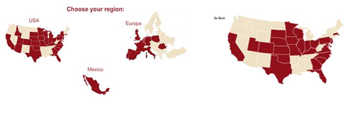
Figure 3. Web site where the participants
must click on a map, and there is no textual equivalent for screen-reader
users or those unable to use a mouse pointer
Provide accessible feedback on data entry problems
All online employment application processes
required users to fill out online forms, and this was expected. However,
there were instances on multiple sites where the feedback on data entry
forms was inaccessibly provided when data fields were filled out
incorrectly, as recorded in Table 1. Inaccessible methods for providing
feedback included highlighting the incorrectly filled-out field in red or
providing feedback only in an inaccessible mouse-over. On one employment
site (see Figure 4), the participants were prompted in a dialog box that
they should hover over the problematic data entry fields with their mouse
to learn what the problem is. A similar problem was noted on other Web
sites, (e.g., see Figure 5) where the participants were given information
about the data entry problem only through the use of a mouse-over on
fields that were marked with a red exclamation point.
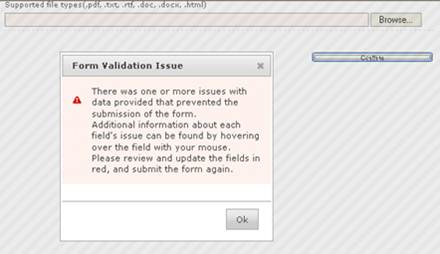
Figure 4. Feedback on a Web site about an
incorrectly filled-out data entry form was provided in an inaccessible
manner. The dialog box notes that, to find out what the error was, the
participant should hover over the field with their mouse.
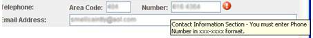
Figure 5. Feedback on the data entry from a
Web site was provided only by doing a mouse-over where a red exclamation
point was indicated as a field with incorrect data entry.
Provide accessible feedback regarding participant progress through the application
Typically, there are a number of steps that an applicant must complete
before they can formally submit an application. Unlike e-commerce sites,
where there is a standard and simple process (place items in the shopping
cart, and then go to the checkout), submitting a job application is a much
longer process, requiring as many as 10 different steps, and the actual
steps vary widely from site to site. Unfortunately, the status feedback on
participant progress through the sites we tested tended to be
inaccessible, that is, the feedback was provided only graphically, through
the use of shading, shapes, or colors, rather than a simple textual
declaration saying “you have completed step 3 (previous employment) out of
9 steps” or something similar. Because the steps varied so widely from
site to site, it was unrealistic to expect participants to know how many
steps were involved or which steps were involved. Figure 6 displays
progress indicators from three different sites, which show the various
steps in the job application process, but show the data in an inaccessible
manner.
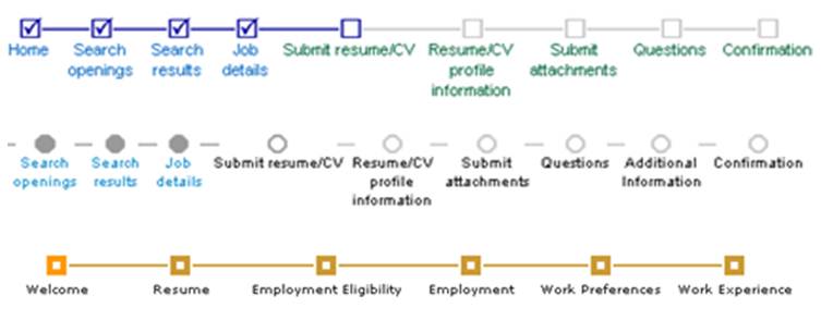
Figure 6. Progress indicators from different
Web sites, which show the progress in an inaccessible manner that is
unusable to screen-reader users
Use links that are unique and identifiable when listened to using a
screen reader
A number of Web sites had link text that was listed
as “click here” or “click here to read more.” When a screen reader user
listens to these links using the JAWS links list feature, all of the links
sound exactly alike and are identical and not individually identifiable.
This is easy to fix, instead of having all links read “click here,”
developers should designate the actual job titles as the links. On one of
the Web sites, all of the job listings had links titled “more info,” and
on another Web site, all of the job listings had links titled “click here
to read more” (see Figure 7). The outcome of that design decision is
presented in Figure 8, where the JAWS links list displays a list of links,
and the participant therefore hears a list of links titled “click here to
read more.”
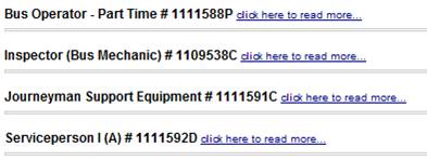
Figure 7. A list of job links that all have the same text: “click here to read more”
which would be meaningless to screen-reader users
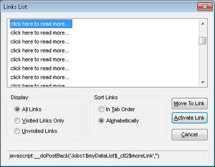
Figure 8. The JAWS links list on a Web site
job listing, where all jobs have the same link title, which was confusing
and meaningless to screen-reader participants
Use appropriate markup for lists and groups of questions
Users of screen readers rely on the Web design code (such as HTML) to
provide appropriate information about the structure of information
presented on the screen. For instance, headers (such as H1, H2, H3)
provide information about the meaningful headings on the Web page, which
allow users to navigate through those headings. Rather than presenting
content with the goal of how it will appear visually, it is important to
provide content with the goal of coding to indicate meaning and structure.
Figure 9 provides an example of a problem where the participants are not
hearing the questions and the answers together, but are hearing all of the
seven questions listed together, and then the answers are read together.
Developers sometimes use tables for visual layout, and this can confuse
screen-reader users who count on structured Web design code to understand
the meaning and relationship between items on the Web page.
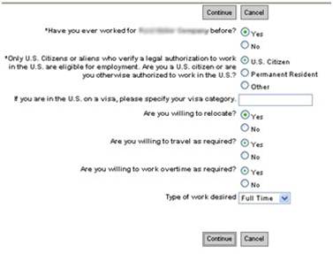
Figure 9. Example where participants were not hearing the questions and the answers
read together, but were hearing all of the questions first, and then all of the answers.
Common Problems Related to General Usability
Participants in this study faced a number of
problems that were not specific to blind participants, but rather were
general problems with usability that would apply to all users.
Data is required that does not make logical sense
There were a number of sites where the required data fields were noted by
using red stars (which, itself, might be a problem for blind users if
there are no non-visual equivalents for indicating a required field).
However, in some cases, the required fields simply did not make sense. For
instance, in Figure 10, the start date and end date of a job were
required, which makes sense generally, even though there was an option to
note that a job was the current job. Even if the check box for current job
was selected, the participant still needed to provide an end date, even if
there was no end date. This clearly could be confusing to users.
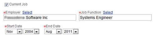
Figure 10. Participants were required to
enter an end date for their current job, which makes no logical sense.
Data fields are required, but users are not informed that the fields
are required
If a data field is required, that needs to be stated clearly. The lack of this
type of information to the user was obvious, as shown Table 1. It is
understandable that there are data fields that must be required, such as
for name, contact information (such as email and phone), and educational
degrees. However, if these fields are required, that fact needs to be
clearly communicated to all users. Typically, the wording “Required field”
should be used, or if a red star or something is used to indicate a
required field, there should be equivalents (such as alt text) that
indicate for color-blind, low-vision, or blind users that the field is
required. In Figure 11, there are no indications that both email and phone
numbers are required fields. Yet if the data is not entered in those
fields, users will receive an error message.
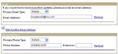
Figure 11. Required data entry fields with
no indication (to blind participants or any users) that the fields are
required
Participants are required to do a “lookup” when a data field is more
suited to free text
When there are a limited number of potential
choices in a data entry field, a drop-down list makes sense. However, when
there are potentially thousands of possible choices, participants should
simply be allowed to use free-text entry to indicate their data. Yet one
of the online employment applications required that participants search
for and select the colleges and universities that they attended. This is
not standard on most online employment applications. Participants were
required to enter the title of their school and then select from a list of
potential matches to their search string. This approach was especially
problematic when either a school was listed multiple times for the same
school, or when there was a university system with multiple campuses with
similar names. In the example in Figure 12, multiple campuses of a
university were listed, and the same campus was listed more than once.
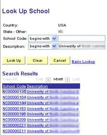
Figure 12. Multiple campuses of a university
were listed, and the same campus was listed more than once, which was
confusing to all users.
Participants in the study attempting to apply for
jobs tended to find this approach problematic and confusing. It would be
understandable if the choice from a list was required because it would
note a specific code for a university, and then allow access for the
employer to student records and transcripts from potential employees;
however, at no point in the application process were participants asked to
give permission to access transcripts, so this cannot be connected to
providing the university name.
Data entry is required in a specific format, but the format desired is
unclear
Earlier in this paper, the problem of inaccessible feedback on data entry
was discussed. Another related problem is the problem of unclear guidance
on what format data should be entered in, where, even though the feedback
is accessible, it still is not meaningful for any users (refer to the data
in Table 1). For instance, in Figure 13, the data entry field was supposed
to be entered in a currency format ($XXX.XX), but the field itself did not
clearly indicate that, and the error message in Figure 13 did not in any
way specify how participants should enter the data, only that the data was
entered improperly.
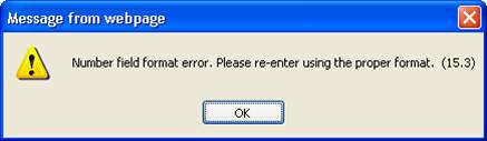
Figure 13. Unclear error message related to
data field entry, which is confusing to all users
Users are not given the opportunity to indicate that more time is
needed
In five of the participant attempts to submit a job application, the
application automatically timed out because the participant had reached a
certain time limit, without notifying the participant or giving the
participant the opportunity to indicate that more time was needed. This
impacts usability for users who may be busy (and may have their
application task interrupted by other pressing tasks) and novice users of
assistive technologies, who may need more time to complete an application
task.
Recommendations
There were a number of usability problems on the
employment application Web sites that were problematic for the blind
participants in this usability study and kept the participants from
independently submitting applications online. However, none of these
usability problems were ones that were technically hard to solve or
address. These were all commonly-known and understood problems, relating
both to accessibility for blind users and general usability for all users.
The solutions themselves are easy—such as creating textual equivalents for
clickable image maps, accessible feedback for form errors, and clearly
stating which fields are required and which data format should be used.
For instance, if any of these employment application Web sites followed
either Section 508 (Section508.gov, 1998) or the Web Content Accessibility
Guidelines (W3C, 2011b), it is likely that most of the accessibility
problems mentioned previously in the paper would have been addressed.
Companies should ensure that their online employment processes are
accessible and usable for users with disabilities.
If online employment application software is being
purchased (such as solutions from Kenexa or Taleo) employers should
request documentation that the software complies with Section 508, similar
laws in other countries, or international standards. This can be done by
asking for documentation of what methods were used to check for
accessibility, or asking for a Voluntary Product Accessibility Template®
(VPAT®) that documents the accessibility features (http://www.itic.org/index.php?src=gendocs&ref=vpat&category=resources).
While it is possible that users with disabilities would face challenges in
using the interface that are not covered under Section 508, the most basic
accessibility problems documented in this study would have indeed been
covered under Section 508 or similar laws.
If online employment application software is being
developed or modified in-house, good user-centered design techniques
should be used to ensure accessibility. These techniques include usability
testing involving people with disabilities, expert inspections using
assistive technology, and automated accessibility testing (software such
as HiSoftware Compliance Sheriff, Odellus ComplyFirst, and Deque
Worldspace). In addition, if the online employment process Web pages are
going to be modified in any way, accessibility needs to be considered in
the modifications.
Even though there is additional expense and time
involved with user testing, we believe that it is important to have real
users with disabilities test Web sites. We uncovered the following
usability problems that would likely not be detected by automated software
tools:
- Many of the usability challenges we
consider to be serious for the blind participants in our study, such as no
clear identification of when fields are required fields, free-text being
preferred to look-up, and unclear data format preference, would definitely
not be detected. - While it’s likely that the inaccessible
maps with no textual equivalent would be flagged, it’s unlikely that the
inaccessible feedback when users entered incorrect information would be
detected. - User actions, such as entering incorrect
information, were required before the inaccessible feedback was triggered.
Without the actions, the feedback would not be evaluated. - Data fields that do not make logical sense,
such as requiring an “end date” to a job those participants marked as
their current job, would not be detected.
Automated accessibility testing tools are necessary
for evaluating and monitoring any large Web site, as there may be
thousands of sub-sites and pages; however, those tools are not a
replacement for user testing, especially when users with disabilities must
perform tasks that involve a series of sub-tasks across multiple screens.
User-based testing provides a much deeper understanding of accessibility
and usability.
It is important to note that these participant
attempts to submit applications were only the first step in the process of
applying for a job. The entire process, once the individual submits the
application, must also be accessible. If these applications were real
applications (and not marked with “for training purposes only”), and if
these applicants were chosen for interviews and further review, those
future steps would also need to be accessible. For instance, there are
reports of many employers requiring potential employees to take online
aptitude tests. Are these online tests accessible? Are follow-up
communications electronic? If so, are they accessible? And furthermore
(and non-technically), when potential employees go for an interview, are
those face-to-face meetings in accessible locations? Do the offices and
buildings have Braille signage? This usability evaluation has only
examined the initial attempts to submit an employment application online.
Future work needs to evaluate the accessibility of the entire process.
Conclusion
This study examined the accessibility and usability
of 16 employer Web sites in the southeastern United States, and it
revealed that the majority of attempts by blind individuals to apply for
jobs using these Web sites were not successful. There were many unique
problems identified (see Table 1). Accessibility and broader usability
challenges can clearly prevent or discourage users with disabilities from
even the earliest phases of the process of seeking and obtaining
employment, as illustrated in this study. When a particular segment of the
population (e.g., people with disabilities) is in this manner prevented
from the right to apply for employment, it amounts to discrimination.
Accessible and usable online employment applications should be a priority
for employers, and the negative impact that this has on people with
disabilities must be understood. As illustrated in this research, most of
the problems related to electronic accessibility and usability are easy
for designers to correct. Following guidelines such as Section 508 and
WCAG can allow businesses to make significant progress towards providing
equal opportunities for all individuals to gain employment.
References
- Braddy, P., Meade, A., & Kroustalis, C. (2008). Online recruiting: The effects of organizational familiarity, website
usability, and website attractiveness on viewers’ impressions of organizations. Computers in Human Behavior 24(6): 2992, 2993. - Breen, B. (2000). Full house. Fast Company. Retrieved March 22, 2011 from http://www.fastcompany.com/magazine/42/pp_bellagio.html?page=0%2C0
- Bruyere, S., Erickson, E., & VanLooy, S. (2005). Information technology and the workplace: Implications for persons with
disabilities. Disability Studies Quarterly25(2). Available at
http://dsq-sds.org/article/view/548/725 - Bureau of Labor Statistics (2011, November). The employment situation. Retrieved December 14, 2011 from
http://www.bls.gov/news.release/archives/empsit_12022011.htm - Canadian Federation of the Blind (2011). Review:
The politics of blindness: From charity to parity. Retrieved December 14,
2011 from
http://www.cfb.ca/review-the-politics-of-blindness-from-charity-to-parity - Capellli, P. (2001). Making the most of online
recruiting. Harvard Business Review,
Harvard Business Publishing. 79(3), 139–146. - Department of Justice (2010). Nondiscrimination on
the basis of disability; Accessibility of web information and services of
state and local government entities and public accommodations. Retrieved
December 15, 2011 from
http://www.ada.gov/anprm2010/web%20anprm_2010.htm - Department of Labor (2011). Affirmative action and
nondiscrimination obligations of contractors and subcontractors:
Evaluation of recruitment and placement results under Section 503.
Retrieved December 15, 2011 from
http://www.dol.gov/ofccp/regs/unifiedagenda/Spring-2011/1250-AA02.htm - Everett, C. (2011). Online recruitment sites “not
accessible.” Retrieved March 13, 2011 from
http://www.hrzone.co.uk/topic/recruitment/online-recruitment-sites-not-accessible/109886 - Frey, B. (2008). Happiness research in economics—A
revolution? Journal of Happiness
Studies, 10(4), 499-502. - Frey, B., & Stutzer, A. (2002). What can economists
learn from happiness research?
Journal of Economic Literature
40(2), 402–435. - Hastings, R. (2010). Making recruiting sites
accessible for all. Retrieved May 5, 2011 from
http://www.shrm.org/hrdisciplines/Diversity/Articles/Pages/RecruitingSitesAccessible.aspx - Lazar, J., Feng, J., & Allen, A. (2006).
Determining the impact of computer frustration on the mood of blind users
browsing the web. Proceedings of ACM
Conference on Assistive Technology (ASSETS; pp. 149-156). Portland,
OR, USA: ACM (New York, USA). - Lazar, J., Wentz, B., Biggers, D., Delair, J.,
Donnelly, M., Kashim, E., Henin, A., Markakis, J., Matos, A., McNicol, A.,
Nixon, J., Osborne, R., Postnova, T., Raja, J., Roberts, R., Serra, H.,
Sfakianoudis, V., Tyler, V., & Yun, J. (2011). Societal inclusion:
Evaluating the accessibility of job placement and travel web sites.
Proceedings of the INCLUDE 2011
conference, London, UK, Royal College of Art., Available at
http://www.hhc.rca.ac.uk/3845/all/1/proceedings.aspx - Meskauskas, J. (2003). The potential of online job
boards. iMedia Connections. Retrieved March 23, 2011 from
http://www.imediaconnection.com/content/2013.imc - Nakamura, A., Shaw, K., Freeman, R., Nakamura, E.,
& Pyman, A. (2009). Jobs online. In: Autor, D.H. (Ed.)
Studies of Labor Market Intermediation (National Bureau of Economic
Research Conference, May 17-18, 2007; pp. 27 – 66). The University of
Chicago Press. - National Federation of the Blind (2010). Senators
Dodd and McCain introduce Blind Persons Return to Work Act: National
Federation of the Blind applauds a common sense work incentive for blind
social security beneficiaries. Retrieved March 9, 2011 from
http://www.nfb.org/nfb/NewsBot.asp?MODE=VIEW&ID=547 - National Federation of the Blind (2011). NFB
executive Mark Riccobono honored by Wisconsin Alumni Association.
Retrieved December 14, 2011 from
http://www.nfb.org/NewsBot.asp?MODE=VIEW&ID=769 - Office for National Statistics (2011, November).
Labor market statistics. Retrieved December 14, 2011 from
http://www.ons.gov.uk/ons/rel/lms/labour-market-statistics/december-2011/index.html - Olalere, A., & Lazar, J. (2011). Accessibility of
U.S. Federal Government home pages: Section 508 compliance and site
accessibility statements. Government
Information Quarterly 28(3),
303-309. - Ross, T. (2011, January 10). Happiness is having a
job, and the salary doesn’t matter.
The Telegraph, Retrieved March 23, 2011 from
http://www.telegraph.co.uk/science/science-news/8249538/Happiness-is-having-a-job-and-the-salary-doesnt-matter.html - Royal National Institute of Blind People (2011a).
Key information and statistics. Retrieved March 14, 2011 from
http://www.rnib.org.uk/aboutus/Research/statistics/Pages/statistics.aspx - Royal National Institute of Blind People (2011b).
UK law for websites. Does the law require me to make my site accessible?
Retrieved March 14, 2011 from
http://www.rnib.org.uk/professionals/webaccessibility/lawsandstandards/Pages/uk_law.aspx - Section508.gov (1998). Section 508 of the
Rehabilitation Act. Available at
http://section508.gov/index.cfm?fuseAction=1998Amend - Statistics Canada (2011, November). Labor force
survey. Retrieved December 14, 2011 from
http://www.statcan.gc.ca/subjects-sujets/labour-travail/lfs-epa/lfs-epa-eng.pdf - Treasury Board of Canada Secretariat (2007). Common
look and feel standards for the Internet, part 3: Standard on common web
page formats. Retrieved March 14, 2011 from
http://www.tbs-sct.gc.ca/clf2-nsi2/clfs-nnsi/clfs-nnsi-3-eng.asp - W3C (2011a). Web Accessibility Initiative (WAI).
Retrieved March 23, 2011 from http://www.w3.org/WAI/ - W3C (2011b). Web Content Accessibility Guidelines
(WCAG). Retrieved March 23, 2011 from
http://www.w3.org/WAI/intro/wcag - Wang, K., Barron, L., & Hebl, M. (2010). Making
those who cannot see look best: Effects of visual resume formatting on
ratings of job applicants with blindness.
Rehabilitation Psychology,
55(1), 68-73. - WebAIM (2010). Screen reader user survey #3
results. Retrieved February 2, 2012 from
http://webaim.org/projects/screenreadersurvey3/ - Wentz, B., & Lazar, J. (2011). Usability evaluation
of email applications by blind users.
Journal of Usability Studies,
6(2), 75-89. - Williams, S., & Verhoeven, H. (2008). “We-find-you”
or “You-find-us”? – Internet recruitment and selection in the United
Kingdom. International Review of
Business Research Papers, 4(1),
374-384. - Younger, J. (2008). Online job recruitment: Trends,
benefits, outcomes, and implications.
International Review of Business
Research Papers, 4(1),
374-383.