
Abstract
This paper describes a method for visualizing and analyzing co-occurrence in card-sorting data. Card sorting is a popular knowledge elicitation method used in information architecture and user experience design. However, analyzing card-sorting data can be a challenge. Detailed qualitative analysis is difficult and time consuming, especially for larger studies. Quantitative analysis can be automated and is scalable, but can be difficult to interpret.
A graph visualization offers a novel way to analyze and understand the relationships between cards and the mental models elicited in a card-sorting study. Graph visualizations are graphs that illustrate connections between concepts, such as cards in a card-sorting study. A visualization can quickly show relationships between cards and clusters of cards that represent topics that may not be obvious from traditional card-sort analysis methods. A case study describes how graph visualization can be used to analyze the data. The results of the analysis are compared and contrasted with a popular histogram-matrix analysis method. Strengths and weaknesses of the proposed graph-visualization analysis method are discussed.
Tips for Usability Practitioners
Working with graph data can be intimidating. The following tips will help you get started quickly and easily:
- Try graph visualization using data from a previous card-sorting study. Compare your initial findings with any new insights derived from the visualization. Download NodeXL or ask the designers of your favorite card-sort analysis tool to add graph visualization functionality.
- Only record card-pair relationships once. When preparing data for a graph-visualization tool, note that you only need to record a card relationship once. That is, if you have an entry for Card 10 sorted with Card 34, you don’t need a record of Card 32 sorted with Card 10.
- Save images while you analyze data. These images are great for presentations and illustrating results of the card sort and design decisions made during the creation of an information architecture.
- Share your experiences using graph visualization for analyzing card-sort data. Blog about the benefits and drawbacks that you experienced while using graph visualization to analyze card-sorting data. Sharing these experiences will help others analyze their data and develop better ways for utilizing graph visualization for card-sort analysis.
Introduction
Information architecture is the classification and organization of information within a specific context. An information architect organizes information by understanding the purpose of the information, the context in which the information will be used, and the mental model of the user who will consume and interpret the information.
Information architecture is used in many types of information design and user-centered design applications. For example, information architecture is used in web design to organize and document the content on a website (Sinha & Boutelle, 2004). Specific applications of information architecture in visualization include the use in the design of knowledge visualizations (Burkhard, 2005) and the use to describe data models that drive intuitive visualization interfaces (Plaisant, Shneiderman, & Mushlin, 1998). Visualization of an information architecture has also been used to document and explore collaboration tasks and processes (Lottaz, Stouffs, & Smith, 2000).
Card sorting is a method to elicit people’s underlying mental models about a conceptual domain. While card sorting has been used in many domains, the application of card sorts in information systems dates back to the 1980s (Tullis, 1985) and gained popularity in the early 2000s as a user experience design method (Hudson, 2013; Sinha & Boutelle, 2004). It is a popular information architecture method because it is low-cost and easy to conduct.
Card sorting also has applications in visualization research. For example, card sorting has been used to explore people’s mental models of classifying visualization methods (Eppler & Platts, 2007). It has also been used as a way to conduct a task analysis of geovisualization tools and interactions (Lloyd, Dykes, & Radburn, 2007).
There are many ways a card-sorting study can be conducted, but the general methodology is the same (Paul, 2008). A card-sorting study is conducted by creating a set of concept cards that represents a research domain. Participants in the study sort cards into different groups based on their interpretation of a card’s relationship to other cards and the group. Either researchers create these groups and the participant sorts within those groups (closed card sort), or participants create groups on an ad-hoc basis as they sort cards (open card sort). Then, participants name the groups based on the topic they represent. Once the study is completed, the card-sorting data is analyzed and the results are used to inform research goals, such as to explore a conceptual domain or aid in the design of an information architecture. The analysis process is described in more detail in the Background section.
Background
The following sections discuss card-sorting analysis, visualization, challenges, and the motivation for the study.
Card-Sorting Analysis
Card-sorting data can be analyzed using both qualitative and quantitative methods. Often multiple analysis methods that include both qualitative and quantitative approaches must be applied to the data in order to interpret the results.
The most common card-sorting analysis methods are derived from qualitative analysis methods (Fincher & Tenenberg, 2005; Righi et al. 2013). These methods are heuristic in nature and rely heavily on designer intuition and interpretation. Qualitative analysis is focused on understanding the topics participants create and the cards they group within topics. Common techniques include manually analyzing and understanding the agreement of group and topic naming, the meaning of the topics, the relationships between groups, the relationships of cards within topics, the context of participant use, and the domain of use (Deibel, Anderson, & Anderson, 2005; Sanders et al., 2005).
Topic normalization is one of the most common qualitative card-sorting data analysis techniques. It is a process of merging similar participant-created groups (determined by terminology comparison and content analysis) into a single topic for further analysis. Essentially it is a way of creating an “averaged” mental model. Topics can be influenced by the expected context of use or by differences among participants. For example, two similarly named groups may not necessarily be the same group because they were generated using different participant mental models. Or, two differently named groups may be conceptually the same group because both groups contain many of the same cards, and they were generated by participants with similar mental models. Overall, qualitative analysis is a manual, time-consuming process that trades off analysis effort with a rich understanding of the data.
Quantitative analysis methods include descriptive and statistical techniques. Descriptive methods examine the shape of the data, such as the number of groups and number of cards within groups (Deibel et al., 2005). Statistical methods assess the significance of features within the data. For example, hierarchical analysis is used to identify significant relationships between cards (Sanders et al., 2005; Tullis & Wood, 2004). Edit distance is used to examine the degree of difference between participants (Deibel et al., 2005). Correlation is used to calculate topic agreement or confidence in card placement in a group or topic (Sanders et al., 2005).
Visualization
Many qualitative and quantitative analysis methods are complemented by visualization (Figure 1). Dendrograms (Figure 1-A) are used to visualize the results of a hierarchical cluster analysis and may provide insights into high-level topics (Bossolon, 2009; Deibel et al., 2005; Eppler & Platts, 2007; Hudson, 2013; Righi et al., 2013). A histogram matrix (Figure 1-B) is used to visualize participant agreement of cards within specific topics (Lamantia, 2003; Righi et al., 2013). A similarity matrix (Figure 1-C) is used to show the relationships between cards based on counts, co-occurrence, or correlation (Hudson, 2013; Sanders et al., 2005; Righi et al., 2013). A word frequency cloud (Figure 1-D) is used to explore the popularity of participant-generated card topics (Hinkle, 2009). These visualizations are often offered by card-sorting software for use in data analysis (e.g., OptimalSort, UsabiliTest, UserZoom, and WebSort).
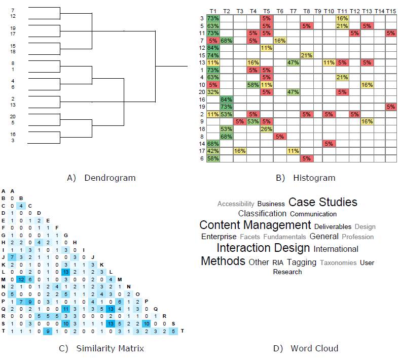
Figure 1. Common card sorting visualization techniques: A) dendrogram from hierarchical cluster analysis, B) histogram matrix of topic agreement, C) similarity matrix of card relationships, and D) word frequency cloud of participant-generated topics.
More novel but lesser used visualization techniques utilize histograms in some way. For example, proximity matrices and multidimensional scaling maps support exploration of participant organization mental models (Hill, 2006; Hudson, 2007).
There are also a few examples of graphs used to display and explore card-sorting data. For example, a graph inspired by a parallel coordinates design is an alternative to dendrograms and can support the exploration of alternate mental models or architectures within the study data (Mayfield, 2011). An affinity graph can show complex relationships between cards (Morville & Rosenfeld, 2006). A k-means analysis graph can show card topic clustering (Burkhard, 2005). The most related examples of graphs used in card-sort analysis are used for comparing categories as a way for topic normalization (Davies, 2009; Wolf, Dougherty, & Kortemeter et al., 2012). However, results derived from this analysis are limited by what can be learned through topic normalization, and the authors do not provide an analysis methodology to aid in interpreting the results.
There are also related applications of visualization for co-occurrence data, which is similar to card-sorting data. For example, iAVATAR (Sun, Bhowmick, & Liu 2010) uses graphs to visualize the co-occurrence between image tags for search. WordBridge (Katsanos, Tselios, & Vouris, 2008) uses a combination of word frequency clouds and graphs to create a graph cloud of term co-occurrence in text analysis.
All of the discussed visualization techniques can offer insights when analyzing card-sorting data. However, they are often used as supplementary analysis to qualitative (heuristic) or quantitative (statistical) analysis and are insufficient as the primary analysis method.
Challenges
While qualitative analysis methods offer rich, in-depth analysis with the most valuable and interpretable design insights, these methods cannot be automated and do not scale well to larger card-sorting studies (Deibel et al., 2005; Fincher & Tenenberg, 2005).
Quantitative statistical approaches provide automated and repeatable results, but often lack or hide richer details found in qualitative analysis and are often difficult to interpret (Deibel et al., 2005; Fincher & Tenenberg, 2005; Hudson, 2007). Many of the quantitative methods only offer a high-level view of the data in the aggregate and lack the necessary detail to support design decisions (Fincher & Tenenberg, 2005; Hudson, 2007).
Determining a group topic can become difficult when similar group topics mean conceptually different things, when different group topics mean the same thing, or when the presence of completely different mental models renders any group topic interpretation across participants useless. This is especially true when card sorting is used for exploratory purposes or in a volatile domain where a common mental model does not exist. The inability to normalize topics affects the designer’s ability to use common analysis tools and techniques.
Many of the visualization techniques described are more often used as support to qualitative or quantitative analysis and are not used as the primary analysis method. Visualization can help provide insights or direct further analysis, but can also be just as difficult to interpret (Morville & Rosenfeld, 2006).
Motivation for Study
Despite its popularity as a user-centered design method for information architecture and visualization research, there are few tools that support visually exploring and understanding card-sorting data. The purpose of this work was to provide a repeatable, scalable analysis method that could also support rich, in-depth qualitative and quantitative analysis of card-sorting data. This paper presents a method for analyzing co-occurrence in card-sorting data using graph visualization. The visualization technique can be implemented in any visualization tool that supports graph visualization. The visualization-based analysis method is demonstrated through a case study using data from a sample card-sorting study.
Previous work (Wolf et al., 2012) described how to visualize card-sorting data, but focused on categorical comparison (topic normalization) and does not provide a corresponding analysis process or guidelines for interpreting the results. This work focuses on visualizing the relationships between cards instead of categories that offers alternate insights to the typical topic normalization process. This work also describes a repeatable analysis process and guidelines on how to interpret the results.
Visualization Analysis for Card Sorting
Visualizing card-sorting data as a graph supports the exploration and analysis of data in ways that other analysis methods do not support. The presented graph visualization-analysis method leverages card co-occurrence, a relationship that calculates the number of times two cards are sorted together independent of the group or topic in which they are sorted. This allows for strong common relationships between cards to emerge regardless of the different sorting mental models expressed by participants. The ability to converge across different mental models is especially valuable for open card-sorting studies that tend to generate multiple mental models. Co-occurrence can also be referred to as card agreement across participants. The co-occurrence value can be used as a confidence measure to help judge the strength of the relationship between two cards or the validity of a card or topic. Higher co-occurrence, or the higher number of participants who sorted two cards together, translates into higher confidence in the features expressed in the graph.
Graph Visualization
The visualization technique can be implemented in any visualization tool that supports node-link graph visualization. A node-link graph consists of nodes and edges. In this visualization model, nodes represent concept cards in a card-sorting study, and edges represent the relationship between two cards. Edge weight represents the relationship strength between two cards. In the presented visualization technique, relationship is defined as the agreement (co-occurrence) of two cards. The weight of the relationship is defined as an amount of agreement that is the number of participants who sorted two cards together.
A force-directed graph layout is a way to order and display graph data to maximize readability while expressing meaningful relationships. Conceptually, an invisible “force” pushes nodes away from each other so that they are positioned in a way that they do not overlap and can be easily seen. Some layout algorithms will minimize edge crossing to make it easier to follow connections between nodes. Edge weight can also be used to change the shape of the graph and exaggerate features to help emphasize certain relationships.
Analytic Process
The construction of the graph is determined by the relationships between cards. The relationships between cards are visually expressed by features such as weight, clusters, bridges, overlay, and orphans. Confidence is a qualitative guide to help compare strengths in relationships and may change depending on the data. In general, card relationships that have 75% agreement or greater (i.e., 75% or more participants created the relationship) could be considered high confidence. Additionally, any relationships that have 50% agreement or greater (i.e., half or more of the participants created the relationship) could be considered with good or moderate confidence. Figure 2 provides examples of the following common graph features:
- Clusters: Cards display close together when they share many or strong relationships with other cards. Clusters of cards may indicate potential topic areas. Figure 2-A shows a cluster of eight cards that make up a potential topic.
- Bridges: Cards that act as connectors between clusters when they share relationships between clusters. Bridges may indicate related topics, transitional topic concepts, or ambiguous cards. Figure 2-B shows how the red bridge node connects two potentially related clusters.
- Weight: Relationship weight reflects the strength or confidence of the graph. Higher relationship weight represents more agreement between participants. All of the examples in Figure 2 are part of a high confidence graph using ≥53% agreement as a display filter.
- Overlay: Overlay of relationship weight or other features supports comparison. This comparison can help explore subtopics or alternate mental models. Figure 2-C shows an overlay of the 75% agreement network weight that reveals potential subtopics.
- Orphans/Singletons: Single cards or thin card clusters that have few or weak relationships with other cards. Orphans may indicate less important cards or ambiguous cards. Figure 2-D shows orphans/singleton cards.
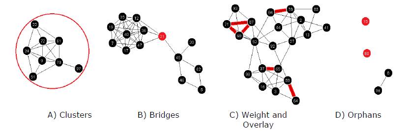
Figure 2. Example graph visualization features for card-sorting analysis. Card labels are coded with a number for easy reference.
Case Study
The following sections discuss the sample data used in this study, the visualization process, the analysis of the data, the results, and a comparison to a histogram matrix.
Sample Data
The sample dataset used in this case study is from the Information Architecture Summit Card-Sorting Study (Spencer, 2007), a freely available card-sorting study with data from 19 participants1. The study used 99 cards that were based on past Information Architecture Summit presentation titles. Researchers conducted the study where the participants (Information Architecture practitioners) used a web-based card-sorting software to perform an open card sort.
The sample card-sorting data was recorded using a popular spreadsheet analysis method (Lamantia, 2003). Card labels were coded with a number for easy reference. Group names that were slightly different but conceptually similar across participants were normalized into a common label. Table 1 provides an example of the participant data.
Table 1. Sample Card-Sorting Data From Information Architecture Summit Card-Sorting Study (Spencer, 2007)
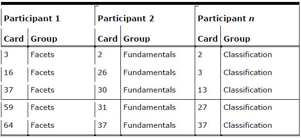
Data was prepared for the visualization tool in the following manner. Card pairs for cards sorted into the same group were recorded for each participant and then totaled. Card pairs were only recorded once, that is, (2,17) is the same as (17,2) and was only recorded once. Not all cards were paired together, and so only card pairs that existed were recorded. Table 2 shows sample card pair data with participant counts and a total. In Table 1 you can see that both Participant 1 and Participant n sorted the card pair (3,37) together, even though the cards were sorted into different groups. Participant 2 did not sort any of the shown card pairs together.
Table 2. Sample Card-Sorting Data Formatted for the Visualization Tool
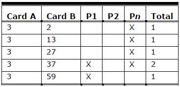
The exact data format is dependent on the visualization tool; however, most graph-visualization tools parse data formatted in this way.
Visualization
Nodes were defined as the cards, and edges were defined as a card pair. Edge weight was defined as the value of co-occurrence between two cards. Agreement was a measure of co-occurrence and calculated as a count of participants who sorted two cards together regardless of group topic.
An in-house general purpose graph-visualization tool was used to visualize the card-sorting data. The tool supported interactive analysis through data filters and visualization options. Any graph-visualization tool (such as NodeXL) could visualize card-sorting data, but the ability to filter data is an important aspect of the interactive analysis process. A force-directed layout was used to arrange the graph. Display and data filters were provided by the tool that supported feature exploration during analysis.
For the purpose of demonstration, only card numbers are displayed on the graph nodes to simplify screenshots. However, most visualization tools can be configured to display any type of label on the graph nodes and it is recommended to display the card name to aid analysis.
Analysis
There were 123 card pairs with ≥53% agreement (10/19 or more participants) that represented 72 of the 99 cards in the study. There were 18 card pairs with ≥74% agreement (14/19 or more participants) that represented 24 of the 99 cards in the study. Overall there was a good representation of cards with moderate (≥53% agreement) and high (≥74% agreement) confidence.
The first step in analyzing the card-sorting data visualization was to explore the data by adjusting card relationship weight in order to get a sense of the most common mental models represented in the data. Figure 3 shows progressive graph visualizations beginning with all relationships (Figure 3, Base Network) with increasing card agreement (Figure 3, ≥11% through ≥89%). Note that there was no card agreement with ≥97% (18 participants) and 100% (19 participants).
The most interesting graph visualizations were those that the most participants expressed. The 53% and greater agreement graphs (Figure 3, 53%-89%) are the representations of card pairs sorted together by more than half of the participants in the study.
The ≥53% agreement graph shows 13 clusters of potential topic areas (Figure 3, ≥53%; Figure 4). Cluster labels or topics can be established through content analysis of the cards within each cluster. For example, content analysis of the clusters suggests potential topics such as Accessibility, Business, Case Studies, Classification, Content Management, Information Visualization, Interaction Design, Internationalization, Personas, Post Web 2.0, Rich Internet Applications, and User Experience Design (Figure 4). A potential topic for one cluster, Unknown, could not be determined by content analysis.
Several of the clusters were explored in more detail to verify the topics they represented. A relationship weight overlay of ≥74% agreement on the visible ≥53% agreement graph shows cards with high co-occurrence within the context of a more general mental model (Figure 4). The overlay shows potential subtopics within one of the topic clusters.
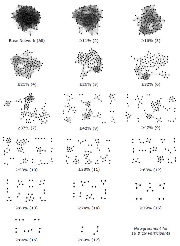
Figure 3. Progressive graph visualizations of increasing card agreement (the minimum percentage and count of participants who sorted two cards together regardless of topic). Orphans/singletons are not shown. Note: There was no card agreement for 97% (18 participants) and 100% (19 participants).
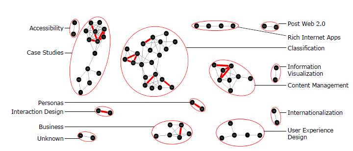
Figure 4. Content analysis of the clusters in the ≥53% agreement (10/19 or more participants) graph visualization (also shown in Figure 3). Includes an overlay of the ≥74% agreement (14/19 or more participants) relationships. The cluster topics listed were derived from the content analysis described in the text.
Content analysis of several small graphs with ≥74% agreement that is within a large cluster suggests the topic of Classification that contains subtopics such as Tagging, Taxonomies, and Facets (Figure 5-A). There is also a bridge card between Tagging and Facets called Tags and facets, tags and languages: A case study.
In one of the clusters, there is a bridge card between two subclusters, Stories from the field: Never consider yourself a failure, you can always serve as a bad example (Figure 5-B). The topic of the cluster had already been previously identified in the relationship weight overlay analysis as Case Studies (Figure 4). Content analysis of the other connected cluster suggests a topic of Enterprise IA Lessons Learned which is very similar to the Case Studies topic (Figure 5-B). Interestingly, the Enterprise IA Lessons Learned topic is not expressed as a subtopic within Case Studies but as a similar topic. This indicates a possible alternate mental model for understanding Case Studies.
Further analysis combines bridge analysis with relationship weight analysis. The ≥47% agreement (9/19 or more participants) graph shows additional bridges between the ≥53% high agreement clusters (Figure 5-C). This time, the relationship weight overlay indicates the differences between the ≥47% and ≥53% agreement graphs. A connection exists between the previously defined Interaction Design cluster and cards that imply a topic on User Experience Design. The lack of a high-agreement relationship may indicate alternate mental models, weakly expressed subtopics, a disagreement about the type of relationship between Interaction Design and User Experience Design, or a meta-topic of Design.
Orphan analysis also applies to small or thin clusters. For example, there was a small Unknown cluster in the ≥53% agreement graph that could not be identified through content analysis. With additional analysis by adjusting the relationship weight overlay, this cluster does not connect with other cards until the ≥42% agreement graph (Figure 5-D).
Content analysis of the other cards in this cluster does not indicate an obvious topic. This cluster could be an artifact of the data (i.e., a pattern that is not a pattern), or a Junk or Miscellaneous topic used by participants to sort cards they did not understand or could not place within the mental model they were expressing during the study.
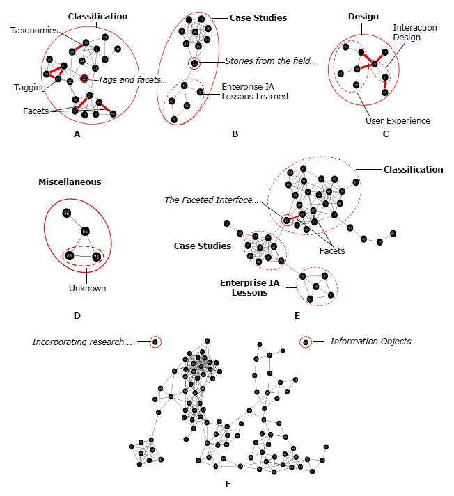
Figure 5. Detailed graph features and content analysis: A) topic analysis of Classification cluster in ≥53% agreement graph with ≥74% agreement relationship weight overlay, B) bridge analysis of Case Studies subclusters in ≥53% agreement graph, C) meta-topic analysis of Interaction Design and User Experience Design clusters (dotted circles) in ≥47% agreement graph with differences between ≥47% and ≥53% agreement relationship weight overlay, D) content analysis of the Unknown orphan cluster in the ≥42% agreement graph, E) bridge analysis in ≥43% agreement graph to examine relationships between the Classification and Case Studies clusters, and F) orphan/singleton cards first occur in the ≥37% agreement graph.
In the ≥47% agreement graph there is also a bridge card between the Case Studies and Classification clusters, The Faceted Interface: PC connection case study (Figure 5-E). Content analysis shows that the bridge card is a case study on facets. It is also one of the cards in the high confidence Facets subtopic within Classification. The bridge indicates a possible ambiguity or confusion of the card by participants, thus leading to an overlap in topic concepts. Also consider that this conclusion is drawn from the analysis of a graph that less than half of the participants agreed. This information could inform design but is low-confidence evidence. The bridge could also indicate a relationship between the Case Studies and Classification topics, such as a focus on classification-related case studies.Next, orphans and thin clusters are analyzed. Orphans do not appear until the ≥37% agreement (7/19 or more participants) graph (Figure 5-F). Cards at this low-confidence level may indicate ambiguous topics that do not provide enough information to participants to easily sort (e.g., Information Objects) or cards that were too difficult to sort without more context (e.g., Incorporating research…).
Results
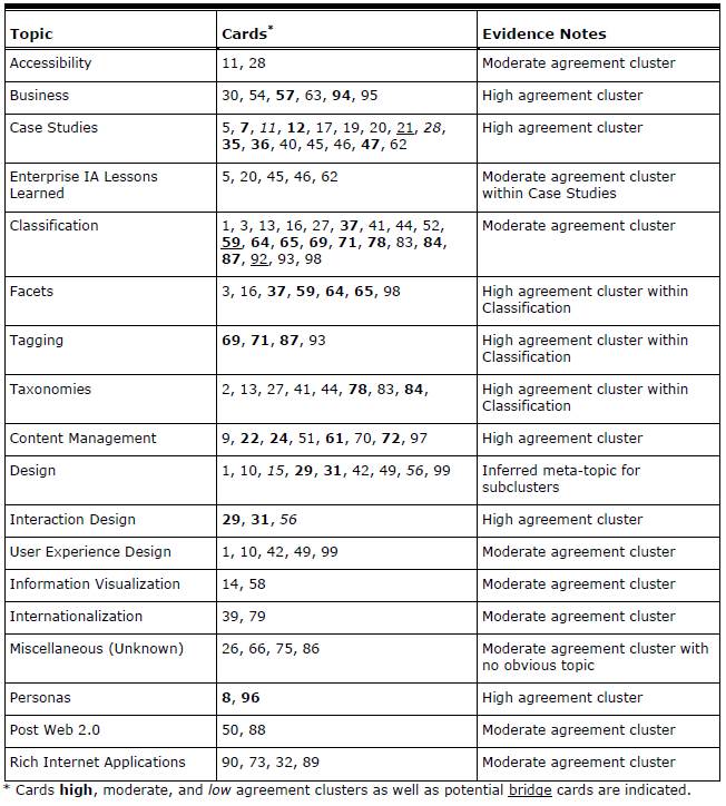
Using the information obtained through graph-visualization analysis, it is possible to draft a tentative information structure that can be used to inform the design of an information architecture (see Table 3). The information structure derived from the analysis of the case study card-sorting data describes the major categories participants created—in this case categories of Information Architecture Summit papers.
The information structure is not yet an information architecture; it is simply an artifact of the card-sorting data analysis. However, this artifact is a useful tool in the design of an information architecture. The information structure provides the output of analysis by documenting topics with the highest agreement, the cards within the highest agreement topics, and a note describing the evidence from which the information was derived. Product goals, business rules, subject matter expertise, and designer experience can easily be applied to the information structure to create an information architecture.
Additional content details or information hierarchy may be able to be derived from further graph-visualization analysis, but with diminishing returns. The analysis has provided a repeatable, moderate to high confidence structure in a reasonable amount of analysis time. Insights that would result from further analysis of lower confidence features within the data may or may not be valuable.
There were also several small clusters that could not easily be organized into a meta-topic from visualization analysis, such as Accessibility, Information Visualization, Internationalization, Personas, and Post Web 2.0 (Figure 4). At this point, designer intuition, in-depth qualitative analysis, and knowledge of the research goals would supplement the current analysis and contribute to the design of an information architecture.
Table 3. Information Structure With Proposed Topics, Corresponding Cards (listed by number), and Analysis Evidence Notes (derived from the graph analysis of the Information Architecture Summit Card Sort results).
Comparison to Histogram Matrix
The presented case study demonstrated how data from a card-sorting study can be analyzed using graph visualization. However, it is also useful to compare the presented graph-visualization analysis method to existing analysis techniques. This section assesses how the graph-visualization analysis method compares to a popular card-sorting analysis method that uses a histogram available in a popular spreadsheet analysis tool (Lamantia, 2003; Figure 6).
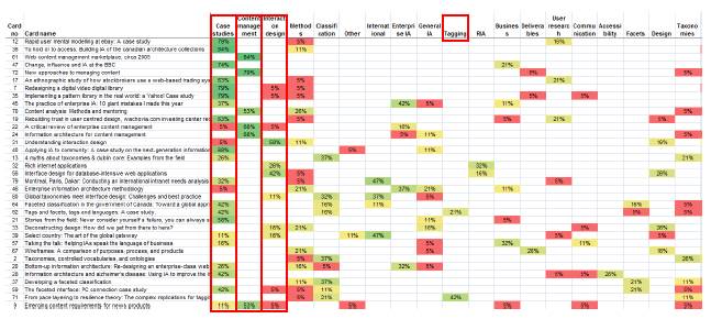
Figure 6: Screenshot of histogram matrix in card sorting spreadsheet analysis tool. X-axis ordered by number of participants who used the category (high to low) and Y-axis ordered by categories/card (low to high). Case Studies and Content Management include cards with ≥75% topic agreement (high confidence topic). Interaction Design includes a card with ≥50% topic agreement (moderate confidence topic).
The card-sorting study data used in the case study (Spencer, 2007) included corresponding histogram matrix visualization. The spreadsheet provided standard descriptive information, such as the number of total cards within a topic, as well as a card-topic agreement table that was visualized as a histogram matrix (such as in Figure 1-B).
The spreadsheet is set up by entering cards used in the study. Each participant’s sorting data is recorded, such as the created groups, topic names given to the groups, and the cards sorted within the groups. Topic normalization using heuristics and content analysis is conducted by the researcher to merge similar topic names into a single topic for comparison and correlation. Finally, the category summary, card and topic agreement information, and card correlation information is analyzed.
The histogram uses topic agreement (the number of participants who sorted a card into a group / the number of different groups a card was sorted into) as a measure of confidence. Topic agreement is a similar measure of confidence just as card co-occurrence is used in graph-visualization analysis. Heuristic guidelines for topic agreement using the spreadsheet tool recommend ≥75% as high agreement and ≤25% as low agreement (Spencer, 2007) which are similar to the guidelines provided in this paper for interpreting card agreement.
The histogram analysis identified two potential high confidence topics (75% or greater topic agreement): Case Studies and Content Management (Figure 6). The histogram analysis also identified one potential moderate confidence topic (50%-75% topic agreement): Interaction Design (Figure 6). A number of cards with low topic agreement are also identifiable, possibly indicating ambiguous topics or problem cards (Figure 6).
In comparison, the graph visualization analysis from the case study was able to identify six potential high confidence topics (≥74% agreement): Business, Case Studies, Classification, Content Management, Interaction Design, and Personas (Figure 7). Additionally, the graph visualization identified seven potential moderate confidence topics (≥53% agreement) that were not easily identified in the spreadsheet analysis: Accessibility, Information Visualization, Internationalization, Post Web 2.0, Rich Internet Applications, User Experience Design, and Unknown (Figure 7).
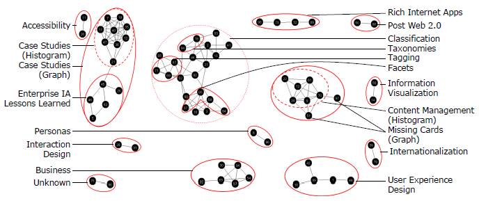
Figure 7: Comparison between results of graph-visualization analysis and histogram analysis methods. Dotted circles indicate categories identified by both graph visualization and histogram. Solid circles indicate differences in major categories between the graph visualization and histogram as well as additional categories and subtopics identified by the graph visualization but not the histogram. Note the two potential cards in Content Management missed by the spreadsheet histogram and identified by the graph visualization.
The graph visualization analysis was also able to identify several potential subtopics (e.g., Tagging within Classification and Enterprise IA Lessons Learned as part of Case Studies (Figure 7), while subtopic analysis is not supported by the histogram analysis. Tagging was identified as a topic in the histogram analysis but not within a hierarchy.
Finally, the graph visualization was able to identify potential missing cards from the Content Management topic that the histogram analysis was not able to group into a topic with confidence (Figure 7).
Topics are key to understanding a user’s mental model for the concept domain. Identifying high-confidence topics provides a good idea of the general mental model of the study. The additional ability to identify features, such as subtopics, related topics, and ambiguous cards is critical for developing a detailed understanding of the data.
1 Readers are encouraged to download the dataset and follow along.
Discussion
The presented case study demonstrated a straightforward way that card-sorting data (or similar co-occurrence data) can be analyzed using graph visualization. This method is especially valuable as online card-sorting tools allow researchers the ability to conduct larger studies and collect larger amounts of data. Next, a comparison of the visualization analysis method to a popular card-sort data histogram analysis method provides a compelling argument for using the graph visualization approach.
Benefits and Drawbacks to the Visualization Technique
There are a number of benefits and drawbacks to utilizing the graph visualization in a card-sorting analysis. These trade-offs can be used to help determine if graph visualization is appropriate for the analysis needs of a card-sorting dataset.
Benefits include
- Easy to analyze features. The graph features described in the analytic process guidelines are intuitive and do not require extensive visual analytics experience to recognize and interpret.
- Repeatable results. The guidelines for interpreting graph features in card-sorting data offer heuristics for researchers to produce repeatable, defensible results.
- Supports hierarchy. Graph visualization supports exploring hierarchy within card-sorting data that the histogram analysis method does not support.
- Supports multiple groups. The graph visualization-analysis method supports the sorting of a card into more than one category while the histogram analysis cannot.
- Topic Normalization. The graph-visualization analysis method utilizes card agreement and does not require manual, time consuming topic normalization in order to conduct analysis.
Drawbacks include
- Requires visualization software. While both the graph visualization and histogram analysis methods require some level of data preparation, the graph-visualization method also requires access to and knowledge of how to use visualization software.
- Requires qualitative analysis. Qualitative content analysis is still necessary to identify group topics and make sense of cluster relationships. Content analysis requires experience or knowledge of the study domain and may introduce inconsistent interpretation results between researchers.
Conclusion
This paper describes a novel approach for analyzing participant agreement in card-sorting data through the use of graph visualization. The visualization technique can be implemented in any visualization tool that supports graph visualization. The purpose of this method is to support in-depth qualitative analysis that is scalable and repeatable. When compared to a common histogram analysis method, the graph-visualization method was able to identify more high-confidence topic areas as well as subtopics that were not identifiable in the histogram analysis.
The ability to identify meaningful, high-confidence topics is significant because by improving the process of identifying more high-confidence topic areas and features, researchers will be able to reduce the amount of time necessary to analyze card-sorting results and will have better data for information architecture design. In our own work, the visualization technique described in this paper offered additional insight that traditional card-sorting analysis techniques could not support (Paul & Whitley 2013). Although the method does not completely eliminate manual qualitative analysis and requires visualization software, the overall benefits make this graph-visualization method an attractive alternative for card-sorting data analysis. The integration of this analysis method in card-sort analysis tools (such as those described in the Background section) provides another valuable tool in the information architect’s toolbox.
References
- Burkhard, R.A. (2005). Impulse: Using knowledge visualization in business process oriented knowledge infrastructures. Journal of Universal Knowledge Management, 0(2), 170-188.
- Davies, R. (2009, December). Network visualization of qualitative data. Monitoring and Evaluation NEWS. Retrieved from http://mande.co.uk/special-issues/participatory-aggregation-of-qualitative-information-paqi/
- Deibel, K., Anderson, R., & Anderson, R. (2005). Using edit distance to analyze card sorts. Expert Systems, 22(3), 129-138.
- Eppler, M.J., & Platts, K. (2007). An empirical classification of visual methods for management: Results of picture sorting experiments with managers and students. Proceedings of IEEE InfoVis 2007 (pp. 335-341). IEEE.
- Fincher, S., & Tenenberg, J. (2005). Making sense of card sorting data. Expert Systems, 22(3), 89-93.
- Hill, B.R. (2006). Teaching with pro tools? Proceed with caution! The development of mental models for recording engineering instruction. Music and Entertainment Industry Educators Association Journal, 6(1), Article 2.
- Hinkle, V. (2009, April). Using tag clouds to visualize text patterns. Usability News, 11(1), Retrieved from http://usabilitynews.org/using-tag-clouds-to-visualize-text-data-patterns/
- Hudson, W. (2007). Old cards, new tricks: Applied techniques in card sorting. Proceedings of BCS HCI 2007 (pp. 225-226). University of Lancaster, UK
- Hudson, W. (2013). Card sorting. In M. Soegaard & R. Dam (Eds.), Encyclopedia of Human-Computer Interaction, 2nd Ed. Aarhus, Denmark: The Interaction Design Foundation.
- Katsanos, C., Tselios, N., & Vouris, N. (2008). AutoCardSorter: Designing the information architecture of a web site using latent semantic analysis. Proceedings of ACM CHI 2008 (pp. 875-878). Florence, Italy: ACM Press.
- Lamantia, J. (2003, August 26). Analyzing card sort results with a spreadsheet template. Boxes and Arrows. Retrieved from http://boxesandarrows.com/analyzing-card-sort-results-with-a-spreadsheet-template/
- Lloyd, D., Dykes, J., & Radburn, R. (2007). Mediating geovisualization to potential users and prototyping a geovisualization application. Proceedings of GIS Research UK 2007 (pp. 9-16).
- Lottaz, C., Stouffs, R., & Smith, I. (2000). Increasing understanding during collaboration through advanced representations. Journal of Information Technology in Construction, 5, 1-24.
- Mayfield, A. (2011). Determining second best IAs using card sorting. Proceedings of Information Architecture Summit 2011, Poster.
- Morville, P., & Rosenfeld, L. (2006). Information Architecture for the World Wide Web: Designing Large-Scale Web Sites (3rd ed.). Sebastopol, CA: O’Reilly Media.
- Paul, C.L. (2008). A modified delphi approach to a new card sorting methodology. Journal of Usability Studies, 4(1), 7-30.
- Paul, C.L., & Whitley, K. (2013). A taxonomy of cyber situation awareness questions for the user-centered design of cyber situation awareness. Proceedings of HCI International 2013, Human Aspects of Security (pp. 145-154). Springer: Berlin Heidelberg.
- Plaisant, C., Shneiderman, B., & Mushlin, R. (1998). An information architecture to support the visualization of personal histories. Information Processing & Management, 34(5), 581-597.
- Righi, C., James, J., Beasley, M., Day, D.L., Fox, J. E., Gieber, J., … & Ruby, L (2013). Card Sort Analysis Best Practices. Journal of Usability Studies, 8(3), 69-89.
- Sanders, K., Fincher, S., Bouvier, D., Lewandowsk, G., Morrison, B., Murphy, L., … & Zander, C. (2005). A multi-institutional multinational study of programming concepts using card sort data. Expert Systems, 22(3), 121-128.
- Sinha, R., & Boutelle, J. (2004). Rapid information architecture prototyping. Proceedings of ACM DIS 2004 (pp. 349-352). New York, NY: ACM.
- Spencer, D. (2007). IA summit papers card sort. Proceedings of Information Architecture Summit 2007, Workshop on Introduction to Information Architecture. Retrieved from http://rosenfeldmedia.com/books/downloads/cardsorting/iasummitpapers_cardsort.xls.
- Sun, A., Bhowmick, S.S., & Liu, Y. (2010). iAVATAR: An interactive tool for finding and visualizing visual-representative tags in image search. Proceedings of VLDB 2010 (pp. 1609-1612).
- Tullis, T. (1985). Designing a menu-based interface to an operation system. Proceedings of ACM CHI 1985 (pp. 79-84). New York, NY: ACM.
- Tullis, T. & Wood, L. (2004). How Many Users are Enough for a Card-Sorting Study? Proceedings of UPA 2004. Minneapolis, MN
- Wolf, S.F., Dougherty, D.P., & Kortemeter, G. (2012). Empirical approach to interpreting card-sorting data. Physical Review Special Topics: Physics Education Research, 8(1), 010124.